Ridgeline plots are useful for visualizing changes in the shapes of distribution over multiple groups or time periods. Let us look at an example of how we can create this plot using the SGPLOT procedure that is part of the ODS Graphics Procedures. For this example, we will plot the distribution of temperatures across months for the town of Cary, North Carolina in 2019.
To get the data for the plot, I discovered an API service that provides weather data in json format. We can use PROC HTTP and the JSON engine to get the input raw data and read it in SAS. Below is the code snippet that fetches the data for the year 2019.
filename resp clear; filename resp 'rdu_weather_2019.json'; proc http url = 'https://data.townofcary.org/api/records/1.0/search/?dataset=rdu-weather-history&q=date+%3E+31-12-2018+and+date+%3C+1-1-2020&rows=-1&sort=date' method = "GET" out = resp; run; /* Assign a JSON library to the HTTP response */ libname rdu clear; libname rdu JSON fileref=resp noalldata; |
Figure 1 shows a snippet of the SAS dataset. The list below only displays relevant variables we will be using for the plots discussed in this article. Here is a brief description of the variables.
-
Date: Date of Observations
TemperatureMin: Low Temperature of the day in Fahrenheit
TemperatureMax: High Temperature of the day in Fahrenheit
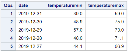
Figure 1. Partial SAS dataset for minimum and maximum temperatures for the month of December in 2019.
We will need to process this dataset and derive necessary variables and statistics before we can generate the plot. The required steps are outlined below:
-
Step 1: Compute the kernel density estimates for the variables of interest.
Step 2: For plotting purpose, re-scale the computed density estimates so we can stack multiple density plots on a common axis.
Step 3: Prepare data for reference lines to indicate the name of the month.
Step 4: Consolidate all the data into one SAS dataset.
Step 5: Create the plot using PROC SGPLOT.
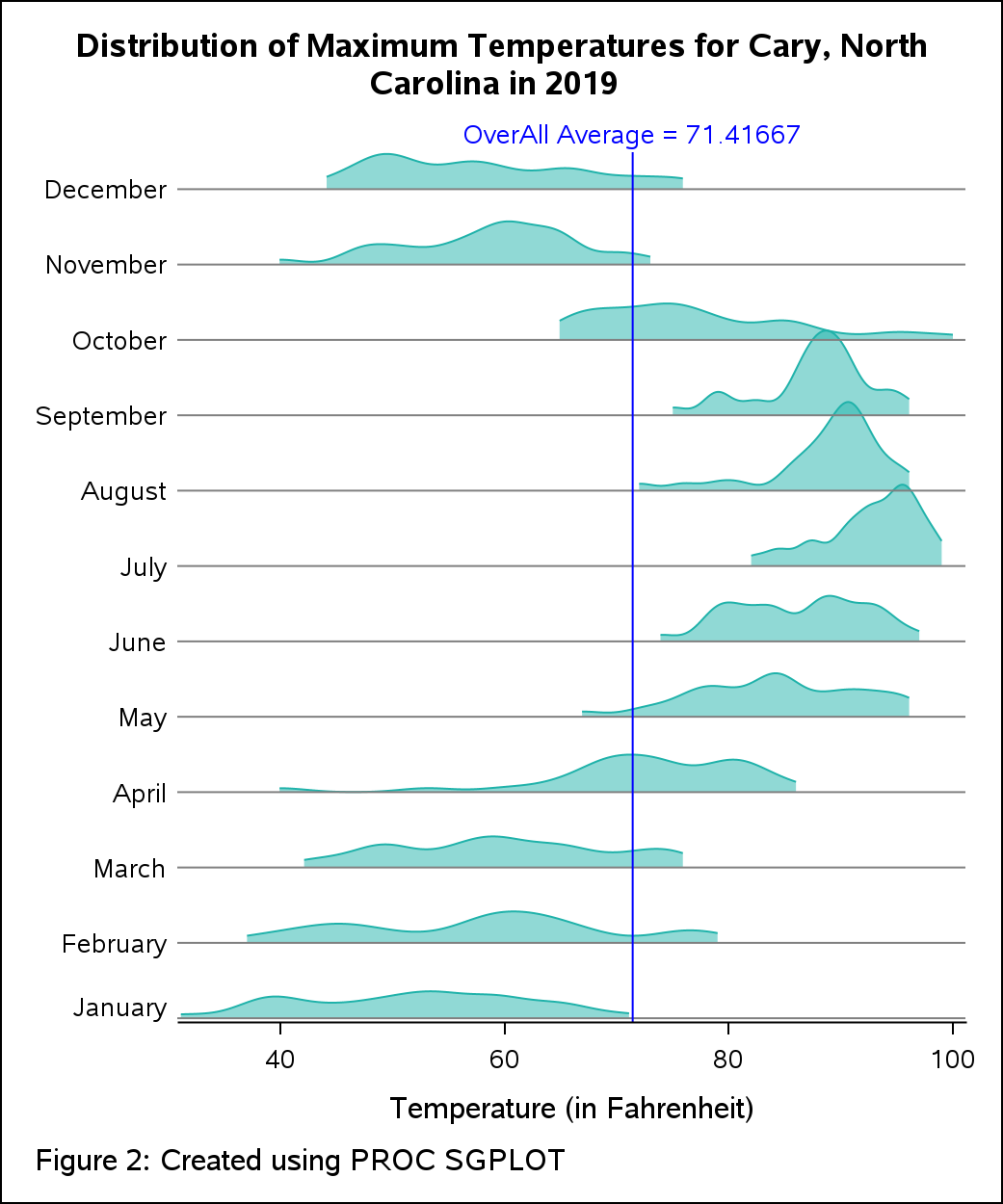
Visualizing the Distribution of Maximum Temperatures in 2019 Across different Months
Step 1: For computing the kernel densities, you can either leverage CAS Language (CASL) and CAS actions in SAS Viya or the KDE procedure in SAS 9. Let us see both methods.
Method 1 - Using SAS Viya: I have used the kde action available in the dataPreprocess action set. Below is the CASL code that computes the density estimates and saves them in a table. The input variable is ‘maxTemperature’ in the kde action. I have used the groupBy option to compute the densities for each month from January through December. The original data has records of day wise temperatures. Hence, we will need to create a derived variable to extract the month so we can use it for computing the densities for each month. As shown in the code snippet below, the variable ‘MONTH’ is derived from the dates provided in the original data that is subsequently used in the groupBy option in CASL code. For this post, I have used this method.
/* Derive the group variable 'month' */ data temp; set rdu.records_fields; date_num = input(date, YYMMDD12.); month = month(date_num); run; /* create a CAS table */ cas casauto; libname mycas cas; data mycas.temp; set work.temp; run; /* CASL code to compute densities using kde action */ proc cas; session CASAUTO; dataPreprocess.kde result=s / table = {name="temp" , groupBy = {{name = "month"}} }, inputs = {"temperatureMax"}, casoutKDEDetails = { name = "_castemp", replace = TRUE } ; quit; |
Method 2 – Using SAS 9: Alternatively, you can also compute the densities using the KDE procedure. The BY statement allows you calculate the densities for each month. You can save them out in a SAS dataset for further use.
/* compute kernel density estimates using proc kde in SAS 9.4 */ proc sort data=temp out=sorted; by month; run; proc kde data=sorted; univar temperatureMax / out=outkde (rename=(value=temperatureMax)) noprint plots=none; by month; run; |
Step 2: I have used a data step program to re-scale the computed densities so I can stack them up on a common Y-axis. The trick is to loop over a dummy numeric group variable (mapped to the original group) and to increment the densities for each iteration of the loop. The increment value is appropriated based on the maximum density value and the value of dummy group variable.
/* for each group, re-scale the computed values */ data work.rescale; set work.density; %do grp=1 %to &nGroups; if group = &grp then do; increment = %sysevalf(&maxDensity * %eval(&grp - 1)); increment = increment * 0.85 ; density = _density_ + increment; end; %end; run; |
Step 3: I have used reference lines on the Y-axis to create boundaries for each month in the plot. They are labeled by the name of the month at the start of the line towards the left.
/* add variables for reference lines */ proc sql noprint; create table work._temp3 as select distinct increment as refVal from work.rescale; create table work._temp4 as select distinct month as refLabel from work.rescale; quit; |
Step 4: Subsequently, I have merged all derived variables and computations into a single dataset that can be used for plotting. I wrapped up all the pieces together in a SAS macro program. This makes it easier to create a ‘ready-to-use' dataset the next time around for a different raw dataset.
/* create data for plotting purpose */ data work.plotData; merge work.rescale work._temp3 work._temp4; run; /* macro program to create data for ridge line plot */ %prepareRidgeData(dslib=work, dsnm=temp, analysisVar=temperatureMax, groupVar=month, dsnout=plotData); |
Step 5: The plot statements BAND, SERIES and REFLINE are used in the SGPLOT procedure to create the plot. The SERIES plot displays the density curve while BAND is used to fill the area under the curve. The months and the overall average temperature are created by overlaying multiple reference lines on different axes. The style attributes are managed at the plot level by providing suitable options like LINEATTRS and FILLATTRS on the necessary statements.
ods graphics / width=500px height=600px; title "Distribution of Maximum Temperatures for Cary, North Carolina in 2019"; footnote j=l "Created using PROC SGPLOT"; proc sgplot data=work.plotData noautolegend nowall noborder; band x = temperatureMax lower = increment upper = Density / group = month fillattrs=(color=lightseagreen transparency=0.5); series x = temperatureMax y = Density / group = month lineattrs=(color=lightseagreen pattern=solid); refline refVal / label=refLabel labelloc=outside labelpos=min ; refline &avg / label="OverAll Average = &avg" axis=x labelloc=outside labelpos=max labelattrs=(color=blue) lineattrs=(color=blue); yaxis display=none offsetmax=0; xaxis label = 'Temperature (in Fahrenheit)' ; format refLabel mth.; run; title; footnote; |
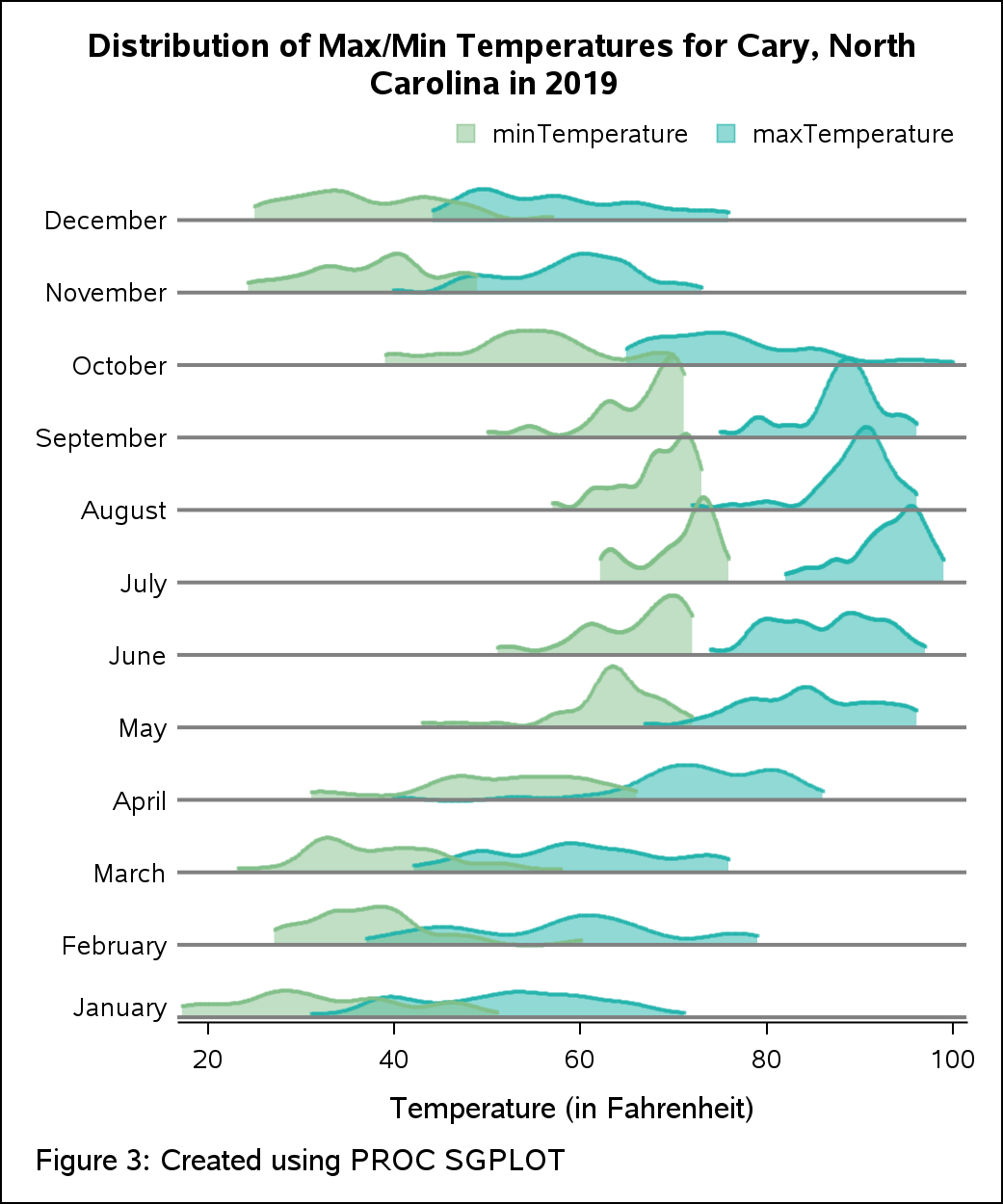
Tweaking the Plot for Multiple Measures
Early in the article (in Figure 1), we looked at the partial raw dataset. Notice that we also have the measure ‘minTemperature’ in the dataset. Let us see if we can tweak the current visualization and create density plots for two measures – maxTemperature and minTemperature across different months. This can help to compare both minimum and maximum temperatures within the same visualization. To prepare the dataset considering both measures, we will invoke the SAS macro for each measure. This will give us output datasets that we can merge and then use for plotting.
/* invoke macro program to create output datasets for measures 'temperatureMax and temperatureMin */ %prepareRidgeData(dslib=work, dsnm=temp, analysisVar=temperatureMax, groupVar=month, dsnout=out1); %prepareRidgeData(dslib=work, dsnm=temp, analysisVar=temperatureMin, groupVar=month, dsnout=out2); /* merge both output datasets for plotting */ data plotData; merge out1 (rename=(_density_=_density_temp_max density=density_temp_max increment=inc_temp_max refLabel=refLabel_temp_max refVal=refVal_temp_max)) out2 (rename=(_density_=_density_temp_min density=density_temp_min increment=inc_temp_min refLabel=refLabel_temp_min refVal=refVal_temp_min) drop=_Dim_ month_f _NPerDimGridPoints_ _NPerDimGridPoints_ ); by group; run; |
For plotting the densities for both measures, I have used SGPLOT with multiple plot statements. SGPLOT supports overlaying of compatible plots. To plot the temperatures, I have used two scatter plots for each measure. I have specified multiple band statements to shade the areas for both measures. I have mapped the BAND and SERIES plots for minimum temperature on the secondary (Y2) axis to manage the alignment of the plot. I have also requested a custom graph legend which makes it easier to distinguish the measures. For plotting the legend, I have used the KEYLEGEND statement with options to control its behavior. Since there may be overlapping regions in the plot, I have used the TRANSPARENCY option.
ods graphics / width=500px height=600px; title "Distribution of Min/Max Temperatures for Cary, North Carolina in 2019"; footnote j=l "Created using PROC SGPLOT"; proc sgplot data=work.plotData noautolegend noborder ; band x = temperatureMax lower = inc_temp_max upper = density_temp_max / group = month fillattrs=(color=lightseagreen transparency=0.5); band x = temperatureMin lower = inc_temp_min upper = density_temp_min / group = month fillattrs=(color=LIYG transparency=0.5) y2axis; scatter x = temperatureMax y = density_temp_max / markerattrs=(color=lightseagreen size=2px symbol=squarefilled) transparency=0.5 name='max' legendlabel="maxTemperature"; scatter x = temperatureMin y = density_temp_min / markerattrs=(color=LIYG size=2px symbol=squarefilled) transparency=0.5 y2axis name='min' legendlabel="minTemperature"; refline refVal_temp_min / label=refLabel_temp_min labelloc=outside labelpos=min axis=y2 lineattrs=(thickness=2px); yaxis display=none; y2axis display=none; xaxis label = 'Temperature (in Fahrenheit)' ; format refLabel_temp_min mth.; keylegend "min" "max" / AUTOITEMSIZE location=outside position=topright noborder; run; title; footnote; |
If you are interested in the full code, you can find it here.


3 Comments
Nicely done! Y'know when you look at a graph, and just KNOW you're going to be able to use it. This is one of those graphs. Thanks, Debpriya! And keep them coming!
Fantastic work!
I run your code to fetch the data from the website but got an error message below. could you tell what I'm missing here?
Thanks.
ERROR: File RDU.RECORDS_FIELDS.DATA does not exist.
Hi Ethan. I noticed that currently no data is being returned from source. I tried to download the data manually and even that did not work. This may be due to possible outage from source. Please re-try once this is resolved. Thanks!