Many data analysts are familiar with logistic regression, where the response variable, Y, has two observed values, often represented as Y=0 and Y=1. The case Y=0 encodes that an event did not happen. For example, a patient did not experience some disease or did not die. The opposite case (Y=1) means that the event did happen. These binary responses are common in many areas but are especially useful in medicine.
However, sometimes the response variable encodes multiple levels of severity. The response variable can have k states, where k > 2. This is called an ordinal response model. For example, the spread of cancer in a patient is often described by using k=5 stages: Stage 0 indicates abnormal cells that have not spread, whereas Stage 4 indicates advanced cancer that has metastasized through the body. Since each stage is more severe than the ones before, the stages of cancer represent an ordinal variable. As in this example, usually k is a small integer.
PROC LOGISTIC in SAS enables you to build an ordinal regression model where the response variable is ordinal. Given values for the explanatory variables in the model, the model predicts the probability that Y=0, Y=1, ..., and Y=k-1. (You can also use levels 1-k.) The References section contains several references that explain the mathematics of ordinal regression models. Unfortunately, most references do not visualize these ordinal models. Robin High (2023) and the documentation for PROC LOGISTIC include graphs for a model that contains only categorical explanatory variables. Derr (2013) draws graphs for models that involve either categorical or continuous covariates. This article focuses on how to visualize an ordinal regression model that has a continuous covariate. It shows two techniques: use the built-in EFFECTPLOT statement in PROC LOGISTIC or create your own graphs by evaluating the model on a set of scoring data.
Example data
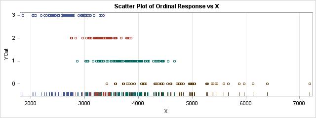
The Appendix shows some example data for which the response variable, YCat, has k=4 levels with values 0-3. The explanatory variable, X, is continuous. A scatter plot of the data is shown to the right. The graph shows a negative association between YCat and X: high values of YCat are associated with low values of the X variable, whereas low values of YCat are associated with high values of X.
An ordinal response model tries to predict the classes (YCat=0, 1, 2, or 3) based on the X variables. From the graph, it looks like the model should predict YCat=3 when X is less than 2800, then predict either YCat=2 or YCat=1 as X increases further. After X exceeds 4500, the model should predict YCat=0. From the graph, it is not clear how to assign probabilities for YCat when X is in the range 3000-4500.
The cumulative logit model
There are several kinds of ordinal regression models, but this article examines only the cumulative logit model, which is the default model in PROC LOGISTIC when the response variable has more than two values. The cumulative logit model is used to predict the probability P(Y ≤ j | x) for j=0, 1, ..., k-1. For simple models, you can use the EFFECTPLOT statement in PROC LOGISTIC to visualize the model. When there is one continuous covariate, use the SLICEFIT option on the EFFECTPLOT statement, as follows:
proc logistic data=Have; model YCat = X / link=CLOGIT; ods select ResponseProfile ParameterEstimates SliceFitPlot; effectplot slicefit(x=X sliceby=YCat) / noobs; /* to see the linear predictors, use effectplot slicefit(x=X sliceby=YCat) / noobs link; */ run; |
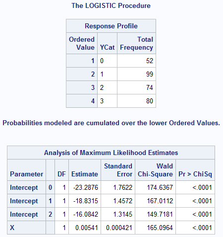
The tabular output includes the ResponseProfile table and the ParameterEstimates table. The ResponseProfile table shows the number of observations in each level of the ordinal response variables. For these data, the each category has more than 50 observations. If there is a category that has very few observations, you should probably combine it with one of the adjacent levels. The ParameterEstimates table gives the parameter estimates for the model. Derr (2013, p. 2-3) explains that the model predicts the probabilities Pr(Y ≤ j) for each level j=0,1,2,3. The linear predictors have the form αj + X`*β. For these data, α0 = -23.3, α0 = -18.8, α0 = -16.1, and β = 0.0054.
When you apply the cumulative logit link to these linear predictors, you get the predicted cumulative probabilities on the following graph:
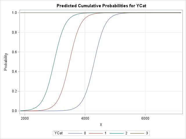
Here is how to interpret this graph:
- The brown horizontal line is the predicted cumulative probability for Pr(YCat ≤ 3| x). Because YCat=3 is the largest ordinal value, the probability is always 1 that YCat is 3 or less.
- The green curve is the leftmost sigmoid-shaped curve. This is the predicted cumulative probability for Pr(YCat ≤ 2| x). When X exceeds 2500, the probability that YCat is 2 or less begins to increase. By the time X reaches 4000, there is about 100% chance that YCat is 2 or less.
- The red curve is the middle sigmoid-shaped curve. This is the predicted cumulative probability for Pr(YCat ≤ 1| x). When X exceeds 3000, the probability that YCat is 1 or less begins to increase. By the time X reaches 4500, there is almost 100% chance that YCat is 1 or less.
- The blue curve is the rightmost sigmoid-shaped curve. This is the predicted cumulative probability for Pr(YCat ≤ 0| x), which means Pr(YCat = 0| x). When X exceeds 3800, the probability that YCat is 0 begins to increase. By the time X reaches 4500, there is almost 100% chance that YCat is 0. This agrees with the scatter plot that was shown earlier.
I have written several articles about how to use the EFFECTPLOT statement in SAS procedures to visualize regression models. For ordinal regression models, Derr (2013) provides other examples that use the EFFECTPLOT statement in PROC LOGISTIC.
A visualization that shows predicted probabilities
The EFFECTPLOT statement can visualize many simple regression models. However, for more complicated models (for example, models with spline effects) and for regression procedure that do not support the EFFECTPLOT statement, I have shown how to create a sliced fit plot manually.
Notice that the EFFECTPLOT statement visualizes the cumulative probabilities (the CDF) for the cumulative logit model. This makes sense, but sometimes it is more useful to display the predicted probability for each response level. The SCORE statement in PROC LOGISTIC outputs the predicted probability for each level.
As discussed in a previous article about the sliced fit plot, there are three steps:
- Create scoring data that contains a grid of values for the continuous covariate and sets the other explanatory variables to convenient reference values.
- Use the SCORE statement in the regression procedure to evaluate the fitted model on the scoring data. Output the predictions.
- Use PROC SGPLOT to graph the predicted values against the continuous covariate.
/* Visualize the density of P(YCat=y) vs X for y=0, 1, 2, 3. Step 1: Create scoring data */ data ScoreData; do X = 1850 to 7190 by 10; output; end; run; /* Step 2: Evaluate the fitted model on the scoring data. Output predictions. */ proc logistic data=Have; model YCat = X / link=CLOGIT; ods select ResponseProfile ParameterEstimates; score data=ScoreData out=ScoreWide; /* output contains 4 columns: P_0, P_1, P_2, and P_3 */ run; /* Step 3: Graph the predicted values against the continuous covariate. */ title "Visualize the Cumulative Logit Model"; title2 "Predicted Probabilities for YCat = 0, 1, 2, and 3"; proc sgplot data=ScoreWide; series x=X y=P_0 / lineattrs=(thickness=2); series x=X y=P_1 / lineattrs=(thickness=2); series x=X y=P_2 / lineattrs=(thickness=2); series x=X y=P_3 / lineattrs=(thickness=2); run; |
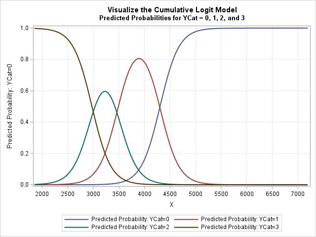
I like this visualization better than the one that shows cumulative probabilities. This graph shows the intervals of the X axis on which each level of YCat is most likely. Here is how to interpret this graph:
- The brown curve is the predicted probability for Pr(YCat = 3| x). For small values of X, the probability is quite high that the response is 3. For X ≥ 4000, the probability is essentially zero.
- The green bell-shaped curve is the predicted probability for Pr(YCat = 2| x). This level is most probable when X is in the interval [2500, 4000].
- The red bell-shaped curve is the predicted probability for Pr(YCat = 1| x). This level is most probable when X is in the interval [3000, 5000].
- The blue curve is the predicted probability for Pr(YCat = 0| x). For small values of X, the probability is almost 0. For X ≥ 4000, the probability rises. For X ≥ 5000, the probability is essentially 1.
- For every fixed value of X, the sum of the probabilities is 1. That is, at every value of X, P_0 + P_1 + P_2 + P_3 = 1.
Summary
This article shows two ways to visualize a regression model for an ordinal response variable. In SAS, you can use the EFFECTPLOT statement in PROC LOGISTIC to automatically create a visualization. The graph shows the cumulative probabilities, such as Pr(Y ≤ j | x) for j=0, 1, ..., k-1. You can also create a graph of the individual probabilities, Pr(Y = j | x). One way to do that is to create a scoring data set that specifies values for the explanatory variables. You can then use the SCORE statement to evaluate the model at these points and plot the predicted probabilities for each response level.
References
- Derr, B. (2013) "Ordinal Response Modeling with the LOGISTIC Procedure." Proceedings of SAS Global Forum 2013.
- High, R. (2013) "Models for Ordinal Response Data." Proceedings of SAS Global Forum 2013.
- High, R. (2023) "The Analysis of Ordinal Data with Graphs and Odds Ratios." Conference presentation at the 2023 Iowa SAS User Group.
- Wicklin, R. (2017a) "Visualize multivariate regression models by slicing continuous variables." The DO Loop blog.
- Wicklin, R. (2017b) "How to create a sliced fit plot in SAS." The DO Loop blog.
- Wicklin, R. (2024) "Visualize a multivariate regression model when using spline effects." The DO Loop blog.
Appendix: Create the example data
The following data set is used in this article. The scatter plot for the data is shown at the top of this article.
data Have; input YCat X Group $ @@; datalines; 3 1850 A 3 2035 A 3 2055 A 3 2085 A 3 2195 A 3 2255 A 3 2290 A 3 2339 A 3 2340 A 3 2348 C 3 2370 C 3 2387 A 3 2387 A 3 2403 A 3 2425 A 3 2432 A 3 2447 A 3 2458 A 3 2500 A 3 2500 A 3 2502 A 3 2513 A 3 2513 A 3 2524 A 3 2524 A 3 2581 C 3 2581 A 3 2601 A 3 2606 C 3 2606 C 3 2612 C 3 2617 C 3 2617 C 3 2626 C 3 2635 A 3 2635 A 3 2656 A 3 2661 A 3 2676 C 3 2676 A 3 2676 A 3 2679 A 3 2686 A 3 2691 C 3 2692 C 3 2692 C 3 2692 C 3 2696 A 3 2697 A 3 2698 A 3 2701 C 3 2701 A 3 2702 C 3 2732 A 3 2744 A 2 2750 C 2 2750 A 3 2751 C 3 2751 C 2 2756 A 3 2761 A 3 2762 A 3 2771 C 3 2771 C 3 2778 A 3 2782 A 3 2795 A 2 2835 A 1 2866 C 3 2890 A 3 2932 A 3 2946 C 3 2960 A 2 2965 A 3 2994 A 3 3020 A 1 3020 A 1 3023 A 3 3028 C 1 3029 A 2 3039 A 3 3042 A 3 3047 A 1 3053 A 1 3060 C 2 3085 C 2 3085 A 3 3086 A 2 3090 A 2 3091 A 2 3101 C 2 3105 C 3 3109 C 2 3118 C 2 3119 A 1 3153 A 2 3173 C 3 3174 C 2 3175 C 3 3175 A 2 3182 C 2 3188 A 2 3197 A 2 3197 C 2 3217 C 1 3217 A 1 3217 A 2 3222 C 2 3230 A 2 3240 A 2 3241 A 1 3246 C 1 3248 C 1 3255 A 2 3258 A 1 3263 A 1 3263 A 2 3279 A 3 3281 A 1 3285 A 2 3285 A 2 3290 C 2 3294 A 2 3296 A 2 3296 A 2 3297 C 2 3306 C 1 3306 A 2 3308 C 1 3313 C 3 3315 C 1 3315 C 1 3336 A 2 3340 C 1 3346 C 1 3347 C 2 3349 A 1 3351 C 3 3351 A 2 3353 C 2 3357 C 2 3362 A 2 3380 A 2 3381 C 2 3395 A 0 3410 C 1 3410 A 1 3416 A 2 3417 A 2 3417 A 2 3428 A 2 3430 A 1 3434 C 2 3439 A 2 3439 A 2 3448 C 2 3458 C 2 3460 A 2 3461 C 2 3465 C 2 3468 A 2 3469 C 2 3473 A 2 3476 C 2 3476 A 2 3477 C 2 3479 C 2 3484 C 2 3485 A 1 3487 C 1 3488 C 2 3495 A 1 3497 C 1 3536 C 1 3548 C 2 3549 A 1 3549 A 2 3567 C 0 3571 A 2 3575 A 0 3575 C 1 3581 C 2 3591 C 1 3606 C 1 3610 A 1 3623 C 1 3630 A 1 3647 C 1 3649 A 1 3649 A 1 3650 C 1 3651 A 1 3651 A 1 3677 A 2 3681 C 2 3681 C 1 3682 A 1 3694 C 1 3699 C 0 3714 C 1 3715 A 0 3725 C 1 3760 A 1 3768 C 1 3768 C 2 3778 C 1 3779 C 1 3780 C 0 3790 C 1 3790 C 2 3801 A 1 3803 C 1 3812 A 2 3826 C 0 3829 C 1 3836 A 1 3840 A 1 3851 A 2 3862 C 0 3871 A 1 3880 A 1 3893 A 1 3909 C 0 3925 A 1 3932 A 1 3935 A 1 3948 C 1 3977 A 1 3984 C 1 3990 A 1 3992 C 1 4012 A 1 4021 A 1 4024 C 1 4035 A 1 4044 C 1 4052 C 1 4052 C 1 4052 C 0 4056 A 1 4057 C 1 4057 C 1 4057 C 1 4065 A 1 4068 C 0 4083 C 0 4112 A 1 4120 A 1 4134 A 0 4142 C 1 4165 A 1 4175 A 1 4195 C 1 4275 C 0 4302 C 0 4309 C 0 4309 A 1 4310 A 1 4331 C 0 4340 C 1 4365 A 1 4369 C 1 4369 C 0 4374 C 1 4387 A 0 4425 C 1 4431 C 0 4435 A 1 4440 C 1 4451 A 0 4463 C 1 4474 C 0 4542 C 1 4548 C 0 4600 C 0 4605 C 1 4675 C 0 4718 A 0 4740 A 0 4760 C 0 4788 C 0 4802 A 0 4804 C 0 4834 C 0 4945 C 0 4947 C 0 4967 A 0 4987 C 0 5000 C 0 5013 A 0 5042 C 0 5050 C 0 5270 A 0 5287 A 0 5367 C 0 5390 A 0 5440 C 0 5464 C 0 5590 A 0 5678 C 0 5879 C 0 5969 C 0 6133 C 0 6400 C 0 7190 C ; |
I didn't make up these data. They are derived from the Sashelp.cars data set. I used PROC RANK to bin the MPG_City variable into four groups (0-3). I then renamed the Weight variable to X.
