Have you ever run a regression model in SAS but later realize that you forgot to specify an important option or run some statistical test? Or maybe you intended to generate a graph that visualizes the model, but you forgot? Years ago, your only option was to modify your program
Author
Feature generation (also known as feature creation) is the process of creating new features to use for training machine learning models. This article focuses on regression models. The new features (which statisticians call variables) are typically nonlinear transformations of existing variables or combinations of two or more existing variables. This
I previously discussed how you can use validation data to choose between a set of competing regression models. In that article, I manually evaluated seven models for a continuous response on the training data and manually chose the model that gave the best predictions for the validation data. Fortunately, SAS
Machine learning differs from classical statistics in the way it assesses and compares competing models. In classical statistics, you use all the data to fit each model. You choose between models by using a statistic (such as AIC, AICC, SBC, ...) that measures both the goodness of fit and the
This article shows how to use SAS to simulate data that fits a linear regression model that has categorical regressors (also called explanatory or CLASS variables). Simulating data is a useful skill for both researchers and statistical programmers. You can use simulation for answering research questions, but you can also
Recently I was asked to explain the result of an ANOVA analysis that I posted to a statistical discussion forum. My program included some simulated data for an ANOVA model and a call to the GLM procedure to estimate the parameters. I was asked why the parameter estimates from PROC
In machine learning and other model building techniques, it is common to partition a large data set into three segments: training, validation, and testing. Training data is used to fit each model. Validation data is a random sample that is used for model selection. These data are used to select
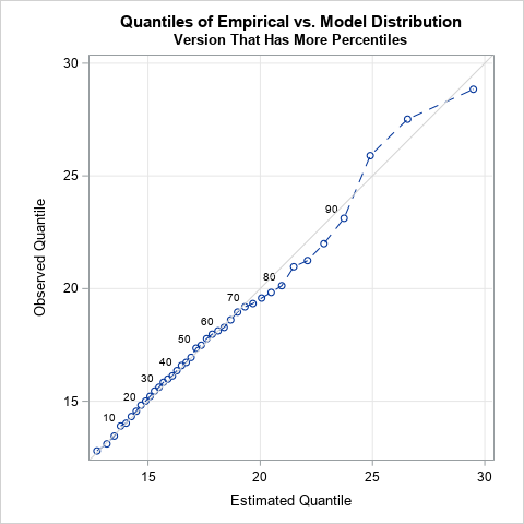
A quantile-quantile plot (Q-Q plot) is a graphical tool that compares a data distribution and a specified probability distribution. If the points in a Q-Q plot appear to fall on a straight line, that is evidence that the data can be approximately modeled by the target distribution. Although it is
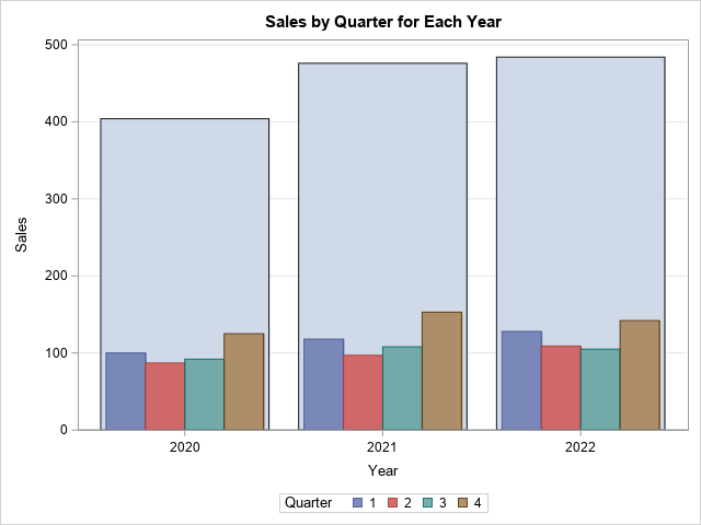
When you overlay two series in PROC SGPLOT, you can either plot both series on the same axis or you can assign one series to the main axis (Y) and another to a secondary axis (Y2). If you use the Y and Y2 axes, they are scaled independently by default,
Numbers don't lie, but sometimes they don't reveal the full story. Last week I wrote about the most popular articles from The DO Loop in 2018. The popular articles are inevitably about elementary topics in SAS programming or statistics because those topics have broad appeal. However, I also write about
Deming regression (also called errors-in-variables regression) is a total regression method that fits a regression line when the measurements of both the explanatory variable (X) and the response variable (Y) are assumed to be subject to normally distributed errors. Recall that in ordinary least squares regression, the explanatory variable (X)
Last year, I wrote more than 100 posts for The DO Loop blog. Of these, the most popular articles were about data visualization, SAS programming tips, and statistical data analysis. Here are the most popular articles from 2018 in each category. Data Visualization Visualize repetition in song lyrics: In one
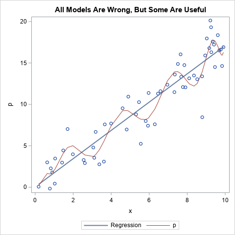
I regularly see questions on a SAS discussion forum about how to visualize the predicted values for a mixed model that has at least one continuous variable, a categorical variable, and possibly an interaction term. SAS procedures such as GLM, GENMOD, and LOGISTIC can automatically produce plots of the predicted
Many data analysts use a quantile-quantile plot (Q-Q plot) to graphically assess whether data can be modeled by a probability distribution such as the normal, lognormal, or gamma distribution. You can use the QQPLOT statement in PROC UNIVARIATE to create a Q-Q plot for about a dozen common distributions. However,
This article describes best practices and techniques that every data analyst should know before bootstrapping in SAS. The bootstrap method is a powerful statistical technique, but it can be a challenge to implement it efficiently. An inefficient bootstrap program can take hours to run, whereas a well-written program can give
The best way to spread Christmas cheer is singing loud for all to hear! -Buddy in Elf In the Christmas movie Elf (2003), Jovie (played by Zooey Deschanel) must "spread Christmas cheer" to help Santa. She chooses to sing "Santa Claus is coming to town," and soon all of New
Recently a SAS programmer wanted to obtain a table of counts that was based on a histogram. I showed him how you can use the OUTHIST= option on the HISTOGRAM statement in PROC UNIVARIATE to obtain that information. For example, the following call to PROC UNIVARIATE creates a histogram for
When a graph includes several markers or line styles, it is often useful to create a legend that explains the relationship between the data and the symbols, color, and line styles in the graph. The SGPLOT procedure does a good job of automatically creating and placing a legend for most
I remember the first time I used PROC GLM in SAS to include a classification effect in a regression model. I thought I had done something wrong because the parameter estimates table was followed by a scary-looking note: Note: The X'X matrix has been found to be singular, and a
Last week my colleague, Robert Allison, visualized data regarding immunization rates for kindergarten classes in North Carolina. One of his graphs was a scatter plot that displayed the proportion of unimmunized students versus the size of the class for 1,885 kindergarten classes in NC. This scatter plot is the basis
A data analyst asked how to compute parameter estimates in a linear regression model when the underlying data matrix is rank deficient. This situation can occur if one of the variables in the regression is a linear combination of other variables. It also occurs when you use the GLM parameterization
You might know that you can use the ODS SELECT statement to display only some of the tables and graphs that are created by a SAS procedure. But did you know that you can use a WHERE clause on the ODS SELECT statement to display tables that match a pattern?
An ROC curve graphically summarizes the tradeoff between true positives and true negatives for a rule or model that predicts a binary response variable. An ROC curve is a parametric curve that is constructed by varying the cutpoint value at which estimated probabilities are considered to predict the binary event.
The SGPLOT procedure enables you to use the value of a response variable to color markers or areas in a graph. For example, you can use the COLORRESPONSE= option to define a variable whose values will be used to color markers in a scatter plot or cells in a heat
When solving optimization problems, it is harder to specify a constrained optimization than an unconstrained one. A constrained optimization requires that you specify multiple constraints. One little typo or a missing minus sign can result in an infeasible problem or a solution that is unrelated to the true problem. This
Will the real Pareto distribution please stand up? SAS supports three different distributions that are named "Pareto." The Wikipedia page for the Pareto distribution lists five different "Pareto" distributions, including the three that SAS supports. This article shows how to fit the two-parameter Pareto distribution in SAS and discusses the
A useful feature in PROC SGPLOT is the ability to easily visualize subgroups of data. Most statements in the SGPLOT procedure support a GROUP= option that enables you to overlay plots of subgroups. When you use the GROUP= option, observations are assigned attributes (colors, line patterns, symbols, ...) that indicate
If you want to bootstrap the parameters in a statistical regression model, you have two primary choices. The first, case resampling, is discussed in a previous article. This article describes the second choice, which is resampling residuals (also called model-based resampling). This article shows how to implement residual resampling in
If you want to bootstrap the parameters in a statistical regression model, you have two primary choices. The first is case resampling, which is also called resampling observations or resampling pairs. In case resampling, you create the bootstrap sample by randomly selecting observations (with replacement) from the original data. The