Statisticians often emphasize the dangers of extrapolating from a univariate regression model. A common exercise in introductory statistics is to ask students to compute a model of population growth and predict the population far in the future. The students learn that extrapolating from a model can result in a nonsensical prediction, such as trillions of people or a negative number of people! The lesson is that you should be careful when you evaluate a model far beyond the range of the training data.
The same dangers exist for multivariate regression models, but they are emphasized less often. Perhaps the reason is that it is much harder to know when you are extrapolating a multivariate model. Interpolation occurs when you evaluate the model inside the convex hull of the training data. Anything else is an extrapolation. In particular, you might be extrapolating even if you score the model at a point inside the bounding box of the training data. This differs from the univariate case in which the convex hull equals the bounding box (range) of the data. In general, the convex hull of a set of points is smaller than the bounding box.
You can use a bivariate example to illustrate the difference between the convex hull of the data and the bounding box for the data, which is the rectangle [Xmin, Xmax] x [Ymin, Ymax]. The following SAS DATA step defines two explanatory variables (X and Y) and one response variable (Z). The SGPLOT procedure shows the distribution of the (X, Y) variables and colors each marker according to the response value:
data Sample; input X Y Z @@; datalines; 10 90 22 22 76 13 22 75 7 24 78 14 24 76 10 25 63 5 26 62 10 26 94 20 26 63 15 27 94 16 27 95 14 29 66 7 30 69 8 30 74 8 ; title "Response Values for Bivariate Data"; proc sgplot data=Sample; scatter x=x y=y / markerattrs=(size=12 symbol=CircleFilled) colorresponse=Z colormodel=AltThreeColorRamp; xaxis grid; yaxis grid; run; |
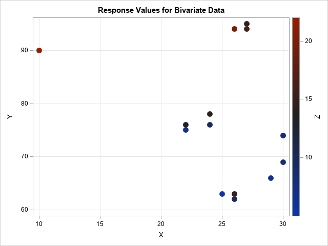
The data are observed in a region that is approximately triangular. No observations are near the lower-left corner of the plot. If you fit a response surface to this data, it is likely that you would visualize the model by using a contour plot or a surface plot on the rectangular domain [10, 30] x [62, 95]. For such a model, predicted values near the lower-left corner are not very reliable because the corner is far from the data.
In general, you should expect less accuracy when you predict the model "outside" the data (for example, (10, 60)) as opposed to points that are "inside" the data (for example, (25, 70)). This concept is sometimes discussed in courses about the design of experiments. For a nice exposition, see the course notes of Professor Rafi Hafka (2012, p. 49–59) at the University of Florida.
The convex hull of bivariate points
You can use SAS to visualize the convex hull of the bivariate observations. The convex hull is the smallest convex set that contains the observations. The SAS/IML language supports the CVEXHULL function, which computes the convex hull for a set of planar points.
You can represent the points by using an N x 2 matrix, where each row is a 2-D point. When you call the CVEXHULL function, you obtain a vector of N integers. The first few integers are positive and represent the rows of the matrix that comprise the convex hull. The (absolute value of) the negative integers represents the rows that are interior to the convex hull. This is illustrated for the sample data:
proc iml; use Sample; read all var {x y} into points; close; /* get indices of points in the convex hull in counter-clockwise order */ indices = cvexhull( points ); print (indices`)[L="indices"]; /* positive indices are boundary; negative indices are inside */ |

The output shows that the observation numbers (indices) that form the convex hull are {1, 6, 7, 12, 13, 14, 11}. The other observations are in the interior. You can visualize the interior and boundary points by forming a binary indicator vector that has the value 1 for points on the boundary and 0 for points in the interior. To get the indicator vector in the order of the data, you need to use the SORTNDX subroutine to compute the anti-rank of the indices, as follows:
b = (indices > 0); /* binary indicator variable for sorted vertices */ call sortndx(ndx, abs(indices)); /* get anti-rank, which is sort index that "reverses" the order */ onBoundary = b[ndx]; /* binary indicator data in original order */ title "Convex Hull of Bivariate Data"; call scatter(points[,1], points[,2]) group=onBoundary option="markerattrs=(size=12 symbol=CircleFilled)"; |
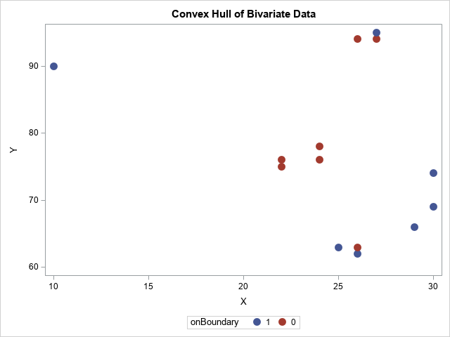
The blue points are the boundary of the convex hull whereas the red points are in the interior.
Visualize the convex hull as a polygon
You can visualize the convex hull by forming the polygon that connects the first, sixth, seventh, ..., eleventh observations. You can do this manually by using the POLYGON statement in PROC SGPLOT, which I show in the Appendix section. However, there is an easier way to visualize the convex hull. I previously wrote about SAS/IML packages and showed how to install the polygon package. The polygon package contains a module called PolyDraw, which enables you to draw polygons and overlay a scatter plot.
The following SAS/IML statements extract the positive indices and use them to get the points on the boundary of the convex hull. If the polygon package is installed, you can load the polygon package and visualize the convex hull and data:
hullNdx = indices[loc(b)]; /* get positive indices */ convexHull = points[hullNdx, ]; /* extract the convex hull, in CC order */ /* In SAS/IML 14.1, you can use the polygon package to visualize the convex hull: https://blogs.sas.com/content/iml/2016/04/27/packages-share-sas-iml-programs-html */ package load polygon; /* assumes package is installed */ run PolyDraw(convexHull, points||onBoundary) grid={x y} markerattrs="size=12 symbol=CircleFilled"; |
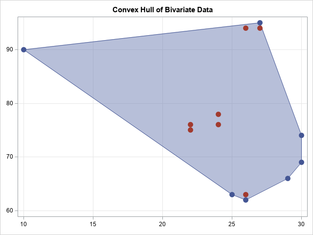
The graph shows the convex hull of the data. You can see that it primarily occupies the upper-right portion of the rectangle. The convex hull shows the interpolation region for regression models. If you evaluate a model outside the convex hull, you are extrapolating. In particular, even though points in the lower left corner of the plot are within the bounding box of the data, they are far from the data.
Of course, if you have 5, 10 or 100 explanatory variables, you will not be able to visualize the convex hull of the data. Nevertheless, the same lesson applies. Namely, when you evaluate the model inside the bounding box of the data, you might be extrapolating rather than interpolating. Just as in the univariate case, the model might predict nonsensical data when you extrapolate far from the data.
Appendix
Packages are supported in SAS/IML 14.1. If you are running an earlier version of SAS, you create the same graph by writing the polygon data and the binary indicator variable to a SAS data set, as follows:
hullNdx = indices[loc(b)]; /* get positive indices */ convexHull = points[hullNdx, ]; /* extract the convex hull, in CC order */ /* Write the data and polygon to SAS data sets. Use the POLYGON statement in PROC SGPLOT. */ p = points || onBoundary; poly = j(nrow(convexHull), 1, 1) || convexHull; create TheData from p[colname={x y "onBoundary"}]; append from p; close; create Hull from poly[colname={ID cX cY}]; append from poly; close; quit; data All; set TheData Hull; run; /* combine the data and convex hull polygon */ proc sgplot data=All noautolegend; polygon x=cX y=cY ID=id / fill; scatter x=x y=y / group=onBoundary markerattrs=(size=12 symbol=CircleFilled); xaxis grid; yaxis grid; run; |
The resulting graph is similar to the one produced by the PolyDraw modules and is not shown.

5 Comments
Pingback: Truncate response surfaces - The DO Loop
Hi Rick,
Very interesting post. Are there other ways to asses if a point is an extrapolation point for multidimensional data? For example using the Mahanalobis distance? What about computing the distance to the polytope? Thanks!
Yes, that is possible, although it is rarely done in practice. I show a 2-D example in the article "Create scoring data when regressors are correlated."
If you use a full factorial experimental design, this problem doesn't occur, but a full factorial design is often too expensive in high dimensions.
Rick,
I just ran across this post.....Can this approach be extended to three dimensions within SAS? I'm using the University Edition and don't know if it supports the processes you are describing here. Thanks in advance for any insights you can provide.
Gene
To clarify, the main point of this post is that the standard error of the prediction increases as you move away from the data. In other words, you should not trust predicted values when they are far from observed values.
To answer your question, the SAS/IML CVEXHULL function is limited to 2-D so, no, you can't easily draw a similar picture in 3-D. However, if the data are approximately multivariate normal, you can use the technique in the article "Create scoring data when regressors are correlated," which works in arbitrary dimensions.