When I run a bootstrap analysis, I create graphs to visualize the distribution of the bootstrap statistics. For example, in my article about how to bootstrap the difference of means in a two-sample t test, I included a histogram of the bootstrap distribution and added reference lines to indicate a confidence interval for the difference of means.
For t tests, the TTEST procedure supports the BOOTSTRAP statement, which automates the bootstrap process for standard one- and two-sample t tests. A new feature in SAS/STAT 15.1 (SAS 9.4M6) is that the TTEST procedure supports the PLOTS=BOOTSTRAP option, which automatically creates histograms, Q-Q plots, and scatter plots of various bootstrap distributions.
To demonstrate the new PLOTS=BOOTSTRAP option, I will use the same example that I used to demonstrate the BOOTSTRAP statement. The data are the sedans and SUVs in the Sashelp.Cars data. The research question is to estimate the difference in fuel efficiency, as measured by miles per gallon during city driving. The bootstrap analysis enables you to visualize the approximate sampling distribution of the difference-of-mean statistic and its standard deviation. The following statements create the data and run PROC TTEST to generate the analysis. The PLOTS=BOOTSTRAP option generates the bootstrap graphs. The BOOTSTRAP statement request 5,000 bootstrap resamples and 95% confidence intervals, based on the percentiles of the bootstrap distribution:
/* create data set that has two categories: 'Sedan' and 'SUV' */ data Sample; set Sashelp.Cars(keep=Type MPG_City); if Type in ('Sedan' 'SUV'); run; ods trace on; title "Bootstrap Estimates with Percentile CI"; proc ttest data=Sample plots=bootstrap; class Type; var MPG_City; bootstrap / seed=123 nsamples=5000 bootci=percentile; run; |
The TTEST procedure creates seven tables and eight graphs. The previous article displayed and discussed several tables, so here I display only two of the graphs.
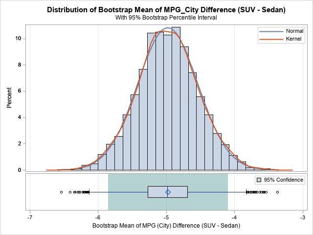
The first graph is a histogram of the bootstrap distribution of the difference between the sample means for each vehicle type. The distribution appears to be symmetric and approximately normal. The middle of the distribution is close to -5, which is the point estimate for the difference in MPG_City between the SUVs and the sedans in the data. How much should we trust that point estimate? The green region indicates that 95% of the bootstrap samples had differences that were in the green area underneath the histogram, which is approximately [-5.9, -4.1]. This is a 95% confidence interval for the difference.
Similar histograms (not shown) are displayed for two other statistics: the pooled standard deviation (of the difference between means) and the Satterthwaite standard deviation. The procedure also creates Q-Q plots of the bootstrap distributions.
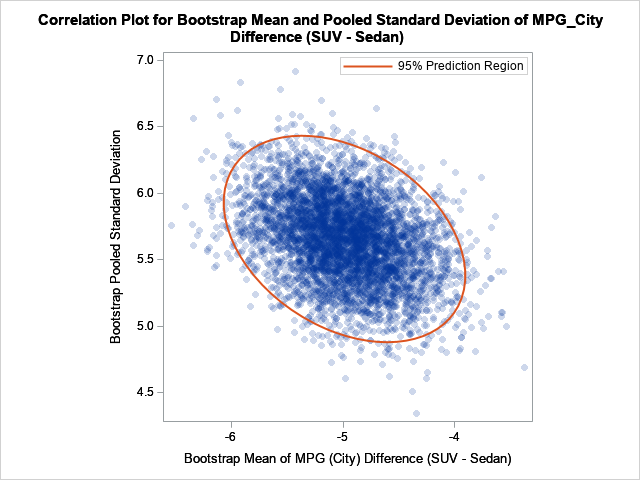
The second graph is a scatter plot that shows the joint bootstrap distribution of the mean difference and the pooled standard deviations of the difference, based on 5,000 bootstrap samples. You can see that the statistics are slightly correlated. A sample that has a large (absolute) mean difference also tends to have a relatively large standard deviation. The 95% prediction region for the joint distribution indicates how these two statistics co-vary among random samples.
In summary, the TTEST procedure in SAS/STAT 15.1 supports a new PLOTS=BOOTSTRAP option, which automatically creates many graphs that help you to visualize the bootstrap distributions of the statistics. If you are conducting a bootstrap analysis for a t test, I highly recommend using the plots to visualize the bootstrap distributions and results
