Feature generation (also known as feature creation) is the process of creating new features to use for training machine learning models. This article focuses on regression models. The new features (which statisticians call variables) are typically nonlinear transformations of existing variables or combinations of two or more existing variables. This article argues that a naive approach to feature generation can lead to many correlated features (variables) that increase the cost of fitting a model without adding much to the model's predictive power.
Feature generation in traditional statistics
Feature generation is not new. Classical regression often uses transformations of the original variables. In the past, I have written about applying a logarithmic transformation when a variable's values span several orders of magnitude. Statisticians generate spline effects from explanatory variables to handle general nonlinear relationships. Polynomial effects can model quadratic dependence and interactions between variables. Other classical transformations in statistics include the square-root and inverse transformations.
SAS/STAT procedures provide several ways to generate new features from existing variables, including the EFFECT statement and the "stars and bars" notation. However, an undisciplined approach to feature generation can lead to a geometric explosion of features. For example, if you generate all pairwise quadratic interactions of N continuous variables, you obtain "N choose 2" or N*(N-1)/2 new features. For N=100 variables, this leads to 4950 pairwise quadratic effects!
Generated features might be highly correlated
In addition to the sheer number of features that you can generate, another problem with generating features willy-nilly is that some of the generated effects might be highly correlated with each other. This can lead to difficulties if you use automated model-building methods to select the "important" features from among thousands of candidates.
I was reminded of this fact recently when I wrote an article about model building with PROC GLMSELECT in SAS. The data were simulated: X from a uniform distribution on [-3, 3] and Y from a cubic function of X (plus random noise). I generated the polynomial effects x, x^2, ..., x^7, and the procedure had to build a regression model from these candidates. The stepwise selection method added the x^7 effect first (after the intercept). Later it added the x^5 effect. Of course, the polynomials x^7 and x^5 have a similar shape to x^3, but I was surprised that those effects entered the model before x^3 because the data were simulated from a cubic formula.
After thinking about it, I realized that the odd-degree polynomial effects are highly correlated with each other and have high correlations with the target (response) variable. The same is true for the even-degree polynomial effects. Here is the DATA step that generates 1000 observations from a cubic regression model, along with the correlations between the effects (x1-x7) and the target variable (y):
%let d = 7; %let xMean = 0; data Poly; call streaminit(54321); array x[&d]; do i = 1 to 1000; x[1] = rand("Normal", &xMean); /* x1 ~ U(-3, 3] */ do j = 2 to &d; x[j] = x[j-1] * x[1]; /* x[i] = x1**i, i = 2..7 */ end; y = 2 - 1.105*x1 - 0.2*x2 + 0.5*x3 + rand("Normal"); /* response is cubic function of x1 */ output; end; drop i j; run; proc corr data=Poly nosimple noprob; var y; with x:; run; |
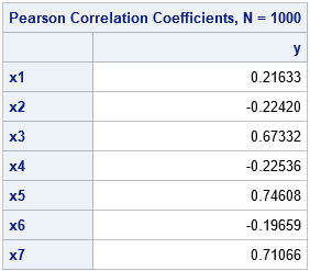
You can see from the output that the x^5 and x^7 effects have the highest correlations with the response variable. Because the squared correlations are the R-square values for the regression of Y onto each effect, it makes intuitive sense that these effects are added to the model early in the process. Towards the end of the model-building process, the x^3 effect enters the model and the x^5 and x^7 effects are removed. To the model-building algorithm, these effects have similar predictive power because they are highly correlated with each other, as shown in the following correlation matrix:
proc corr data=Poly nosimple noprob plots(MAXPOINTS=NONE)=matrix(NVAR=ALL); var x:; run; |
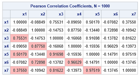
I've highlighted certain cells in the lower triangular correlation matrix to emphasize the large correlations. Notice that the correlations between the even- and odd-degree effects are close to zero and are not highlighted. The table is a little hard to read, but you can use PROC IML to generate a heat map for which cells are shaded according to the pairwise correlations:
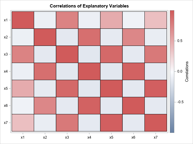
This checkerboard pattern shows the large correlations that occur between the polynomial effects in this problem. This image shows that many of the generated features do not add much new information to the set of explanatory variables. This can also happen with other transformations, so think carefully before you generate thousands of new features. Are you producing new effects or redundant ones?
Generated features are not independent
Notice that the generated effects are not statistically independent. They are all generated from the same X variable, so they are functionally dependent. In fact, a scatter plot matrix of the data will show that the pairwise relationships are restricted to parametric curves in the plane. The graph of (x, x^2) is quadratic, the graph of (x, x^3) is cubic, the graph of (x^2, x^3) is an algebraic cusp, and so forth. The PROC CORR statement in the previous section created a scatter plot matrix, which is shown below: Again, I have highlighted cells that have highly correlated variables.
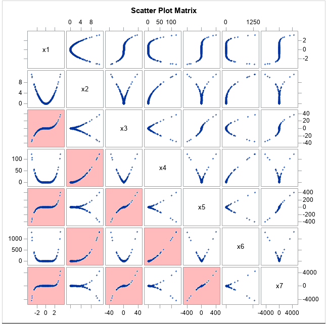
I like this scatter plot matrix for two reasons. First, it is soooo pretty! Second, it visually demonstrates that two variables that have low correlation are not necessarily independent.
Summary
Feature generation is important in many areas of machine learning. It is easy to create thousands of effects by applying transformations and generating interactions between all variables. However, the example in this article demonstrates that you should be a little cautious of using a brute-force approach. When possible, you should use domain knowledge to guide your feature generation. Every feature you generate adds complexity during model fitting, so try to avoid adding a bunch of redundant highly-correlated features.
For more on this topic, see the article "Automate your feature engineering" by my colleague, Funda Gunes. She writes: "The process [of generating new features]involves thinking about structures in the data, the underlying form of the problem, and how best to expose these features to predictive modeling algorithms. The success of this tedious human-driven process depends heavily on the domain and statistical expertise of the data scientist." I agree completely. Funda goes on to discuss SAS tools that can help data scientists with this process, such as Model Studio in SAS Visual Data Mining and Machine Learning. She shows an example of feature generation in her article and in a companion article about feature generation. These tools can help you generate features in a thoughtful, principled, and problem-driven manner, rather than relying on a brute-force approach.
