パブリックデータを使った子宮頸がんを取り巻く日本の状況の可視化
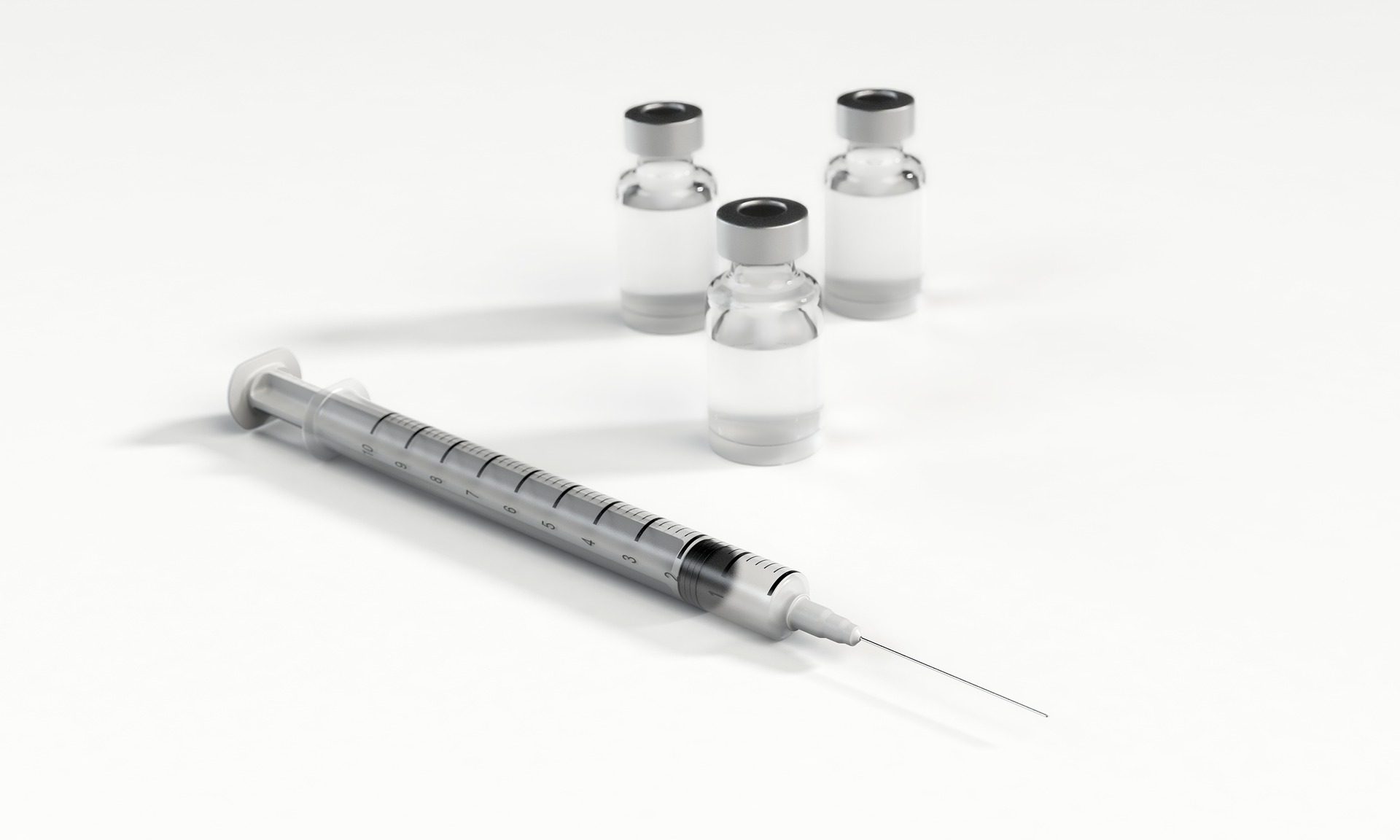
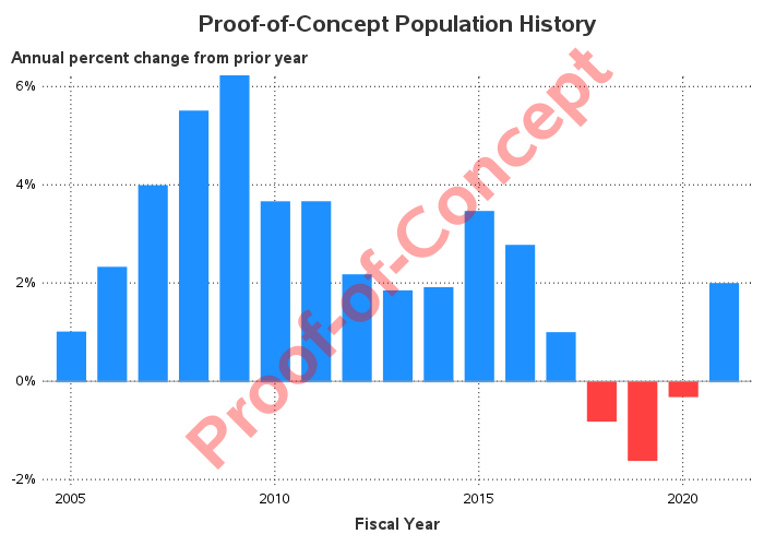
2021年11月、国が一時停止している子宮頸がんを防ぐHPV(ヒトパピローマウイルス)ワクチンの積極的な接種の勧奨の再開が厚生労働省の専門家による検討部会によって正式に承認されました。このHPVワクチンは世界保健機関(WHO)がその接種を推進しており、日本をはじめとして多くの先進国では公的接種とされています。この記事はData for Good活動の一環として、パブリックデータを用いて問題を可視化することで、子宮頸がんに対する認知や関心をより持っていただき、今後のHPVワクチンの普及につなげることを目的としています。 子宮頸がん 子宮頸がんのほとんどはヒトパピローマウイルス(HPV)というウイルスの感染が原因となり子宮の頸部に発生するがんの一種です。感染の経路は主に性的接触によるものであり、成人女性の大部分はHPVに感染するとされています。HPVに感染してもその多くは自然に消失しますが、一部は頸部の細胞が異常な変化を起こした子宮頸部異形成というがんの前段階(前がん病変)になります。そしてさらにその一部が数年から10年ほどで悪性腫瘍へと進展し、子宮頸がんを発症します。この子宮頸部異形成(前がん病変)の早期段階では自覚症状はほぼなく、病変を発見するためには子宮頸がん検診を受けることが必要ですが、自覚症状があまりないために検診を受けた段階で既に進行がかなり進んでしまっているケースもあります。 国立がん研究センターがん情報サービスは国立がん研究センターが運営している公式サイトであり、日本国内のがんに関する統計情報ががん種別に公開されています。今回はその統計情報の中から、子宮頸がんに該当するデータ(がん種:子宮頸部)を抜き出し、無料で利用可能なSAS OnDemand for Academicsを利用して可視化を行いました。日本での死亡者数は2019年度時点で年間約3,000名、罹患者数は2018年時点で約11,000名ほどとなっており、下図のように増加の一途をたどっています。 出典:国立がん研究センターがん情報サービス「がん統計」(人口動態統計) より作成 ま子宮頸がんの罹患者数は2009年~2018年(最新)まで10年連続で1万人を超えており、罹患者数は30歳頃から増え始め現在は45-49歳が最も罹患が多い年代層となっています。また罹患する年齢層が若年化していることも危険視されています。子宮頸がんに対して我々ができることは以下の二つです。 子宮頸がん検診を受けること(発見) HPVワクチンを接種すること(予防) 私たちにとって重要なことは、2年に1度の受診が推奨されている子宮頸がん検診によって異形成(前がん病変)を早期に発見すること。そして検診と同様に重要ことが、HPVワクチンを接種し対応するHPVの感染を防ぎ、子宮頸がんとなるリスクを下げることです。 HPVワクチン 子宮頸がんの原因となるHPV(ヒトパピローマウイルス)は現在100種類以上の存在が知られており、そのうちのいくつかは子宮頸がんを引き起こしやすいハイリスク型に分類されます。HPVワクチンにも様々なタイプがありますが、日本では定期接種の対象となっているのは2価(サーバリックス)と4価(ガーダシル)のワクチンで、接種することでおおよそ50~70%程の感染を防ぎ子宮頸がんになるリスクを減らすことが可能です。また2021年2月24日からは9価ワクチンも日本での取り扱いが開始されましたが定期接種の対象ではないため自費での接種となっています。 「接種の積極的な勧奨」について HPVワクチンは下図のようにいくつかの事業、法案の後押しもあり、その対象となる年齢の女性へ接種の積極的な勧奨が行われていました。しかし公費での定期接種開始後に副反応の報告が相次ぎ、副反応と接種との因果関係や、その頻度、海外での詳しい実態調査が必要とされ、厚生労働省は約半年間をめどに「接種の積極的な勧奨」の一時中止という決定を2013年6月に下しました。当初は半年間がめどとされていたものの、一時停止はその後も続き、ワクチンの有効性が様々な研究により示され2021年11月に接種の積極的な勧奨の再開が正式に決定されるまで約8年の月日がかかりました。 専門家らの研究結果によると、接種の積極的な勧奨が一時停止されるまではおおよそ70%であった定期接種の対象年齢での接種率もこの一時停止により現在は1%未満にまで落ち込んでしまっています。論文のデータをもとに出生年ごとのワクチン接種率を可視化したものが下図です。 Nakagawa S, Ueda Y, Yagi A, Ikeda S, Hiramatsu K, Kimura T. Corrected human papillomavirus vaccination rates for each birth fiscal year in Japan. Cancer Sci. 2020;111(6):2156-2162. doi:10.1111/cas.14406 より作成