In data visualization, colors can represent the values of a variable in a choropleth map, a heatmap, or a scatter plot. But how do you visualize a palette of colors from the RGB or hexadecimal values of the colors? One way is to use the HEATMAPDISC subroutine in SAS/IML, which enables you to specify a color ramp as part of the syntax. If you do not have SAS/IML software, you can use the HEATMAPPARM statement in PROC SGPLOT and use a discrete attribute map to define which color is used for each cell in the heat map. If you do not yet know about discrete attribute maps, I highly recommend that you take a moment to learn about them; they are very useful!
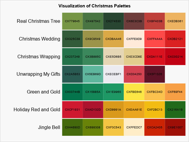
If you do not want to use a discrete attribute map and you do not have access to SAS/IML, there is a third way to visualize color palettes: use the POLYGON statement in PROC SGPLOT. As discussed in this article, each polygon has a unique value of an ID variable. You can use the GROUP= option to associate a color with each value of the ID variable. You can use the DATACOLORS= option on the STYLEATTRS statement to specify the colors for each polygon. This article uses rectangular polygons and arranges them so that you can visualize a palette of colors. Because I am writing this article in the Christmas season, I will use a set of Christmas-themed red-and-green palettes to demonstrate the technique. The final visualization is shown to the right.
How to use the POLYGON statement to visualize a palette
The following list outlines the main steps for using the POLYGON statement in PROC SGPLOT to visualize a set of palettes:
- Use the DATA step to read the colors in each palette.
- Assign a unique ID to each color.
- Concatenate all the colors and store the set of colors in a macro variable. This macro variable will be used to assign a color to each polygon.
- Create a polygon for each color. This example uses rectangles. The i_th color for the j_th palette is represented by a rectangle that is centered at the coordinate (i,j).
- Optionally, use the TEXT statement in PROC SGPLOT to overlay the hexadecimal values of the colors on the graph.
- Optionally, use the TEXT statement to display the name of each palette.
- Use the POLYGON and TEXT statements to display the palettes of colors.
Read the colors in each palette
I found several Christmas-themed palettes at www.schemecolor.com. The specific palettes are cited in the comments of the following program, which implements the first three steps of the outline:
ods graphics/reset; /* Acknowledgements: Jingle Bell palette: https://www.schemecolor.com/jingle-bells.php Holiday Red and Gold: https://www.schemecolor.com/holiday-red-gold.php Green and Gold: https://www.schemecolor.com/green-and-gold.php Unwrapping My Gifts: https://www.schemecolor.com/unwrapping-my-gifts.php Christmas Wrapping: https://www.schemecolor.com/christmas-wrapping.php Christmas Wedding: https://www.schemecolor.com/christmas-wedding.php Real Christmas Tree: https://www.schemecolor.com/real-christmas-tree.php */ /* 1. Use the DATA step to read the colors in each palette. */ data Palettes; length Name $30 color $8; length palette $450; /* must be big enough to hold all colors */ retain ID 1 row 1 palette; input Name 1-22 n @; do col = 1 to n; input color @; palette = catx(' ', palette, color); output; ID + 1; /* Assign a unique ID to each color. */ end; row + 1; call symput('AllColors', palette); /* 3. Concatenate colors; store in macro. */ drop palette; /* Palette Name |n| color1 | color2 | color2 | color4 | ... */ datalines; Jingle Bell 6 CX44690D CX698308 CXF3C543 CXFFEDC7 CXCA2405 CX9E1007 Holiday Red and Gold 6 CXCF1931 CXAD132D CXD9991A CXEAA61E CXF2BC13 CX216A1B Green and Gold 6 CX03744B CX15885A CX1E9965 CXFBE646 CXFBC34D CXF69F44 Unwrapping My Gifts 5 CX2A5B53 CX5EB69D CXECEBF1 CXD34250 CX5F1326 Christmas Wrapping 6 CX237249 CX3B885C CXE5D6B5 CXE3CD8E CXDA111E CXC00214 Christmas Wedding 6 CX325C39 CX9C9549 CXDBAA46 CXFFE9D9 CXFF4A4A CXDB2121 Real Christmas Tree 6 CX779645 CX497542 CX274530 CX6E3C3B CXBF403B CXEDB361 ; %put &AllColors; /* check that all colors are here */ |
The following sections implement the visualization in three stages: an initial visualization that uses a scatter plot, an improved visualization that uses rectangular polygons, and a final visualization.
An initial visualization
After running this DATA step, the Palettes data set contains all the information you need to visualize the colors in each palette. In fact, you can use a scatter plot to visualize the data and make sure it was read correctly. The following call to PROC SGPLOT creates a graph for which each row represents a palette of colors. Recall that the STYLEATTRS statement supports two different options for specifying how colors are assigned to groups when you use the GROUP= option:
- The DATACOLORS= option specifies the fill color for bars and polygons.
- The DATACONTRASTCOLORS= option specifies the colors for lines and markers.
For a scatter plot, you can use the DATACONTRASTCOLORS= option to assign group colors, as follows:
%let gray = CXF8F8F8; title "Initial Visualization of Christmas Palettes"; proc sgplot data=palettes noautolegend noborder; styleattrs backcolor=&gray wallcolor=&gray datacontrastcolors=(&AllColors); scatter x=col y=row / group=ID markerattrs=(symbol=SquareFilled size=45); text x=col y=row text=color; run; |
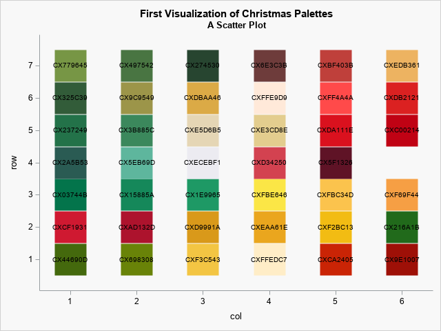
This is not a professional-looking graph, but it does provide a quick-and-easy way to visualize the colors. Each row is a palette of colors. The colors are labeled by using their hexadecimal values. In the next section, the markers are replaced by rectangular polygons.
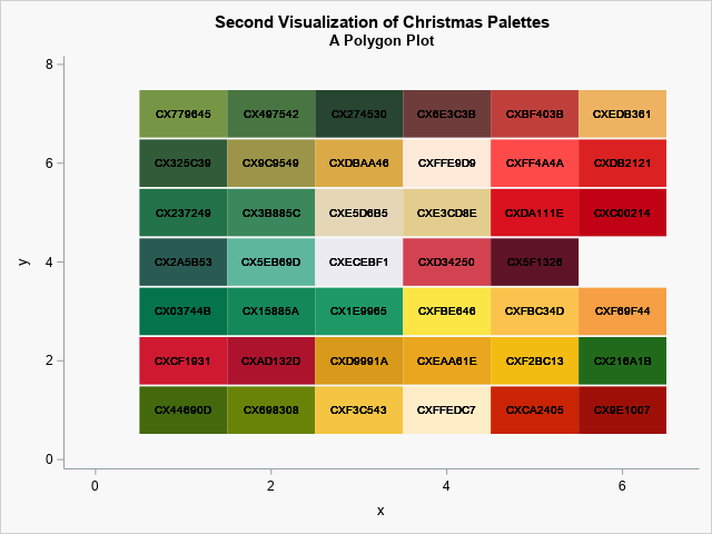
A better visualization of palettes
In the data set, the (col, row) coordinates are the center of each polygon. The following DATA step creates new variables (x, y) for the vertices of rectangles:
/* 4. Create a polygon for each color. The i_th color for the j_th palette is represented by a rectangle that is centered at the coordinate (i,j). */ data Poly; set Palettes; w = 0.5; h = 0.48; /* width and height of rectangle */ x = col - w; y = row - h; output; /* four vertices of square */ x = col + w; y = row - h; output; x = col + w; y = row + h; output; x = col - w; y = row + h; output; drop w h; run; |
With that minor change, you can use a POLYGON statement to display colored rectangles. (Be sure to use the DATACOLORS= option on the STYLEATTRS statement.) The resulting visualization looks much better:
%let gray = CXF8F8F8; title "Second Visualization of Christmas Palettes"; title2 "A Polygon Plot"; proc sgplot data=Poly noautolegend; styleattrs wallcolor=&gray datacolors=(&AllColors); polygon x=x y=y ID=ID / group=ID fill; text x=col y=row text=color; run; |
The final visualization
Although both previous graphs show the palettes of colors, you can improve the graphs by making minor changes:
- Because each rectangular polygon is defined by using four rows in the data, the hexadecimal value of the colors is plotted four times. You can see in the previous graphs that the color values appear to be boldfaced. You only need to plot the value once for each value of the ID variable.
- Add the name of the palette to the graph.
- Do not display the axes. They are not necessary.
/* 5. Optionally, use the TEXT statement to display the name of each palette. */ data Temp; set Poly; by ID; if ^first.ID then color=" "; run; /* 6. Optionally, use the TEXT statement to overlay the hex values of the colors */ data PlotPalettes; set Temp; by Name notsorted; label = Name; if first.Name then do; lx = col - 0.6; ly = row; end; else do; label=" "; lx = .; ly = .; end; run; /* 7. Use the POLYGON and TEXT statements to display the palettes of colors. */ %let gray = CXF8F8F8; title "Visualization of Christmas Palettes"; proc sgplot data=PlotPalettes noautolegend noborder; styleattrs backcolor=&gray wallcolor=&gray datacolors=(&AllColors); polygon x=x y=y ID=ID / group=ID fill; text x=col y=row text=color; text x=lx y=ly text=label / position=left textattrs=(size=12); xaxis display=none offsetmax=0; yaxis display=none thresholdmin=0 thresholdmax=0; run; |
The final graph is shown at the top of this article. It enables you to see that most of the palettes are green-to-red and include either a golden or creamy-white color. Three palettes are different from the others:
- The "Real Christmas Tree" palette ends with gold instead of red.
- The "Green and Gold" palette does not contain any red.
- The "Holiday Red and Gold" palette starts with red and ends with green.
Summary
This article shows how to use a polygon plot to visualize a set of Christmas-themed color palettes. By using the STYLEATTRS statement in PROC SGPLOT, you can specify how colors are assigned to groups when you use the GROUP= option. You can use the DATACOLORS= option to specify the fill color for polygons. You can use the POLYGON statement and the GROUP=ID option to assign each color to a rectangular polygon, thus visualizing each palette as a strip of colors.

4 Comments
Rick,
Here is the code for HeatMap without " discrete attribute map".
proc sgplot data=PlotPalettes noborder noautolegend;
where color is not missing;
styleattrs backcolor=&gray wallcolor=&gray datacolors=(&AllColors);
heatmapparm x=col y=name colorgroup=color;
scatter x=col y=name/markerchar=color;
refline name/axis=y discreteoffset=-0.5 lineattrs=(color=&gray thickness=3);
xaxis display=none offsetmin=0 offsetmax=0;
yaxis display=(nolabel noline noticks) valueattrs=(size=10 weight=bold) ;
run;
Thanks! This is very nice. You have used the STYLEATTRS statement and the DATACOLORS= option to define the (temporary) discrete attribute map, as shown in this post. I like the innovative use of the REFLINE statement to display a small horizontal space between each row. If you need more control over the attributes of the palette names, you can use the TEXT statement instead of the SCATTER statement:
text x=col y=name text=color;
Pingback: A principal component analysis of color palettes - The DO Loop
Pingback: A statistical palette of Christmas colors - The DO Loop