Suppose you are creating a craft project for the Christmas holidays, and you want to choose a palette of Christmas colors to give it a cheery holiday appearance. You could use one of the many online collections of color palettes to choose a Christmas-themed palette. However, I didn't want to merely take a palette that someone else designed. As a statistician, I wanted to create my own Christmas palette by using some sort of mathematical technique that creates a "statistically perfect" set of Christmas colors from other palettes!
Artists use their talents to create aesthetically pleasing and harmonious palettes of colors. But why should artists have all the fun? In this article, I show how a statistician might create a palette of Christmas colors! Starting from existing palettes of colors, the technique uses principal component analysis to select a linear subspace of colors. From within that subspace, you can create your own palette of colors. An example is the green-gold-red palette that is shown below. It was made by math, but I think it is pretty!
The same technique could also be used to create autumn palettes, spring palettes, and so forth, but don't take this too seriously: this article is intended to be geeky fun for the holidays. I'll let others debate whether this mathematical technique is useful for creating art.
Outline of the method
Here is the general idea behind creating a statistical palette of colors:
- Collect 6-10 existing palettes that you like. This process should produce 40-60 colors that are related to your theme (such as "Christmas"). I have written about how to read and visualize palettes in SAS.
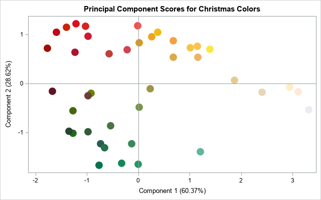
- Each color can be represented a triplet of values in RGB space. You can use principal component (PC) analysis to project the colors into a plane that captures most of the variation in the colors. The graph at the right shows the principal component scores for 41 colors in seven Christmas palettes.
- Each palette is represented as a path through this linear subspace. So, you can choose a new sequence of points in this subspace and then REVERSE the projection to obtain a new palette of RGB colors.
- There are infinitely many paths you could choose, but one choice is to use vertices of a regular polygon to create a "statistically perfect" set of Christmas colors.
Paths through principal component space
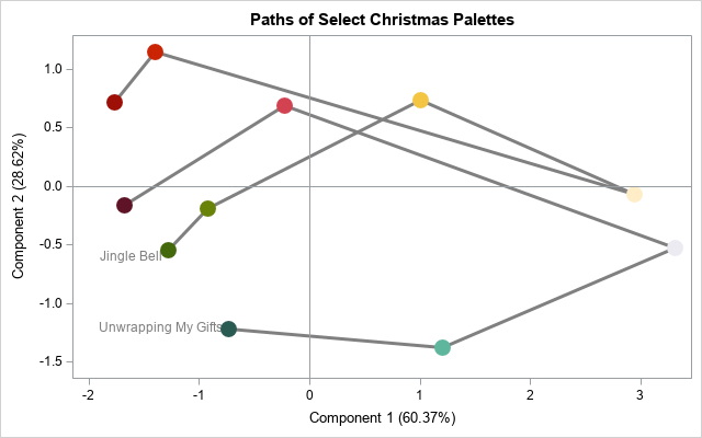
For each palette, if you connect the sequence of colors in the palette, you obtain a path through the plane of the principal component scores. If you try to display the paths for all seven palettes, you will get a jumbled mess of lines that crisscross the graph. To make it easier to visualize the paths for each palette, the following graph limits the display to two palettes. The "Jingle Bell" palette has six colors. It starts with two green colors, moves to golden colors, and ends with two red colors. The "Unwrapping My Gifts" palette has five colors. It starts with two green colors, moves to a silver color, and ends with a red and dark burgundy color. The other palettes trace similar paths through the plane of scores.
Create your own path
If each palette corresponds to a path, then each path corresponds to a palette. In other words, if you choose a sequence five or six coordinates in the space of principal component scores, the path defines a new Christmas palette.
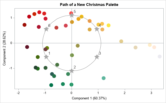
The ancient Greeks thought that a circle was the most perfect shape. Regular polygons, which approximate the circle, are also seen as perfect in their symmetry and beauty. Therefore, it makes sense to use a regular hexagon to create a new Christmas palette. The following graph demonstrates how you can choose a new Christmas palette. The circle represents a path through the space of colors. The gray stars represent six points on the circle, which are also vertices on a regular hexagon. I will define a new palette by using math to figure out what colors to associate with the coordinates of the six stars. I've ordered the six points starting from the point that I know will be green (because it is in the lower-left corner) and ending with the point that I know will be red (because it is in the upper-left corner).
Inverting the principal component transformation
Until now, we've only considered the projection of the RGB colors onto the plane of the first two PCs. Of course, this projection is not invertible: There are many colors that share the same two PC scores. However, in general, the transformation from RGB space to the space of all principal component scores is invertible. You can represent the transformation as a matrix by using the spectral decomposition of the correlation matrix of the colors. To embed the plane of the first two PCs, you need to set a value for the coordinate of the third PC. The obvious statistical choice is to use PC3=0, which represents the average score in the third PC. In other words, you can associate the first two PC scores with the plane that has ordered triplets (PC1, PC2, 0).
With that choice, it is straightforward to apply the inverse PC transformation. The inverse transformation maps PC scores into colors in RGB space. You can use the SAS IML language to carry out this transformation. If you visualize a dense set of points on the circle, you get the following spectrum of colors:
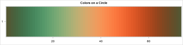
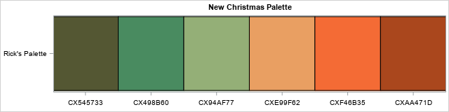
Any smaller palette will contain a subset of these colors. For example, if you choose six points on the circle that are vertices of a regular histogram, you get the palette that is shown at the top of this article. The new palette is based on the original seven palettes but is distinct from them. The new palette incorporates the properties of the original palettes but is defined by defining a new path through the PC scores.
Summary
In summary, this article shows how to create a new palette of colors that is based on statistical properties of a set of colors. You can perform a principal component analysis in RGB space to obtain a plane of PC scores. Every path through that plane corresponds to a new palette of colors. For my palette, I chose a sequence of vertices on a regular hexagon.
This method is not guaranteed to give an aesthetically pleasing palette of colors, but I think it does in this example. And if you don't like my palette, you can choose any other path through the set of PC scores to create a new palette! If you would like to experiment with this technique, you can download the SAS program that I used to generate the figures in this article.
