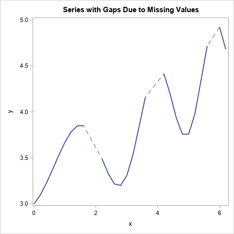
A SAS programmer asked an interesting question: If data in a time series has missing values, can you plot a dashed line to indicate that the response is missing at some times?
A simple way to achieve this is by overlaying two lines. The first line (the "bottom" line in the overlay) is dashed. The second line (the "top" line in the overlay) is solid and uses the BREAK option to add gaps where the series has missing data. The result is shown to the left.
Plotting gaps in the data
An important thing to remember about the SG graphics procedures in SAS is that points and lines are displayed in the same order as the statements that you specify. So, if you use two SERIES statements, the first line is plotted "on the bottom," and the second statement is plotted "on top."
A second important point is that you can use the BREAK option on the SERIES statement to force a break in the line for each missing value for the Y variable. The BREAK statement causes the line to appear as multiple line segments that do not "connect through" missing data. If you do not use the BREAK statement, the SERIES statement will connect each valid data point to the next valid data point.
You can therefore plot two lines. The bottom line is dashed and connects through missing values. The top line is solid and breaks at missing values. This is shown in the following call to PROC SGPLOT:
/* create data that has some missing Y values */ data Have; do x = 0 to 6.2 by 0.2; cnt + 1; y = 3 + x/4 + 0.5*sin(x**1.5); if cnt=10 | cnt=11 | cnt=20 | cnt=21 | cnt=30 | cnt=40 | cnt=41 then y = .; output; end; run; title "Series with Gaps Due to Missing Values"; proc sgplot data=Have noautolegend; series x=x y=y / lineattrs=GraphData1(pattern=dash); series x=x y=y / BREAK lineattrs=GraphData1(pattern=solid thickness=2); run; |
The graph is shown at the top of this article.
Display more information about nonmissing data
There might be times when you want to enhance the series plot by showing more information about the location of the nonmissing data. An easy way to do that is to use the MARKERS option to add markers to the graph. The markers are displayed only at locations for which both X and Y are nonmissing. A second way to visualize the locations of the nonmissing values is to add a fringe plot along the bottom of the line plot, as follows:
/* append the "fringe" data: the X value of points that have nonmissing Y value */ data Want; set Have Have(rename=(x=t) where=(y ^= .)); keep x y t; run; title "Series and Fringe Plot"; proc sgplot data=Want noautolegend; series x=x y=y / lineattrs=GraphData1(pattern=dash); series x=x y=y / markers BREAK lineattrs=GraphData1(pattern=solid thickness=2); fringe t; run; |
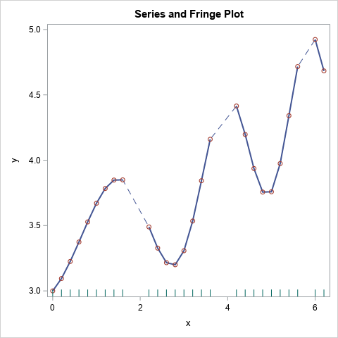
This graph makes it easier to see the nonmissing values and the locations of the gaps in the data.
Summary
This article shows a cool trick for using a dashed line to indicate that a time series has missing values. The trick is to overlay a dashed line and a solid line. By using the BREAK option on the solid line, the underlying dashed line shows through and visually indicates that missing values are present in the data.

2 Comments
Great one! very useful.
Well explained