These days, many countries are moving away from coal, and towards natural gas, hydro, wind, and solar as ways to meet their electricity needs. I had heard that some countries still use a lot of coal (especially those countries with large coal deposits), and I was curious which countries use the most coal. And it seemed like a good potential topic for some graphs...
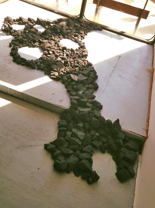
Follow along, and maybe you'll learn a little something about coal, or maybe you'll learn some tricks to help you graph similar data! And here's a random coal-picture to get you in the mood ... this is some coal artwork created by my artist friend Sara (no 'h'). She can (and does) create art from just about anything!
The Data
I found some coal consumption data on the ourworldindata.org website, and downloaded the csv data file. It was a very simple data file, therefore I used a SAS data step to read it in. There were quite a few countries in the data, and I decided to focus on the 6 countries that had the highest cumulative coal consumption since 1980.
There are probably some more elegant ways to get the data for the top 6, but I decided to just use brute force (that way I know exactly how it's calculated):
/* calculate the sum for each country */
proc sql noprint;
create table highest as
select unique entity, sum(Coal_Consumption_TWh) as total
from my_data
group by entity;
quit; run;
/* sort them from highest to lowest */
proc sort data=highest out=highest;
by descending total;
run;
/* get the top 6 */
data highest; set highest (obs=6);
run;
/* subset the data, only keeping the ones that are in the top/highest 6 */
proc sql noprint;
create table my_data as
select *
from my_data
where entity in (select unique entity from highest)
order by entity, year;
quit; run;
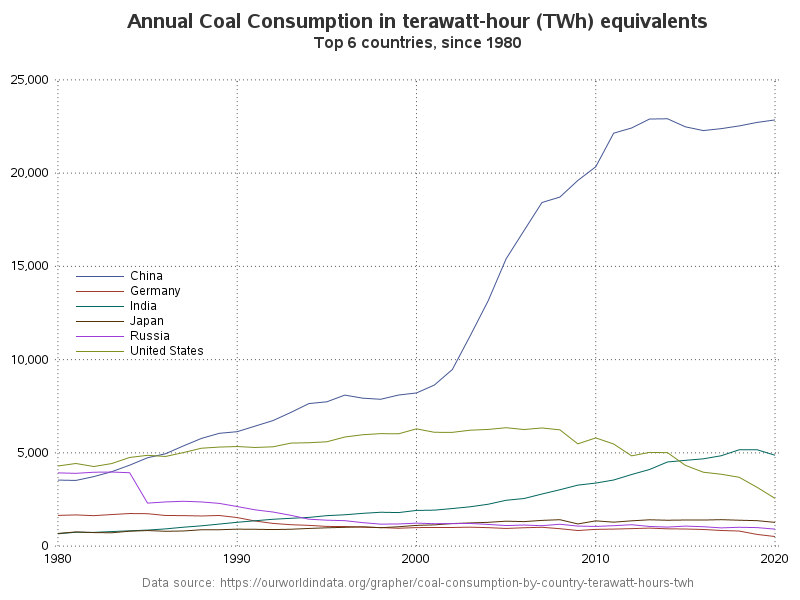
First Draft
For my first graph, I plotted the data using a simple line for each country. This plot was OK, but I always have difficulty mousing-over lines, to see the exact values. Here's the essence of the code I used:
proc sgplot data=my_data;
series x=year y=coal_consumption_twh / group=entity;
keylegend / position=left;
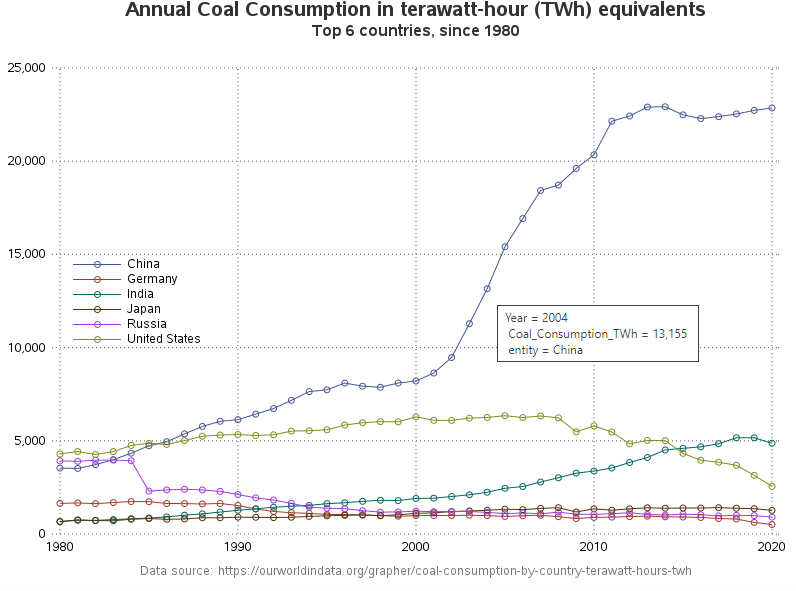
Second Version
When I'm creating a graph, I usually create lots of different versions, so see which I like best, and which help explain the data best. In my second version, I added markers to the plot lines. I almost always like markers on the plot line, because they help me see how fast the data is changing over time (for example, where China's line is increasing, you can now easily see that it was increasing over several years, rather than just a sharp increase between two years). The markers also give you an easy spot to mouse-over, to see the detailed data (see the example mouse-over text in the screen-capture below).
And all I had to do was add the 'markers' option to the series statement:
series x=year y=coal_consumption_twh / group=entity markers;
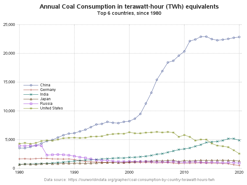
Third Version
The second version was probably good enough ... but I just can't leave well enough alone. I wanted to try using a different marker shape for each country. I thought this might help distinguish the lines, and also help users more quickly relate the lines to the legend. Using different marker shapes can also be helpful to color blind users.
This change is a little more tricky. There's not an option in the proc, to simply turn on/off. One solution could be defining which marker to use for which country in an attribute map - that would be handy if I wanted a specific marker to always be used for a specific country. But in this case, I don't really care what marker is used for which country - therefore an attribute map is a bit "overkill". If you just want to rotate through the default markers, you can make a simple change at the ODS level to trigger that behavior.
ods graphics / attrpriority=none;
Different Approach
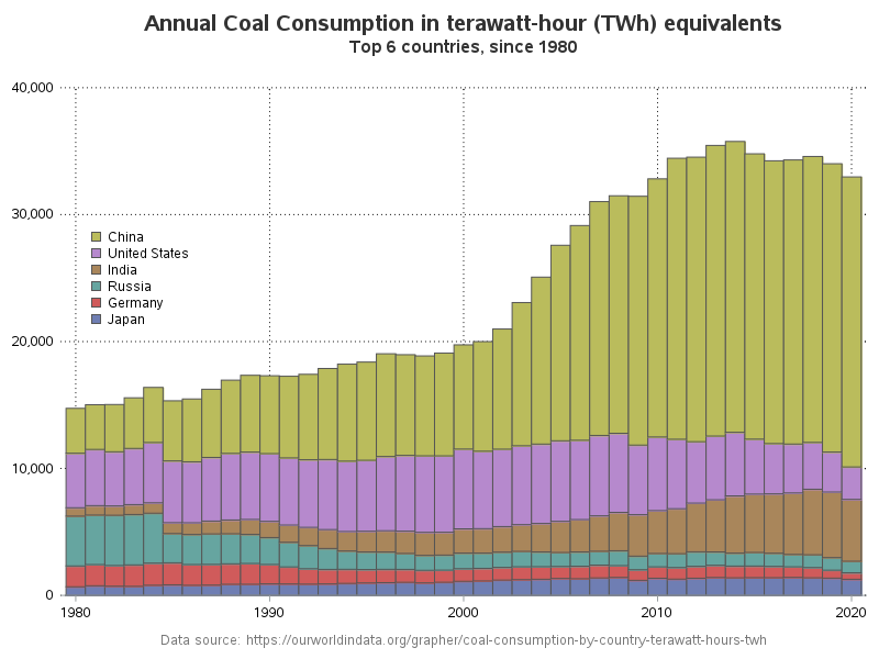
The overlaid line chart is good for comparing the countries ... but what if you want to know the total impact of all the countries combined? It's difficult to visually estimate the combined consumption with the overlaid lines, but a stacked bar chart would be a good way to show that. It also shows the "give & take" interactions between the countries, to some extent.
Here's a summarized version of the code. Note that I reversed the default sort order of the legend, so the countries will be 'stacked' in the same order as they are in the stacked bars (I think that makes it easier to relate from one to the other). By the way, here's a link to the complete SAS code for all the examples.
proc sgplot data=my_data;
vbarparm category=year response=coal_consumption_twh /
group=entity groupdisplay=stack;
keylegend across=1 sortorder=reverseauto;
My Coal Mining Tie-In
I've written a few blog posts related to coal (coal powered nation, power sources, petcoke), but I bet you didn't know that my grandfather was a coal miner. His name was Harman Allison (nicknamed "Red" because of his red hair), and he lived in the western mountains of Virginia near the West Virginia border. He had worked in the coal mines for most of his life, when he was in one of the Bishop Coal Mine explosions (around 1958) - 22 people died, but luckily he survived. There was a newspaper article about him surviving, titled "LUCKIEST MAN ALIVE!". But, his years of coal mining are probably what eventually killed him - he died at the age of 57 battling black lung and brain cancer.

Extra
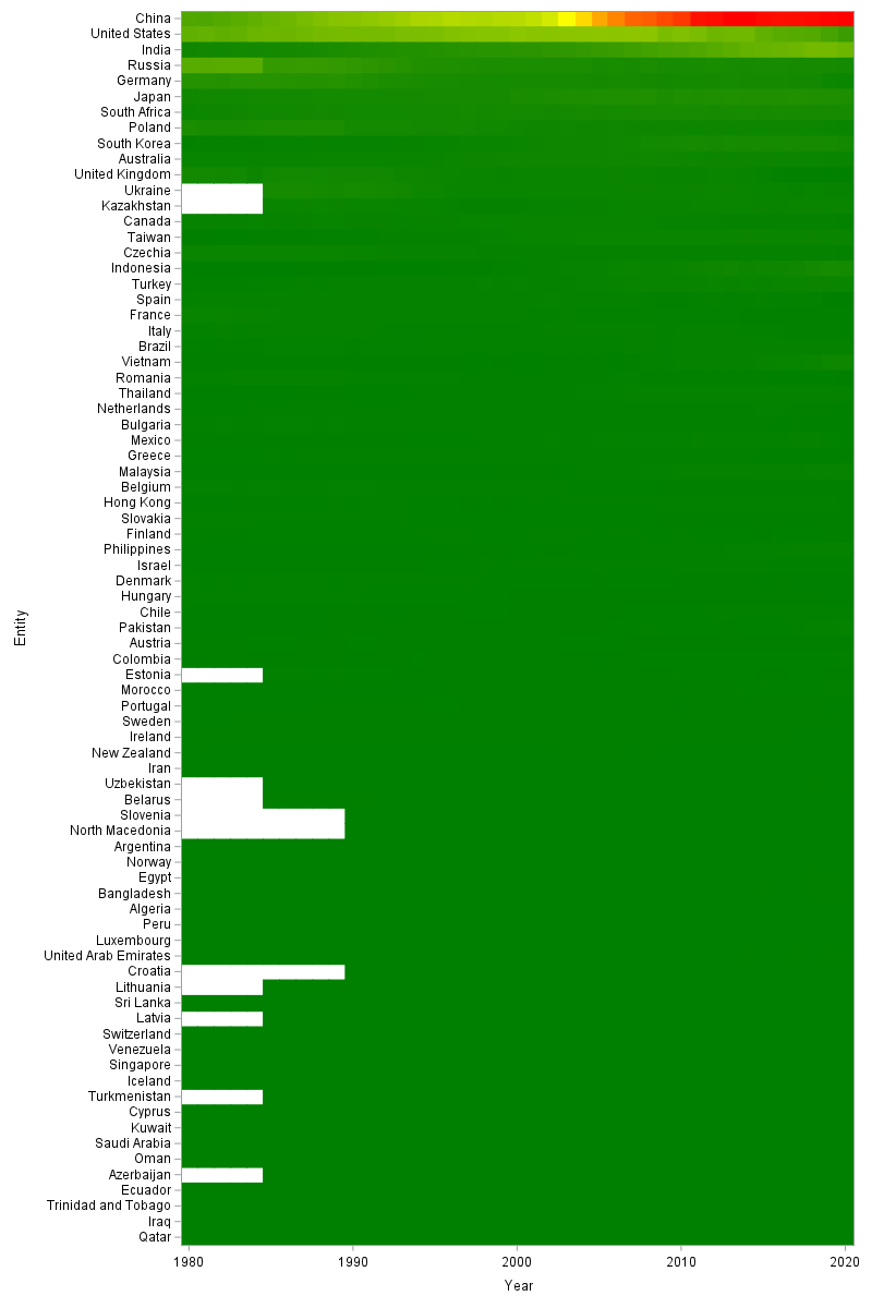
User Ksharp provided some sample code in the comments to create a 'heat map' graph of the same data. I ran his code, and am including the output here, in case you'd like to see what that output looks like. I always like looking at the same data plotted in several different ways! 🙂


11 Comments
thank you for sharing a nice story, both at country and individual level. I learn a lot from your code.
If you add country population, consumption per capital would be another story.
Regards,
Thanks! ... and good idea!
Robert,
I would like to use HEATMAP if there were too many countries.
proc import datafile='c:\temp\coal-consumption-by-country-terawatt-hours-twh.csv' dbms=csv replace out=have;
guessingrows=max;
run;
data have2;
set have;
if year>=1980 and code^='' and entity^='World' then output;
run;
proc sql;
create table have3 as
select *,sum(Coal_Consumption___TWh) as total from have2
group by entity
order by total desc;
quit;
ods graphics / noscale width=800px height=1200px noborder;
proc sgplot data=have3 noautolegend;
heatmapparm x=year y=entity colorresponse=Coal_Consumption___TWh / colormodel=(green yellow red);
yaxis reverse ;
xaxis offsetmin=0 offsetmax=0;
run;
Thanks Ksharp! ... We can't include images in the comments, therefore I've included your heat map at the bottom of my blog post, in case people want an easy way to see what it looks like. 🙂
Great to see the creative process being shared and expanded upon! I also like the background story. Nice job! Of course, I now want to map the data...
It will be interesting to see what you come up with, Louise! 🙂
Listen to your words, read ten years
Colored legends are hardly distinguishable among six levels. May consider make the legends larger or label directly on the plot lines or areas.
Very interesting to see how China has dominated coal consumption. It makes me wonder how the poverty levels have changed in China and India as coal usage has increased. While India has managed to industrialize rapidly through cleaner IT industries, China has focused on physical manufacturing industries which require more power, which I assume led them to select the cheaper option of coal. But which industry has brought more out of poverty faster. That's probably a graph for another day.
Interesting questions to ponder, Tony!
Another visualization is to use rate statistics instead of raw statistics.
Based on the following wikipedia link, the story telling using CO2 emissions per capital has painted a very different version.
https://en.wikipedia.org/wiki/List_of_countries_by_carbon_dioxide_emissions_per_capita
Here for USA in 2018, we emitted 16.1 ton of CO2 per capita per year.
As for China in 2018, they emitted 8.0 ton of CO2 per capita per year.