I ran across a map recently that seemed to show a lot of US states are primarily coal-powered. The map was a little difficult to read, so I decided to give it a SAS makeover ...
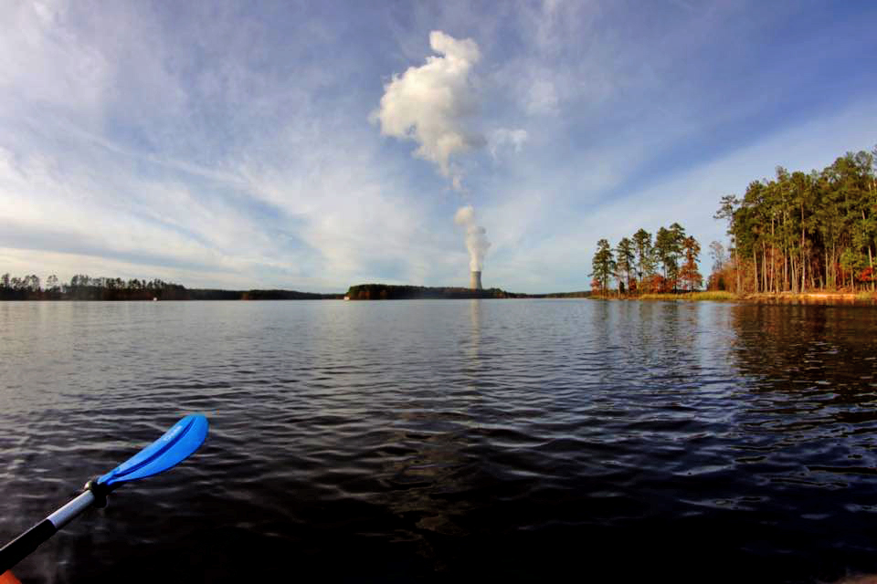
Before we get started, here's a picture my friend David took of the Shearon Harris Nuclear Power Plant, here in NC. We have 3 nuclear plants in our state, and this is the one that provides power for the SAS headquarters.
I recently found a web site called metricmaps.org that shows maps of many interesting things. While perusing the site, I found the following interesting 'energy source' map.
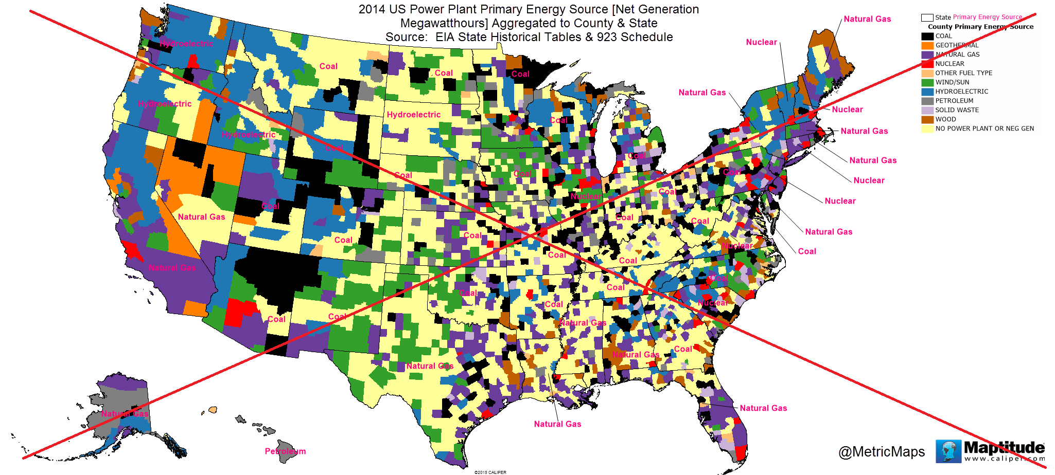
At first glance, I assumed this map showed the primary energy source of the power consumed in each county, but as I looked closely I noticed that the counties with nuclear power as the primary source were only the counties that actually contained the nuclear power plants. I finally 'got it' that this map showed the primary source of energy produced in each county, not the power consumed in each county.
In addition to the counties being colored by source, each state also had a label showing the primary source of energy produced in the whole state. I think the state data is actually more important than the individual counties, but their state labels were very difficult to read.
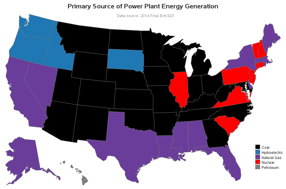
So I set about creating my own map. I decided to split it into two separate maps - one for state, and one for county. With the state map, you can easily tell with a single glance that many of the states still use coal as their primary source of power (see the coal-black states below).
The county map was a bit more difficult to make a nice clean/simple version of. First, I simplified the title, and made it more clear exactly what data is being shown. Also, since there were too many colors to easily discern, I decided to eliminate the (light yellow) color for the counties with no data. And if you click the map below, you can see my interactive version with html mouse-over text (with the county name, and the amount of energy produced from that source).
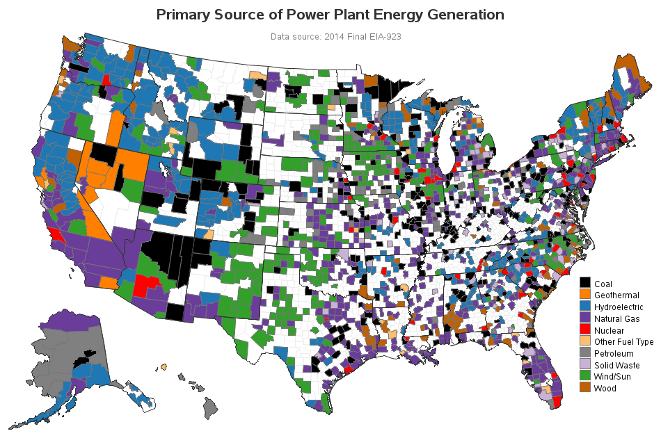
If you live in the US, how did your area do in this map - is the primary source of energy produced in your county & state what you thought it would be? (In my case, I thought NC would be nuclear rather than coal.)

5 Comments
Pingback: Solar and wind power in the United States - SAS Learning Post
Hello .. This was a great example of showing the energy sources in the country.. Don't you think bubble map would take more spaces to show.. Anything hovering on the map makes people uncomfortable. Just my suggestion. You know the best.
Ur help would be much appreciated. I am looking for analysis like this. I want to work more on analysis like this unlike Clinical Trails . Can you please help me out with this ?
Deciding how to scale the bubbles would be a tough decision. If you scale bubbles so that the largest ones fit totally within their counties, then most of the bubbles will be very small (maybe just 1 pixel). If you scale the bubbles such that most of the counties have a reasonable/visible bubble, then the counties with very large values are going to have huge bubbles that overlap other counties & bubbles.
These maps show geographic coverage, but what about how much power is used/generated with each source? For example, Montana shows as "coal", but how much power does Montana require compared to a more populated area (like NYC)?
I was thinking about maybe using a bubble-map (where the size of the bubble shows the amount of power generated) to show something like that. But it will be a little tough, since the counties with large populations will have much larger bubbles than the small-population counties ... but I guess that will be what we're trying to show, eh! :)