A scatter plot is my go-to graph! It's what I often start with to get a feel for the data ... and I often end up using just a scatter plot. But some scatter plots are better than others ...
In this blog post, I create a scatter plot of some COVID data, and demonstrate how to add a few enhancements that might help show more about the data.
The Basic Scatter Plot
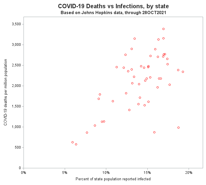
Here is the code I used to create a basic scatter plot. I decided to plot covid deaths on the y-axis, and confirmed covid cases on the x-axis, with a separate marker for each state. In the US, our state populations vary widely, and therefore instead of plotting the raw totals, I calculated deaths per million, and cases per 100 (aka, percent) so that the values from the various states could be plotted on the same axes.
proc sgplot data=my_data noautolegend nowall;
scatter x=latest_infected y=latest_deaths / markerattrs=(color=red);
yaxis offsetmin=0 offsetmax=.05 values=(0 to 3500 by 500);
xaxis offsetmin=0 offsetmax=.08 values=(0 to .2 by .05);
run;
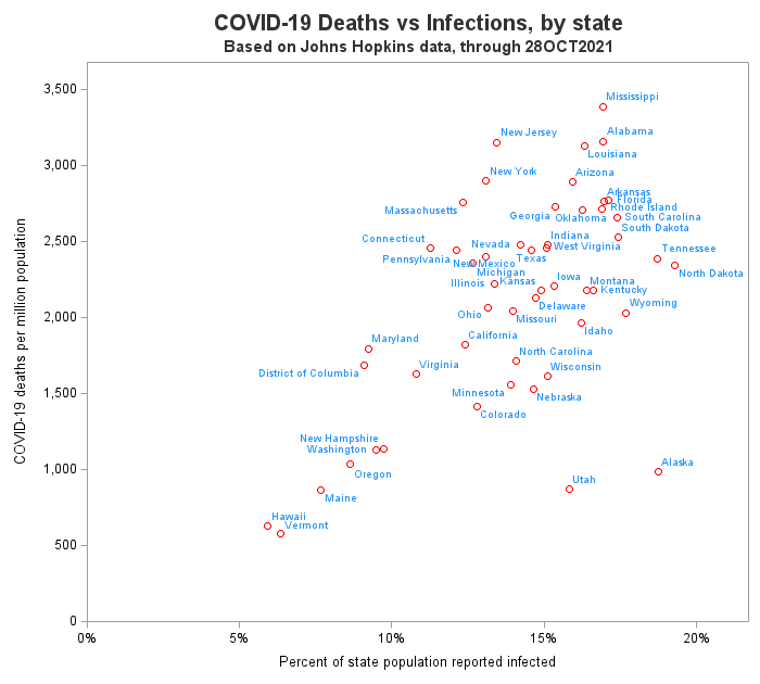
Adding Point Labels
Those markers sure would tell a better story if I could easily tell which marker represents which state. And it's easy to add state labels with the datalabel option. Notice that the labels are automatically repositioned so they don't overlap.
proc sgplot data=my_data noautolegend nowall;
scatter x=latest_infected y=latest_deaths / markerattrs=(color=red)
datalabel=statename datalabelattrs=(color=dodgerblue);
yaxis offsetmin=0 offsetmax=.05 values=(0 to 3500 by 500);
xaxis offsetmin=0 offsetmax=.08 values=(0 to .2 by .05);
run;
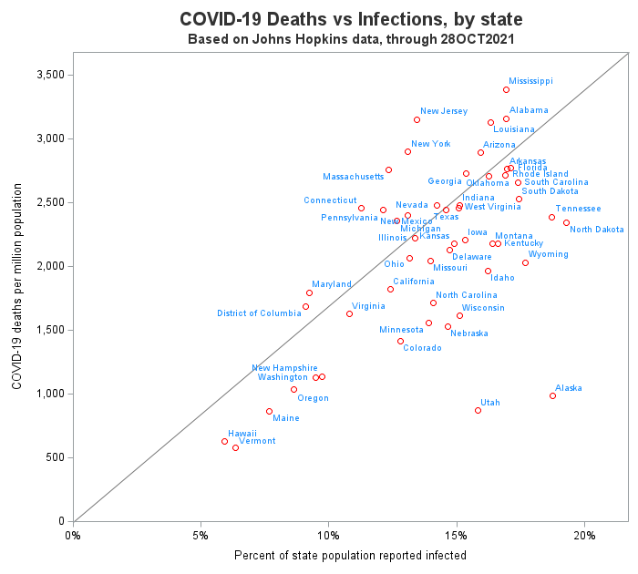
Diagonal Reference Line
In graphs like this, I often like to add a diagonal reference line, so I can see which markers are above and below the line. Note that there are a couple of caveats. For example, some people might think it's a regression line (which it is not). Also, which markers are above and below the line can be changed, by making subtle adjustments to the extents of the x and y axes (don't abuse this!)
There are multiple ways to add a diagonal reference line, such as a LINEPARM statement or an annotate dataset. I used an annotate dataset:
data anno_diagonal;
length label $300 x1space y1space anchor layer $50;
layer="back"; /* be sure to use 'nowall' with this */
x1space='wallpercent'; y1space='wallpercent';
x2space='wallpercent'; y2space='wallpercent';
function='line'; linethickness=1;
linecolor='gray77';
x1=0; y1=0; x2=100; y2=100;
output;
run;
proc sgplot data=my_data noautolegend nowall sganno=anno_diagonal;
scatter x=latest_infected y=latest_deaths / markerattrs=(color=red)
datalabel=statename datalabelattrs=(color=dodgerblue);
yaxis offsetmin=0 offsetmax=.05 values=(0 to 3500 by 500);
xaxis offsetmin=0 offsetmax=.08 values=(0 to .2 by .05);
run;
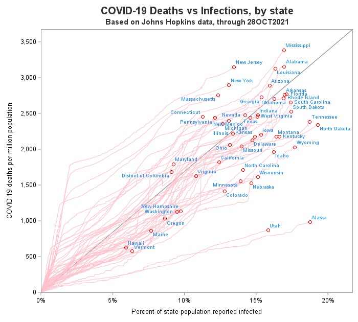
Adding Smoke Trails
The markers show you what the latest/current values are ... but wouldn't it be interesting to know what path the markers followed, over time, to get there? In this next graph, I add a light-colored trail to each marker, so you can see the path it followed over time. Note that these 'smoke trail' lines make it easy to see that states like New York and New Jersey had a high deaths-to-cases ratio in the early days of the pandemic, when testing was not widely available. In this case, I added a pink series line (click here to see the full code).
proc sgplot data=my_data noautolegend nowall sganno=anno_diagonal;
series x=percent_infected y=deaths_this_day_per_million / group=statename
lineattrs=(pattern=solid thickness=1 color=pink);
scatter x=latest_infected y=latest_deaths / markerattrs=(color=red)
datalabel=statename datalabelattrs=(color=dodgerblue);
yaxis offsetmin=0 offsetmax=.05 values=(0 to 3500 by 500);
xaxis offsetmin=0 offsetmax=.08 values=(0 to .2 by .05);
run;
Now that you've got all these cool ideas for enhancing scatter plots, what do you plan to do with them? Feel free to share your ideas in the comments...


4 Comments
Hi Robert,
Thanks for this interesting blog.
One real problem with scatter plots is that they only work well for relatively small number of observations. If one has literally thousands of data points, one is most likely to get overlap, and some data is "hidden"; also, there is a finite limit to how many symbols one can display in a single plot.
Rick Wicklin has a solution for this case: https://blogs.sas.com/content/iml/2019/09/18/visualize-density-bivariate-data.html
I combine both a standard scatter plot with a contour plot from the bivariate kernel density estimate from PROC KDE, mentioning the percentage of data not shown due to overlap
David Carr
In addition, I sometimes like using transparent markers, so I can 'see' where they overlap (multiple overlapping markers produce darker colors).
I'm going to miss these tremendously, Robert. Those smoke trails in particular are brilliant.
Thanks for everything and all the inspiration (I still have the physical copy of your book on my Amazon wishlist, and I think it's time to buy it) and best wishes for the retirement.
Thanks Asger!