Create an interpolating polynomial in SAS

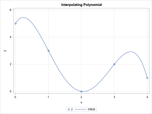
While reviewing a book on numerical analysis, I was reminded of a classic interpolation problem. Suppose you have n pairs of points in the plane: (x1,y1), (x2,y2), ..., (xn,yn), where the first coordinates are distinct. Then you can construct a unique polynomial of degree (at most) n-1 that passes through