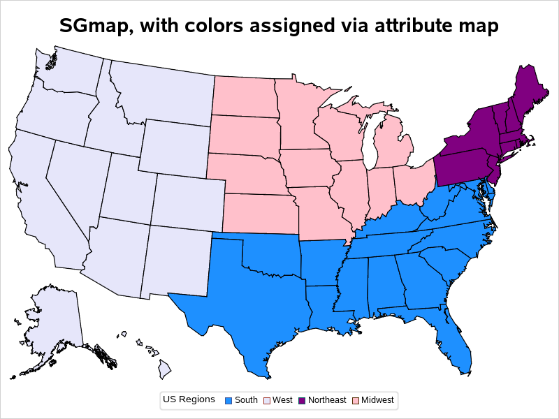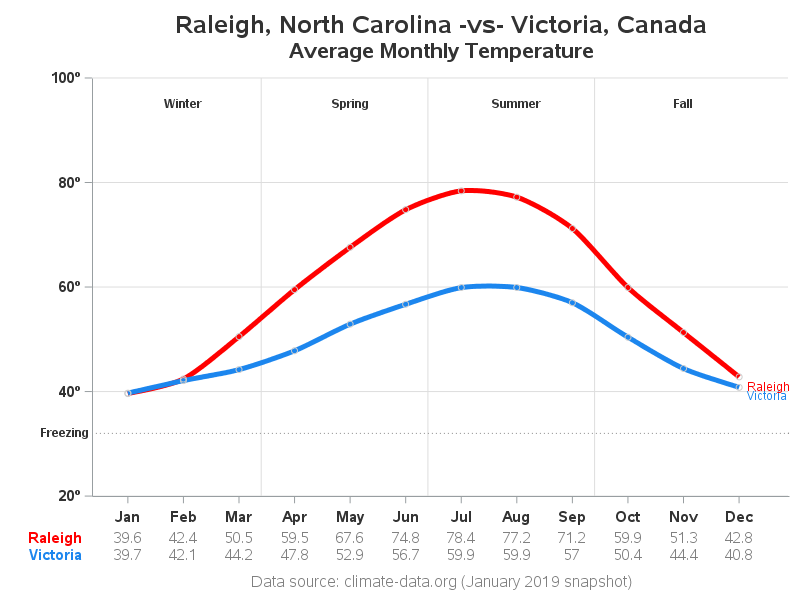
Create a wind chill chart in SAS

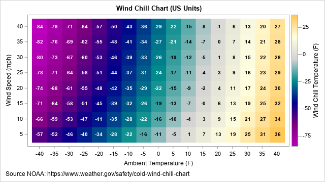
I recently wrote about a simple statistical formula that approximates the wind chill temperature, which is the cumulative effect of air temperature and wind on the human body. The formula uses two independent variables (air temperature and wind speed) to predict the wind chill temperature. This article describes how to