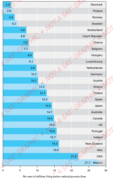
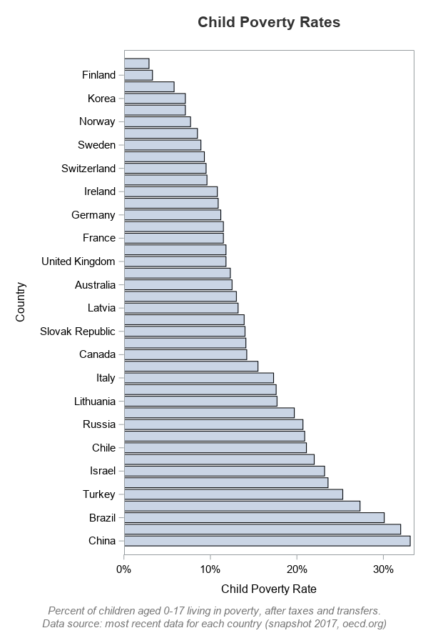
According to the most recent data, the child poverty rate in China is 33.1% - the rate in Denmark is 2.9%. Where do other countries fall in between these two extremes? Let's build a graph and find out! (or, if you're not interested in the code - jump to the end to see the final graph!)
While searching for data on various topics, I found an interesting graph on the Washington Post website. The title (which was not part of the graph) said "Child Poverty in Rich Countries 2005". There were some interesting things going on visually in the graph (see graph below) - therefore I decided to see if I could create one like it.
Data
First I needed some similar data. After a few web searches, I found it on the oecd.org (Organisation for Economic Co-Operation and Development) website. I went to their Income Distribution and Poverty page, changed the 'Measure' to "Age group 0-17: Poverty rate after taxes and transfers", and then exported the data as a text file. The csv has more than just the poverty data, therefore subset it as follows (using Unix commands):
head -1 oecd_data.csv > child_poverty.csv
grep "0-17: Poverty rate" oecd_data.csv >> child_poverty.csv
I imported the csv data into SAS using Proc Import, but some countries had data for more recent years than others. Should I just pick a certain year for the graph (and leave out countries that don't have data for that year), or do I use the most recent data available for each country? I chose the latter, and here is the SQL code I used to make that happen:
proc sql noprint;
create table my_data as
select unique country, var4 as age_group, methodology, year,
value format=percent7.2 as poverty_rate, flag_codes, flags
from my_data
group by country
having year=max(year);
quit; run;
Intermediate Graphs
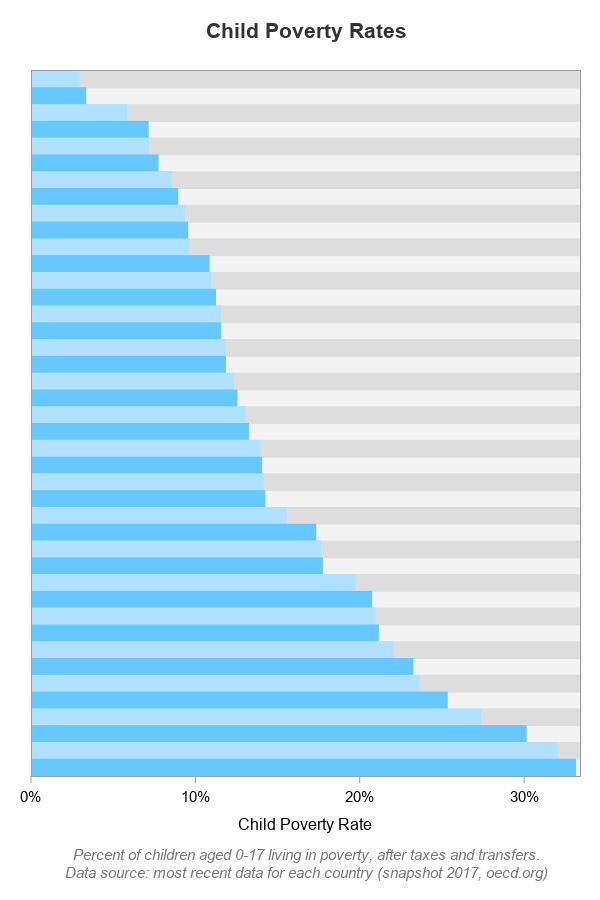
Now, let's plot the data ... Since it is pre-summarized (one data observation per country), I use Proc SGplot's hbarparm (rather than hbar, which would be used to summarize the data). With the following minimal code, I get a basic bar chart:
proc sgplot data=my_data;
hbarparm category=country response=poverty_rate;
run;
But it's not that great a plot for this particular data . For example, you can see that China has the highest percent of children living in poverty ... but you can't tell which country has the 2nd highest, because that bar is not labeled. When SGplot thinks the axis values won't fit, it 'thins' out some of the labels by default.
Let's not worry about fighting the label-thinning along the axis, because we're going to add custom labels for the country names later. So, for now, let's completely suppress the country names (using the novalues option). We also want to get rid of the gaps between the bars, therefore let's use the barwidth=1 (100%) option.
proc sgplot data=my_data;
hbarparm category=country response=poverty_rate / barwidth=1;
yaxis display=(nolabel novalues noticks) offsetmin=.014 offsetmax=.014;
run;

Now, let's assign alternating colors to every-other bar, like the original graph. I number the bars, use the mod() function to determine whether the bars are odd or even, and then assign a variable (which I call colorvar) that I can use later to control the bar colors. I specify the two colors using the styleattrs.
data my_data; set my_data;
barnum=_n_;
if mod(barnum,2)=0 then colorvar=1;
else colorvar=2;
run;
proc sgplot data=my_data noautolegend;
styleattrs datacolors=(cxB0E2FF cx67C8FF);
hbarparm category=country response=poverty_rate /
group=colorvar barwidth=1;
yaxis display=(nolabel novalues noticks)
offsetmin=.014 offsetmax=.014;
run;

In addition to the alternating bar colors, the original graph also had alternating bands of color in the background. These bands of background color make it easier to visually follow from the bar to the country name (this is sort of like the old 'green bar' paper used for computer printouts ... back in the dinosaur days when I was in college). Sgplot's axis statement allows you to specify color bands behind the odd or even bars (but not both). Therefore I specified dark gray colorbands behind the odd bars...
yaxis display=(nolabel novalues noticks)
colorbands=odd colorbandsattrs=(color=graydd)
offsetmin=.014 offsetmax=.014;
I also wanted light gray bands behind the even bars - but how can I accomplish that, when the axis only allows me to specify either odd or even colorbands ... but not both? Let's trick it into doing what we want! ... The color between the colored bands is actually the wall/background within the axes, and I can control that using the wallcolor style attribute. So I specified a light gray for that:
styleattrs datacolors=(cxB0E2FF cx67C8FF) wallcolor=grayf3;
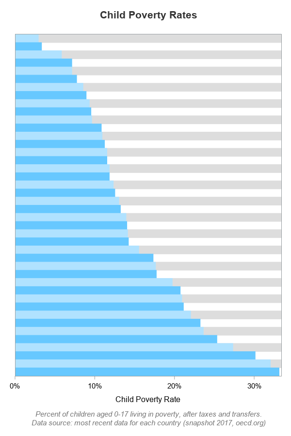
Final Graph
I've now got the bars & colors the way I want - so far, so good!. The remaining step is to add some custom text along the right edge of the graph to show the country names, and at the end of each bar to show the values! I use offsetmax=.22 on the xaxis to add some extra space for the country names, and then I use an annotate dataset to add the country names and values as annotated text.
data anno_text; set my_data;
length label $100 anchor x1space y1space $50;
layer="front";
function="text"; textcolor="gray33"; textweight='normal';
width=100; widthunit='percent';
y1space='datavalue';
yc1=country;
x1space='datavalue'; x1=poverty_rate;
anchor='right'; label=trim(left(put(poverty_rate*100,comma7.1))); textsize=7; output;
x1space='wallpercent'; x1=100;
anchor='right'; label=trim(left(country)); textsize=9; output;
run;
proc sgplot data=my_data noautolegend sganno=anno_text;
styleattrs datacolors=(cxB0E2FF cx67C8FF) wallcolor=grayf3;
hbarparm category=country response=poverty_rate /
group=colorvar barwidth=1 nooutline
tip=(country year poverty_rate);
xaxis display=(nolabel)
values=(0 to .35 by .05) valueattrs=(size=9pt color=gray33)
grid gridattrs=(color=white)
offsetmin=0 offsetmax=.22;
yaxis display=(nolabel novalues noticks)
colorbands=odd colorbandsattrs=(color=graydd)
offsetmin=.014 offsetmax=.014;
run;
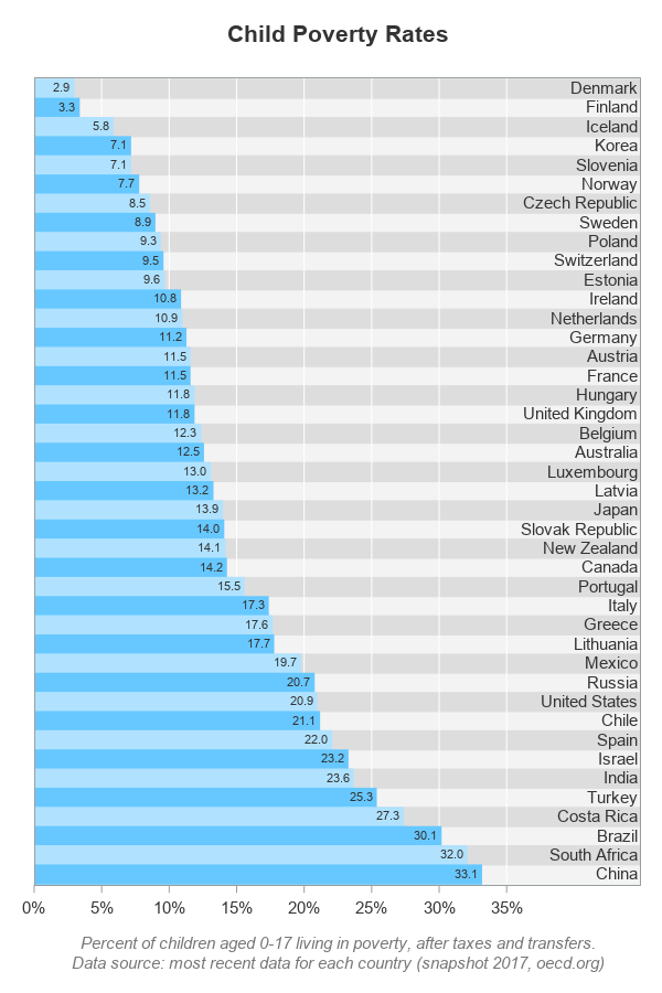
Hopefully you've learned a little about customizing graphs, and also about world poverty. Where does your country fall along the list, and are you surprised at what countries are above/below yours? What are some possible caveats with calculating and comparing child poverty rates in various countries?
(Here's a copy of the complete SAS code, if you'd like to experiment with it.)