 Many examples for performing analysis of covariance (ANCOVA) are available in statistical textbooks, conference papers, and blogs. One of the primary interests for researchers and statisticians is to obtain a graphical representation for the fitted ANCOVA model. This post, co-authored with my SAS Technical Support colleague Kathleen Kiernan, demonstrates how to obtain the statistical analysis for a quadratic ANCOVA model by using the GLM procedure and graphical representation by using the SGPLOT procedure.
For the purposes of this blog, the tests for equality of intercepts and slopes have been omitted. For more detailed information about performing analysis of covariance using SAS, see SAS Note 24177, Comparing parameters (slopes) from a model fit to two or more groups.
Fitting the model
Keep in mind that the statistical methods for ANCOVA are similar whether you have a one-way ANCOVA model or a repeated-measures ANCOVA model. The example data below consists of three treatments, the covariate X and the response value Y. Predicted observations were generated based upon augmenting observations to the training data set that is used to fit the final model.
data ts132; input trt x y @@; datalines; 1 2.2 3.7 1 3.5 4.7 1 4.1 5.3 1 4.1 5.5 1 7.4 5.7 1 3.0 3.8 1 0.5 1.0 1 2.4 3.3 1 8.4 5.3 1 8.5 5.3 1 8.0 6.1 1 6.3 5.8 2 5.8 7.2 2 9.9 2.5 2 1.2 4.3 2 6.0 6.9 2 5.5 8.0 2 9.7 3.7 2 8.6 5.2 2 5.0 8.0 2 2.6 6.9 2 8.4 4.3 2 3.0 6.8 2 5.2 7.6 3 8.8 5.7 3 9.0 6.1 3 8.8 6.4 3 4.1 9.6 3 2.4 9.4 3 4.1 8.2 3 4.4 10.2 3 8.9 6.0 3 5.3 9.4 3 9.5 5.0 3 1.1 7.5 3 0.1 5.3 ; run; data new; do trt=1 to 3; x=0; y=.; output; x=10; output; end; run; data combo; set ts132 new; run; |
The following statements fit the final model with common slope in the direction of x and unequal quadratic slope in direction of X*X.
proc glm data=combo; class trt; model y=trt x x*x*trt/solution noint; output out=anew p=predy; ods output parameterestimates=pe; quit; |
The Type III SS displays significance tests for the effects in the model.
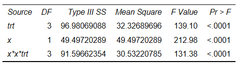
The F statistic that corresponds to the TRT effect provides test intercepts (α1=α2=α3=0). The F statistic that corresponds to X provides test β1=0. The X*X*TRT effect provides test β1=β2=β3=0. The significance levels are very small, indicating that there is sufficient evidence to reject the null hypothesis.
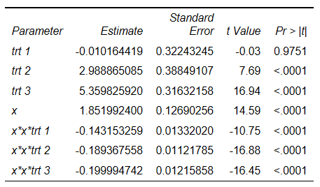
Displayed next: parameter estimates
You can write the parameter estimates to a data set by using the PARAMETERESTIMATES output object in an ODS OUTPUT statement in order to display the model equations on a graph.
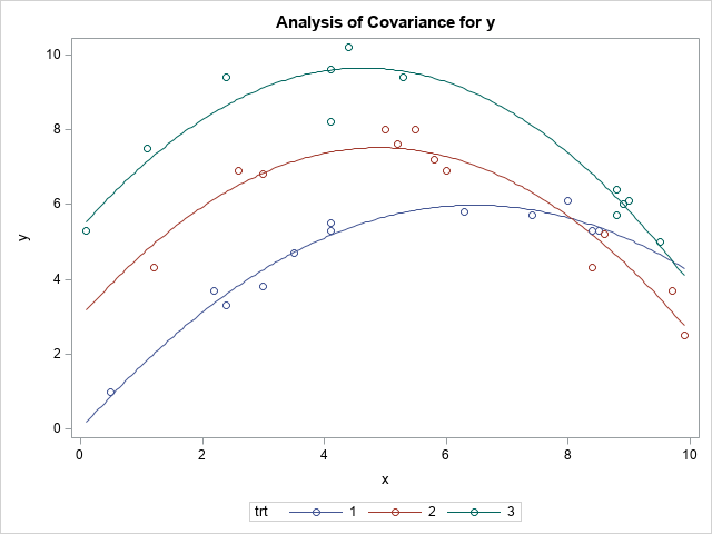
The default ODS graphics from PROC GLM provides the following graphic representation of the model:
However, researchers, managers and statisticians often want to modify the graph to include the model equation, to change thickness of the lines, symbols, titles and so on.
You can use PROC SGPLOT to plot the ANCOVA model and regression equations by using the OUTPUT OUT=ANEW data set from PROC GLM, as shown in this example:
proc sgplot data=anew; scatter y=y x=x /group=trt; pbspline y=predy x=x / group=trt smooth=0.5 nomarkers; run; |
This code produces the following graph:
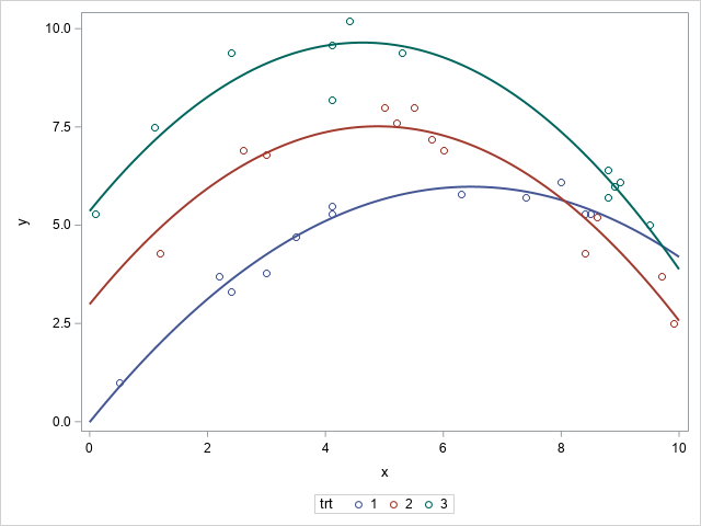
You can see that the respective graphs from PROC GLM and PROC SGPLOT look similar.
Customizing your graphs
It is easier to use PROC SGPLOT to enhance graphs rather than to do the same by editing the ODS Graphics Template associated with the GLM procedure.
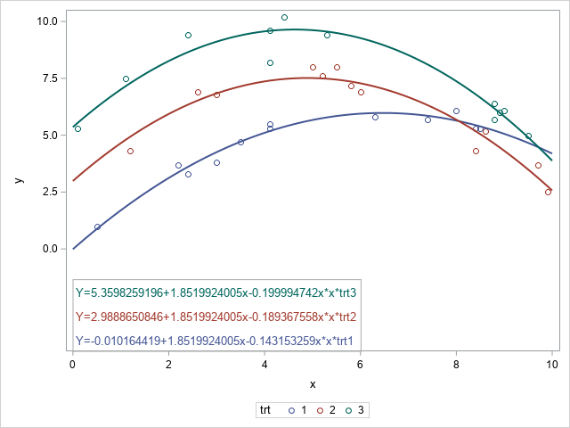
To color coordinate the respective treatments with the regression model equations and display them in the graph, you can use SG annotation. The TEXT function is used to place the text at specific locations within the graph.
The POLYGON and POLYCONT functions are used to draw a border around the equations. Note that you might need to adjust the values for X1 and Y1 in the annotate data set for your specific output.
data eqn; set pe(keep=parameter estimate) end=last; retain trt1 trt2 trt3 x x_x1 x_x2 x_x3; length function $9 textcolor $30; x1space='datapercent'; y1space='wallpercent'; function='text'; x1=0; anchor='left'; width=120; select (compbl(parameter)); when ('trt 1') trt1=estimate; when ('trt 2') trt2=estimate; when ('trt 3') trt3=estimate; when ('x') do; if estimate <0 then x=cats(estimate,'x'); else x=cats(' + ',estimate,'x'); end; when ('x*x*trt 1') do; if estimate < 0 then x_x1=cats(estimate,'x*x*trt1'); else x_x1=cats(' + ',estimate,'x*x*trt1'); end; when ('x*x*trt 2') do; if estimate < 0 then x_x2=cats(estimate,'x*x*trt2'); else x_x2=cats(' + ',estimate,'x*x*trt2'); end; when ('x*x*trt 3') do; if estimate < 0 then x_x3=cats(estimate,'x*x*trt3'); else x_x3=cats(' + ',estimate,'x*x*trt3'); end; otherwise; end; if last then do; label=cats("Y=",trt1,x,x_x1); y1=3; textcolor="graphdata1:contrastcolor"; output; label=cats("Y=",trt2,x,x_x2); y1=10; textcolor="graphdata2:contrastcolor"; output; label=cats("Y=",trt3,x,x_x3); y1=17; textcolor="graphdata3:contrastcolor"; output; function='polygon'; x1=0; y1=0; linecolor='grayaa'; linethickness=1; output; function='polycont'; y1=21; output; x1=60; output; y1=0; output; end; run; proc sgplot data=anew sganno=eqn; scatter y=y x=x /group=trt; pbspline y=predy x=x / group=trt smooth=0.5 nomarkers; yaxis offsetmin=0.3; run; |
This code results in the following graph with model equations:
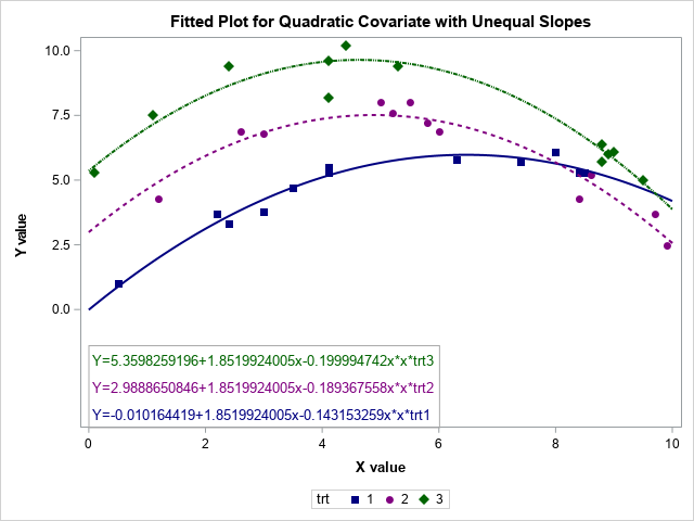
You might also want to add a title; change the X or Y-axis label; or change the color, thickness and pattern for the lines as well as the symbol for the data points, as follows:
- Use a TITLE statement to add a title to the graph.
- Use the LABEL= option in the XAXIS and YAXIS statements in PROC SGLPLOT to specify a label for the axis, with the LABELATTRS= option specifying attributes for those labels.
- Use the STYLEATTRS statement in PROC SGPLOT to specify the attributes for the lines and marker symbols.
The following PROC SGPLOT code produces a graph with the customizations described above:
ods graphics / attrpriority=none; title 'Fitted Plot for Quadratic Covariate with Unequal Slopes'; proc sgplot data=anew sganno=eqn; styleattrs datacontrastcolors=(navy purple darkgreen) datalinepatterns=(1 2 44) datasymbols=(squarefilled circlefilled diamondfilled); scatter y=y x=x /group=trt; pbspline y=predy x=x / group=trt smooth=0.5 nomarkers; yaxis offsetmin=0.3 label='Y value' labelattrs=(size=10pt color=black weight=bold); xaxis label='X value' labelattrs=(size=10pt color=black weight=bold); run; |
Keep in mind that you also need to adjust the color for the annotated text by changing the value for the TEXTCOLOR= variable (in the DATA step) from textcolor="graphdata1:contrastcolor" to reference the new colors, as shown in this example: textcolor="navy";
The resulting graph, including the modifications, is displayed below.
Conclusion
Using the output data set from your statistical procedure enables you to take advantage of the functionality of PROC SGPLOT to enhance your output. This post describes just some of the customizations you can make to your output.
References
Milliken, George. A., and Dallas E. Johnson. 2002. Analysis of Messy Data, Volume III: Analysis of Covariance. London: Chapman and Hall/CRC.
SAS Institute Inc. 2006. SAS Note 24529, "Modifying axes, colors, labels, or other elements of statistical graphs produced using ODS Graphics." Available at support.sas.com/kb/24/529.html.

2 Comments
Thank you for your comment. You are correct you may also use the SERIES statement to obtain the graphical display.
Using PBSPLINE in the SGPLOT might lead to unwanted wiggles. Another way to visualize is to score the model on a grid of x values: