You've probably heard of the famous Rosetta Stone. It had the same decree written on it in both ancient Egyptian and Greek, and was an essential key to help modern historians decipher and translate the ancient Egyptian hieroglyphs. To help the 'old timers' (like me) shift from using SAS/Graph to the newer ODS Graphics, I thought it might be useful to create a few examples showing how to generate the same graph in both - and I decided to call these examples ... you guessed it, my 'Rosetta Graphs'!
For my first example, I will focus on a scatter plot. I chose a very simple graph, using 'fake' data from the sashelp data library, to keep things simple. You could probably create a very similar plot using less code ... but I'm trying to demonstrate all the bits-n-pieces that I typically use to create scatter plots, so you can see how to do those things using both techniques. I'll show the code & graphs first, and then explain the differences.
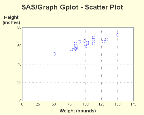
SAS/Graph Gplot - Scatter Plot
goptions device=png xpixels=500 ypixels=400
cback=cxFFFFE0 ctitle=gray33 ctext=gray33 htext=10pt;
symbol1 value=circle height=13pt color=A0000ff88;
axis1 label=(font='albany amt/bold' height=12pt
justify=center 'Height' justify=center '(inches)')
order=(0 to 80 by 20) major=none minor=none offset=(0,0);
axis2 label=(font='albany amt/bold' height=12pt 'Weight (pounds)')
order=(0 to 175 by 25) major=none minor=none offset=(0,0);
title1 h=18pt ls=1.5 "SAS/Graph Gplot - Scatter Plot";
title2 a=-90 h=3pct ' ';
proc gplot data=sashelp.class;
plot height*weight=1 / cframe=white
vaxis=axis1 haxis=axis2
autohref chref=gray77 lhref=33
autovref cvref=gray77 lvref=33
name="scatter_gplot";
run;
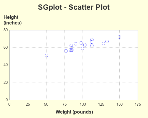
ODS Graphics SGplot - Scatter Plot
ods graphics / imagefmt=png imagename="scatter_sgplot"
width=500px height=400px noborder noscale;
title1 c=gray33 h=18pt "SGplot - Scatter Plot";
ods escapechar='^';
proc sgplot data=sashelp.class pad=(right=5pct);
styleattrs backcolor=cxFFFFE0 wallcolor=white;
scatter y=height x=weight / transparency=.50
markerattrs=(symbol=circle size=9pt color=blue);
yaxis display=(noticks) labelpos=top
label="Height^{unicode '000a'x}(inches)"
labelattrs=(size=12pt weight=bold color=gray33)
values=(0 to 80 by 20) valueattrs=(size=10pt color=gray33)
grid gridattrs=(color=gray77 pattern=dot) offsetmin=0 offsetmax=0;
xaxis display=(noticks) label="Weight (pounds)"
labelattrs=(size=12pt weight=bold color=gray33)
values=(0 to 175 by 25) valueattrs=(size=10pt color=gray33)
grid gridattrs=(color=gray77 pattern=dot) offsetmin=0 offsetmax=0;
run;
Code Explanation
What's the best way to show the differences in the code? I considered marking up the code with numbers, which I could then refer to in my text explanations below. I also considered showing the 2 blocks of code side-by-side and drawing lines between the equivalent pieces. But either of those methods would get very crowded very quickly, with all the code differences I'm trying to explain. Therefore I left the code unmarked, and just refer to the commands and options by name. If you want to easily find these commands and options in the code above, I recommend using your browser's Ctrl+f functionality to find the text.
- To control the type (png) and size (500x400 pixels) of the graph, I used goptions (xpixels, ypixels, and device) in the gplot code. I specified these things in the "ods graphics" line (imagefmt, width, and height) for sgplot.
- In gplot I specify the background color (the light yellow behind the graph) using goptions cback. In sgplot I specify it using styleattrs backcolor.
- The title1 statement is very similar in both. I did not have to specify any extra line spacing (ls=1.5) in the sgplot, because there's already adequate white-space above the title.
- In gplot I specify the name of the output png file using the name= option after the plot statement's '/'. In sgplot I specify it via the ods graphics imagename option.
- In gplot we plot height*weight, whereas in sgplot we scatter y=height x=weight.
- In gplot, I am able to control the color and size of all the text by using a goptions statement (htext, ctext), whereas in the sgplot I hard-code the size and color of each individual piece of text (using labelattrs and valueattrs). Alternatively, you could control all the sgplot text from a central location by customizing the ODS Style ... but I prefer not to modify the styles.
- I use axis1 and axis2 statements to control the axes in gplot, whereas I use yaxis and xaxis statements in the sgplot.
- In the gplot, I split the y-axis label onto two lines by specifying the two pieces of text, and specifying the text-justification (justify=center) between them. In the sgplot, I use an escape character, and then specify the hex code for a line-feed character ^{unicode '000a'x}.
- In gplot, I use autohref and autovref to turn on the of reference lines. In sgplot, you use the grid option on the xaxis and yaxis.
- In the gplot, I specify major=none on the axis1 and axis2 statements to get rid of the tick marks sticking out from the axes. In sgplot, I specify display=(noticks) on the xaxis and yaxis statements.
- In the gplot, I specify the marker shape (value=circle), size (height=13pt) and a transparent color (color=A0000ff88) in the symbol statement. In the sgplot, I specify the shape, size, and color as attributes in the scatter statement markerattrs=(symbol=circle size=9pt color=blue)., and I set the level of transparency using the transparency=.50 option.
- Scatter plots typically add a bit of space around the outside of the axes, in case your plot markers are close to the edge (so they don't get chopped off, or extend outside the graph). I typically hand-pick my axes so that they comfortably include all the plot markers, and therefore I like to eliminate that extra space. In gplot, I use offset=(0,0) in the axis1 and axis2 statements. In sgplot, I use offsetmin=0 offsetmax=0 in the xaxis and yaxis statements.
- I sometimes like to add extra white-space along the left or right side of the graph, to make it better centered or more aesthetically pleasing. In gplot I added the white-space by adding a blank title angled to be on the side of the graph - in this case title2 a=-90 h=3pct ' ';. In sgplot, you use the pad option - in this example pad=(right=5pct).
- There are a few other small differences in the syntax - I'll leave those for you to suss out for yourself! 🙂
Let me know if you found this example useful, and would like to see more done in a similar format in the future. (leave a comment to let me know what you think!)