The SAS 9.4M6 software includes a new SGPIE procedure (preproduction) as introduced in the recent article - The SGPIE Procedure. In that article, I described the basic features of the two statements supported in the procedure, the PIE and the DONUT, with some examples.
It is my humble opinion that the Pie (or Donut) graphs work well for "Part-to-Whole" comparison and Bar Charts or Dot Plots may be more suited for general usage. However, Dr. Bessler rightly points out that the Pie chart can work well with more category levels provided the slices are sorted in response order, and the category and response values are fully displayed in a legend.
As we can imagine, even if we could include all the information in the legend (which may require some creative programming using annotation), a Pie chart with many categories would end up with a large legend. It so happens, the SGPIE procedure does provide a good solution in such a case as shown below in a Pie Chart of all the 19 students the Class data set.
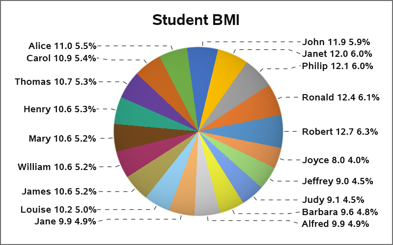
Note the following features of this graph:
- We use the "Callout" feature for labeling each slice of the pie. This allows the labels to be displayed along the sides, with call out lines to each slice. Effectively, the legend values are displayed along the sides.
- The pie starts the slices in the default "East" direction, and the slices are drawn in the default CounterClockwise direction.
- The slices are displayed with descending response using the option SLICEORDER.
- The default position of the first slice is centered on the start angle (default=0), thus showing the largest slice centered on the right, with a label going straight out.
Since there are 19 slices and only 12 distinct fill colors in the style, the colors are reused with slight change in the lightness. Note, color for Louise onwards are the "lightened" shades from the first seven slices. This could be an issue when trying to match colors of legend swatches with the pie slices. But here, the slices are directly labeled, providing much better readability. The color of each slice is almost redundant. Code snippet is shown below, see link at bottom for full code with data.
title 'Student BMI';
proc sgpie data=bmi;
pie name / response=bmi datalabeldisplay=all datalabelloc=callout
sliceorder=respdesc datalabelattrs=(size=7 weight=bold);
run;
The Pie and Donut charts allow placement of the first slice at any start angle, with slices going clockwise or counterclockwise, either centered on the start angle, or on edge. Here is a traditional Pie Chart of the number of each type of vehicles in sashelp.cars. The slices are sorted by descending count, and placed clockwise starting in the North (StartAngle=90). Slice labels are placed inside or outside based on fitting.
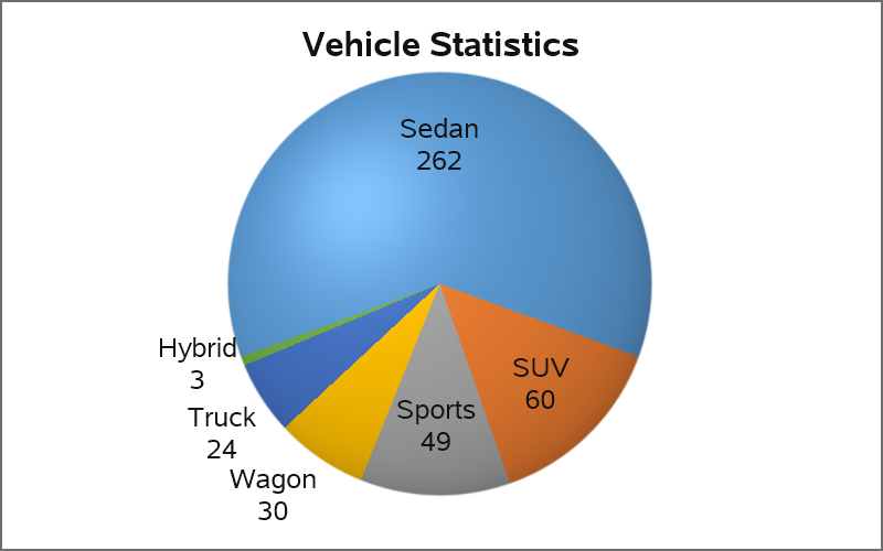
title 'Vehicle Statistics';
proc sgpie data=sashelp.cars;
pie type / startangle=90 direction=clockwise datalabeldisplay=(category response)
sliceorder=respdesc dataskin=pressed;
run;
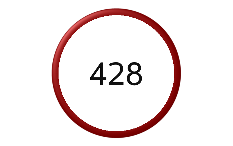
Another statement supported in the SGPIE procedure is the DONUT statement. We can use this creatively to display a nice "Key Value" indicator, as shown below. Such a display could be useful in a report, showing some measure at the top. Or, one could create a panel of such indicators.
proc format;
value $ring
'Sedan'='Sedan'
other= 'Sedan';
run;
proc sgpie data=sashelp.cars noautolegend ;
format type $ring.;
styleattrs datacolors=(maroon);
donut type / holevalue ringsize=0.1 datalabeldisplay=none dataskin=gloss;
run;
Note, I created a format that forces all category values to be formatted as "Sedan". So, the pie has only one full slice. Also, I suppressed the display of the labels and set the ring size to 10%.
We hope you will find the SGPIE procedure a useful addition to your toolbox to create the figures you need. We would appreciate your feedback.
Full SGPIE code: SGPie_2