The 6th maintenance release of SAS 9.4 is now available for users. Along with it comes a new SG procedure - the SGPIE procedure (pre-production).
The primary audience for the SG procedures has been the analytical user, for creating effective displays of analytical data. However, the rich feature set of these procedures make them useful for all applications. Now, with the SGPIE procedure, you can easily create Pie charts and Donut charts for inclusion in your reports.
The procedure supports two statements - the PIE statement and the DONUT statement. These statements allow easy rendering of these charts to your ODS destination. Here are a couple of starter examples.
proc format;
value $type
'Sedan'='Sedan'
other= 'Other';
run;
ods graphics / reset width=4in height=2.5in;
title 'Vehicle Distribution';
proc sgpie data=sashelp.cars;
format type $type.;
styleattrs datacolors=(gold maroon);
pie type / startangle=270;
run;
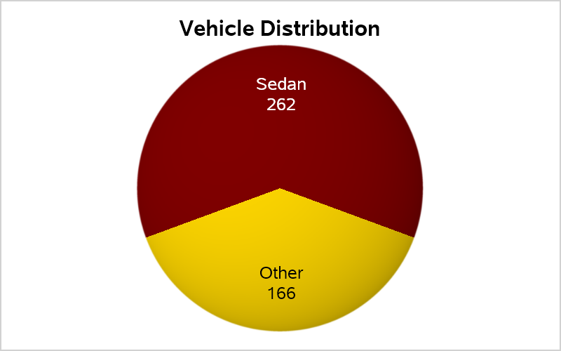
While there is some debate among users on the effectiveness of pie charts for graphical display of data, the pie chart remains very popular with many users. It is my humble opinion the pie chart is an effective visual for viewing "part-to-whole" relationships. In the graph above, the pie chart provides an intuitive feel for the proportion of "Sedans" among all the cars. Even without the numbers, you can get a good "feel" for the proportions.
Effectiveness of a pie chart decreases as the number of slices increase. Direct comparisons of the magnitude of one slice to another is harder when displayed as an angular value from different baselines. In such cases, a bar chart may be more effective.
Part-to-whole pie charts are more intuitive when the two slices are oriented in the primary directions. So, the pie chart positions the first slice centered about the start angle (default East), instead of starting at the start angle. Of course, you can change that behavior using options. The color of the slice labels is also automatically adjusted to the slice color.
The donut chart provides a few additional features as shown below.
ods graphics / reset width=4in height=2.5in;
title 'Vehicle Distribution';
proc sgpie data=sashelp.cars;
format type $type.;
styleattrs datacolors=(gold olive);
donut type / holevalue holelabel='Count' ringsize=0.2;
run;
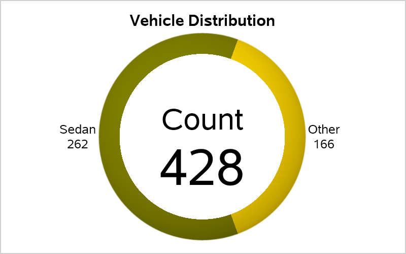
In addition to displaying the slices, we can also display additional information in the hole.
Note: For technology reasons, the SGPIE procedure is available only on Windows and Linux systems. Also, to get an initial version out in the M6 time frame, the feature set was limited to meet the available time and resources. Hence it is marked as pre-production. We plan to complete the feature set to match features you would expect in a SG procedure. We also look forward to your feedback.
Full code for SGPIE Procedure: SGPie2

3 Comments
Where is the syntax documentation for this pre-production procedure?
As you know, I dispute the alleged inadequacy of pie charts for comparing the relative sizes of slices. My long-time advocated and often demonstrated solution is to: (a) order the slices by size (there is no reason not to do so); AND (b1) if there is no label overlap, label the slices with slice descriptor, value, and percent of whole; OR (b2) if there would be label overlap, provide a legend that includes slice descriptor, value, and percent of whole. Given that the legend entries would be ordered by ranked slice order, the legend is a particularly effective table, and pie is a companion visual. Even WITHOUT possible slice label overlap, a legend is always the best design.
If the software tool used to create the pie chart does not allow one to specify that the legend entries must include all three key information items for the pie slices, the solution is to pre-process the data input for the pie chart to create pie slice descriptors that concatenate the raw descriptor text, the value, and the percent of whole.
When you order the slices by size, that puts all of the small ones adjacent to each other, which can increase the probability of label overlap—which is always avoided with a legend. I have been beating the drum for, and creating, maximally informative legends at least since 1995.
Thanks Dr. Bessler. I appreciate your comments, and suggestions. The doc can be found on the web here: https://go.documentation.sas.com/?cdcId=pgmsascdc&cdcVersion=9.4_3.4&docsetId=grstatproc&docsetTarget=n11xqf2g2rxnmbn1pgk4rbl5vz80.htm&locale=en
Hey, Dr. Bessler,
I believe the code below will give you what you described above. There are 19 slices in descending response order, starting with "Phillip" and ending with "Joyce". Callouts are used to prevent collisions, and they are aligned for easier reading.
proc sgpie data=sashelp.class;
pie name / response=weight datalabeldisplay=all datalabelloc=callout
sliceorder=respdesc;
run;