This is another in my series of blogs where I take a deep dive into converting customized R graphs into SAS graphs. Today I show how to combine several graphs with shared axes, which we'll call paneled graphs.
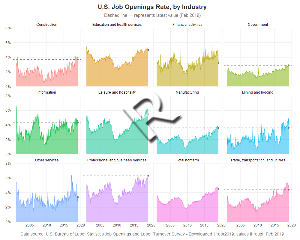
This time I'll be plotting the Job Openings Rate by Industry, similar to how Len Kiefer graphed them in this Twitter post. Len is always posting interesting (and nice looking) graphs, and was kind enough to share his R code, which I consulted while creating my R graph. Thanks Len!
R paneled graphs, created using geom_bar()
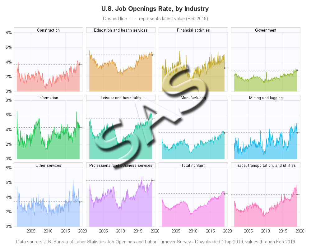
SAS paneled graphs, created using Proc SGpanel
My Approach
I will be showing the R code (in blue) first, and then the equivalent SAS code (in red) that I used to create both of the graphs. Note that there are many different ways to accomplish the same things in both R and SAS - and keep in mind that the code I show here isn't the only (and probably not even the 'best') way to do things. If you know of a better/simpler way to code it, feel free to share your suggestion in the comments (note that I'm looking for better/simpler/best-practices that will help people new to the languages - not just different/shorter but more obscure code that might be difficult for newer programmers to follow!).
Also, I don't include every bit of code here in the blog (in particular, things I've already covered in my previous blog posts). I include links to the full R and SAS programs at the bottom of the blog post.
The Data
For this example, I downloaded 12 separate spreadsheets of data from the Bureau of Labor Statistics website (here's the page, but unfortunately the specific data I used isn't on this particular page any more). I created a piece of code to import one spreadsheet, executed that same code for each of the 12 spreadsheets, and appended each of those datasets to my master dataset (which I called my_data).
Note: this is a lot of data-wrangling code, and if you're only interested in the graph code, skip to the next section!
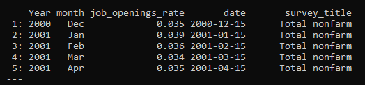
Here is the R function I wrote, and how I ran it on the 12 spreadsheets. I use read_excel() to import the data. I then use the melt() function to restructure it so that the month names change from being column headers, to values in the data. I use the as.Date() function to convert a concatenated string into a proper date value I can plot (note that I set the date to the 15th day of the month, so the plotted monthly values will be visually 'centered' on the months). See the numerous comments to understand all the little steps I took along the way.
read_data <- function(xlsfile,survey_title) {
# read the Excel spreadsheet
temp_data <- read_excel(xlsfile,sheet=1,skip=11)
# turn the month column names into values
temp_data <- melt(as.data.table(temp_data),id=c("Year"),
value.name="job_openings_rate",variable.name="month")
# divide by 100, so I can use % formats
temp_data$job_openings_rate <- temp_data$job_openings_rate/100
# Use year & month, and create a proper date variable (for 15th of each month)
temp_data$date <- as.Date(paste("15",temp_data$month,temp_data$Year,sep=""),"%d%b%Y")
# add a variable for the descriptive text (which you passed-in to the macro)
temp_data$survey_title <- c(survey_title)
# remove rows with missing/NA data
temp_data <- na.omit(temp_data)
# append the temp_data to the global my_data
my_data <<- rbind(my_data,temp_data)
}
read_data("SeriesReport-20190411072035_0b99d7.xlsx","Total nonfarm")
read_data("SeriesReport-20190411084943_987910.xlsx","Trade, transportation, and utilities")
read_data("SeriesReport-20190411091327_530482.xlsx","Professional and business services")
read_data("SeriesReport-20190411091852_3ae78c.xlsx","Education and health services")
read_data("SeriesReport-20190411092515_a7430e.xlsx","Leisure and hospitality")
read_data("SeriesReport-20190411092906_c269ba.xlsx","Manufacturing")
read_data("SeriesReport-20190411093420_c2726b.xlsx","Government")
read_data("SeriesReport-20190411094247_8b3456.xlsx","Construction")
read_data("SeriesReport-20190411094638_8479b9.xlsx","Other services")
read_data("SeriesReport-20190411095010_9fd34a.xlsx","Financial activities")
read_data("SeriesReport-20190411095445_7d57c5.xlsx","Information")
read_data("SeriesReport-20190411095643_4052a1.xlsx","Mining and logging")
The R code produces data that looks like this:
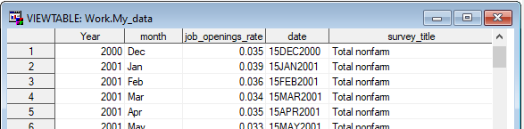
In SAS, did something very similar ... except we call the re-usable code a SAS macro rather than a function. I use Proc Import to read the Excel file. And then I use Proc Transpose to restructure the data so that the month names go from being column headers to values in the data. I use the input() function with a date9. format to convert a concatenated string into a proper date value that I can plot.
%macro read_data(xlsfile,survey_title);
/* Read the Excel spreadsheet */
proc import datafile="&xlsfile" dbms=xlsx out=temp_data replace;
range='BLS Data Series$a12:m0';
getnames=yes;
run;
/* turn the month column names into values */
proc transpose data=temp_data out=temp_data;
by year;
run;
/* re-name variables, after the transpose */
data temp_data; set temp_data (where=(job_openings_rate^=.)
rename=(_name_=month col1=job_openings_rate) drop=_label_);
/* divide by 100, so I can use % formats */
job_openings_rate=job_openings_rate/100;
/* turn the month variable names into proper date values */
date=input('15'||trim(left(month))||trim(left(year)),date9.);
length survey_title $100;
/* add a variable for the descriptive text (which you passed-in to the macro) */
survey_title="&survey_title";
/* remove rows with missing data */
if job_openings_rate^=. then output;
run;
/* append the temp_data to my_data */
data my_data; set my_data temp_data;
run;
%mend;
%read_data(SeriesReport-20190411072035_0b99d7.xlsx,Total nonfarm);
%read_data(SeriesReport-20190411084943_987910.xlsx,%bquote(Trade, transportation, and utilities));
%read_data(SeriesReport-20190411091327_530482.xlsx,Professional and business services);
%read_data(SeriesReport-20190411091852_3ae78c.xlsx,Education and health services);
%read_data(SeriesReport-20190411092515_a7430e.xlsx,Leisure and hospitality);
%read_data(SeriesReport-20190411092906_c269ba.xlsx,Manufacturing);
%read_data(SeriesReport-20190411093420_c2726b.xlsx,Government);
%read_data(SeriesReport-20190411094247_8b3456.xlsx,Construction);
%read_data(SeriesReport-20190411094638_8479b9.xlsx,Other services);
%read_data(SeriesReport-20190411095010_9fd34a.xlsx,Financial activities);
%read_data(SeriesReport-20190411095445_7d57c5.xlsx,Information);
%read_data(SeriesReport-20190411095643_4052a1.xlsx,Mining and logging);
The SAS code produces data that looks like this:
Paneling Band/Ribbon Plots
In R they call it a ribbon plot - basically a line graph, with the area between the line and the bottom axis shaded. In R, I create that by using the geom_ribbon() function, and then I use facet_wrap() to panel these together on the same page, and using the same axes. The x axis year values were a little crowded, therefore I hard-code them so I can use a blank for the first one. I use alpha=0.5 to make the colored areas semi-transparent, and I let the line at the top of the shaded area be solid (not transparent) which makes it a darker shade of the area color - this produces a cool visual effect.
geom_ribbon(alpha=0.5,aes(ymin=0,ymax=job_openings_rate,fill=survey_title),color=NA) +
scale_y_continuous(
breaks=seq(0,.08,by=.02),
limits=c(0,.08),expand=c(0,0),
labels=scales::percent_format(accuracy=1)) +
scale_x_date(
breaks=seq(as.Date("2000-01-01"),as.Date("2020-01-01"),by="5 years"),
limits=as.Date(c("2000-01-01","2020-01-01")),
expand=c(0,0),
labels=c(' ','2005','2010','2015','2020')
) +
facet_wrap(~ survey_title,ncol=4) +
In SAS, we call this type of graph a band plot. I use Proc SGpanel, and the band statement. Similar to the R code, most of the SAS code is to get the axes exactly like I want them. I use the transparency=.50 to make the colored areas semi-transparent.
proc sgpanel data=my_data noautolegend dattrmap=myattrs;
styleattrs backcolor=white wallcolor=cxfafbfe;
panelby survey_title / columns=4 novarname spacing=6 noborder;
format date best12.;
band x=date lower=0 upper=job_openings_rate / fill group=survey_title
attrid=my_id transparency=.50 tip=none;
rowaxis values=(0 to .08 by .02) display=(nolabel noline noticks)
valueattrs=(color=gray33) valuesformat=percent7.0
grid offsetmin=0 offsetmax=0;
colaxis
values=('15jan2000'd to '15jan2020'd by year5)
valueattrs=(color=gray33)
valuesdisplay=(' ' '2005' '2010' '2015' '2020')
display=(nolabel noline noticks) grid offsetmin=0 offsetmax=0;
run;
Controlling the Colors
Since I created the R graph first, I used the default colors in R, which requires no extra code.
I could have also used default colors in SAS, but they wouldn't be the same default colors as R ... and I thought it would be a good opportunity to demonstrate how to map specific colors to specific data values, using an attribute table. First you set up a dataset, mapping the colors (fillcolor and linecolor) to the survey_title values (as below), and then point to that dataset using the dattrmap= option on the Proc SGpanel. Then when you create the band plot, use the attrid=my_id to specify which id value to look for in the attribute map dataset (there could be multiple ids in it, for multiple different things you're overlaying in the plot).
data myattrs;
input fillcolor $ 1-8 value $ 10-80;
linecolor=fillcolor;
id="my_id";
datalines;
cxf77c73 Construction
cxde952a Education and health services
cxbba21a Financial activities
cx89b619 Government
cx10bf44 Information
cx0ac28f Leisure and hospitality
cx0ac1c7 Manufacturing
cx04b5f0 Mining and logging
cx87b3ff Other services
cxc77dff Professional and business services
cxf56de4 Total nonfarm
cxff68b3 Trade, transportation, and utilities
;
run;
proc sgpanel data=my_data noautolegend dattrmap=myattrs;
band x=date lower=0 upper=job_openings_rate / fill group=survey_title
attrid=my_id transparency=.50 tip=none;
Dashed Reference Line
If the data towards the end of the graph is going up/down sharply, it is sometimes difficult to tell where the last (most current) data value falls on the graph. Therefore I like to identify that data point by showing a marker on it ... then, in addition to adding a plot marker, I added Kiefer's technique of showing the value with a dashed reference line. I think this is a nice final touch, and the result looks pretty good with the enhancement.
In R, I accomplish this by creating a separate dataset (called my_latest) containing just the last data point for each series_title (using the tail() function), and then I use geom_point() and geom_hline() to add the marker and dashed line to the graph.
temp_latest <- tail(temp_data,n=1)
my_latest <<- rbind(my_latest,temp_latest)
geom_point(data=my_latest,aes(x=date,y=job_openings_rate),color="#777777",size=1.5,shape=16) +
geom_hline(data=my_latest,aes(yintercept=job_openings_rate),linetype="dashed",color="#777777",size=0.5) +
In SAS, all for the plot must be in the same dataset, therefore as I'm processing each spreadsheet I add an extra variable (column) which I call 'latest' that only contains a value for the last (most recent) date for each series. And then when I'm plotting the data, I use a scatter statement to plot the marker, and a refline statement to add a dashed horizontal line.
data temp_data; set temp_data;
by survey_title;
if last.survey_title then latest=job_openings_rate;
run;
data my_data; set my_data temp_data;
run;
scatter x=date y=latest / markerattrs=(color=gray77 symbol=CircleFilled size=8px)
refline latest / axis=y lineattrs=(color=gray77 pattern=shortdash);
My Code
Here is a link to my complete R program that produced the graph.
Here is a link to my complete SAS program that produced the graph.
If you have any comments, suggestions, corrections, or observations - I'd be happy to hear them in the comments section!


