This is another in my series of blog posts where I take a deep dive into converting customized R graphs into SAS graphs. Today we'll be working on bubble maps - specifically, plotting earthquake data as bubbles on a map.
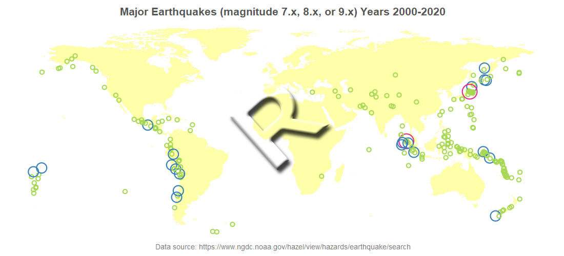
R bubble map, created using geom_polygon() and geom_point()
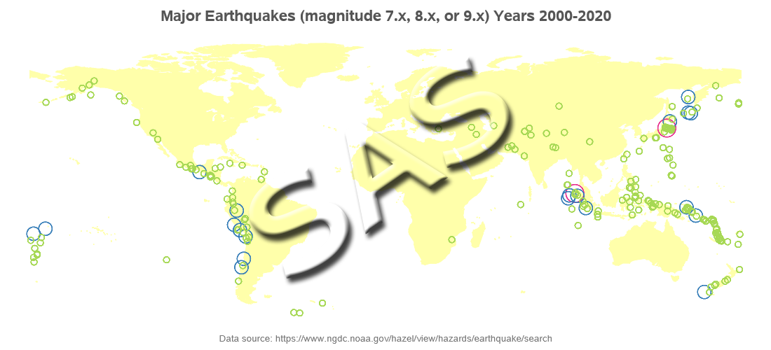
SAS bubble map, created using Proc SGmap
My Approach
I will be showing the R code (in blue) first, and then the equivalent SAS code (in red) that I used to create both of the maps. Note that there are many different ways to accomplish the same things in both R and SAS - and the code I show here isn't the only (and probably not even the 'best') way to do things. If you know of a better/simpler way to code it, feel free to share your suggestion in the comments!
Also, I don't include every bit of code here in the blog post (in particular, things I've already covered in my previous posts). I include links to the full R and SAS programs at the bottom.
The Data
I got the earthquake data from the National Oceanic and Atmospheric Administration (NOAA) National Centers for Environmental Information earthquake data search page. I entered 2000 as the 'Min' year, and 2020 as the 'Max' year, and then in the results page I clicked the "Download TSV File" button (TSV is tab separated value). The file had a line between the column names and data, showing what the query was ... "[""2000 <= Year >= 2020""]" - I manually deleted that line, making the data easier to import. I renamed the file earthquakes_2000_2020.tsv. Here's a glimpse of what the data looked like on their webpage (there were many other columns in addition to these):

In R, I used the following code to import the TSV file, and limit it to just the earthquakes with a magnitude of 7.0 or higher.
my_data <- read.table(sep="\t",header=TRUE,file="earthquakes_2000_2020.tsv")
my_data <- my_data[my_data$Mag>=7.0,]
In SAS, I used Proc Import to read the TSV file, and then a data step to subset the data.
proc import datafile="earthquakes_2000_2020.tsv" dbms=dlm out=my_data replace;
delimiter='09'x;
getnames=yes;
datarow=2;
guessingrows=all;
run;
data my_data; set my_data (where=(mag>=7.0));
run;
Getting World Map
I want to plot the earthquake data on a world map, and in this step I get a copy of that map. And since there are no magnitude 7.0 or larger earthquakes located in Antarctica in this data (not to mention, it's difficult getting Antarctica to look good when drawing a world choropleth map), I omit that continent from the map.
In R, I use the map_data() function, and specify "world." In this map, there is a region variable with the country (or region) name - I subset the map, and only keep the areas where the region is not Antarctica.
my_map <- map_data("world")
my_map <- my_map[my_map$region!="Antarctica",]
In SAS, I get the world map from the mapsgfk library (which is included with SAS/Graph), and use a where clause to eliminate Antarctica. The SAS world map has quite a bit of border detail, which I don't need in this example, therefore I limit it to only the points where the density is <= 1 (the possible density values go from 0 to 6).
data my_map; set mapsgfk.world (where=(idname^='Antarctica' and density<=1));
run;
Drawing the Map
In R, we basically plot the map areas as polygons on a set of axes (like you would when plotting non-map data) ... and then use the theme() function to eliminate the axes and such, leaving just the map. Note that I intentionally make the land areas very light yellow, because the bubbles/data are what I want to stand out. There might be other ways to draw maps in R, but this is the most expeditious technique that presented itself, after a bit of web searching.
We then use geom_point() to overlay the bubbles. Note that rather than using the magnitude as the bubble size, I use the mag_int (just the integer part - 7, 8, and 9) so that I only have 3 sizes of bubbles (which I hard-code as the size values 2, 6, and 9). I also specify three colors, for the three bubble sizes, based on the mag_int values.
my_plot <- ggplot() +
geom_polygon(data=my_map,aes(x=long,y=lat,group=group),fill="#ffffaa") +
geom_point(data=my_data,aes(x=Longitude,y=Latitude,size=mag_int,color=factor(mag_int)),shape=1,stroke=1.1) +
scale_color_manual(name="mag_int",values=c("7"="#a6d854","8"="#377eb8","9"="#e7298a")) +
scale_size_manual (values= c(2,6,9))
theme(panel.grid.major=element_blank()) +
theme(panel.grid.minor=element_blank()) +
theme(axis.text.x=element_blank()) +
theme(axis.text.y=element_blank()) +
theme(axis.title.x=element_blank()) +
theme(axis.title.y=element_blank()) +
theme(panel.border=element_blank()) +
theme(axis.ticks=element_blank()) +
theme(legend.position="none")
In SAS, I use Proc SGmap to draw the map. One caveat is that in order to have the country polygons filled-in with a color, I must plot some response data in them. Therefore I create a response data set (mapresponsedata) containing 1 observation for each country, and create a bogus variable in it containing a value of 'foo' (just a nonsense value I randomly picked).
I add a Proc SGmap bubble statement to overlay the bubbles on the map. I use style attributes (styleattrs) to control the colors of both the map and bubbles - the datacolors controls the color of the map polygons (countries), and the datacontrastcolors controls the color of the bubbles. And the lineattrs controls the outline color of the map polygons.
data land_data; set mapsgfk.world_attr;
landcolor='foo';
run;
proc sgmap plotdata=my_data mapresponsedata=land_data mapdata=my_map noautolegend;
styleattrs datacontrastcolors=(cxa6d854 cx377eb8 cxe7298a);
styleattrs datacolors=(cxffffaa);
choromap landcolor / mapid=id lineattrs=(color=cxffffaa) tip=none;
bubble x=longitude y=latitude size=mag_int / group=mag_int
bradiusmin=5px bradiusmax=15px nofill tip=none;
run;
My Code
Here is a link to my complete R program that produced the graph.
Here is a link to my complete SAS program that produced the graph.
If you have any comments, suggestions, corrections, or observations - I'd be happy to hear them in the comments section!


2 Comments
Regarding the first few histograms, bar-charts and box-plots, if we are to use the set palette colors, how do we set the legend color? Since, we actually do not know the color name or hex code, will the usual way of defining legends work?
If you do not know the names or hex codes of the colors you want, you could use a tool such as Pixeur to 'read' the color off of your screen, and tell you the RGB hex code.