This is another in my series of blogs where I take a deep dive into converting a customized R graph into a SAS graph. Today I'm focusing on a diverging bar chart (where one bar segment is above the zero line, and the other is below).
What type of data am I using this time? Here's a hint in the form of a picture ... This is my 2001 Camaro SS convertible, with the LS1 (Corvette) engine. It's 20 years old this year, and has about 43k miles on it. It spends most of its time in my garage, waiting for sunny/not-raining weather (because, why drive a convertible with the top up, eh!) Now that it is 20 years old, I only have to get the annual North Carolina safety inspection (no annual emissions inspection required!)

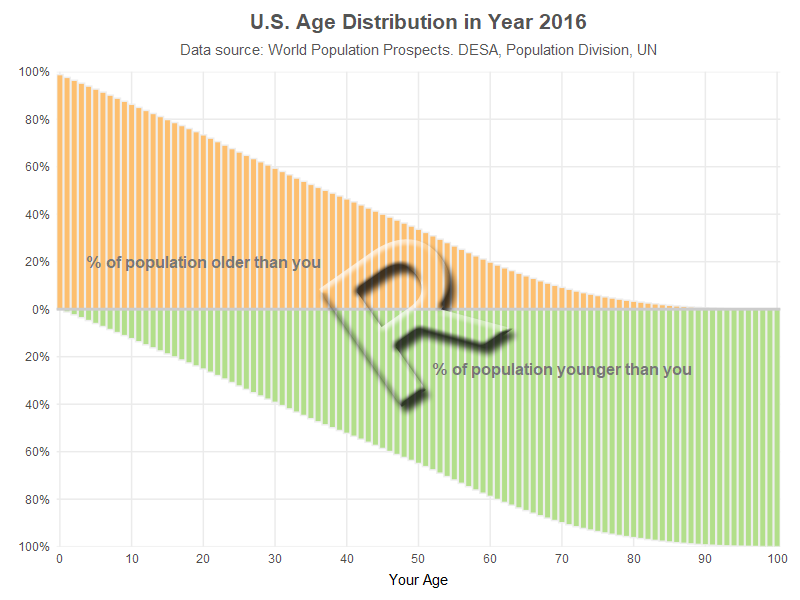
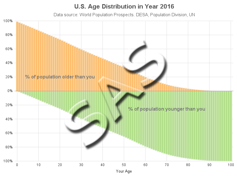
If you guessed age data, you're right! (but it's people-age, not car-age) I'm creating my own version of an age graph I saw on FlowingData. Below are my two comparable bar charts, created using R and SAS (they look pretty similar, eh!?!)
R bar chart, created using geom_bar()
SAS bar chart, created using Proc SGplot
My Approach
I will be showing the R code (in blue) first, and then the equivalent SAS code (in red) that I used to create both of the graphs. Note that there are many different ways to accomplish the same things in both R and SAS - and keep in mind that the code I show here isn't the only (and probably not even the 'best') way to do things. If you know of a better/simpler way to code it, feel free to share your suggestion in the comments (note that I'm looking for better/simpler/best-practices that will help people new to the languages - not just different/shorter but more obscure code that might be difficult for newer programmers to follow!).
Also, I don't include every bit of code here in the blog (in particular, things I've already covered in my previous blog posts). I include links to the full R and SAS programs at the bottom, that you can download and run.
The Data
To focus on the graphics, I went ahead and pre-processed the data in a separate job, and I just read in those values here. I code the data into the R job, so you only have to download one file (rather than multiple files for the code and data). For each age 0-100, there are two lines of data - one showing what percent of the population is younger than that age, and one showing what percent is older (so that's 200 lines of data).
my_data<-read.table(header=TRUE,text="
your_age value bar_segment
0 0.0000 Younger
0 0.9881 Older
1 0.0119 Younger
1 0.9763 Older
[more lines not shown]
99 0.9996 Younger
99 0.0002 Older
100 0.9998 Younger
100 0.0000 Older
")
After I read in all the values, I modify the dataset and make the percent value for the 'Younger' observations negative, so I can plot their bar segments pointing down below the axis. Using the R ifelse function, if the condition is true assign the first thing (i.e., value*-1) to value, otherwise assign the second thing to value (which in this case is just the same/original value, not multiplied by anything).
my_data$value <- ifelse (my_data$bar_segment=='Younger',my_data$value*-1,my_data$value)
In SAS, I use a data step to read in the data. And while I'm reading in the values, I also make the 'Younger' bar segments have a negative value. I think the if/then syntax is a bit easier to follow here.
data my_data;
length bar_segment $7;
input your_age value bar_segment;
if bar_segment='Younger' then value=value*-1;
datalines;
0 0.0000 Younger
0 0.9881 Older
1 0.0119 Younger
1 0.9763 Older
[more lines not shown]
99 0.9996 Younger
99 0.0002 Older
100 0.9998 Younger
100 0.0000 Older
;
run;
Drawing the Bar Chart
In R I use ggplot() and geom_bar() to create the bar chart. Geom_bar would do a frequency plot by default (which in this case would just be a frequency of 1 for each bar segment). Therefore I use the percent value as the 'weight' to make the bar segment heights represent that percent value. I use the bar_segment values (Younger/Older) to control the color of the bar segments, and I specify #eeeeee (light gray) as the outline color of the bar segments.
my_plot <- ggplot(my_data,aes(x=your_age,weight=value,fill=bar_segment)) +
geom_bar(color="#eeeeee") +
scale_fill_manual(values=c("Younger"="#b2df8a","Older"="#fdbf6f")) +
In SAS, I use Proc SGplot's vbarparm to draw the bar chart, and styleattrs to control the fill colors of the bar segments. In this situation exactly which color gets assigned to which bar segment isn't really that important, therefore this simple technique (that assigns the colors based on the data order) is ok to use. But if I wanted to guarantee that a specific color was always assigned to a specific data value, I could use an attribute map (as I demonstrated in a previous example).
proc sgplot data=my_data noautolegend noborder nowall;
styleattrs datacolors=(cxb2df8a cxfdbf6f);
vbarparm category=your_age response=value / group=bar_segment groupdisplay=stack
barwidth=1.0 outlineattrs=(color=grayee);
Negative Axis Values
In R, I create a continuous Y axis, going from -1 to 1 (-100% to +100%). But rather than showing the negative percent values at the tick marks below the zero axis, I want them to look like they're positive values. Therefore I hard-code the desired values in a labels statement.
scale_y_continuous(breaks=seq(-1,1,by=.2),limits=c(-1,1),expand=c(0,0),
labels=c('100%','80%','60%','40%','20%','0%','20%','40%','60%','80%','100%')) +
In SAS, I do things in a more data-driven way. Hard-coding the axis values would be easy, but there's a risk that someone/something might change the axis scale or tick marks ... and then the hard-coded values would be incorrect, making the graph incorrect and misleading (one of the worst things that could happen).
SAS allows you to programmatically create a data-driven user-defined format, such that an actual value prints as a desired value (for example, I want the actual value of -1 to print as 100%). The code below creates a dataset of the mappings from actual values to desired values, and then that dataset is used to drive Proc Format, and create a user-defined format that I name pctfmt (you could choose any name you want).
data control;
length label $10;
fmtname='pctfmt';
type='N';
do start = -1 to 1 by .2;
label=put(abs(start),percent7.0);
output;
end;
run;
proc format lib=work cntlin=control;
run;
I then apply the pctfmt. to the axis values when I'm running Proc SGplot.
format value pctfmt.;
yaxis display=(nolabel noline noticks) values=(-1 to 1 by .2) valueattrs=(color=gray33 size=9pt)
offsetmin=0 offsetmax=0 grid gridattrs=(color=graydd);
Annotated Text
I want people to be able to look at the graph, and know what it represents (without having to read an article, etc) - therefore I add some text explaining what the bars above and below the zero line represent.
In R, I use the annotate() function.
annotate(geom="text",vjust=.5,hjust=.5,size=4.0,y=.2,x=20,color="#777777",
label="% of population older than you",fontface=2) +
annotate(geom="text",vjust=.5,hjust=.5,size=4.0,y=-.25,x=70,color="#777777",
label="% of population younger than you",fontface=2) +
In SAS, I create an annotate dataset, and then point to that using Proc SGplot's sganno= option.
data anno_labels;
length label $100 function x1space y1space anchor $50;
function='text';
x1space='datapercent'; y1space='datapercent';
textcolor="gray77"; textsize=12; textweight='bold';
anchor='center'; width=100; widthunit='percent';
x1=20; y1=60; label='% of population older than you'; output;
x1=70; y1=37; label='% of population younger than you'; output;
run;
proc sgplot data=my_data sganno=anno_labels;
Titles
In R, I use the labs() function to add a title and subtitle. I then use the theme() function to control the size, color, bold, etc properties, and the margin option to add a little extra space above the main title, and above & below the subtitle.
labs(title="U.S. Age Distribution in Year 2016") +
labs(subtitle="Data source: World Population Prospects. DESA, Population Division, UN") +
theme(plot.title=element_text(color="gray33",face="bold",hjust=0.5,size=15,margin=margin(10,0,0,0))) +
theme(plot.subtitle=element_text(color="gray33",hjust=0.5,size=11,margin=margin(8,0,10,0)))
In SAS, there is a 'bold' title option, but not an 'unbold' one. And since the titles are all bold by default, in order to get the title2 'unbold', I have to create a custom ODS template where titles are not bold by default, and then I can use the 'bold' option on title1. I start with the htmlblue ODS Style, and create my own customized version called htmlblue2. I use the the line spacing option (ls=0.5) in title2 to add a little extra space between title1 and title2.
proc template;
define style styles.htmlblue2;
parent=styles.htmlblue;
class GraphFonts/'GraphTitleFont'=("<sans-serif>,<MTsans-serif>",11pt);
end;
run;
ods html style=htmlblue2;
title1 c=gray55 h=15pt bold "U.S. Age Distribution in Year 2016";
title2 c=gray55 h=11pt ls=0.5 "Data source: World Population Prospects. DESA, Population Division, UN";
My Code
Here is a link to my complete R program that produced the graph.
Here is a link to my complete SAS program that produced the graph.
If you have any comments, suggestions, corrections, or observations - I'd be happy to hear them in the comments section!


2 Comments
This is a nice, easy to reproduce comparison of code.
However, there are a couple of improvements to the R code that will help with the logic -- and readability. I'm being a bit wordy, since the article encourages coding that builds on best practices and is clear(er) for people new to the languages.
R programmers tend to avoid explicit if statements and ifelse functions. Instead, best practice is to use subsetting selectors and assignments, like this:
# Replace "value" in any observation with bar_segment equal to Younger with "value" * -1
my_data[my_data$bar_segment=="Younger","value"] <- my_data[my_data$bar_segment=="Younger","value"] * -1
To an R programmer, this says "In rows of "my_data" where the column named 'bar_segment' is equal to 'Younger', replace the value in column "value" with the matching value * -1"
****
Here a SAS-like explanation for people new to R (or expanding their knowledge of R):
dataset[row-selection,column-selection] returns all of the variables matching the column-selection in observations matching row-selection from the dataframe dataset. row-selection and column-selection are both vectors (an R term for a simple list) of either numbers, TRUE/FALSE, or names (or statements that evaluate to a vector of numbers, TRUE/FALSE, or names).
dataset$column is a special shorthand for selecting all values for a column from all observations in a dataset. It's the same as saying dataset[,"column"] (note that the column name is in quotes).
dataset[5:9,2:4] would select variables 2 through 4 in observations 5 through 9 of the dataset. dataset$group == "Control" would return a vector like c(TRUE,FALSE,FALSE,TRUE,FALSE...) with a value for each observation in dataset, indicating if the variable 'group' had the value "Control". We could use that to select all "Control" observations with dataset[dataset$group=="Control"]
If this syntax is abused, it can lead to some really obtuse hard-to-read code that is much less clear than the simple IF statement in the sample DATA step. It looks strange, at first, to see the dataframe name repeated when referring to column (variable) names, but that's because R doesn't use context clues the same way SAS does -- and that often makes things possible without extra MERGE steps or resorting to IML.
****
=======
It is easy to address the issue of hard-coding the breaks for the y-axis with a couple of easy code changes -- and in the end, have an even more data-driven approach than the one proposed in SAS.
To do this, we create a vector containing the values we want to represent on the y axis:
my_yaxis_breaks <- seq(-1,1,by=.2)
We can use this vector in several places in the call to ggplot, and avoid the dreaded hard-coding.
my_plot <- ggplot(my_data,aes(x=your_age,weight=value,fill=bar_segment)) +
geom_bar(color="#eeeeee") +
scale_fill_manual(values=c("Younger"="#b2df8a","Older"="#fdbf6f")) +
# By using the vector my_yaxis_breaks, the break points on the y-axis are easily controlled. And by using the
# min() and max() of that vector for the y-axis limits, those are also data-driven.
scale_y_continuous(breaks=my_yaxis_breaks,limits=c(min(my_yaxis_breaks),max(my_yaxis_breaks)),expand=c(0,0),
# There is no need in R to create a custom format function to deal with percentages or the negative values;
# The "scales" package has a convenient percent function to display numbers formatted as a percent, and
# applying this function to the absolute value of the my_yaxis_breaks addresses the negative values:
labels=scales::percent(abs(my_yaxis_breaks)))+
ylab("") +
scale_x_continuous(breaks=seq(0,100,10), limits=c(0,100), expand=c(0,0))
Since the "grammar" of ggplot works by adding layers to a base object, we can take advantage of that to break our otherwise long ggplot statement up into chunks. (We can also reuse the base object to try different geometries, themes, faceting, titles, and more without rebuilding it each time.)
# Add the Annotation
my_plot <- my_plot +
annotate(geom="text",vjust=.5,hjust=.5,size=4.0,y=.2,x=20,color="#777777",
label="% of population older than you",fontface=2) +
annotate(geom="text",vjust=.5,hjust=.5,size=4.0,y=-.25,x=70,color="#777777",
label="% of population younger than you",fontface=2)
# Add the Titles
my_plot <- my_plot +
labs(title="U.S. Age Distribution in Year 2016") +
labs(subtitle="Data source: World Population Prospects. DESA, Population Division, UN")
#Adjust the theme
my_plot <- my_plot +
theme_minimal()+
theme(plot.title=element_text(color="gray33",face="bold",hjust=0.5,size=15,margin=margin(10,0,0,0))) +
theme(plot.subtitle=element_text(color="gray33",hjust=0.5,size=11,margin=margin(8,0,10,0)))
print(my_plot)
Thanks for the tips, and detailed explanation!