A user commented on one of my previous maps ... "How can there be 820 cases of Coronavirus per 100,000 people? - There aren't even 100,000 people in my county!"
Well, when you want to compare something like the number of COVID-19 cases between two areas that have differing populations, one common way is to compare per capita values. And depending on how large (or small) the values are, you might choose to express that as "per million people" (like I did in this blog post at the state level) or "per 100,000 people" (like I did in this blog post at the county level). You want to choose something that makes the numbers easy for the users to grasp - not too large (such as 1,234,567) and not too small (such as .00001234567). This time, I'm comparing the COVID-19 cases "per 100 people" ... or, as it is more widely known - percent.
During the first few months of the virus, the numbers were so low that it wasn't practical to show them as percent values. For example, can you easily comprehend when I say .01%? (that's 1 100th of 1%) But now that the numbers are generally up over 1%, it's actually practical to talk about them in terms of percent, which is something that most everyone can understand.
Data Preparation
I downloaded the county COVID-19 data that Johns Hopkins CSSE makes available here. I imported it into SAS, transposed it, took the most recent cumulative values, and combined them with the county population data (using a Proc SQL join). And here's the default map, created using Proc SGmap:
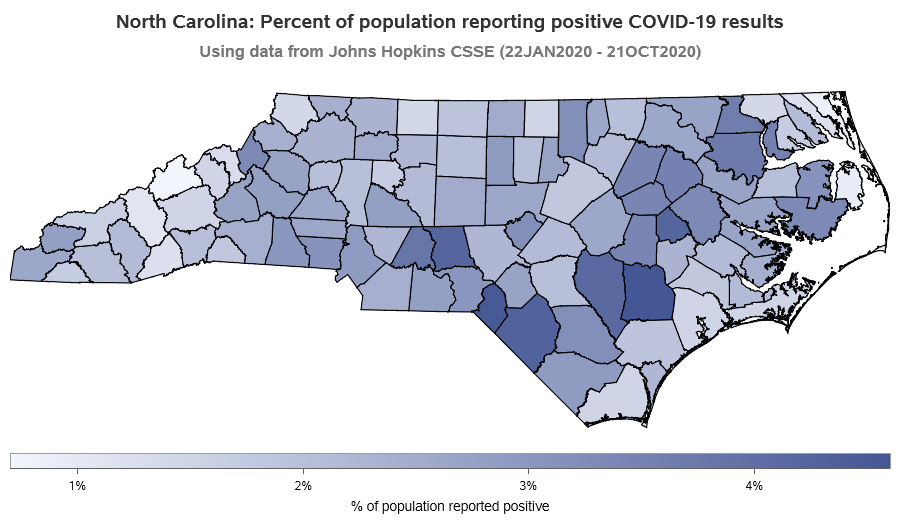
Default Map
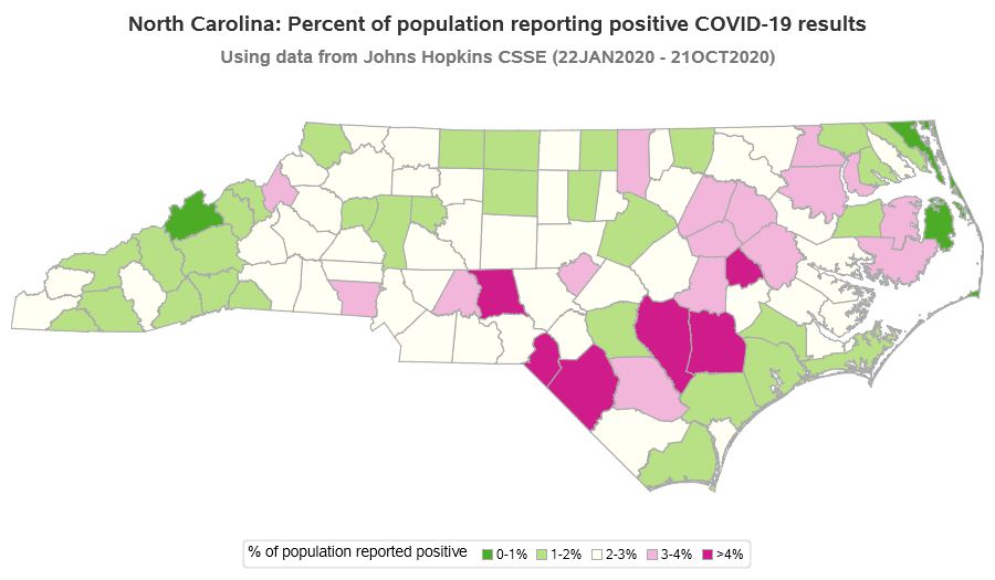
The default map is a pretty good representation of the data ... but my brain and eyes always have difficulty distinguishing the colors in a continuous/gradient color ramp. Rather than using a continuous color legend, I decided to create the map with 6 discrete colors (using the following SGmap options "numlevels=5 leveltype=interval").

Custom Color Ranges
Having fewer shades of color in the map helped me wrap my brain around it a little better ... but the ranges of values picked for each shade are a bit arbitrary. Therefore I decided to take control and assign each value to a range of my choosing. I used a data step to assign the values to my 5 legend/color bins, and a user-defined format to make the legend show the desired text for each bin.
proc format;
value bkt_fmt
1='0-1%'
2='1-2%'
3='2-3%'
4='3-4%'
5='>4%'
;
run;
data latest_reported_data; set latest_reported_data;
label legend_bucket='% of population reported positive';
format legend_bucket bkt_fmt.;
if percent_reported_positive<=.01 then legend_bucket=1;
else if percent_reported_positive<=.02 then legend_bucket=2;
else if percent_reported_positive<=.03 then legend_bucket=3;
else if percent_reported_positive<=.04 then legend_bucket=4;
else legend_bucket=5;
run;
proc sgmap mapdata=nc_map maprespdata=latest_reported_data;
styleattrs datacolors=(cx4dac26 cxb8e186 cxfffff3 cxf1b6da cxd01c8b);
choromap legend_bucket / discrete mapid=county;
run;
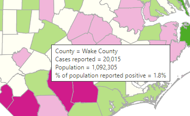
Although you can't see it in the png image above, the interactive version of the map has an HTML overlay that shows the data values for each of the counties, such as:
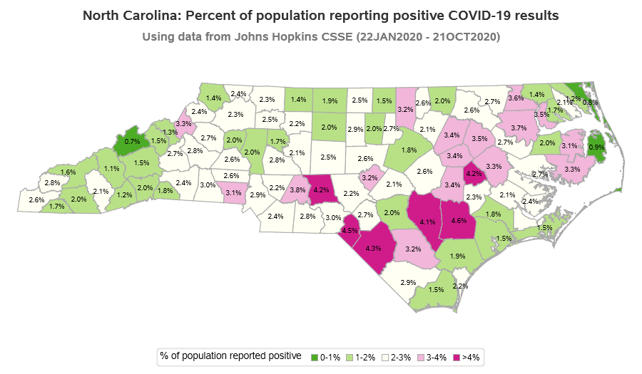
Adding Labels
But what if you do want to see the data values in the png image? Well, since North Carolina's map has 100 counties, there's not all that much room for text labels. But we can probably squeeze one simple text value onto each county. I use the %centroid macro to estimate the center x/y coordinate of each county, and then merge in the text values I want to display (in this case that's the % values), and then use GMap's text statement to overlay those values:
%centroid(nc_map,overlay_text,county,segonly=1);
proc sql noprint;
create table overlay_text as
select unique overlay_text.*, latest_reported_data.percent_reported_positive format=percent7.1
from overlay_text left join latest_reported_data
on overlay_text.county=latest_reported_data.county;
quit; run;
proc sgmap mapdata=nc_map maprespdata=latest_reported_data plotdata=overlay_text;
styleattrs datacolors=(cx4dac26 cxb8e186 cxfffff3 cxf1b6da cxd01c8b);
choromap legend_bucket / discrete mapid=county;
text x=x y=y text=percent_reported_positive / textattrs=(color=black) tip=none;
run;
Here is a link to the full SAS code, if you'd like to download it and perhaps try modifying it to plot your area's COVID-19 data. Note that you'll need the very recently-released SAS version 9.4 maintenance 7 for some of the newer functionality I'm using. And here's a link to the interactive version of the map, if you'd like to try out the mouse-over text.
Note: the number of actual cases is probably (almost certainly) higher than the number of reported cases. But the data I have access to is the reported cases, therefore that's what I plot.


4 Comments
This represents much better than the gradient colors! I'm happy that I'm in a green county 🙂
The date range of January 22 to October 21 is getting quite long for this data. It doesn't tell me if I can safely go out to eat this weekend. I wonder what the data looks like for the 10 to 14-day duration when people are supposed to be contagious.
Keep up the good work Robert!
I guess it would be nice to have 2 versions of the map - the total data, and then the past 2 weeks of data to see what's currently going on.
Hi - great piece.
Can you share code for interactive version? I'm trying to get the tooltips to show...
Thank yoU!
jIM
https://sascommunities.github.io/graphics-programming/robert/nc_county_covid_percent.sas