Now that we are many months into the COVID-19 pandemic, we can start to reexamine the data and look for trends. This time, I want to explore how COVID-19 has been spreading around the US. I do this by animating a county map over time.
What is animation?
Are you old enough to have watched an old-school film when you were in school, before they went digital? They had big reels of film, with thousands of images (each image slightly different from the previous one) ... and when the images went through the projector just right, you got to see a moving picture on the screen. Here's one of these old-school 1970s projectors that my old college buddy Alex just happened to have in his lab (if you knew Alex, you would not be surprised that he would have something like this!)

The concept of an animated GIF is similar to those old-school projectors, but it's all done using computer software. In my case, I generate a sequence of choropleth maps at various points in time, and then create an animated GIF to display them one after the other in a web browser (similar to what the projector does).
Data preparation
First I downloaded the csv containing the data for each county, which Johns Hopkins graciously maintains in Github. I import the data into SAS, and then calculate the difference between the daily cumulative totals to get the number of new daily cases. The days around the weekends seem to have lower values (not as much testing, or not as much processing of tests during the weekends?), therefore I calculate the 7-day moving average to smooth it out a bit.
Map legend binning
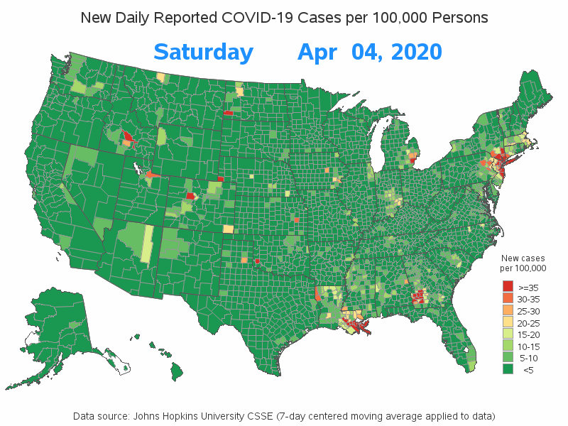
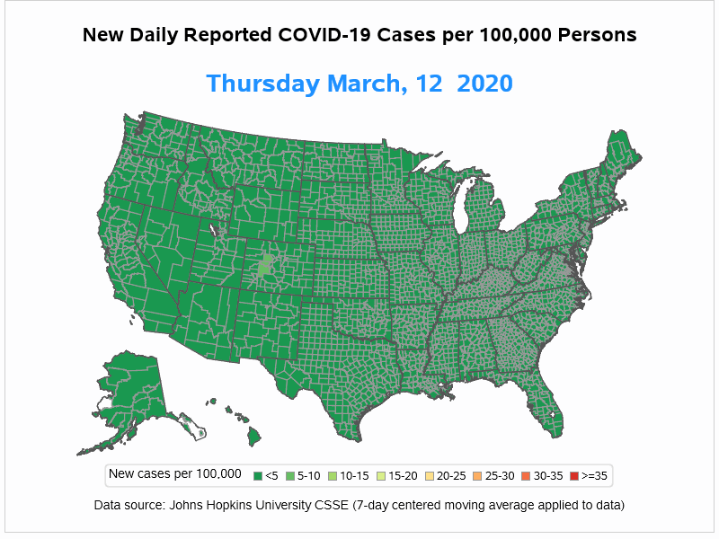
For this animation illusion to work, each of the maps must use the same legend ranges and colors. Therefore, rather than using the easy way of binning the data (just telling the map to divide the values into 'n' levels), I calculate my own bins (1-8) in a data step based on ranges of data that I chose, and force the map to show all 8 levels in the color legend (whether that particular date had data values in all 8 levels or not). Then I applied a user-defined-format to the 1-8 values in the legend, to make them show up as the actual ranges of values.
Animating the COVID-19 data
There are a few different ways to create animations in SAS, but I generally prefer the old traditional standard - animated GIFs. Whereas other techniques might require certain versions of certain software to view their results, animated GIFs are pretty much universal, and can be viewed in any web browser. The biggest drawback of an animated GIF is that you cannot pause, view one frame at a time, or change the speed while you're watching it - it just plays straight through.
In SAS, you set the following options, and then run your code to generate the maps (or graphs) for the dates you want to include in the animated GIF:
options dev=sasprtc printerpath=gif animduration=1.20 animloop=0
animoverlay=no animate=start;
Results
I decided to create two versions of my results - one using both Proc Gmap (which is part of SAS/Graph), and another using Proc SGmap (which is included in Base SAS). With Gmap, I used 'by date' to generate the maps. SGmap doesn't support by-processing yet, therefore I looped through the desired dates in a data step, and called a macro to generate the map for each date. Here's a link to the Gmap code, and the SGmap code.
The full animation of daily data produces a somewhat large GIF file, and takes a bit of patience to watch. Therefore I tweaked my code to use a weekly snapshot (instead of the daily maps) - this produces an animation I think is "just about right" for showing detail, and also holding my short attention span.
The weekly animation is about 3MB, which is unfortunately larger than the maximum size WordPress blogs allow. Therefore I'm including shortened animated GIFs below (using monthly snapshots instead of weekly snapshots). I encourage you to click these links to the Gmap animation and SGmap animation to see the more detailed weekly versions (the weekly animations really do produce much better insight into the data than the monthly ones - it's worth clicking!).
Shortened (monthly) Gmap animation:
Shortened (monthly) SGmap animation:
Discussion
Did these maps give you better insight into the data? Did you see any "hot spots" with high covid-19 rates that you hadn't noticed before? What are your theories about how the virus has spread geographically around the country?