If someone proposes a bet to you, then you should be suspicious that they already know they're going to win. And one frequent topic of such bets is the weather... What if I bet you there's a city in Canada with a warmer average January temperature than Raleigh, NC? You might think you're poised to make some easy money, eh? Well, be warned - watch out for old guys, and their weather bets!
This interesting bit of weather trivia was actually mentioned by someone who read my previous blog post about parts of Canada being farther south than parts of the US. Brian Rupert pointed out in the comments that Canada's mildest city (Victoria) typically experiences warmer winters than Raleigh, NC (the area I live in). With an open mind, I knew this might be possible - but of course I wanted to see the data for myself!
The Data
I did a web search, and found that I could see the monthly average temperature data for Raleigh & Victoria on the climate-data.org website. I copy-n-pasted the data to a text file, so I could easily read it into my SAS job.
Their Graph
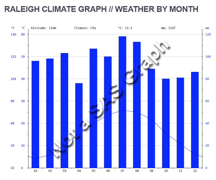
In addition to the data, their website also provided graphs. Below is their graph for the monthly average temperature in Raleigh. But their graph is a bit crowded/cluttered for the question I wanted to answer. In addition to the temperature line graph, they also overlaid a bar chart showing the rainfall. Having all the extra information in the graph made it harder to see the information I was interested in. Also, using their website, I would need to look at two separate graphs to compare Raleigh and Victoria.
My Preliminary Graph
I used the following minimal code to get a basic graph of the temperature data for the two cities, plotted together so you can easily compare them. And if you look very closely, you can see that the blue line (Victoria) is slightly above the red line (Raleigh) for the month of January.
proc sgplot data=my_data;
styleattrs datacontrastcolors=(red cx1C86EE);
series x=month y=avg_temperature_f / group=city smoothconnect lineattrs=(thickness=5);
xaxis values=(1 to 12 by 1);
run;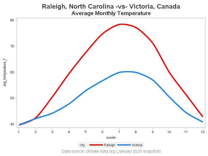
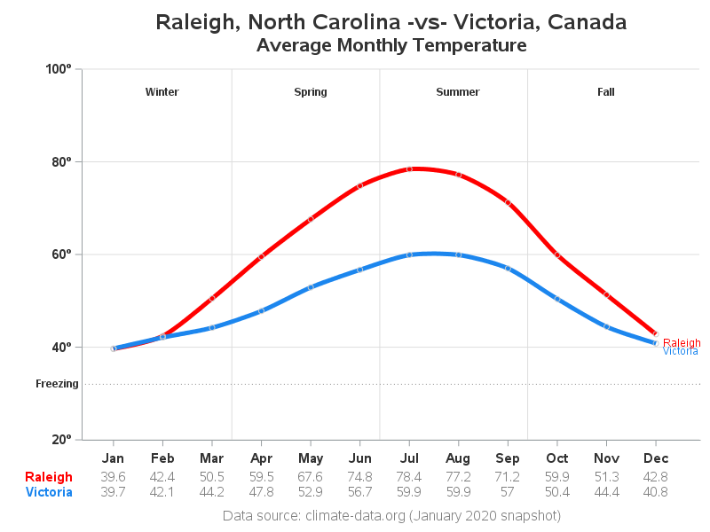
My Final Graph
If you've read my previous blog posts, you already know that I'm not one to leave a simple graph alone. I like to add customizations that help make the data easier to understand, and the questions being asked about the data easier to answer. Therefore I added a few customizations:
- I added the 'degrees' symbol to the numeric values along the y-axis, so it's more obvious that they are temperature values.
- I created a user-defined-format to show the numeric month values (1-12) along the x-axis as the text words (Jan-Dec).
- I added very light/subtle markers along the lines, so you can tell where the actual monthly values are (as opposed to the interpolated sections of the line).
- I added some reference lines, to help put the data into context.
- Rather than using a color legend, I place a label at the end of each line.
- And I add a table of the data values below the x-axis, so you can see the actual data values (this gives you an easy way to see that Raleigh's value is indeed lower than Victoria's value for January).
Discussion
Were you surprised by this data? What are some factors that keep Victoria so 'warm' in the winter? Feel free to discuss in the comments!
And if you'd like to see the full SAS code used for the final graph, click here.


13 Comments
The display of data values beneath the x-axis confirms that "Raleigh's value is indeed LOWER than Victoria's value for January".
Towards ends of December I was in Edmonton, Alberta Canada for work. Given their 0 humidity, 0 wind and 0 moisture, their 4 degrees felt like the 40 degrees I'm use to northeast U.S. I could have worn lighter clothing ironically! I guess it's like a "dry cold" like Arizona's "dry heat" 🙂
Interesting! - I'd never thought about that.
Dry cold is somewhat a misnomer. At about the freezing point humidity can make it feel cooler. But say at -20C the relative humidity is 100% because the air cannot hold moisture. Growing up in Alberta the major difference when its that cold is it is usually quite sunny. I now live in southern Ontario and I would say more often or not when it does get that cold (which fortunately it does not often) it is generally overcast so it feels colder.
Awesome as always!
Hi Robert. First usually we talk about winter as December, January and February. Show the graph should probably be centered differently.
For the data I guess that Raleigh is a bit like the central US (i used to live in Oklahoma) where the temperature seldom is at at the normal avearge temperature. Where I lived in Oklahoma the average was 35 F I think, but it was either 20 or 55-60 F.
Ontario being on the coast will have a more stable temperature. I live in Stavanger, Norway far North of Raleigh and Ontario. Here the normal temperature is 35 F in December, 34 in January and 33 in February. Current years have been much warmer as the normal is 1960-1990 ( the 1970's was an unusally cold period). As for all of western Europe the winter temperatures are warm because of the Atlantic Gulf stream. If you did a winter comparison with e.g. London also far north of Raleigh I think you would be suprised. .
Interesting information!
Hmm ... I guess I could add an extra y-axis along the right-hand side, or annotate the numbers to the left of the fahrenheit numbers. The "graphical/visual difficulty" is that I want to have gridlines on the graph, but the same gridlines don't come up at nice 'round' numbers in fahrenheit and celsius.
Oh - and per the marking the seasons ... Now that you mention it, I guess I've got a bit of a 'disconnect' in my graph, since I'm visually plotting my monthly average temperature data points at the 'beginning' of the month, and then plotting the seasons proportionally in the month (for example, spring 2020 starts on March 19). To make it a bit more visually correct, perhaps I should plot the monthly averages in the middle of the month, and then center my month label in the middle of the month (rather than at the beginning/end). I'll give it some thought!
A more comparative graph for places like Raleigh or I guess most of inland USA with coastal climates would be to plot the average, min and max for each day for e.g. 30 years and compare these two graphs. There is more work to get the data and need some thinking in making the comparison.
https://www.yr.no/en/statistics/graph/1-15452/Norway/Rogaland/Sandnes/Sandnes Shows the concept for one year. These pages have in my mind some of the best non-SAS graphs for weather.
How would you make your graph more understandable outside the USA by adding a Celsius scale?
Would using an index in the first data step (my_data) be useful?
Could you describe a little more about using an index?