Get the right information, with visual impact, to the people who need it
Use PROC SGPLOT to embed a graph inside another graph

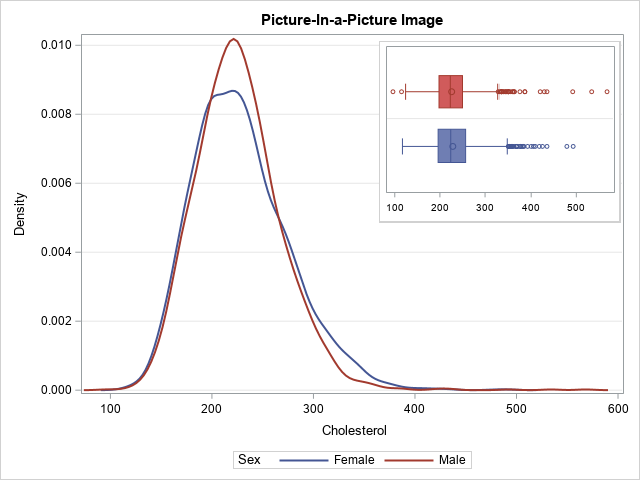
Did you know that you can embed one graph inside another by using PROC SGPLOT in SAS? A typical example is shown to the right. The large graph shows kernel density estimates for the distribution of the Cholesterol variable among male and female patients in a heart study. The small