The previous post on Multiple Blank Categories showed how to include multiple blank categories on the axis. But, given the purpose for this was to separate different segments in the data, I also included ideas on how to segmented a discrete axis using reference lines or Block Plot. A similar idea was discussed way back in 2012 on Time series with regimes, where different time periods were identified using a block plot.
In this article I want to address a similar idea, but in a different way. Recently, a user asked on the Communities site on how to create a bar chart with custom tick values. To me, the data she shown in the question looks like categories that include subgroup headings and values, like a table. But I assume she wants a graph of the data with the custom tick values. This looks much like what we did earlier with the Subgrouped Forest Plot. So, I made up a data set and built the following.
 Starting from the sashelp.cars data set, I extracted all car makes by origin, and computed the low, high and mean MSRP using the MEANS procedure.
Then, I processed the data a bit more, to put the Origin value as the first entry for each block in the "Make" column, and computed some additional columns that will be used later.
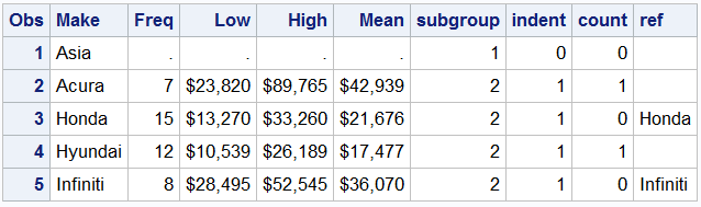 Now, the origin value is in the same column as "Make". This could be a problem, but not in this case. When used in SGPLOT, it will be treated like just another category value. However, it has missing response values, so there will not be any information in the data area, only the axis tick value.
The final graph is shown below. It shows the mean, low and high MSRP values by make. Gives you a general idea of the price range by make segmented by Origin. Porsche values are generally higher, vs Kia. Of course, you may have different data and / or visuals.
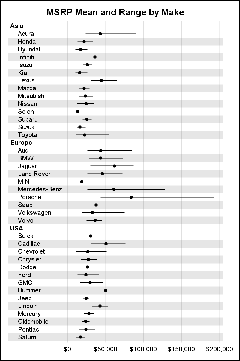
In the graph above, the actual y-axis of the graph is completely hidden. What appears like the y-axis is a yAxisTable. The yAxisTable has the option to indent the subgroup values, keeping the subgroup headers without indentation. Indentation is optional. Also, we have used the TEXTGROUP option and DATTRMAP to make the subgroup headers bold. Alternate reference lines are used to help line up the data with the axis.
title h=10pt 'MSRP Mean and Range by Make'; proc sgplot data=cars4 noborder dattrmap=attrmap; refline ref / discretethickness=1 transparency=0.8; scatter y=make x=mean / xerrorlower=low xerrorupper=high noerrorcaps; yaxistable make / position=left location=inside textgroup=subgroup textgroupid=text indentweight=indentl; yaxis display=none reverse fitpolicy=none colorbands=odd colorbandsattrs=(transparency=1); xaxis display=(nolabel noticks noline) grid valueattrs=(size=7); run; |
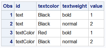 The attribute map data set is shown on the right.
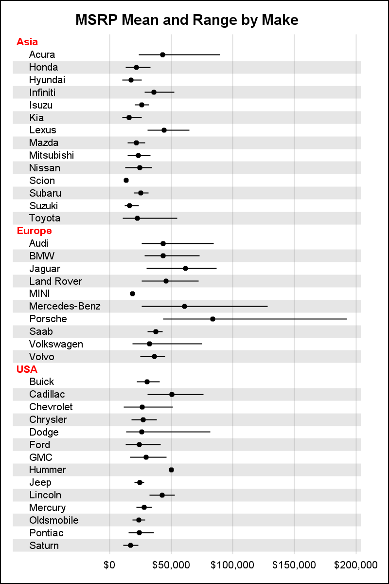
Note the use of TEXTGROUP and TEXTGROUPID on the yAxisTable. These are used to control the font attributes for the subgroup headers (value=1) and subgroup values (value-2). We can set font size, weight, color, style and family. The second graph below has subgroup headers in red using the "textColor" id.
Note: In this graph, the subgroup header and values are in the same column "Type". Since I don't want to a color band for the header, I cannot simply use the COLORBANDS option to get the banding correctly. So, I have to use the REFLINE statement with the "Ref" column computed correctly to draw the bands with the new DISCRETETHICKNESS option.
In the process of making this graph, we discovered that the font size settings in the attribute map are not getting applied to the group. We will address that issue in the next release.
Full SGPLOT program: Segmented


1 Comment
I am not very experienced, and I am having a difficult time recreating this chart. Specifically, I cannot make the grouping value (e.g., Asia) to appear. Also, I am getting an error with 'indent'. Can you provide the code to create attrmap, as well as subgroup and indent?
Thanks!