Get the right information, with visual impact, to the people who need it
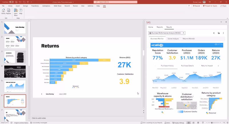
Using PowerPoint with SAS for Microsoft 365 as a Sales Storyteller

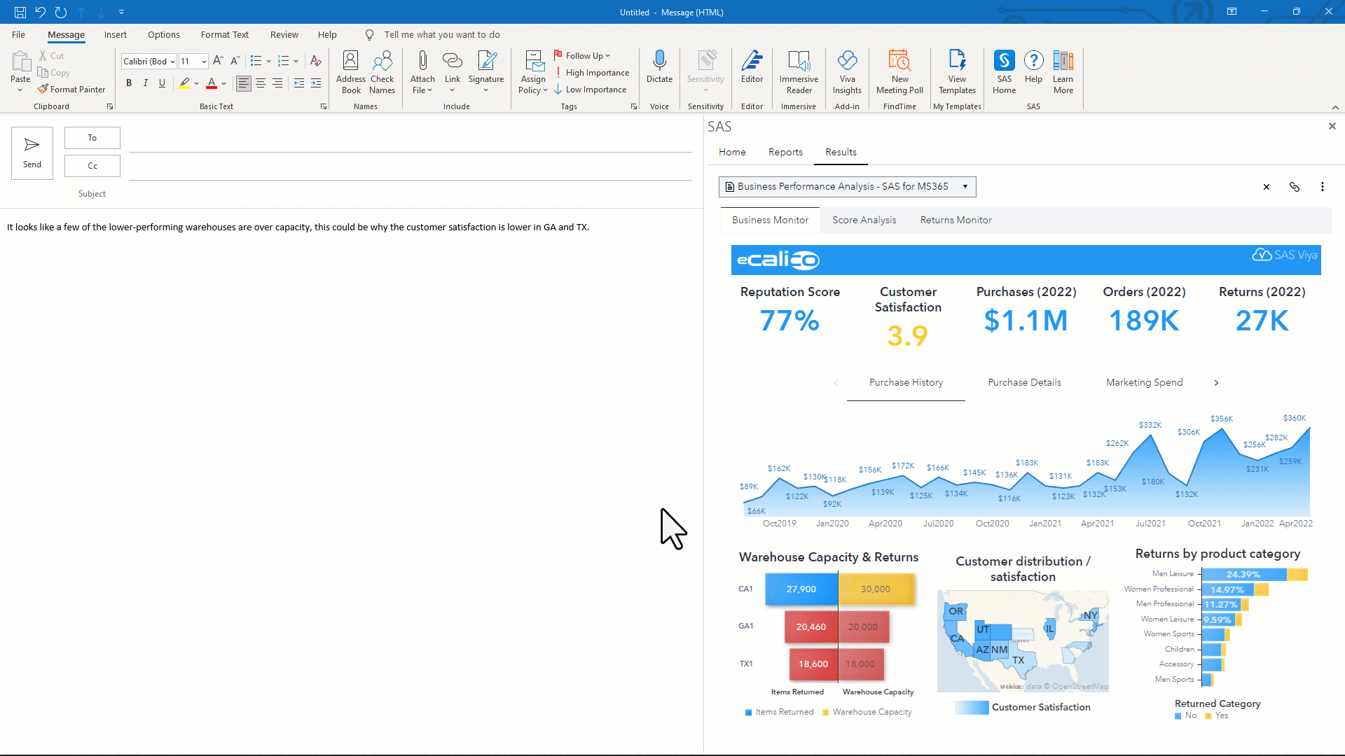
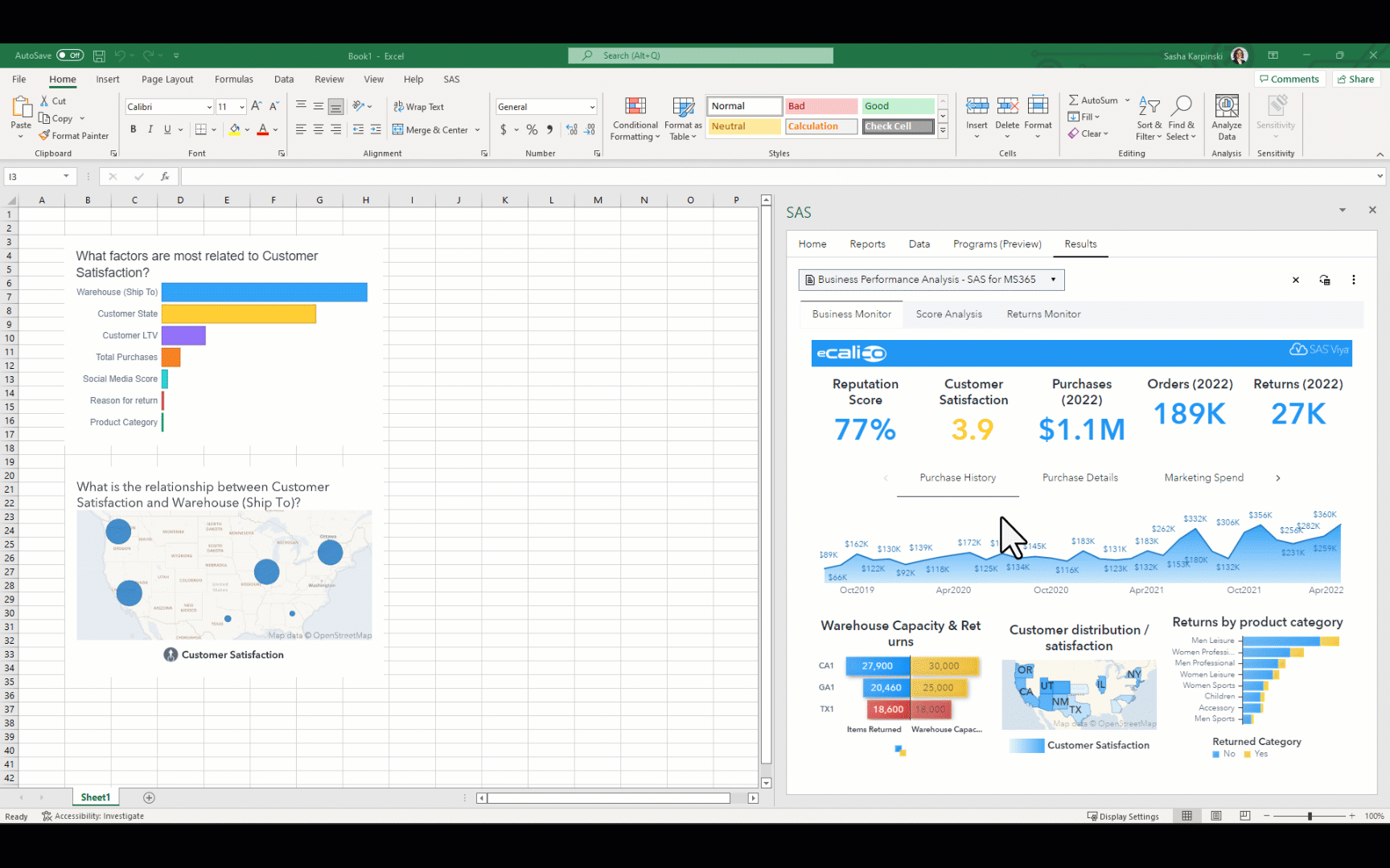
From within PowerPoint, you can use the SAS menu available through SAS for Microsoft 365, to access SAS Visual Analytics reports' graphical visuals.