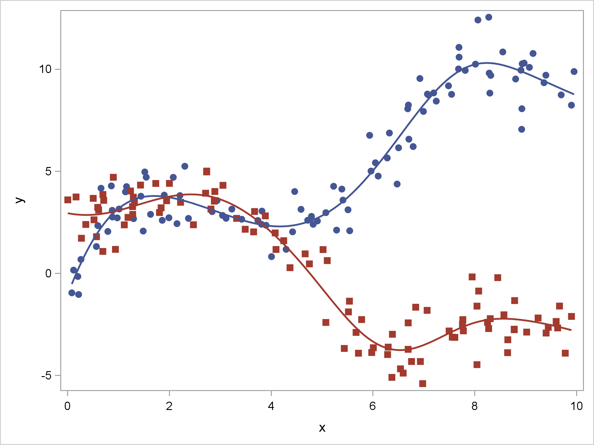
Consider the penalized B-spline fit functions for an artificial data set that has two groups. Both functions have sections that increase and others that decrease. In the case of the first group (the blue circles), the function mostly increases. In the case of the second group (the red squares), the function mostly decreases.
ods graphics on / attrpriority=none; proc sgplot data=x noautolegend; styleattrs datalinepatterns=(solid) datasymbols=(circlefilled squarefilled); pbspline y=y x=x / group=g; run; |
For some analyses, you might not believe that a fit function should both increase and decrease. In other words, you might want to show a fit function that is weakly monotonic. ODS Graphics has no mechanism that enables you to specify that a generally increasing function must never decrease or a generally decreasing function must never increase. However, you can specify this by using PROC TRANSREG and the MSPLINE transformation. PROC TRANSREG makes a fit plot automatically when ODS Graphics is enabled, or you can output its results and use PROC SGPLOT. Here, I illustrate the latter so that I can easily control the attributes of the series and scatter plots.
The following steps use PROC TRANSREG to create an output data set that has the original X and Y variables, the group variable, G, and one additional variable, Py, which has the predicted values for Y. The model interacts the group variable and the X variable and constrains the transformation of X within both groups to be (at least weakly) monotonically increasing. Predicted values either increase or decrease as a function of X depending on the nature of the relationship. These data were deliberately generated to show both. The function is flat (weakly increasing) in areas that otherwise trend in the wrong direction.
proc transreg data=x noprint; model identity(y) = mspline(x / nknots=9) | class(g / zero=none) / maxiter=100; output out=msp(keep=y x py g) p; run; proc sort data=msp; by g x; run; proc sgplot data=msp noautolegend; styleattrs datalinepatterns=(solid) datasymbols=(circlefilled squarefilled); scatter y=y x=x / group=g; series y=py x=x / group=g lineattrs=(thickness=2); run; |
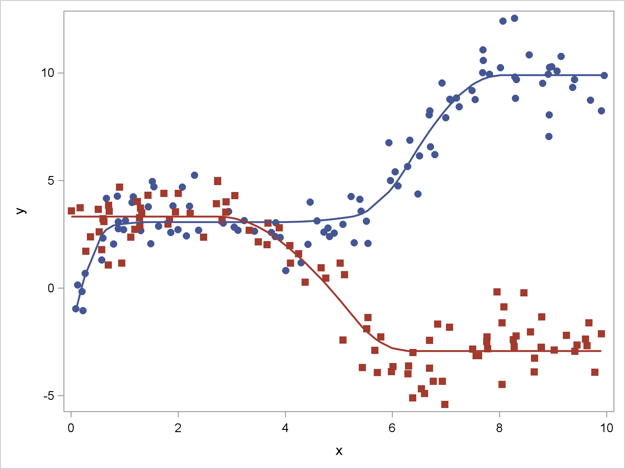
Just as penalized B-splines smooth away irregularities in the fit function that could be displayed, monotone splines smooth away nonmonotonicities to create a smoother fit function. The resulting fit functions are smooth quadratic splines.
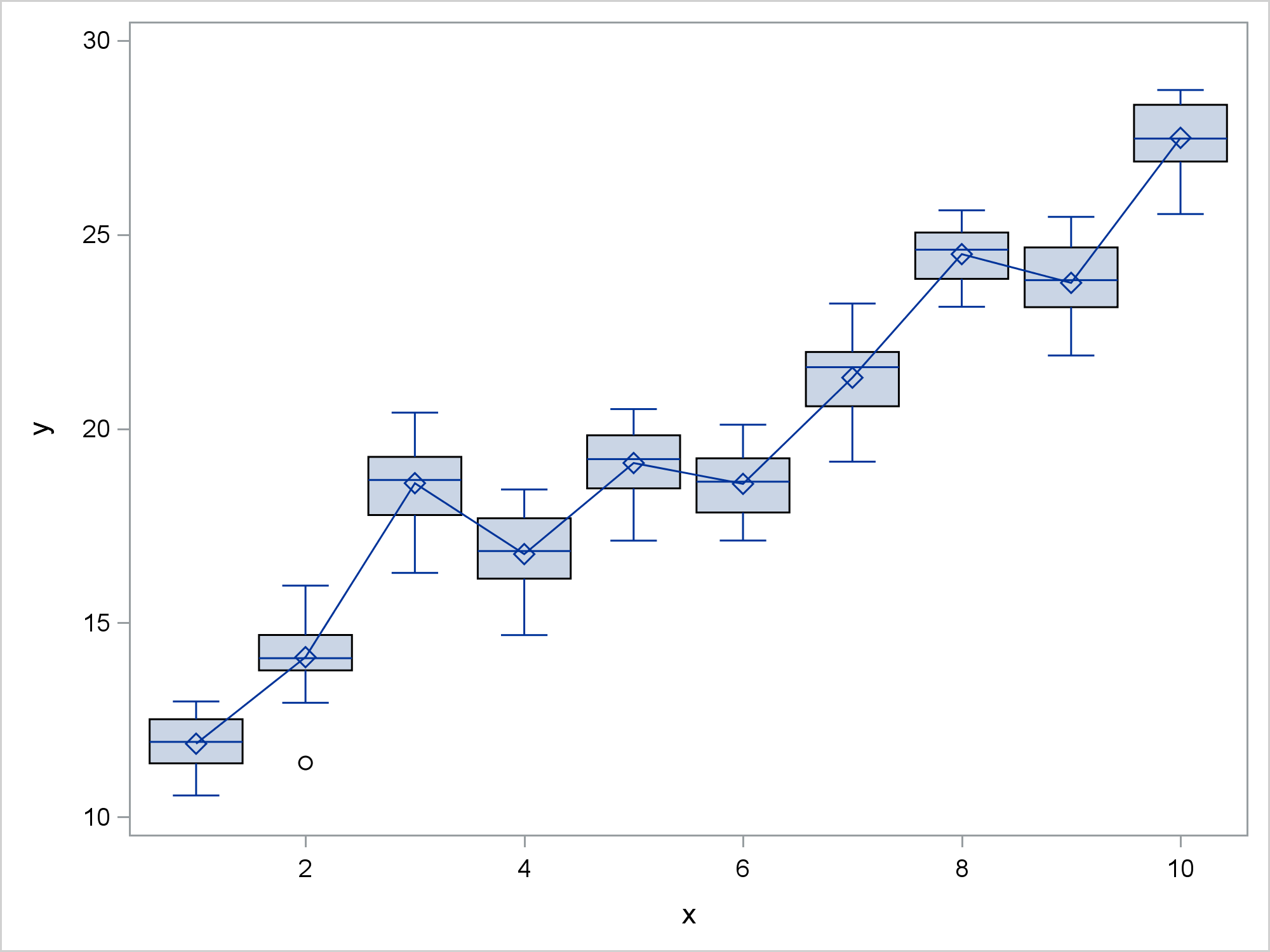
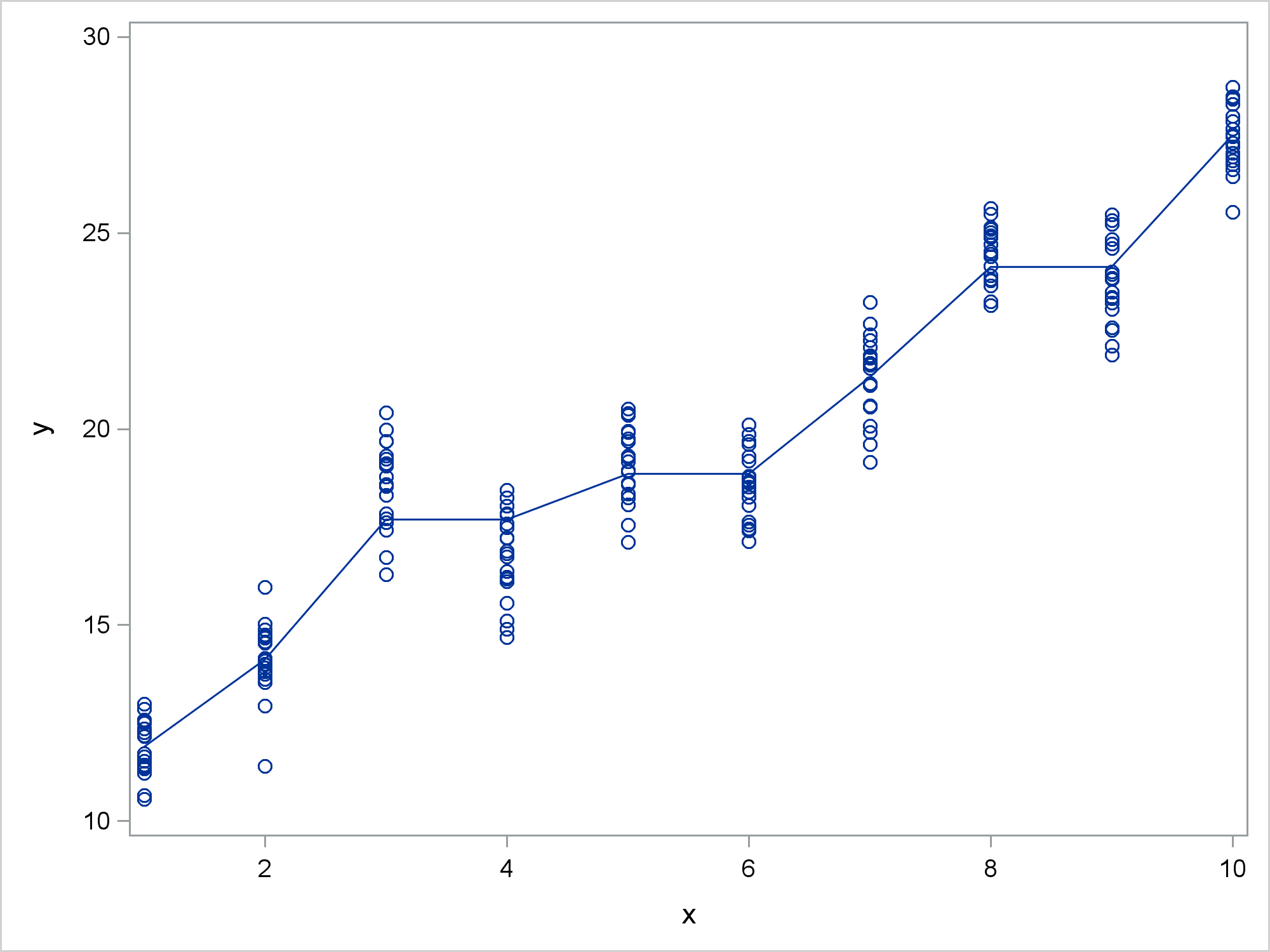
Now consider some more artificially generated data and a box plot for each of 10 groups. In addition to the box plot, the following steps add a series plot that connects the means for each group:
proc means data=b noprint; var y; class x; output out=means(where=(_stat_='MEAN' and n(x))); run; data box; merge b means(rename=(y=ymeans x=xmeans) keep=x y); run; proc sgplot data=box noautolegend; vbox y / category=x; series y=ymeans x=xmeans; xaxis type=linear display=all; run; |
Perhaps you believe that these means should be at least weakly increasing. That is, rather than displaying the results of an ANOVA model, you might want to display the results of a constrained ANOVA model. The following steps use PROC TRANSREG and the MONOTONE transformation to find a monotonically increasing transformation of the category means and PROC SGPLOT to display the results:
proc transreg data=b noprint; model identity(y) = monotone(x) / maxiter=100; output out=msp2(keep=y x py) p; run; proc sort data=msp2(drop=y) out=msp2(rename=(py=ymeans x=xmeans)); by x; run; data msp2; set msp2; by xmeans; if first.xmeans; run; data box2; merge b msp2; run; proc sgplot data=box2 noautolegend; vbox y / category=x; series y=ymeans x=xmeans; xaxis type=linear display=all; run; |
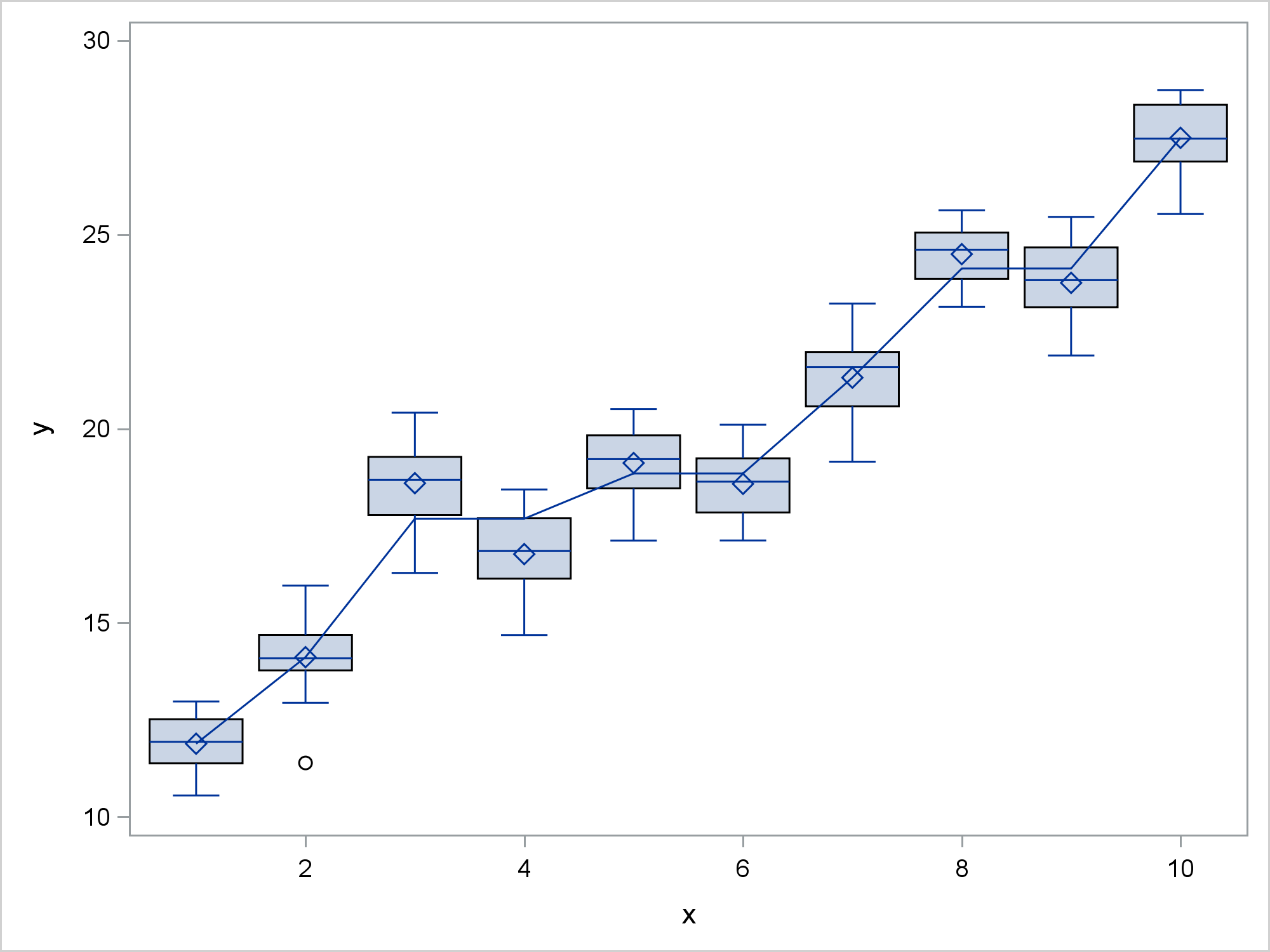
The MONOTONE transformation initially tries to score the values of X by replacing them by the Y category means. When it finds that means are out of order, it replace groups of means by their weighted averages until monotonicity is imposed. The PROC TRANSREG results are then sorted and merged with the original data. The scored values are smoother than the means because of the monotonicity constraint.
Alternatively, you can display the results using a scatter plot instead of a box plot.
proc sgplot data=box2 noautolegend; scatter y=y x=x; series y=ymeans x=xmeans; xaxis type=linear display=all; run; |
In both the spline and the box plot example, the results are obtained by iterating. Hence monotonicity constraints are not available through the EFFECT statement, which provides splines to many modeling procedures. You can also use PROC TRANSREG to output the smoothing splines that are available in PROC GPLOT by using the SMOOTH transformation and the SM= option. For more information about PROC TRANSREG, see the PROC TRANSREG documentation.
PROC SGPLOT is incredibly powerful, but it is not designed to be a fully-functional statistical modeling procedure. However, you can always run a statistical procedure and output the results to a data set and then display the results by using PROC SGPLOT. Of course in many instances you can instead rely on the graphs that statistical procedures automatically produce.


