This is the 7th installment of the Getting Started series. The audience is the user who is new to the SG Procedures. Experienced users may also find some useful nuggets of information here.
Starting with SAS 9.3 which was released 6 years ago, the SGPLOT procedure supports many new plot types including the HIGHLOW plot. This plot is commonly used for many graphs, and was specifically inspired for creating many clinical graphs as we have seen in previous articles such as custom box plot using the HighLow plot.. But, there is more to this plot than meets the eye and we will describe the features of this plot in two installments.
The HIGHLOW plot has four different flavors:
- Display vertical line segments (low to high) for individual x-values.
- Display vertical bar segments (low to high) for individual x-values.
- Display horizontal line segments (low to high) for individual y-values.
- Display horizontal bar segments (low to high) for individual y-values.
In this article, we will describe the first 2 flavors, the vertical HighLow line or bar. The basic syntax for this case is:
highlow x=<column> low=<num-column> high=<num-column> / type=line | bar;
The simplest use case is shown below to display a line segment representing the high and low values of the Amazon stock by day. Here is a part of the data set, the graph and the code needed to create it.
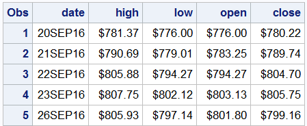
In this case, I downloaded the recent historical stock data from the NASDAQ web site using this link as a CSV file: http://www.nasdaq.com/symbol/amzn/historical. Then, I used PROC IMPORT to read this character data into a SAS data set, converting the character values into SAS date and numeric values.
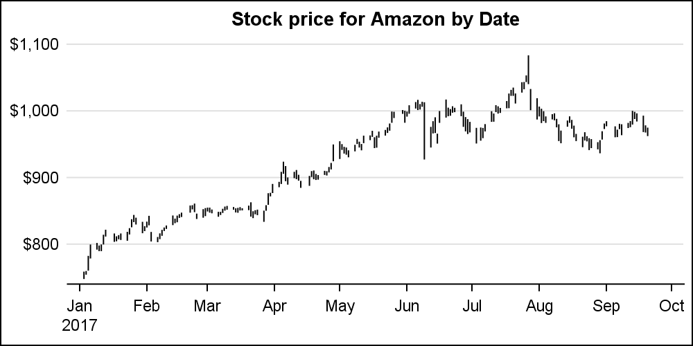
title 'Stock price for Amazon by Date'; proc sgplot data=amzn_2(where=(date > '01Apr2017'd)) noborder; highlow x=date low=low high=high / open=open close=close; yaxis display=(noline noticks nolabel) grid; xaxis display=(nolabel); run; |
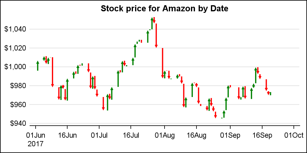
The HighLow plot statement also supports data options to display the "Open" and "Close" values as horizontal tick marks on the vertical bar as shown below. For clarity, I have reduced the data to span about 5 months. The data shown above already contains the columns for "Open" and "Close" values by date.
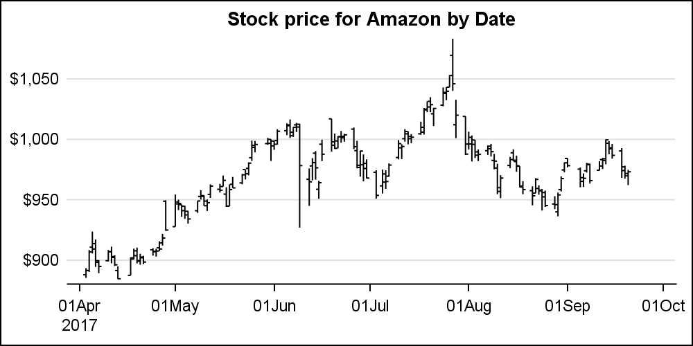
In the two graphs above, the display type is LINE. This is the default for the TYPE option, and hence does not need to be specified. Note, the x-axis in these graphs is of type TIME, and has the SAS format of Date7. The SGPLOT procedure automatically displays a time axis, where the "Year" value is displayed only when necessary. This keeps the x-axis from getting cluttered by repeating the year with each tick value.
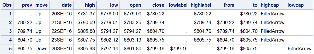
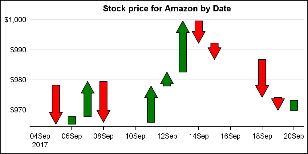
Another useful feature of the HighLow plot is the ability to display arrow heads at one or both ends of the line segment. In the example below, we have added some columns to the data to include caps and labels at each end. If the current close value > previous, then the "Move" variable is set to "Up", indicating the value was up from previous close. Else it is down. Also, the HighCap or LowCap variable has the value "FilledArrow". This data set is shown below. Note the new columns for LowLabel, HighLabel, LowCap, HighCap.
title 'Stock price for Amazon by Date'; proc sgplot data=amzn_2(where=(date > '01Jun2017'd)) noborder noautolegend; styleattrs datacontrastcolors=(green red); highlow x=date low=from high=to/ lowcap=lowcap highcap=highcap group=move lineattrs=(thickness=2); yaxis display=(noline noticks nolabel) grid; xaxis display=(nolabel); run; |
Note, in the graph above, we want to draw the line from "Open" to "Close". Tthe HighLow plot assumes the value of the variable assigned to LOW role is less then HIGH. If this is not so, the line is not drawn. In this case, "Open" value may be higher or lower than "Close", so to ensure a line is drawn, we compute two new variables "From" and "To", and ensure "From" is always the smaller of the two values. This ensures the line is always drawn. Now, we can use GROUP=Move, so we can get the two colored lines.
Note, the use the STYLEATTRS statement to set the group colors to "Green" and "Red". This works only if we know the first group value will be "Up". To be safe, it may be better to use a Discrete Attributes Map to ensure the right attribute mapping by value.
Now, let us take a look a the TYPE=BAR flavor of the vertical Highlow plot. We will use the same data set, but reduce the data further in this case.
The only difference for this graph is the use of TYPE=BAR in the HIGHLOW plot statement:
highlow x=date low=from high=to / type=bar lowcap=lowcap highcap=highcap group=move;
Now, we get filled arrows from "From" to "To". In this case, only the "Filled" type of arrowhead is supported. I have reduced the data to avoid cluttering up the graph, and have also changed the STYLEATTRS since in this data, Move is "Down" first.
Finally, we can also display labels at the low and high end of the segment. This can be done for both the LINE or BAR type plots by using the LOWLABEL and HIGHLABEL roles. Note we have also use the DATASKIN option to pretty up the bars. Labels are displayed at the low or high end appropriately by setting the variables when needed, and the other one as missing. Also note, arrowheads are not displayed when the length of the bar is not long enough to accommodate the arrowhead.
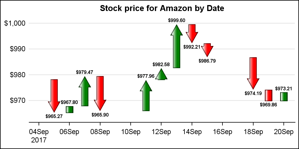
title 'Stock price for Amazon by Date'; proc sgplot data=amzn_2(where=(date > '01Sep2017'd)) noborder noautolegend; styleattrs datacolors=(red green) datacontrastcolors=(black); highlow x=date low=from high=to / type=bar lowcap=lowcap highcap=highcap group=move dataskin=gloss lowlabel=lowlabel highlabel=highlabel labelattrs=(weight=bold); yaxis display=(noline noticks nolabel) grid; xaxis display=(nolabel); run; |
Note: In these graphs, the x-axis is of type "Time" because the x-axis variable has a SAS date format. Due to this, there are gaps in the bars for days where there is no data such as Saturdays and Sundays or other Holidays. Often, Stocks Plots available at various web sites do not show such gaps. I will address how to get such output in an upcoming article.
I will discuss the horizontal version of the HIGHLOW plot in a subsequent article. This version is very useful to create many Clinical Graphs.
Full SGPLOT Code: HighLow_X

2 Comments
As usual, a very nice article, Sanjay. Though I have been working with the SG procedures for some years, I learn something here every time.
It seems that you have a problem with the plugin that you use to insert SAS code though? When you want to use a 'greater than' sigh (>) it shows >.?
It seems to be correct in the link you have provided with the full code though.
Yes, using special characters like or &, there can be collisions with the html or xml script.