SAS 9.4M5 has been released along with the 14.3 release of SAS/STAT. I am excited to announce that some SAS/STAT procedures have a new means and LS-means comparison plot.
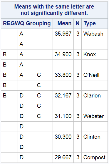
When ODS Graphics is disabled, PROC GLM (and other procedures) display the same means table that they have produced for years.
ods graphics off; proc glm; class Block Type; model StemLength = Block Type; means Type / waller regwq; ods select mclines; quit; |
When ODS Graphics is enabled, these procedures create a new graphical display.
ods graphics on; proc glm; class Block Type; model StemLength = Block Type; means Type / waller regwq; ods select linesplot; quit; ods html close; |
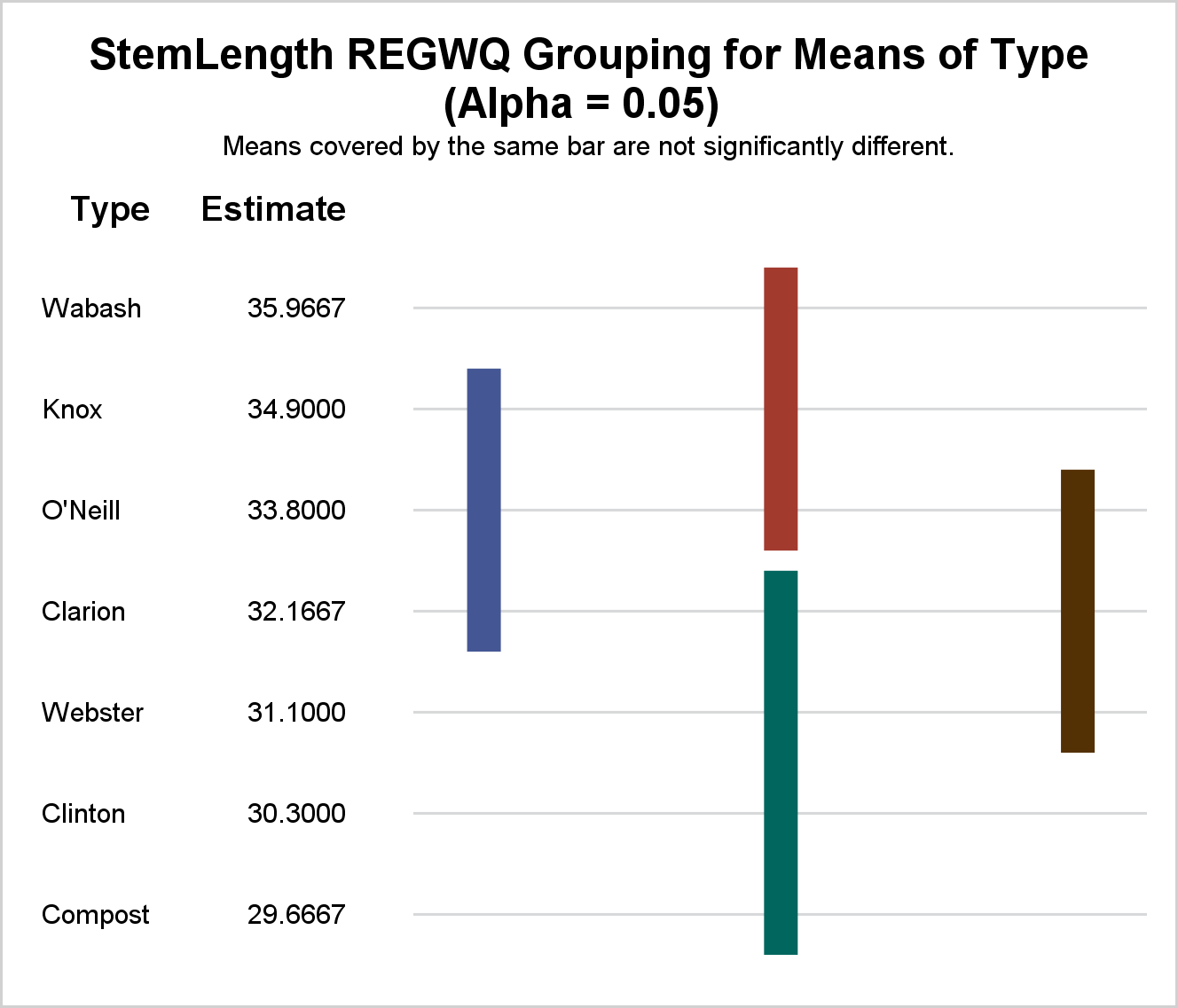
Both the graphical and tabular displays show the same information--a series of means are displayed, and means that are not significantly different are indicated by "lines." In the table, a line is represented by a vertical column of letters. In the graph, a vertical bar is used.
The following step displays the graph template:
proc template; source Stat.GLM.Graphics.MeanLinesPlot; quit; |
The template is not displayed here, but you can run this step if you want to see it. At the heart of the template, there is a series of AXISTABLE statements that display levels of the CLASS variable and the means. A HIGHLOWPLOT statement displays the lines. It has an X= option that controls the column for each line and a GROUP= variable. (The statements have clear patterns, and are generated by macros.) Most axis table examples that Sanjay and I show in Graphically Speaking display horizontal bars or lines. Here, the bars are vertical. See Getting started with SGPLOT - Part 7 - Vertical HighLow Plot for other examples of vertical HighLow plots.
Most graphs that are displayed by SAS procedures have a predictable size. Most are 640 pixels wide by 480 pixels high. Some are 640 by 640, 480 by 480, or some other size. Axis tables are different, particularly (as in this case) when the number of rows and columns depends on the data. The procedure determines a default size for each graph, and you can change it. The option PLOTS=LINESPLOT(WSCALE=wfactor HSCALE=hfactor) controls the size. Specifying HSCALE=2 makes the plot twice as high as it would be by default. Specifying WSCALE=2 makes the plot twice as wide as it would be by default. Scaling factors must be positive numbers. In the template, the width and height are controlled by the BEGINGRAPH statement options: DESIGNWIDTH=_WIDTH and DESIGNHEIGHT=_HEIGHT. A few other graphs in SAS/STAT, such as the inertia table in PROC CORRESP, the studentized residual chart in PROC REG, and the dendrogram in PROC CLUSTER also have options that control the graph size. The next lines plot really shows its colors when you have many means to compare. This plot depicts comparisons of total yield for an agricultural experiment on 60 different combinations of growing regimes. The plot makes it easy to see the sets of statistically indistinguishable regimes.
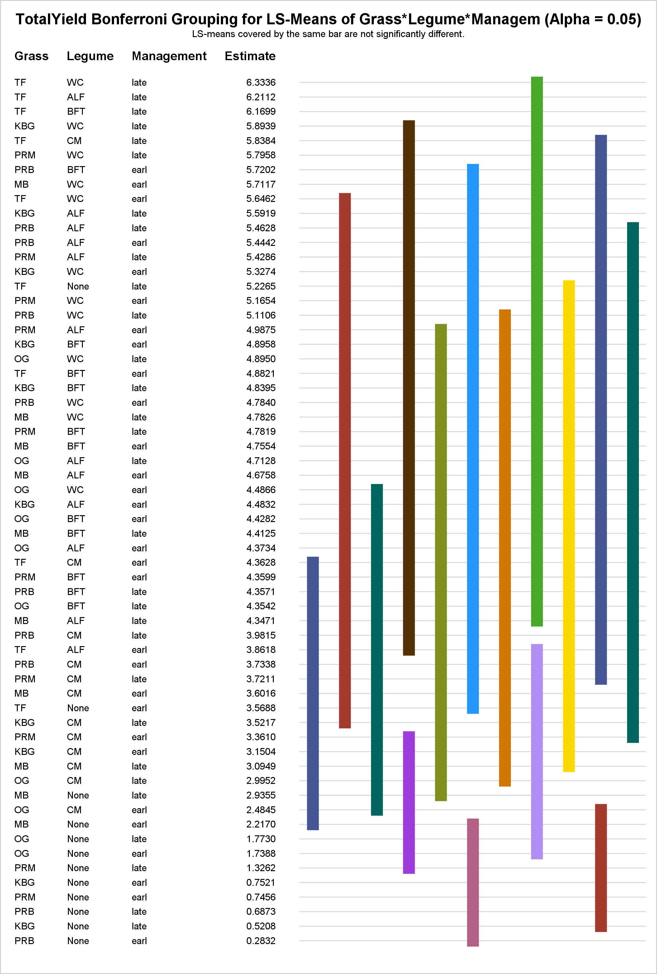
The lines plot is also available via the LSMEANS statement. This statement is available in the following procedures: GEE, GENMOD, GLIMMIX, GLM, LIFEREG, LOGISTIC, MIXED, ORTHOREG, PHREG, PLM, PROBIT, RELIABILITY, SURVEYLOGISTIC, SURVEYPHREG, and SURVEYREG. For more information on the lines plot, see Rick Wicklin's blog: Graphs for multiple comparisons of means: The lines plot.
The data set for the last lines plot was provided by Professor Richard Cutler from his experience at the Statistical Consulting Center at Utah State University and is used by kind permission of Professor Jennifer MacAdam of the College of Agriculture and Applied Sciences at Utah State University.


7 Comments
This is an unusual combination of a Y AxisTable and a vertical HighLow plot. Very creative It is nice to see such use cases.
Thanks for the kind words, Sanjay!
Interesting and useful. Thanks.
.
What controls the order of the bars across the graph? It would make more sense to me to start with bar A at top left and then B, etc. The result would be that the bars connecting the larger means would tend to be at top left. The current arrangement is baffling.
.
A graphical display has more space than a table as the bars can be made thinner and closer together than the letters. This would allow each bar to have its own column, which would be clearer. The practice of stacking bars which happen to fit into one column makes interpretation harder. I assume it was done to save space in the days of line printers. Please may we have an update?
Thanks for the feedback. The new lines plot provides a fairly literal conversion of the old table. We have not heard any negative comments about the table, so we did not contemplate changes from that basic layout. I have passed your feedback on to the developer. He said he would entertain the idea of a line order option.
Having just installed 14.3 I was eager to try this out in MIXED, but LINES does not appear to be an allowed option for LSMEANS. There seems to be some inconsistency about the way it has been implemented in the various procedures. LINES works OK for GLM where it produces the plots (when ODS GRAPHICS is on). In GLIMMIX, LINES produces the table but not the plots - even if ODS GRAPHICS is on. For MIXED, LINES is not permitted and so does nothing - literally, as it causes an error. Have I missed something?
Thanks for the comment, Peter. I asked my colleague Randy Tobias to reply.
For both MIXED and GLIMMIX, you can STORE the fit and then use the LSMEANS statement in PROC PLM to produce the plot from the restored fit---e.g.
In fact, the original analysis for these data involved PROC MIXED just in this way.
That's great. Thanks for the help. I was worried something had gone wrong with our installation.