SAS 9.4 maintenance release 5 was released on Sept 19, 2017. This release includes many new items including integration with SAS Viya and SAS Studio, a web application for SAS development. Also Included with this release are some cool new features in the graphics domain, some of which were requested by you directly.
In this and subsequent articles, we will discuss some of the cool new graphics features released with SG Procedures and GTL. Keep in mind, this is a maintenance release, so the features I speak of are incremental in nature. However, they help make it easier to create the graphs. In this article, I will discuss some new features relating to the display of the x-axis and baselines for bar charts.
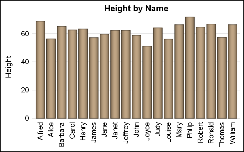
By default, x-axis tick values are displayed for each category value in the graph. When the graph has a large number of categories, the tick values are split or rotated to fit the space. Here is an example of a busy bar chart showing the default rotated tick values.
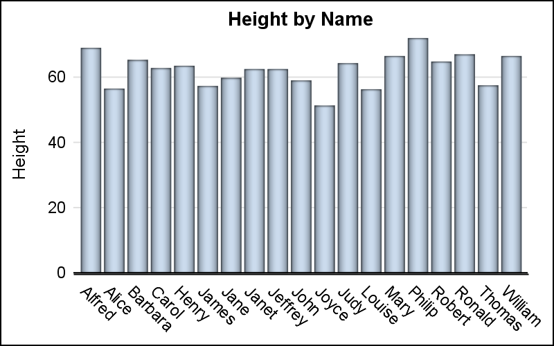
Note, the x-axis tick values are rotated clockwise to avoid collision. Also note, the bar chart baseline is drawn at the zero value which appears to make the axis line thicker. The thick axis line is really two lines, the axis line itself, and the baseline.
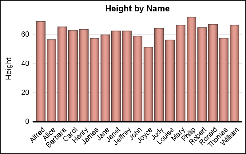
SAS users have often expressed a preference for additional orientations for the tick values, and with 9.4m5, multiple options are now available. These are shwn below using the FITPOLICY and or the VALUESROTATE options.
The VALUESROTATE = Diagonal | Diagonal2 | Vertical can be used to display tick values rotated clockwise 45 degrees, counterclockwise 45 degrees or vertical as shown below.
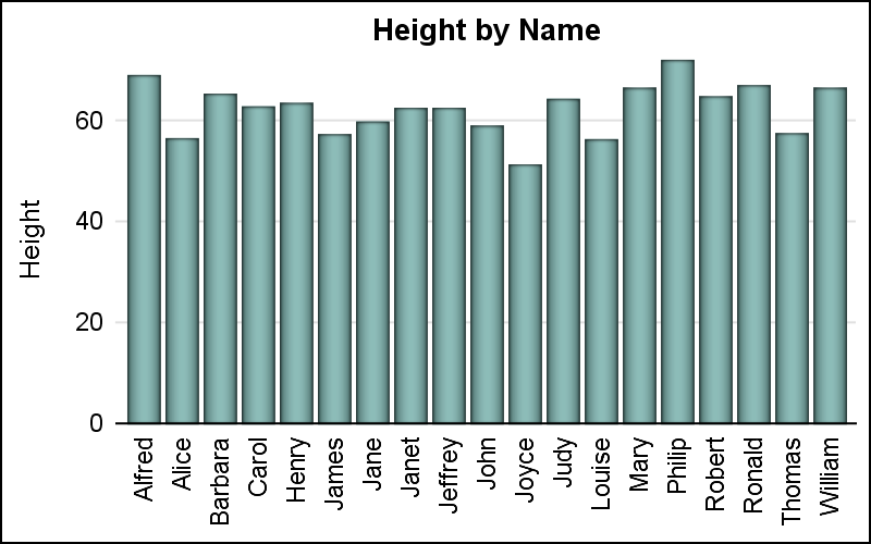
One benefit of the DIAGONAL2 is the rotation of the tick values is in the same general direction of the y-axis label.
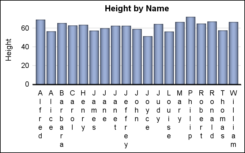
Tick values can also be shown in a "stacked" arrangement, also sometimes known as "Hotel" text. This name comes from the way the word "Hotel" is often displayed on street signs. You can get this arrangement by using FITPOLICY = StackedAlways. This could be very useful for some Asian languages like Chinese or Japanese.
Another improvement is provided for the display of baseline using the new option DISPLAYBASELINE=AUTO. Normally, the bar chart and needle plots always display a baseline at the zero value on the response axis. This could be at the bottom, top, or somewhere in the middle for a vertical bar chart or needle plot. When the baseline is at the top or bottom of the graph, its display makes the axis line look undesirable thicker. The new option causes the plot to draw the base line only when it is not at the extreme end of the axis range, as shown below.
Note, the option DISPLAYBASELINE=AUTO is used in both the graphs below. The display of the baseline is now controlled by its position. It is not drawn when the minimum bar value is near the x-axis and is drawn when it is in the middle. This automatic behavior means you can always set this option. We did not make it the default behavior to avoid changes to your output.
 For the last graph, I computed the mean of all the heights using the MEANS procedure. Then I computed a new variable called Derived=height-Mean. This graph uses RESPONSE=Derived. In this case, the response values are both positive and negative, placing the zero value somewhere in the middle. The x-axis tick values are far from some short bars, and it is useful to provide a "visual aid" for the eye to line up the bars and the tick values. This is done by setting x-axis TICKSTYLE=InBetween. This setting displays the tick marks in between each category instead of at each category. The tick itself is switched off and gridlines are displayed, which are also drawn at the tick location. Another way to do this is to use the COLORBANDS option.
title "Deviation of Height from mean (&mean.in)"; proc sgplot data=class noborder; vbar name / response=deviation stat=mean nostatlabel fillattrs=graphdata5 dataskin=pressed displaybaseline=auto; xaxis display=(nolabel noline noticks) grid fitpolicy=rotate valuesrotate=vertical tickstyle=inbetween; yaxis display=(noline noticks) grid; run; |
SAS 9.40M5 SGPLOT Code: 94m5_Features_1


2 Comments
I have to admit that one of the things that slowed use of SG graphics on my part was the initial shortage of AXIS appearance controls. Admittedly I had been using the AXIS statements from SAS/Graph for quite a while and could usually the get the appearance I wanted fairly quickly. But the options for Xaxis and Yaxis in the SG procedures in 9.2 were pretty abysmal in comparison.
I'm feeling much better now...
The ODS Graphics procedures are designed with different priorities in mind. Graph visual properties were mostly left to the Styles, and the procedures themselves focused more on functionality, rather than appearance. The goal was to produce a "good. clean" graph with minimal "chart junk" out of the box.
SGPLOT allows extensive layering of plot types and SGPANEL makes classification panels easier. Annotation is supported to allow customization. New appearance options are added when the need is widespread. It is good to know more users are inclined to use SG procedures. Normally, I recommend the SG procedures for functional reasons, rather than visual.