We use many tools here at SAS to bring you SAS software. It should come as no surprise that one of the tools on which we heavily rely is SAS itself. We use SAS for all kinds of things. We rely on ODS and the ODS document when we make our documentation. I write SAS programs to check our documentation for obsolete output and samples, link errors, spelling errors, and many other problems. We use ODS Graphics to monitor our progress as we get near the end of the development cycle for a new release. We use SAS for more things than I can begin to know.
Today's topics includes positioning curve labels inside the graph versus outside and using a TYPE=DATE axis versus a TYPE=LINEAR axis along with a date format. They come from a colleague who uses PROC SGPLOT to monitor the performance of a procedure over time. He uses series plots to track various components of run time. This can help detect software changes that negatively impact efficiency so that they can be fixed before that software is released. This artificial data set creates a date variable and simulated run times for three components of a procedure: set up, initial computations, and final computations.
data x1;
   retain final 11  setup 1   initial 1;
   do TestStart = '01Jun2017'd to '01Oct2017'd;
      final   + 0.1 * normal(7);
      setup   + 0.1 * normal(7);
      initial + 0.1 * normal(7);
      output;
   end;
   format TestStart date7.;
run; |
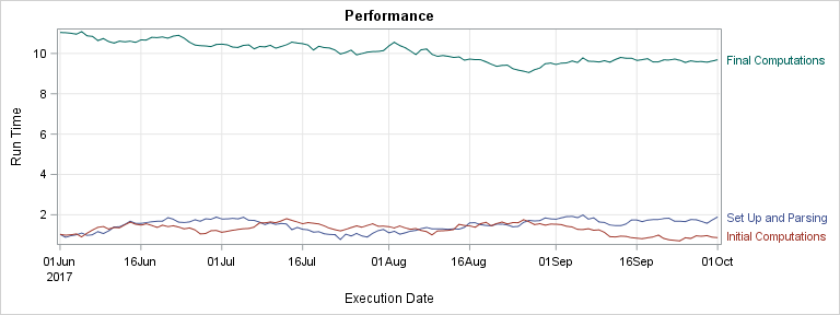
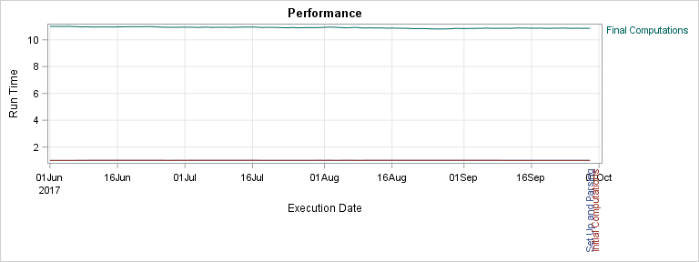
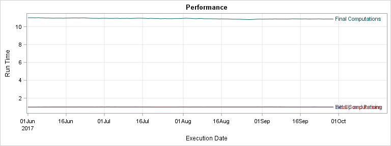
The following steps show three ways to label the three series plots. Throughout these examples, a macro variable &o (for options) contains the curve label options that appear in multiple statements. This step displays the curve labels outside the graph.
ods graphics on / width=8in height=3in; proc sgplot data=x1; title 'Performance'; xaxis grid label="Execution Date"; yaxis grid label="Run Time"; %let o = curvelabel curvelabelloc=outside curvelabelpos=end curvelabel=; series x=TestStart y=setup / &o 'Set Up and Parsing'; series x=TestStart y=initial / &o 'Initial Computations'; series x=TestStart y=final / &o 'Final Computations'; run; |
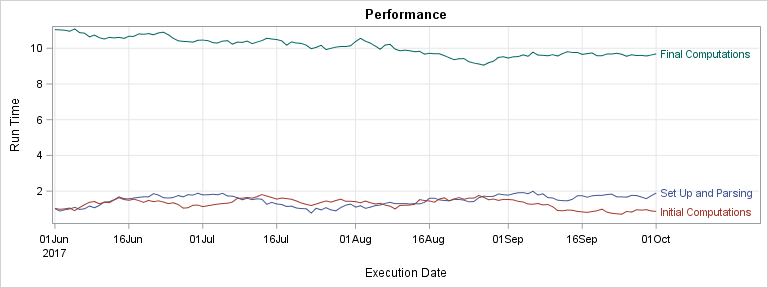
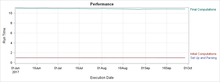
This step displays the curve labels inside the graph.
proc sgplot data=x1; title 'Performance'; xaxis grid label="Execution Date"; yaxis grid label="Run Time"; %let o = curvelabel curvelabelloc=inside curvelabelpos=end curvelabel=; series x=TestStart y=setup / &o 'Set Up and Parsing'; series x=TestStart y=initial / &o 'Initial Computations'; series x=TestStart y=final / &o 'Final Computations'; run; |
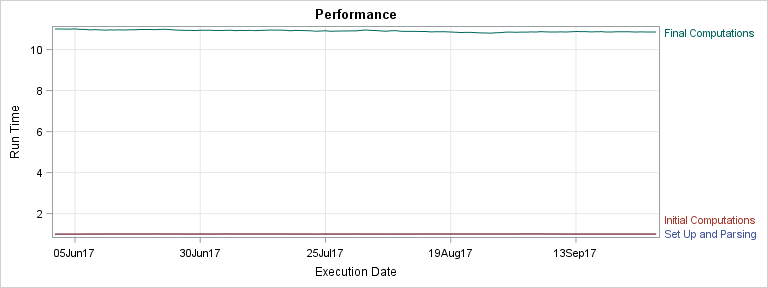
This step uses a legend to identify the curves.
proc sgplot data=x1; title 'Performance'; xaxis grid label="Execution Date"; yaxis grid label="Run Time"; series x=TestStart y=setup / legendlabel='Set Up and Parsing'; series x=TestStart y=initial / legendlabel='Initial Computations'; series x=TestStart y=final / legendlabel='Final Computations'; run; |
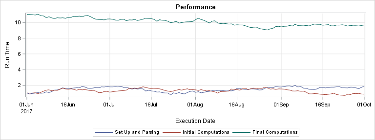
In all three graphs, the results look great! Now consider a different artificial data set.
data x2;
   retain final 11  setup 1   initial 1;
   do TestStart = '01Jun2017'd to '29Sep2017'd;
      final   +  0.01 * normal(7);
      setup   + 0.001 * normal(7);
      initial + 0.001 * normal(7);
      output;
   end;
   format TestStart date7.;
run; |
Now the bottom two series are quite close together and the data end just before the end of the month. This data set is more like the one my colleague had. He was using external curve labels to label each of the components, and he was having a problem. Before I tell you what his problem is, let me say that I had to work really hard to create a set of artificial data that reproduces it. So, I think you are not likely to run into his issue. In case you do, the rest of this post will show you ways to deal with curve labels that rotate or otherwise position themselves anywhere but at the end of the curve. He only had the problem when the curve labels were positioned outside the graph and when they were close to the top or bottom of the plot. The following step displays the curve labels outside the graph.
proc sgplot data=x2; title 'Performance'; xaxis grid label="Execution Date"; yaxis grid label="Run Time"; %let o = curvelabel curvelabelloc=outside curvelabelpos=end curvelabel=; series x=TestStart y=setup / &o 'Set Up and Parsing'; series x=TestStart y=initial / &o 'Initial Computations'; series x=TestStart y=final / &o 'Final Computations'; run; |
That was probably not what you expected! So what's going on here? I specified CURVELABEL, CURVELABELLOC=OUTSIDE and CURVELABELPOS=END. These options do not always position the curve label to the right of the Y2 (right vertical) axis. These options can position labels above the X2 (top) axis or below the X axis. When two labels collide, PROC SGPLOT might rotate them. The problem here is the X axis is closer to the end of the bottom two functions than is the Y2 axis, so PROC SGPLOT positions the labels outside the X axis. There is not currently any option that will force the labels to the right of the Y2 axis. However, there are options that might affect the placement.
Notice that both data sets have a FORMAT statement that assigns a DATE7 format to the X axis variable. Also notice that the X axes so far are all TYPE=DATE axes. How can you tell? They do not simply contain formatted values. ODS Graphics extracts the year information and displays it in a separate line and formats the tick labels accordingly. When ODS Graphics detects a date format on a variable, and when the axis type is not explicitly specified, it makes the axis a TYPE=DATE axis. Date axes are probably most prone to the rotated curve label problem. Date axes sometimes have a final tick value outside the range of the data that increases the distance between the end of the series plot and the Y2 axis. One thing that you might try that might fix the problem is specifing a TYPE=LINEAR axis. You can still use a date format, but all of the special processing that ODS Graphics uses for date axes will be missing.
proc sgplot data=x2; title 'Performance'; xaxis grid label="Execution Date" type=linear; yaxis grid label="Run Time"; %let o = curvelabel curvelabelloc=outside curvelabelpos=end curvelabel=; series x=TestStart y=setup / &o 'Set Up and Parsing'; series x=TestStart y=initial / &o 'Initial Computations'; series x=TestStart y=final / &o 'Final Computations'; run; |
That took care of the problem! Still, TYPE=DATE axes are really nice, so you are probably wondering if there is a way to keep the TYPE=DATE axis and still fix the problem. This step explicitly specifies a maximum value for the X axis (MAX='29SEP2017'D) and a minimum value for the Y axis (MIN=0).
proc sgplot data=x2; title 'Performance'; xaxis grid label="Execution Date" max='29Sep2017'd; yaxis grid label="Run Time" min=0; %let o = curvelabel curvelabelloc=outside curvelabelpos=end curvelabel=; series x=TestStart y=setup / &o 'Set Up and Parsing'; series x=TestStart y=initial / &o 'Initial Computations'; series x=TestStart y=final / &o 'Final Computations'; run; |
You can see that now the bottom series plots are farther from the X axis and closer to the Y axis, so all three series are labeled nicely. Offset options do not seem to accomplish the same thing. You can also move the labels inside, but then they collide.
proc sgplot data=x2; title 'Performance'; xaxis grid label="Execution Date"; yaxis grid label="Run Time"; %let o = curvelabel curvelabelloc=inside curvelabelpos=end curvelabel=; series x=TestStart y=setup / &o 'Set Up and Parsing'; series x=TestStart y=initial / &o 'Initial Computations'; series x=TestStart y=final / &o 'Final Computations'; run; |
In summary, curve labels can appear inside the graph or outside. Outside curve labels might occasionally appear above the X2 axis or below the X axis. While there are not options that explicitly place them to the right of the Y2 axis, you can specify options that adjust the relative positions of the axes and the curves to position the labels on the right. Paradoxically, this problem can be both hard to reproduce and hard to fix. With some understanding of the underlying cause, it is easier to address.