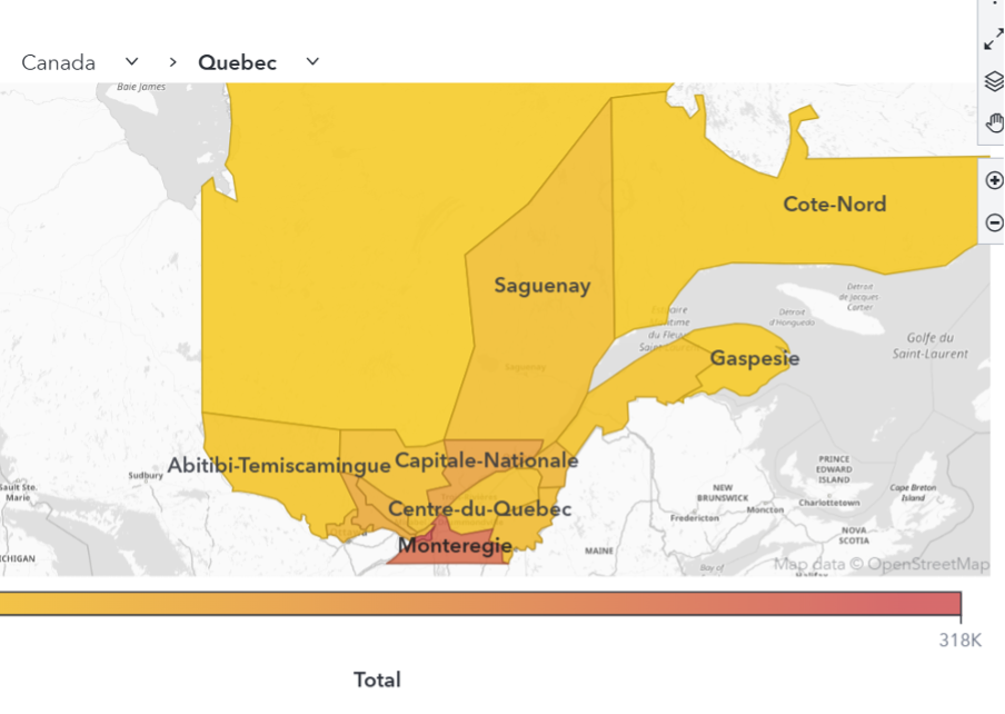
Tag: SAS Visual Analytics

Learn SAS | SAS Events
Dina Duhon 0
What makes SAS Global Forum great?

The people, the energy, the quality of the content, the demos, the networking opportunities…whew, all of these things combine to make SAS Global Forum great every year. And that is no exception this year. Preparations are in full swing for an unforgettable conference. I hope you’ve seen the notifications that

Advanced Analytics | Artificial Intelligence | Data Visualization | Learn SAS | Machine Learning
Jinmo Choi 0
[텍스트 분석 #1]텍스트 토픽 분류로 빠른 인사이트 확보하기

비정형 텍스트 데이터는 인류가 생성하는 가장 큰 데이터입니다. 더 나은 비즈니스 결정을 내리고, 제품 전략을 알리고, 고객 경험 개선에 도움이 되는 유용한 정보가 바로 이 데이터에 포함되어 있습니다. 비정형 텍스트 데이터의 잠재력을 최대한 활용해야 하는 이유입니다. 본 시리즈에서는 텍스트 데이터에서 인사이트를 얻는 주요 방법과 이를 위한 SAS 솔루션을 살펴봅니다. 전

Machine Learning
Katie Tedrow 0
Enhancing your Natural Language Processing: Intro to Conversational AI

Conversational AI can offer a way to provide that always-on 24/7, fast, convenient experience that can go anywhere (phone, computer smart speakers, even your car). It can provide a human-like experience through real-time, personalized interaction with AI running in the background. This technology is being applied across many industries for a variety of use cases (both customer-facing and for internal use).

Advanced Analytics
Subramanian Pazhani 0
Back to School Optimization

Public and private schools are struggling to figure out how to bring face-to-face instruction to students during this pandemic. Health risks to students and teachers, parents struggling with child-care options and/or support for virtual learning, and schools’ capacities and budget limitations make this problem a severe logistical challenge. Schools need

Machine Learning
Katie Tedrow 0
The hybrid approach to enhancing your natural language processing

Unlocking the potential of your unstructured text data can lead to great business outcomes but the prospect of starting a new or enhancing your existing Natural Language Processing (NLP) program can feel overwhelming because of the inherently unique (and sometimes messy) nature of human language. Text data doesn’t fit neatly into rows or columns the way that structured data does, which can make it seem more complex to work with. Conversations and written language range from objective statements to subjective perspectives and opinions. The same sentence, depending on its intent and the nuances in how it's said, can have a positive, negative, or neutral sentiment. To get us started, we'll share different types of NLP models used to analyze unstructured data with a focus on the hybrid approach.

Advanced Analytics | Analytics | Data Visualization | Programming Tips
Mariana Fontanezi 0
Time Series Modeling: R & SAS

Como integrar modelos hierárquicos de séries temporais desenvolvidos em R ao SAS Visual Forecasting analisando as diferentes estratégias? O objetivo deste artigo é apresentar como podemos executar modelos de séries temporais, que foram desenvolvidos no R, no SAS Visual Forecasting, podendo, assim, paralelizar e acelerar o processamento do código R.

Advanced Analytics | Analytics | Data for Good
Melanie Carey 0
Take customer care to the next level with automated prediction in SAS Visual Analytics

What is automated prediction? Automated prediction, in less than a minute, runs several analytic models (such as decision trees, gradient boosting, and logistic and linear regression) on a specific variable of your choice. Most of the remaining variables in your dataset are automatically analyzed as factors that might influence your specified variable. They are called underlying factors. SAS then chooses the one model (champion model) that most accurately predicts your target variable. The model prediction and the underlying factors are then displayed. You can adjust the values of the underlying factors to determine how the model prediction changes with each adjustment.

Advanced Analytics | Analytics | Data for Good | Data Visualization
Melanie Carey 0
Are your hospital resources at risk of hitting capacity?

How have healthcare providers and governmental agencies predicted the fast-changing, potentially exponential increase in the need for medical services and equipment through the various stages of the COVID-19 pandemic? Mathematical techniques that attempt to model and understand the likely spread of the disease have been instrumental. The SEIR model is

Analytics | Data Visualization | Machine Learning
Jihye Yoo 0
[SGF시리즈#2] 인구이동분석, 접촉자 추적.. 팬데믹 극복을 위한 분석 기술

질병 확산을 억제하고 경제적 영향을 최소화하기 위해서는 인구가 어떻게 이동하는지 분석하고, 지역 내 접촉자를 추적하여 적절한 의사결정을 해야 합니다. 이번 SGF 시리즈에서는 인구 이동 분석과 접촉자 추적 등 SAS 분석 기술이 어떻게 팬데믹 극복을 위한 의사결정을 지원하는지에 대한 SAS 짐굿나잇 회장과 스티브 베넷 글로벌 정부기관 프랙티스 부문 이사의 세션을 소개합니다.

Analytics | Data for Good | Data Visualization
Jihye Yoo 0
코로나19 대시보드가 갖춰야 할 7가지 핵심 데이터

인류가 전례 없는 전투를 치르고 있는 가운데, 우리나라는 코로나19 모범 대응 국가로 큰 주목을 받고 있습니다. 여기서 한발 더 나아가 그 어느 국가보다 앞서 포스트 코로나19 를 준비하고 있습니다. 하지만 코로나19는 끊임없이 존재감을 드러내며 정부와 지자체, 공공기관의 의사결정자들을 당혹스럽게 하고 있습니다. 이 위기를 효과적으로 헤쳐나가고 또 다른 위기를 막기 위해서는

Advanced Analytics | Analytics | Data for Good
Melanie Carey 0
Speed up your COVID-19 research with text analysis: step-by-step

Adverse outcomes, and the rapid spread of COVID-19, have accelerated research on all aspects of the disease. You may have found it overwhelming, and very time-consuming, to find relevant and specialized insights in all the scientific literature out there. To aid researchers in quickly identifying relevant literature about key topics

Analytics | Data for Good | Data Visualization
SAS Japan 0
新型コロナウイルスの感染拡大を追跡するためにデータ・ビジュアライゼーション(視覚化)を利用する

この記事はSAS Institute Japanが翻訳および編集したもので、もともとはMark Lambrechtによって執筆されました。元記事はこちらです(英語)。 世界的な公衆衛生問題が拡散する際、初期段階では多くの不明事項が存在するものですが、新型コロナウイルスのように急速な感染拡大の場合は特にその度合が高まります。データ・ビジュアライゼーションは、傾向を理解したり、複数のデータポイントから意味のあるストーリーを組み立てたりするための優れたスタート地点となりえます。ウイルスの拡散状況を視覚化できる機能は、問題意識の喚起、そのインパクトの理解、そして究極的には予防努力の支援に役立つ可能性があります。 2019年12月31日、世界保健機関(WHO)の中国オフィスは、中国湖北省の武漢市で検知された原因不明の肺炎の感染ケースについて報告を受けました。最初の報告以降、この新型コロナウイルス(SARS-CoV-2)は世界的な感染拡大を見せており、感染者は30ヶ国以上の数万人に及び、「新型コロナウイルス感染症(COVID-19)」と呼ばれる急性呼吸器疾病を引き起こしています。 この状況を受け、SASは新型コロナウイルスの現況、場所、拡散状況、トレンド分析を描き出すインタラクティブなレポートを作成しました。 元になるデータは日次で更新されており、感染拡大の進行状況を定期的にチェックすることや、世界的な拡散状況を時間軸に沿ったアニメーションで確認することができます。この対話操作型レポートでは以下のことが行えます。 過去10日以内に新たに確認された感染者の数を調べ、このウイルスの感染率、回復率、死亡率がどのように推移しているかを確認する。 このウイルスがどの地域に侵入したかを調べ、発生地の中国と世界の残りの地域とで状況を比較する。 感染確認済みのケースを分析することで、回復率が時の経過に沿ってどのように変化しているかを理解する。 このレポートはSAS Visual Analyticsと、WHO、CDC、ECDC、NHC、およびDXYからのデータ(JHU CSSEによってコンパイルされたもの)を用いて作成されています[訳注:JHU CSSE=米国ジョンズ・ホプキンズ大学システム科学工学センター]。 SAS Visual Analyticsで作成した新型コロナウイルス・レポートの概要 「新型コロナウイルス感染症(以下、COVID-19)」の感染拡大に関するサマリー情報を手早く確認したい場合は、こちらをご覧ください。 このサマリー情報は、世界各地の統計情報を用いて日次で更新されています。このWebページのこれ以降では、各種レポートからの重要な洞察をスクリーンショットでご紹介します。実際のレポートでは、最新のデータに基づき、ご自身で対話操作しながら統計情報や分析結果を閲覧することができます。 地域別の詳細情報を確認したい場合や、対話操作型レポート全体を探索したい場合は、サマリー情報ページの右上隅にある「Full Report」ボタンをクリックすると、完全なダッシュボードを起動できます。 最初に表示されるダッシュボード・ビュー([Status]タブ)では、日次で更新されるデータに基づき、COVID-19の感染拡大の概況を簡単に確認できます。具体的には、新たに確認された感染者数、回復者数、死亡者数などを地域別にフィルタリングして閲覧することができます。 図1: COVID-19の感染拡大の概況。新たに確認された感染者数、回復者数、死亡者数などを地域別にフィルタリングして閲覧することができます。 レポートの[Locations]タブ(下の図2)では、 全世界および特定国の新型コロナウイルス関連データを確認できます。 図2:[Locations]タブでは、全世界および特定国の新型コロナウイルス関連データを確認できます。 特定国のデータを見るには、左上のフィールドに国名を入力します(下の図3)。 図3: 国名を入力すると、その国の詳細情報だけに集中することができます。 新型コロナウイルスの最初の感染者が中国で報告されてから既に何週間も経過しており、感染拡大は世界各地へと広がっています。私たちは、Esri社のGISマッピング・ソフトウェアから取得した地理空間データのレイヤーを追加することで、対話操作型の画面を用いて、中国とその他の国々にまたがる形で新型コロナウイルスの拡散状況を探索できるようにしました。 [Spread]タブでは、SAS Visual Analyticsの時系列アニメーション機能(下の図4)を用いて、ウイルスが世界全体に拡散していく様子を見ることができます。アニメーションを再生すると、中国国内での拡散状況や、世界全体の拡散状況および深刻度を確認できます。 図4: 時系列アニメーションで、ウイルスが世界全体に拡散していく様子を見ることができます。 [Trend Analysis]タブでは、様々なビジュアライゼーションを切り替えながら、COVID-19の感染拡大に関連したその他のデータの傾向を見ることができます(下の図5)。 図5: 日次の感染者数/死亡者数のトレンド分析 [Epidemiological Analysis]タブでは、罹患率および有病率を見ることができます。 図6: 10万人あたりのCOVID-19感染者数を国ごとに見る 図7: 期間有病率を国または地域ごとに見る [Collective Insights]タブは、全世界のまたは国ごとの感染拡大状況を1つの表にまとめています(下の図8)。

Analytics | Data for Good | Data Visualization
Jeanne (Hyunjin) Byun 0
데이터 시각화로 COVID-19 경로 추적하기

인류의 건강을 위협하는 문제, 특히 코로나바이러스(COVID-19)처럼 빠르게 전파되는 질병이 확산되는 초기 단계에는 예상할 수 없는 많은 변수들이 존재합니다. 이러한 단계에서 데이터 시각화를 활용하면 빠르게 추세를 파악하고 단편적인 데이터들로부터 유의미한 결과를 도출할 수 있습니다. 바이러스 경로 시각화는 사람들에게 경각심을 일깨우고 바이러스의 영향력을 알림으로써, 궁극적으로 질병 예방 활동에 도움이 될 수 있을

1 2 3 4 10