Remember back to your early school days, singing with all your classmates “If you’re happy and you know it clap your hands!” and then we’d all clap our hands. Being happy back then was so simple. Today, it’s hard to get away from all the negative headlines of 2020! It’s hard to focus on what really matters to our overall happiness. In 2012, the UN held a meeting to discuss “Well-Being and Happiness: Defining a New Economic Paradigm.” In support of that meeting the first World Happiness Report was created and has been reproduced annually.
The 2020 report was released in March of this year and ranks 156 countries by how happy their citizens perceive themselves to be. The overall score is dependent on six factors: Generosity; social support; levels of gross domestic product (GDP); corruption; freedom; and healthy life expectancy. For this blog, I'll be using the data I downloaded directly from the World Happiness Report site.
Here we have a SAS Visual Analytics report that's been produced based on the happiness data (Figure 1 below).
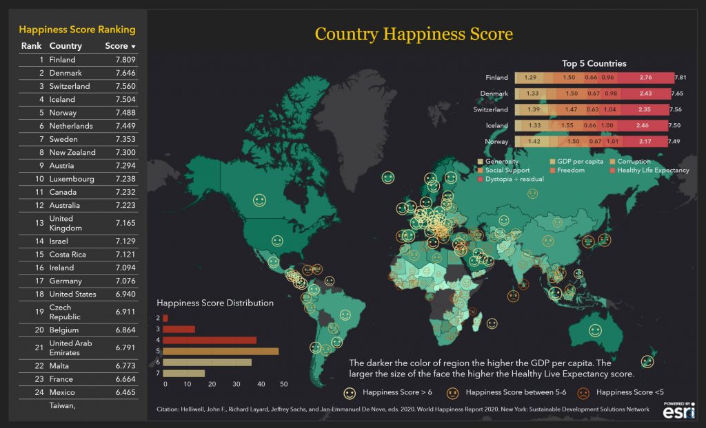
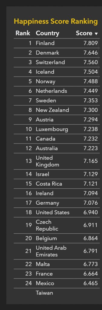
On the left in Figure 1, we have a table that ranks the countries based on the overall happiness score (see Figure 2 below). Finland's residents are the happiest people on the planet, followed by Denmark and Switzerland.
Looking at the map we see face icons that illustrate a country's score (Figure 3 below). A happy face means the country scored greater than six, the "meh" face means a country scored between five and six, and the sad face means a country scored less than five. Seems like there's a lot of happiness in the north, despite the cold climate.
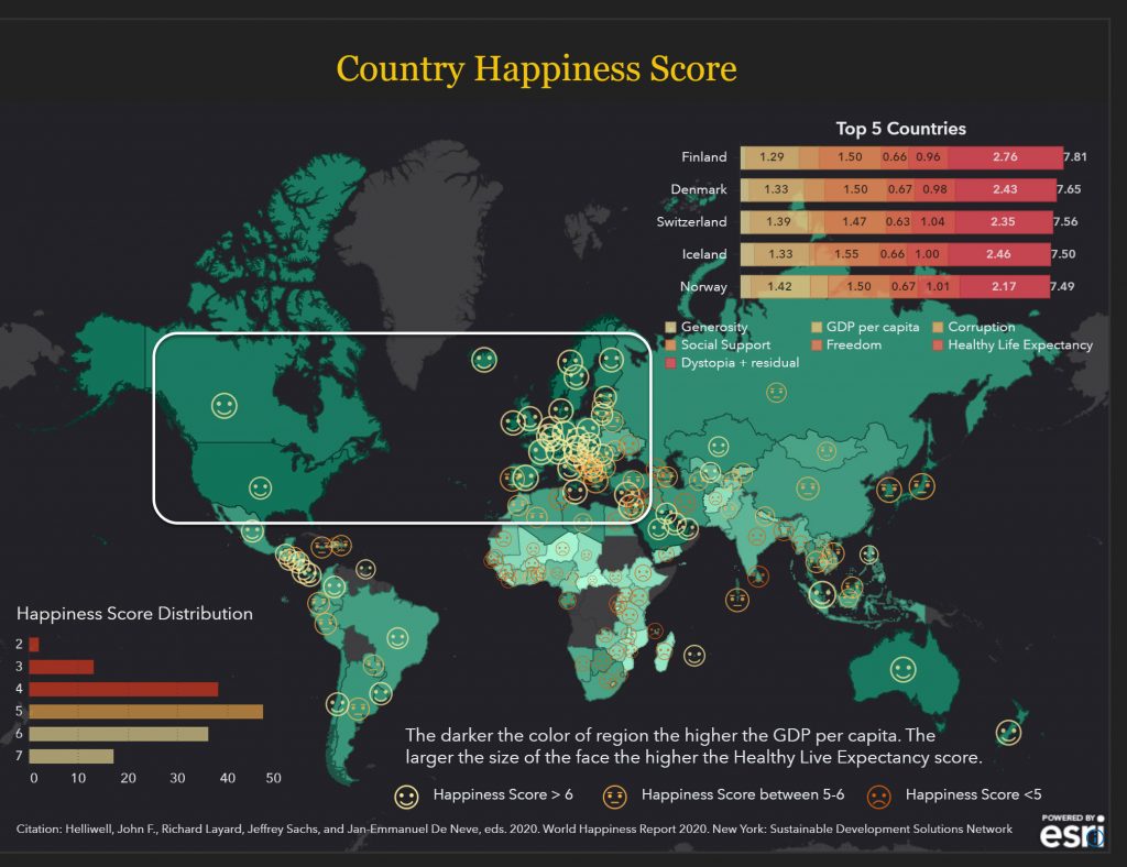
The darker the shading, the higher the logged GDP per capita (Figure 4 below). It does look like the countries with higher GDP per capita are happier. Makes you wonder if perhaps there is something to the saying “money buys you happiness” 😉.
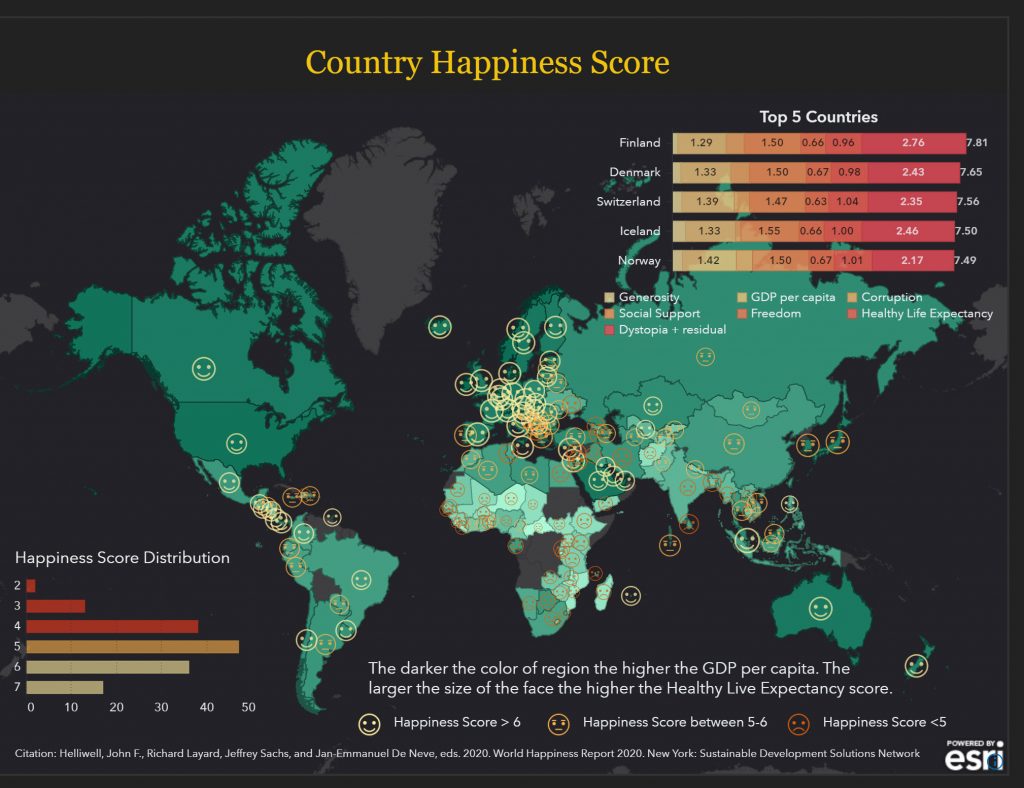
The bottom bar chart shows us the Happiness score distribution (Figure 5 below). Here we see that there are close to 50 countries with a happiness score between five and six. And 17 countries with a score of seven or above. If we selected that bar we can see the list of countries filtered and the map highlights those countries for us. Interesting that the US is not one of the 17 happiest countries.
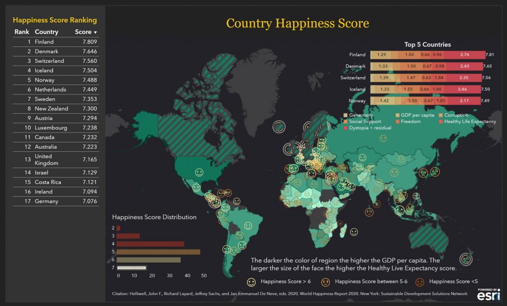
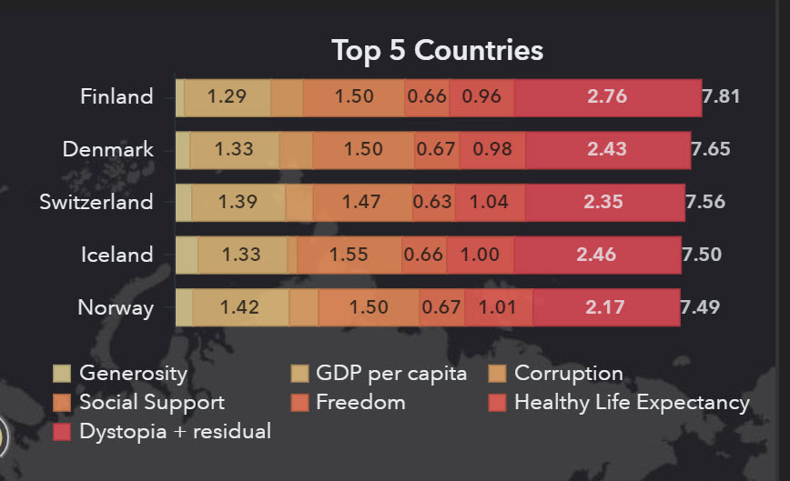
Finally, in the top right corner, we see the top five countries, and the metrics that comprise the overall happiness score (Figure 6 below).
Now that we’ve seen how happy countries were back in March, I wonder how next year’s report will compare. The World Happiness Report provides a nice baseline to measure happiness during the global pandemic. Will COVID-19 change the overall ranking of the countries? Will citizens view corruption as increasing? How will social distancing affect individuals' views on their level of social support (having friends and family close by to ask for assistance)? Will people feel like their freedom has been taken away with all the governmental measures put in place to reduce the transfer of the disease? Will mandatory vaccination reduce perceptions of freedom? Will overall Healthy Life Expectancy change or remain relatively stable? Will all country's GDP levels drop, or will some countries produce more? Leave a post in the comment section on what you think will change in the report next year.