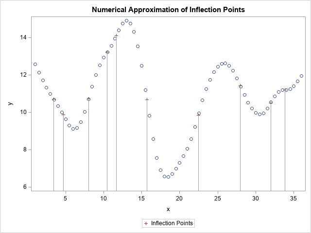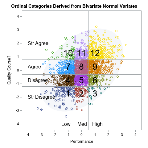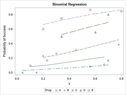
My son is taking an AP Statistics course in high school this year. AP Statistics is one of the fastest-growing AP courses, so I welcome the chance to see topics and techniques in the course. Last week I was pleased to see that they teach data exploration techniques, such as
Tag: Data Analysis
Last week I showed how to compute nearest-neighbor distances for a set of numerical observations. Nearest-neighbor distances are used in many statistical computations, including the analysis of spatial point patterns. This article describes how the distribution of nearest-neighbor distances can help you determine whether spatial data are uniformly distributed or
Last week I wrote about how to compute sample quantiles and weighted quantiles in SAS. As part of that article, I needed to draw some step functions. Recall that a step function is a piecewise constant function that jumps by a certain amount at a finite number of points. Graph
Many univariate descriptive statistics are intuitive. However, weighted statistic are less intuitive. A weight variable changes the computation of a statistic by giving more weight to some observations than to others. This article shows how to compute and visualize weighted percentiles, also known as a weighted quantiles, as computed by
Last week I showed some features of SAS formats, including the fact that you can use formats to bin a continuous variable without creating a new variable in the DATA step. During the discussion I mentioned that it can be confusing to look at the output of a formatted variable
In a scatter plot, the regions where observations are packed tightly are areas of high density. A contour plot or heat map of a bivariate kernel density estimate (KDE) is one way to visualize regions of high density. A SAS customer asked whether it is possible to use SAS to
When I read Robert Allison's article about the cost of a taxi ride in New York City, I was struck by the scatter plot (shown at right; click to enlarge) that plots the tip amount against the total bill for 12 million taxi rides. The graph clearly reveals diagonal and
You can visualize missing data. It sounds like an oxymoron, but it is true. How can you draw graphs of something that is missing? In a previous article, I showed how you can use PROC MI in SAS/STAT software to create a table that shows patterns of missing data in
Missing data can be informative. Sometimes missing values in one variable are related to missing values in another variable. Other times missing values in one variable are independent of missing values in other variables. As part of the exploratory phase of data analysis, you should investigate whether there are patterns
In SAS procedures, the WHERE clause is a useful way to filter observations so that the procedure receives only a subset of the data to analyze. The IML procedure supports the WHERE clause in two separate statements. On the USE statement, the WHERE clause acts as a global filter. The
Descriptive univariate statistics are the foundation of data analysis. Before you create a statistical model for new data, you should examine descriptive univariate statistics such as the mean, standard deviation, quantiles, and the number of nonmissing observations. In SAS, there is an easy way to create a data set that
Last weekend was the 2016 NCAA Division I wrestling tournament. In collegiate wrestling there are ten weight classes. The top eight wrestlers in each weight class are awarded the title "All-American" to acknowledge that they are the best wrestlers in the country. I saw a blog post on the InterMat
My previous blog post shows how to use PROC LOGISTIC and spline effects to predict the probability that an NBA player scores from various locations on a court. The LOGISTIC procedure fits parametric models, which means that the procedure estimates parameters for every explanatory effect in the model. Spline bases
Last week Robert Allison showed how to download NBA data into SAS and create graphs such as the location where Stephen Curry took shots in the 2015-16 season to date. The graph at left shows the kind of graphs that Robert created. I've reversed the colors from Robert's version, so
Most SAS regression procedures support the "stars and bars" operators, which enable you to create models that include main effects and all higher-order interaction effects. You can also easily create models that include all n-way interactions up to a specified value of n. However, it can be a challenge to
Last week I showed how to create dummy variables in SAS by using the GLMMOD procedure. The procedure enables you to create design matrices that encode continuous variables, categorical variables, and their interactions. You can use dummy variables to replace categorical variables in procedures that do not support a CLASS
SAS programmers sometimes ask, "How do I create a design matrix in SAS?" A design matrix is a numerical matrix that represents the explanatory variables in regression models. In simple models, the design matrix contains one column for each continuous variable and multiple columns (called dummy variables) for each classification
Last week I showed how to use PROC EXPAND to compute moving averages and other rolling statistics in SAS. Unfortunately, PROC EXPAND is part of SAS/ETS software and not every SAS site has a license for SAS/ETS. For simple moving averages, you can write a DATA step program, as discussed
A common question on SAS discussion forums is how to compute a moving average in SAS. This article shows how to use PROC EXPAND and contains links to articles that use the DATA step or macros to compute moving averages in SAS. In a previous post, I explained how to
A moving average (also called a rolling average) is a statistical technique that is used to smooth a time series. Moving averages are used in finance, economics, and quality control. You can overlay a moving average curve on a time series to visualize how each value compares to a rolling
Weighted averages are all around us. Teachers use weighted averages to assign a test more weight than a quiz. Schools use weighted averages to compute grade-point averages. Financial companies compute the return on a portfolio as a weighted average of the component assets. Financial charts show (linearly) weighted moving averages
I wrote 114 posts for The DO Loop blog in 2015. Which were the most popular with readers? In general, highly technical articles appeal to only a small group of readers, whereas less technical articles appeal to a larger audience. Consequently, many of my popular articles were related to data
A SAS customer asked: Why isn't the chi-square distribution supported in PROC UNIVARIATE? That is an excellent question. I remember asking a similar question when I first started learning SAS. In addition to the chi-square distribution, I wondered why the UNIVARIATE procedure does not support the F distribution. These are
Did you know that the FREQ procedure in SAS can compute exact p-values for more than 20 statistical tests and statistics that are associated with contingency table? Mamma mia! That's a veritable smorgasbord of options! Some of the tests are specifically for one-way tables or 2 x 2 tables, but many apply
Suppose that you are tabulating the eye colors of students in a small class (following Friendly, 1992). Depending upon the ethnic groups of these students, you might not observe any green-eyed students. How do you put a 0 into the table that summarizes the number of students who have each
Last week I discussed ordinary least squares (OLS) regression models and showed how to illustrate the assumptions about the conditional distribution of the response variable. For a single continuous explanatory variable, the illustration is a scatter plot with a regression line and several normal probability distributions along the line. The
I wanna be an airborne ranger, Live the life of guts and danger.* If you are an 80's movie buff, you might remember the scene in The Breakfast Club where Bender, the juvenile delinquent played by Judd Nelson, distracts the principal by running through the school singing this song. Recently,
Typically a correlation analysis reports the correlations between all pairs of variables, including the variables with themselves. The resulting correlation matrix is square, symmetric, and has 1s on the main diagonal. But suppose you are interested in only specific combinations of variables. Perhaps you want the pairwise correlations between one
Last week's post about odds ratio plots in SAS made me think about a similar plot that visualizes the parameter estimates for a regression analysis. The so-called regression coefficient plot is a scatter plot of the estimates for each effect in the model, with lines that indicate the width of
I recently read an argument by Andrew Wheeler for using a logarithmic axis for plotting odds ratios. I found his argument convincing. Accordingly, this blog post shows how to create an odds ratio plot in SAS where the ratio axis is displayed on a log scale. Thanks to Bob Derr