How to add a curve to a moment-ratio diagram

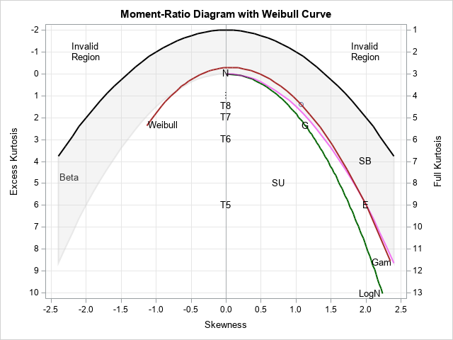
I have previously written about the moment-ratio diagram as a graphical tool for modeling univariate distributions and also as a tool for examining the distribution of the skewness and kurtosis statistics for distributions. The simple moment-ratio (M-R) diagram from my book (Wicklin, 2013, Simulating Data with SAS, Chapter 16) is