Strengthen your SAS skills with the WEEK function

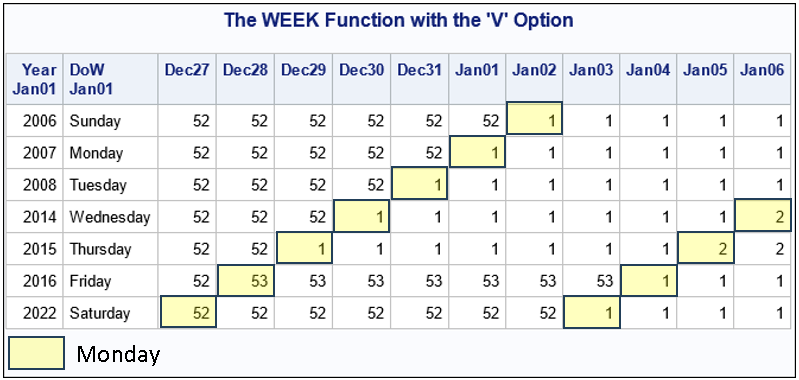
Dating can be a challenge. No, I'm not talking about the process of finding a soulmate. I'm talking about managing days, weeks, months, and years in statistical analyses and reports! One challenge is how to number the weeks of the year. Because there are seven days in a week, 52