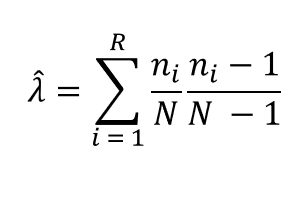
When a categorical variable has dozens or hundreds of categories, it is often impractical and undesirable to create a bar chart that shows the counts for all categories. Two alternatives are popular: Display only the Top 10 or Top 20 categories. As I showed last week, to do this in
Tag: Data Analysis
Sometimes a categorical variable has many levels, but you are only interested in displaying the levels that occur most frequently. For example, if you are interested in the number of times that a song was purchased on iTunes during the past week, you probably don't want a bar chart with
It's the start of a new year. Have you made a resolution to be a better data analyst? A better SAS statistical programmer? To learn more about multivariate statistics? What better way to start the New Year than to read (or re-read!) the top 12 articles for statistical programmers from
In a recent article on efficient simulation from a truncated distribution, I wrote some SAS/IML code that used the LOC function to find and exclude observations that satisfy some criterion. Some readers came up with an alternative algorithm that uses the REMOVE function instead of subscripts. I remarked in a
Sometimes a graph is more interpretable if you assign specific colors to categories. For example, if you are graphing the number of Olympic medals won by various countries at the 2012 London Olympics, you might want to assign the colors gold, silver, and bronze to represent first-, second-, and third-place
The New York Times has an excellent staff that produces visually interesting graphics for the general public. However, because their graphs need to be understood by all Times readers, the staff sometimes creates a complicated infographic when a simpler statistical graph would show the data in a clearer manner. A
Sometimes it is useful to group observations based on the values of some variable. Common schemes for grouping include binning and using quantiles. In the binning approach, a variable is divided into k equal intervals, called bins, and each observation is assigned to a bin. In this scheme, the size
With the US presidential election looming, all eyes are on the Electoral College. In the presidential election, each state gets as many votes in the Electoral College as it has representatives in both congressional houses. (The District of Columbia also gets three electors.) Because every state has two senators, it
Robert Allison posted a map that shows the average commute times for major US cities, along with the proportion of the commute that is attributed to traffic jams and other congestion. The data are from a CEOs for Cities report (Driven Apart, 2010, p. 45). Robert use SAS/GRAPH software to
The other day I was using PROC SGPLOT to create a box plot and I ran a program that was similar to the following: proc sgplot data=sashelp.cars; title "Box Plot: Category = Origin"; vbox Horsepower / category=origin; run; An hour or so later I had a need for another box
I've seen analyses of Fisher's iris data so often that sometimes I feel like I can smell the flowers' scent. However, yesterday I stumbled upon an analysis that I hadn't seen before. The typical analysis is shown in the documentation for the CANDISC procedure in the SAS/STAT documentation. A (canonical)
To celebrate special occasions like Father's Day, I like to relax with a cup of coffee and read the newspaper. When I looked at the weather page, I was astonished by the seeming uniformity of temperatures across the contiguous US. The weather map in my newspaper was almost entirely yellow
The other day I encountered an article in the SAS Knowledge Base that shows how to write a macro that "returns the variable name that contains the maximum or minimum value across an observation." Some people might say that the macro is "clever." I say it is complicated. This is
A reader asked: I want to create a vector as follows. Suppose there are two given vectors x=[A B C] and f=[1 2 3]. Here f indicates the frequency vector. I hope to generate a vector c=[A B B C C C]. I am trying to use the REPEAT function
SAS software provides many run-time functions that you can call from your SAS/IML or DATA step programs. The SAS/IML language has several hundred built-in statistical functions, and Base SAS software contains hundreds more. However, it is common for statistical programmers to extend the run-time library to include special user-defined functions.
Because the SAS/IML language is a general purpose programming language, it doesn't have a BY statement like most other SAS procedures (such as PROC REG). However, there are several ways to loop over categorical variables and perform an analysis on the observations in each category. One way is to use
Last week I discussed how to fit a Poisson distribution to data. The technique, which involves using the GENMOD procedure, produces a table of some goodness-of-fit statistics, but I find it useful to also produce a graph that indicates the goodness of fit. For continuous distributions, the quantile-quantile (Q-Q) plot
Last week I blogged about how to construct a smoother for a time series for the temperature in Albany, NY from 1995 to March, 2012. I smoothed the data by "folding" the time series into a single "year" that contains repeated measurements for each day of the year. Experts in
In yesterday's post, I discussed a "quick and dirty" method to smooth periodic data. However, after I smoothed the data I remarked that the smoother itself was not exactly periodic. At the end points of the periodic interval, the smoother did not have equal slopes and the method does not
Over at the SAS and R blog, Ken Kleinman discussed using polar coordinates to plot time series data for multiple years. The time series plot was reproduced in SAS by my colleague Robert Allison. The idea of plotting periodic data on a circle is not new. In fact it goes
Over at the SAS Discussion Forums, someone asked how to use SAS to fit a Poisson distribution to data. The questioner asked how to fit the distribution but also how to overlay the fitted density on the data and to create a quantile-quantile (Q-Q) plot. The questioner mentioned that the
Locating missing values is important in statistical data analysis. I've previously written about how to count the number of missing values for each variable in a data set. In Base SAS, I showed how to use the MEANS or FREQ procedures to count missing values. In the SAS/IML language, I
After my post on detecting outliers in multivariate data in SAS by using the MCD method, Peter Flom commented "when there are a bunch of dimensions, every data point is an outlier" and remarked on the curse of dimensionality. What he meant is that most points in a high-dimensional cloud
A recent discussion on the SAS-L discussion forum concerned how to implement linear interpolation in SAS. Some people suggested using PROC EXPAND in SAS/ETS software, whereas others proposed a DATA step solution. For me, the SAS/IML language provides a natural programming environment to implement an interpolation scheme. It also provides
Most statistical programmers have seen a graph of a normal distribution that approximates a binomial distribution. The figure is often accompanied by a statement that gives guidelines for when the approximation is valid. For example, if the binomial distribution describes an experiment with n trials and the probability of success
SAS provides several ways to compute sample quantiles of data. The UNIVARIATE procedure can compute quantiles (also called percentiles), but you can also compute them in the SAS/IML language. Prior to SAS/IML 9.22 (released in 2010) statistical programmers could call a SAS/IML module that computes sample quantiles. With the release
I work with continuous distributions more often than with discrete distributions. Consequently, I am used to thinking of the quantile function as being an inverse cumulative distribution function (CDF). (These functions are described in my article, "Four essential functions for statistical programmers.") For discrete distributions, they are not. To quote
As a SAS developer, I am always looking ahead to the next release of SAS. However, many SAS customer sites migrate to new releases slowly and are just now adopting versions of SAS that were released in 2010 or 2011. Consequently, I want to write a few articles that discuss
I've blogged several times about multivariate normality, including how to generate random values from a multivariate normal distribution. But given a set of multivariate data, how can you determine if it is likely to have come from a multivariate normal distribution? The answer, of course, is to run a goodness-of-fit
I previously described how to use Mahalanobis distance to find outliers in multivariate data. This article takes a closer look at Mahalanobis distance. A subsequent article will describe how you can compute Mahalanobis distance. Distance in standard units In statistics, we sometimes measure "nearness" or "farness" in terms of the