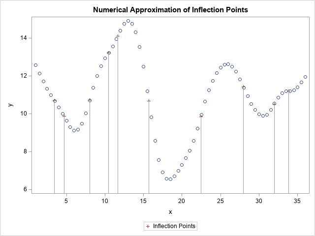
A fundamental operation in data analysis is finding data that satisfy some criterion. How many people are older than 85? What are the phone numbers of the voters who are registered Democrats? These questions are examples of locating data with certain properties or characteristics. The SAS DATA step has a
Tag: Data Analysis
For years I've been making presentations about SAS/IML software at conferences. Since 2008, I've always mentioned to SAS customers that they can call R from within SAS/IML software. (This feature was introduced in SAS/IML Studio 3.2 and was added to the IML procedure in SAS/IML 9.22.) I also included a
When Charlie H. posted an interesting article titled "Top 10 most powerful functions for PROC SQL," there was one item on his list that was unfamiliar: the COALESCE function. (Edit: Charlie's blog no longer exists. The article used to be available at http://www.sasanalysis.com/2011/01/top-10-most-powerful-functions-for-proc.html) Ever since I posted my first response,
Last week the Flowing Data blog published an excellent visualization of the flight patterns of major US airlines. On Friday, I sent the link to Robert Allison, my partner in the 2009 ASA Data Expo, which explored airline data. Robert had written a SAS program for the Expo that plots
More than a month ago I wrote a first article in response to an interesting article by Charlie H. titled Top 10 most powerful functions for PROC SQL. In that article I described SAS/IML equivalents to the MONOTONIC, COUNT, N, FREQ, and NMISS Functions in PROC SQL. In this article,
In last week's article on how to create a funnel plot in SAS, I wrote the following comment: I have not adjusted the control limits for multiple comparisons. I am doing nine comparisons of individual means to the overall mean, but the limits are based on the assumption that I'm
The log transformation is one of the most useful transformations in data analysis. It is used as a transformation to normality and as a variance stabilizing transformation. A log transformation is often used as part of exploratory data analysis in order to visualize (and later model) data that ranges over
Last week I showed how to create a funnel plot in SAS. A funnel plot enables you to compare the mean values (or rates, or proportions) of many groups to some other value. The group means are often compared to the overall mean, but they could also be compared to
In a previous blog post, I showed how you can use simulation to construct confidence intervals for ranks. This idea (from a paper by E. Marshall and D. Spiegelhalter), enables you to display a graph that compares the performance of several institutions, where "institutions" can mean schools, companies, airlines, or
At the beginning of 2011, I heard about the Dow Piano, which was created by CNNMoney.com. The Dow Piano visualizes the performance of the Dow Jones industrial average in 2010 with a line plot, but also adds an auditory component. As Bård Edlund, Art Director at CNNMoney.com, said, The daily
In a previous blog post about computing confidence intervals for rankings, I inadvertently used the VAR function in SAS/IML 9.22, without providing equivalent functionality for those readers who are running an earlier version of SAS/IML software. (Thanks to Eric for pointing this out.) If you are using a version of
When comparing scores from different subjects, it is often useful to rank the subjects. A rank is the order of a subject when the associated score is listed in ascending order. I've written a few articles about the importance of including confidence intervals when you display rankings, but I haven't
This week, I posted the 100th article to The DO Loop. To celebrate, I'm going to analyze the content of my first 100 articles. In December 2010, I compiled a list of The DO Loop's most-read posts, so I won't repeat that exercise. Instead, I thought it would be interesting
In a previous post, I described how to compute means and standard errors for data that I want to rank. The example data (which are available for download) are mean daily delays for 20 US airlines in 2007. The previous post carried out steps 1 and 2 of the method
I recently posted an article about representing uncertainty in rankings on the blog of the ASA Section for Statistical Programmers and Analysts (SSPA). The posting discusses the importance of including confidence intervals or other indicators of uncertainty when you display rankings. Today's article complements the SSPA post by showing how
Loony. Zany. Brilliant. Hysterical. Those are some of the adjectives I use to describe The Far Side® cartoons by Gary Larson from the 1980s and early '90s. I recently rediscovered an old book, The Far Side Gallery 2, which collects some of the best of Larson's wonderfully wacky cartoons. Every
Several times a year, I am contacted by a SAS account manager who tells me that a customer has asked whether it is possible to convert a MATLAB program to the SAS/IML language. Often the customer has an existing MATLAB program and wants to include the computation as part of
Do you have many points in your scatter plots that overlap each other? If so, your graph exhibits overplotting. Overplotting occurs when many points have similar coordinates. For example, the following scatter plot (which is produced by using the ODS statistical graphics procedure, SGPLOT) displays 12,000 points, many of which
I was inspired by Chris Hemedinger's blog posts about his daughter's science fair project. Explaining statistics to a pre-teenager can be a humbling experience. My 11-year-old son likes science. He recently set about trying to measure which of three projectile launchers is the most accurate. I think he wanted to
The Flowing Data blog posted some data about how much TV actors get paid per episode. About a dozen folks have created various visualizations of the data (see the comments in the Flowing Data blog), several of them very glitzy and fancy. One variable in the data is a categorical
In a previous blog post, I described the rules for a tic-tac-toe scratch-off lottery game and showed that it is a bad idea to generate the game tickets by using a scheme that uses equal probabilities. Instead, cells that yield large cash awards must be assigned a small probability of
Because of this week's story about a geostatistician, Mohan Srivastava, who figured out how predict winning tickets in a scratch-off lottery, I've been thinking about scratch-off games. He discovered how to predict winners when he began to "wonder how they make these [games]." Each ticket has a set of "lucky
The other day, someone asked me how to compute a matrix of pairwise differences for a vector of values. The person asking the question was using SQL to do the computation for 2,000 data points, and it was taking many hours to compute the pairwise differences. He asked if SAS/IML
On Friday, I posted an article about using spatial statistics to detect whether a pattern of points is truly random. That day, one of my colleagues asked me whether there are any practical applications of detecting spatial randomness or non-randomness. "Oh, sure," I replied, and rattled off a list of
Last week I generated two kinds of random point patterns: one from the uniform distribution on a two-dimensional rectangle, the other by jittering a regular grid by a small amount. My show choir director liked the second method (jittering) better because of the way it looks on stage: there are
One of my New Year's resolutions is to learn a new area of statistics. I'm off to a good start, because I recently investigated an issue which started me thinking about spatial statistics—a branch of statistics that I have never formally studied. During the investigation, I asked myself: Given an
I sing in the SAS-sponsored VocalMotion show choir. It's like an adult version of Glee, except we have more pregnancies and fewer slushie attacks. For many musical numbers, the choreographer arranges the 20 performers on stage in an orderly manner, such as four rows of five singers. But every once
A colleague posted some data on his internal SAS blog about key trends in the US Mobile phone industry, as reported by comScore. He graciously shared the data so that I could create a graph that visualizes the trends. The plot visualizes trends in the data: the Android phone is
A colleague related the following story: He was taking notes at a meeting that was attended by a fairly large group of people (about 20). As each person made a comment or presented information, he recorded the two-letter initials of the person who spoke. After the meeting was over, he
The Junk Chart blog discusses problems with a chart which (poorly) presents statistics on the prevalence of shark attacks by different species. Here is the same data presented by overlaying two bar charts by using the SGPLOT procedure. I think this approach works well because the number of deaths is