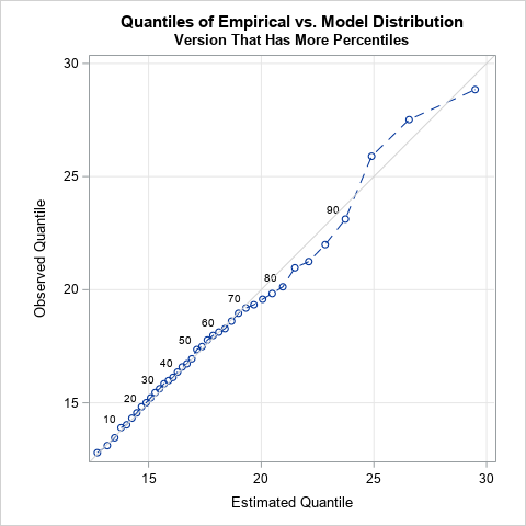
Tag: Data Analysis

Rick Wicklin 0
Detecting outliers in SAS: Part 2: Estimating scale

In a previous blog post on robust estimation of location, I worked through some of the examples in the survey article, "Robust statistics for outlier detection," by Peter Rousseeuw and Mia Hubert. I showed that SAS/IML software and PROC UNIVARIATE both support the robust estimators of location that are mentioned

Rick Wicklin 0
Overlay density estimates on a plot

A recent question on a SAS Discussion Forum was "how can you overlay multiple kernel density estimates on a single plot?" There are three ways to do this, depending on your goals and objectives. Overlay different estimates of the same variable Sometimes you have a single variable and want to

Rick Wicklin 0
The "power" of finite mixture models

When I learn a new statistical technique, one of first things I do is to understand the limitations of the technique. This blog post shares some thoughts on modeling finite mixture models with the FMM procedure. What is a reasonable task for FMM? When are you asking too much? I

Rick Wicklin 0
Maximum likelihood estimation in SAS/IML

A popular use of SAS/IML software is to optimize functions of several variables. One statistical application of optimization is estimating parameters that optimize the maximum likelihood function. This post gives a simple example for maximum likelihood estimation (MLE): fitting a parametric density estimate to data. Which density curve fits the

Rick Wicklin 0
Distances between words

When you misspell a word on your mobile device or in a word-processing program, the software might "autocorrect" your mistake. This can lead to some funny mistakes, such as the following: I hate Twitter's autocorrect, although changing "extreme couponing" to "extreme coupling" did make THAT tweet more interesting. [@AnnMariaStat] When

Rick Wicklin 0
Modeling Finite Mixtures with the FMM Procedure

In my previous post, I blogged about how to sample from a finite mixture distribution. I showed how to simulate variables from populations that are composed of two or more subpopulations. Modeling a response variable as a mixture distribution is an active area of statistics, as judged by many talks

Rick Wicklin 0
The effect of holidays on US births

Last week I showed a graph of the number of US births for each day in 2002, which shows a strong day-of-the-week effect. The graph also shows that the number of births on a given day is affected by US holidays. This blog post looks closer at the holiday effect.

Rick Wicklin 0
Visualizing Scrabble games

My elderly mother enjoys playing Scrabble®. The only problem is that my father and most of my siblings won't play with her because she beats them all the time! Consequently, my mother is always excited when I visit because I'll play a few Scrabble games with her. During a recent

Rick Wicklin 0
Visualizing correlations between variables in SAS

Exploring correlation between variables is an important part of exploratory data analysis. Before you start to model data, it is a good idea to visualize how variables related to one another. Zach Mayer, on his Modern Toolmaking blog, posted code that shows how to display and visualize correlations in R.

Rick Wicklin 0
Complex assignment statements: CHOOSE wisely

This article describes the SAS/IML CHOOSE function: how it works, how it doesn't work, and how to use it to make your SAS/IML programs more compact. In particular, the CHOOSE function has a potential "gotcha!" that you need to understand if you want your program to perform as expected. What

Rick Wicklin 0
Improving graphs of highly correlated data

If you create a scatter plot of highly correlated data, you will see little more than a thin cloud of points. Small-scale relationships in the data might be masked by the correlation. For example, Luke Miller recently posted a scatter plot that compares the body temperature of snails when they

Rick Wicklin 0
Overlaying two histograms in SAS

A reader commented to me that he wants to use the HISTOGRAM statement of the SGPLOT procedure to overlay two histograms on a single plot. He could do it, but unfortunately SAS was choosing a large bin width for one of the variables and a small bin width for the

Rick Wicklin 0
A statistical analysis of coupons

Each Sunday, my local paper has a starburst image on the front page that proclaims "Up to $169 in Coupons!" (The value changes from week to week.) One day I looked at the image and thought, "Does the paper hire someone to count the coupons? Is this claim a good

1 12 13 14 15 16