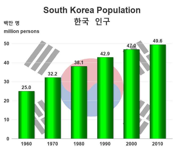
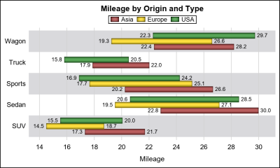
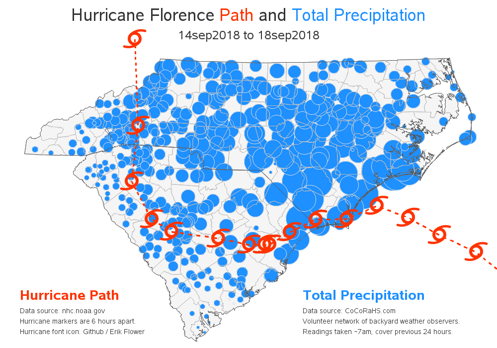
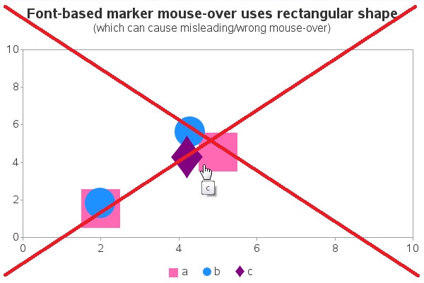
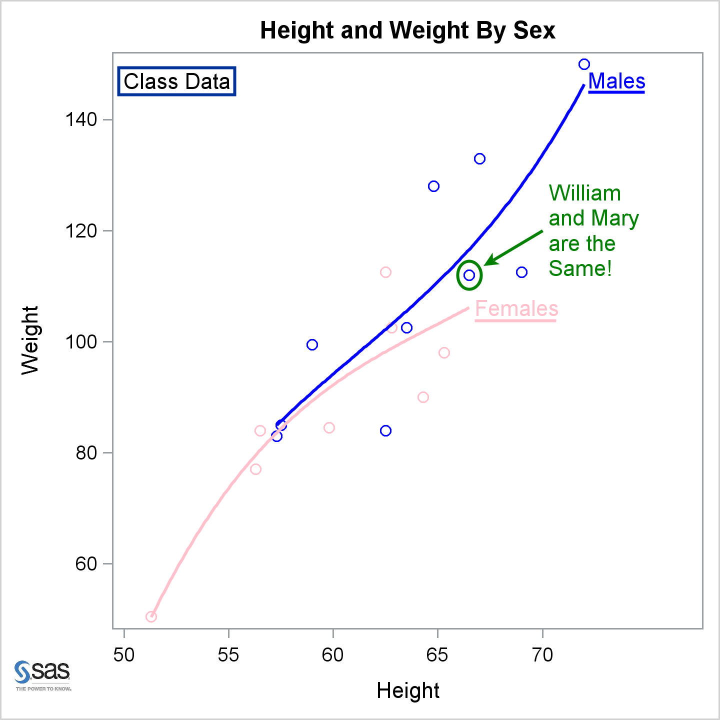
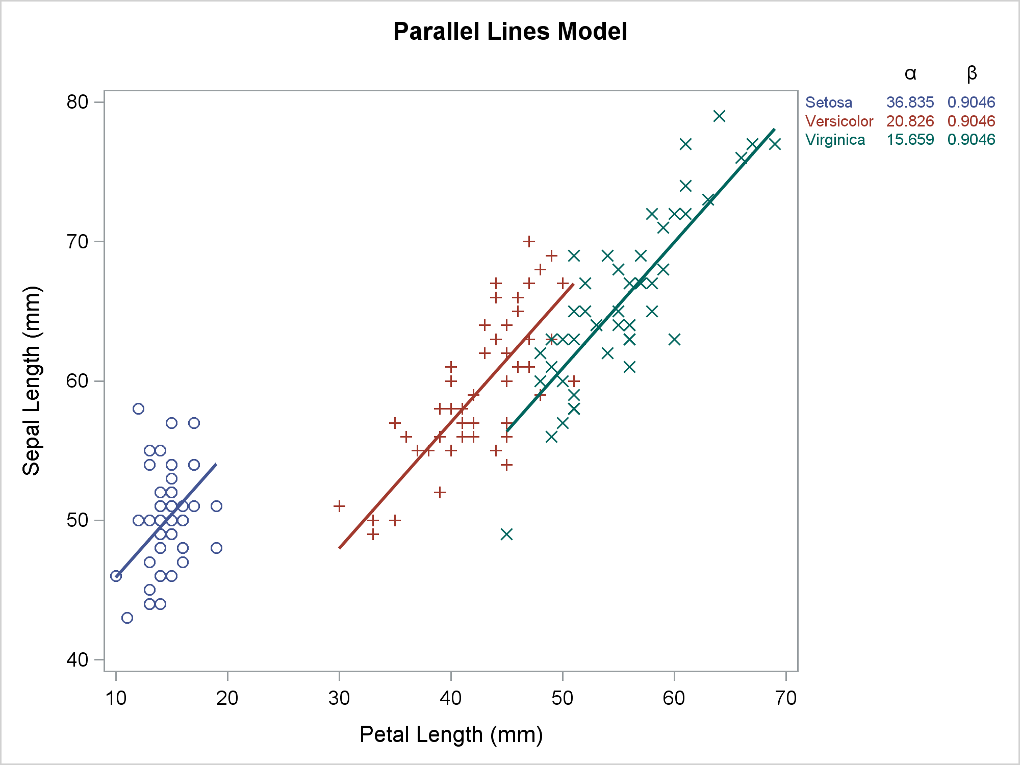
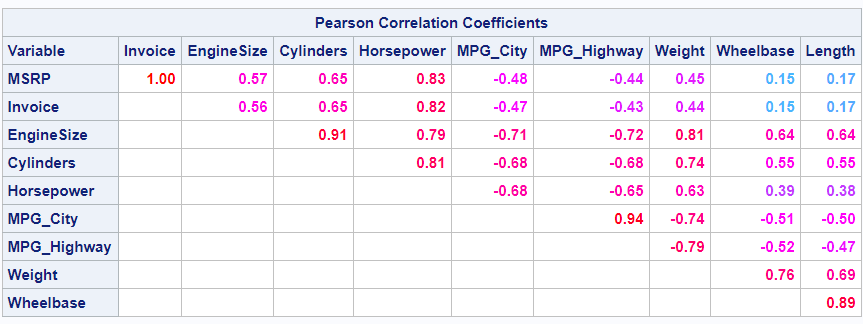
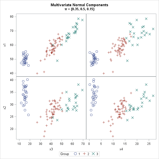
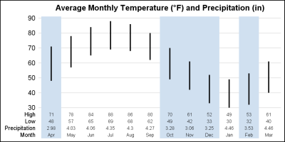
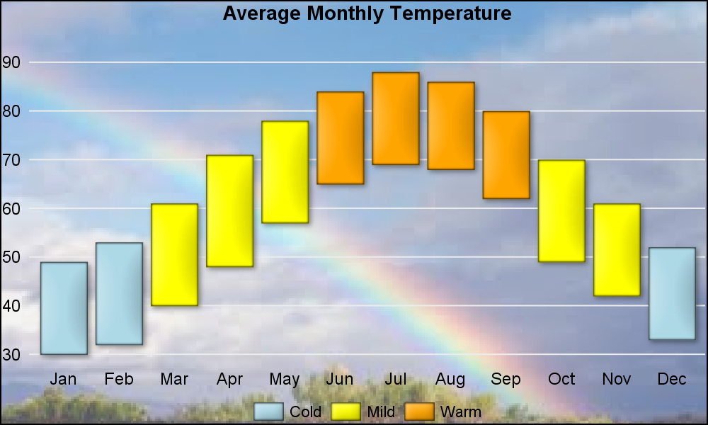
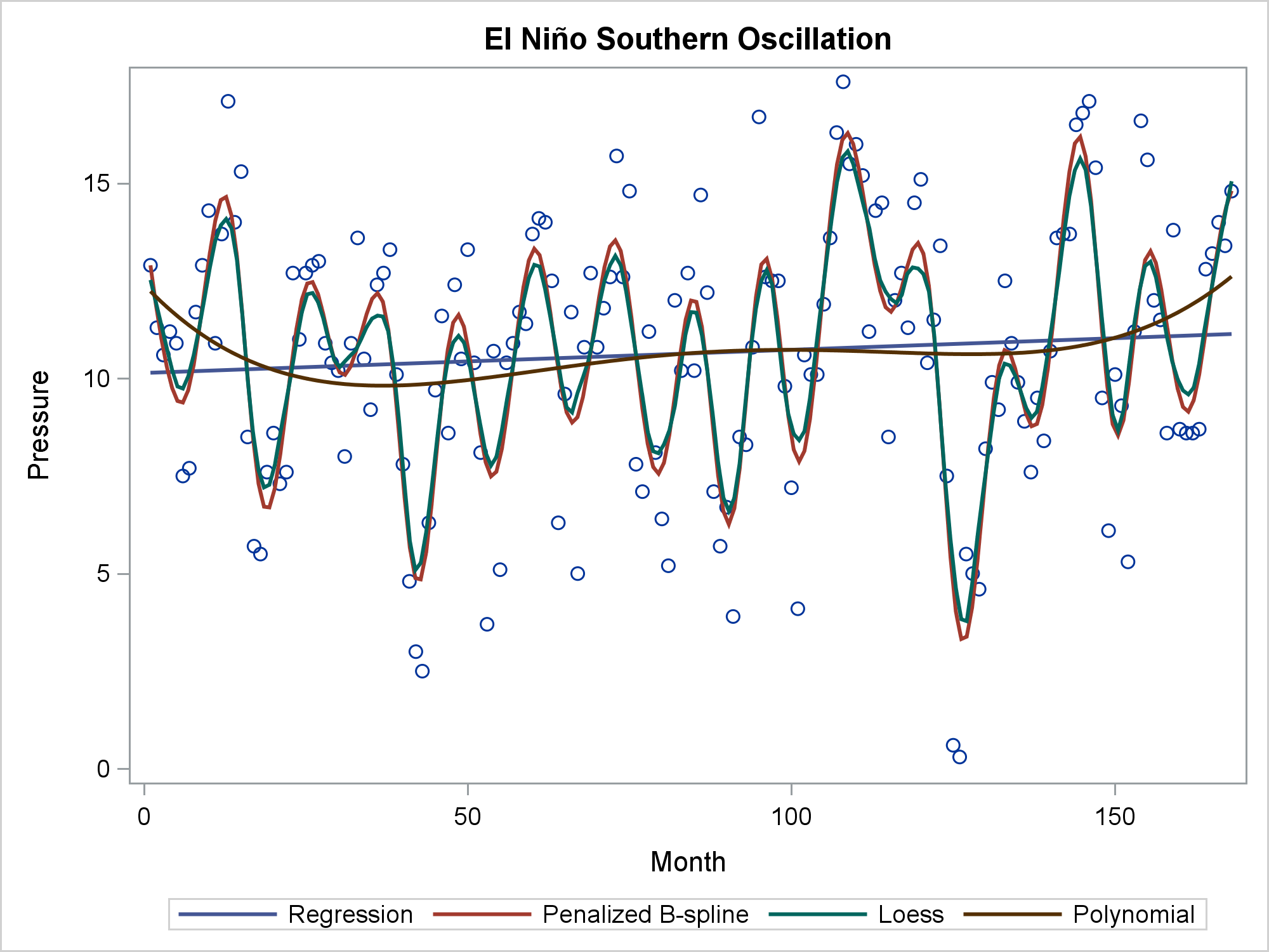
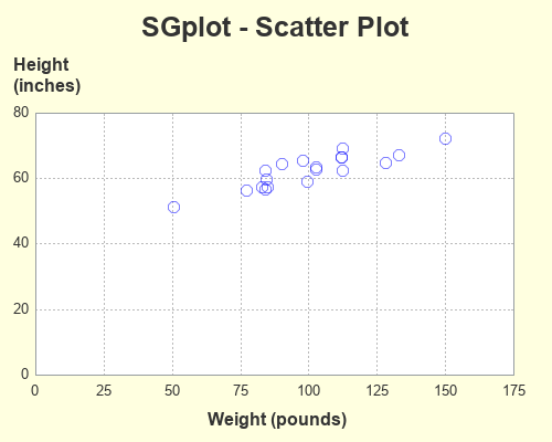
Search Results: Unicode (79)

Data Visualization | Learn SAS | Programming Tips
Sanjay Matange 0
A Graphical Journey

The ODS Graphics software, first released with SAS 9.2, supported creating graphs directly from statistical procedures.  Prior to this, very few statistical procedures created graphs on their own, and in most cases creating graphs was a post process or creating the graphs from the saved data using SAS/GRAPH procedures. With

Analytics | Data Visualization | Programming Tips
Robert Allison 0
Hurricane Florence: rainfall totals in the Carolinas

"We been through every kind of rain there is. Little bitty stingin' rain, and big ol' fat rain, rain that flew in sideways, and sometimes rain even seemed to come straight up from underneath." Was that a quote from the Forrest Gump movie, or something said regarding Hurricane Florence? Could be either one! Hurricane Florence recently came through

Data Visualization | Programming Tips
Warren F. Kuhfeld 0
Advanced ODS Graphics: Examining and processing templates

This post shows a variety of techniques including how to use PROC TEMPLATE and the SOURCE statement, PROC SGPLOT with multiple Y-axis tables, create comparable axes in two side-by-side graphs, create a broken axis, write and use a table template that wraps text, and find and display examples of certain statements in graph templates and fonts in style templates.

Data Visualization
Sanjay Matange 0
Image backgrounds

As many of the regular readers of this blog know, SGPLOT and GTL, provide extensive tools to build complex graphs by layering plot statements together.  These plots work with axes, legends and attribute maps to create graphs that can scale easily to different data. There are, however, many instances where

Rick Wicklin 0
Simulate data from a generalized Gaussian distribution

Although statisticians often assume normally distributed errors, there are important processes for which the error distribution has a heavy tail. A well-known heavy-tailed distribution is the t distribution, but the t distribution is unsuitable for some applications because it does not have finite moments (means, variance,...) for small parameter values.

Rick Wicklin 0
Overlay a curve on a bar chart in SAS

One of the strengths of the SGPLOT procedure in SAS is the ease with which you can overlay multiple plots on the same graph. For example, you can easily combine the SCATTER and SERIES statements to add a curve to a scatter plot. However, if you try to overlay incompatible