A recent post in Rick Wicklin's DO Loop blog shows how to label multiple regression lines. Astute readers of the Graphically Speaking and DO Loop blogs might have noticed that Rick and I sometimes tag-team on topics, with each of us putting our own spin on them. So it is today. There are often several approaches that one can take to a problem. Each might have advantages and disadvantages. Rick suggested that I might want to approach the same topic but by using axis tables. Rick's labels clearly show the association between the function and its equation. In contrast, a table can handle more groups (since no attempt is made to align the equation and the parameter estimates) and you can additionally add other statistics such t statistics and p values. This is an unusual illustration of axis tables. Usually, you use axis tables when there is a clear link between the rows of the axis table and the graph. That is not the case here. When PROC writers are faced with creating a table like the ones that you see in this post, they use the GTL and a LAYOUT GRIDDED. Since we do not have gridded layouts in PROC SGPLOT, I'll show how to use an axis table instead. This post also uses discrete attribute maps.
Rick used PROC REG and a BY statement to get the parameter estimates for the separate fit functions. I will use PROC TRANSREG. I wrote PROC TRANSREG, so I no doubt turn to it more than most people. However, I quite deliberately built these kinds of models into the procedure from its earliest days. In the second part of this post, I will show how you can use PROC TRANSREG to fit a model where the fit function for each group is not independent of the other groups. This PROC TRANSREG step fits a model with three intercepts and three slopes (one each for each of the three iris species). The ZERO=NONE option creates one binary variable for each CLASS level and suppresses the overall intercept (hence, the model has an implicit intercept). The vertical bar creates the interaction between the CLASS variable and the quantitative variable.
ods graphics on; proc transreg data=sashelp.iris ss2 plots=fit(nocli noclm); ods output coef=coef; model identity(sepallength) = class(species / zero=none) | identity(petallength); run; |
The ODS OUTPUT statement stores the parameter estimates in a SAS data set that has one row for each parameter. The following step reformats the parameters from six rows to three rows (number of groups) and two columns (two parameters per group).
data coef2(drop=coef: label);
   length Group $ 10;
   do i = 1 to 3;
      set coef(keep=label coefficient) point=i;
      Group = scan(label, 3);
      Int   = coefficient;
      j = i + 3;
      set coef(keep=label coefficient) point=j;
      Slope = coefficient;
      output;
   end;
   stop;
run; |
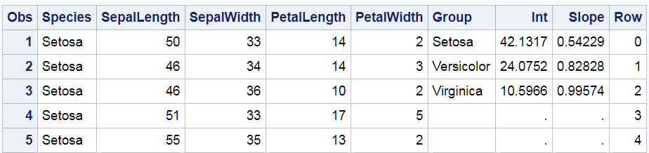
Care must be taken when using the POINT= option in the SET statement to ensure that processing stops at an appropriate time. Since neither SET statement ever tries to read past the end of the file, a STOP statement stops the DATA step at the end of the first pass. Now we have two data sets: SASHelp.Iris (which has 150 observations) and Coef2 (which has 3 observations). The following steps merge the two data sets and add a Row variable that ranges from 0 to 29. The Int and Slope variables from the smaller data set have 147 missing values, and the Row variable has 120 missing values. The PROC PRINT step displays the first five observations.
data all; merge sashelp.iris coef2; Row = ifn(_n_ le 30, _n_ - 1, .); run; proc print data=all(obs=5); run; |
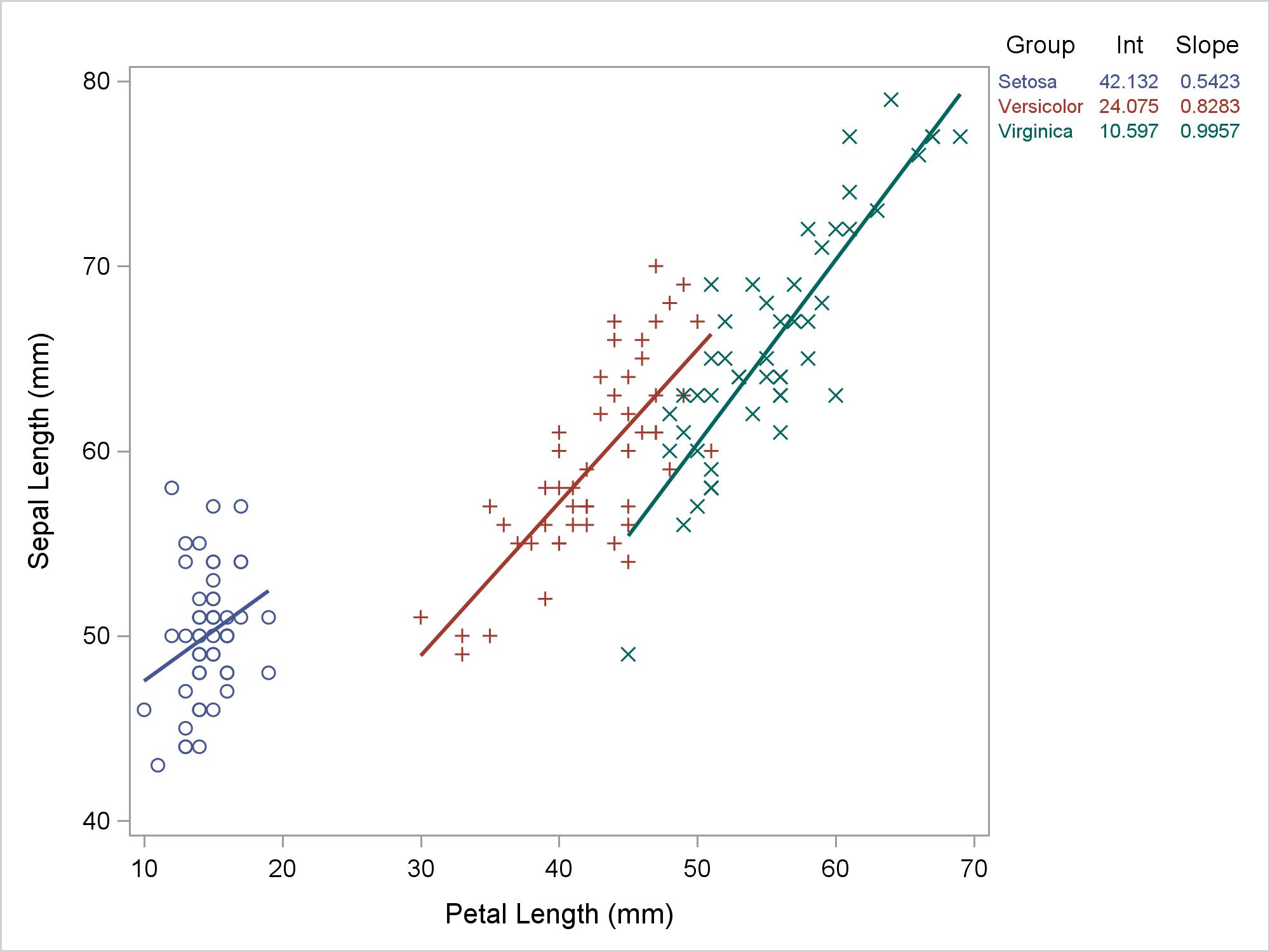
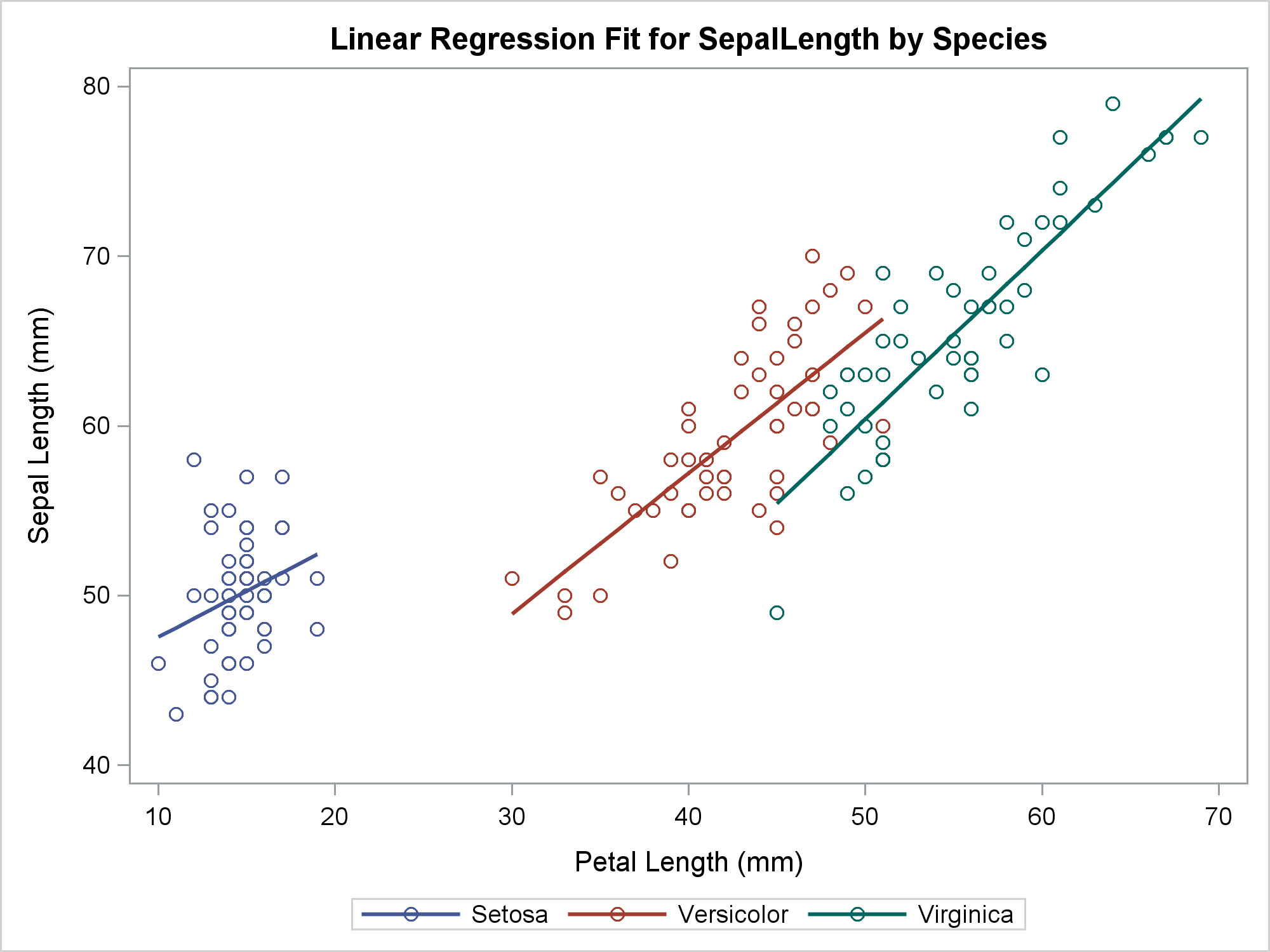
You can use PROC SGPLOT to simultaneously display the fit plot and the axis table. Here, a REG statement makes the grouped fit plot. The REG statement fits the same model as the preceding PROC TRANSREG step.
ods graphics on / attrpriority=none; options missing=' '; proc sgplot data=all; styleattrs datalinepatterns=(solid); scatter y=row x=petallength / y2axis markerattrs=(size=0); reg y=sepallength x=petallength / group=species; yaxistable group Int Slope / y=row y2axis; y2axis reverse display=none; run; |
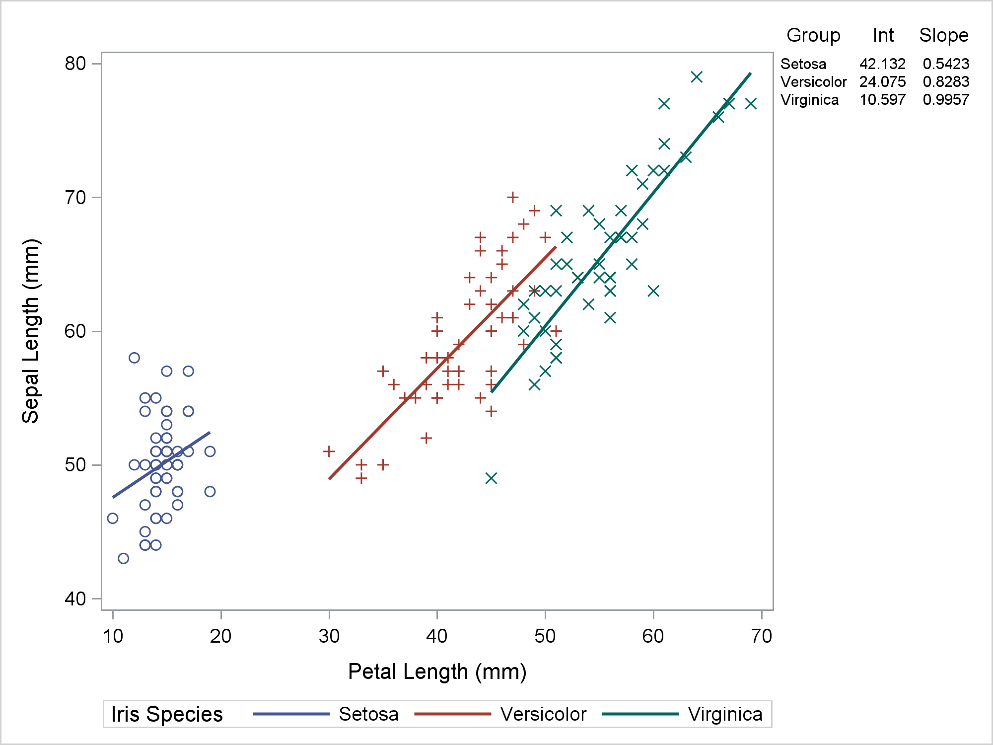
My preference when displaying a graph like this is for the lines to all be solid, for the markers and lines to have different colors for each group, and for each group to use different markers. You can do this by specifying ATTRPRIORITY=NONE in the ODS GRAPHICS statement and a STYLEATTRS statement in PROC SGPLOT that specifies one line pattern, solid. The Row variable provides the Y coordinates for the rows of the axis table. There is no variable in the regression fit plot related to rows, so we made row numbers when we merged the data. The PROC SGPLOT step has an invisible scatter plot. Invisible scatter plots are enormously useful. The invisible scatter plot provides the "glue" that binds the table to the regression fit plot. The invisible scatter plot uses the Y2 axis, which in this example has values that range from 0 to 29. The size zero markers make the plot invisible. Both the scatter plot and the axis table have a Y=ROW option. This positions the rows of the axis table in Y2 axis positions 0 to 2. Meanwhile, the values 3 through 29 of the Row variable correspond to the rest of the Y2 axis. This aligns the axis table with the top of the regression plot. For other size plots or other font sizes, you might need a different range for the Row variable. The Y2 axis appears on the right of the plot, but the ticks, tick labels, and axis labels are suppressed.
I like this plot, but you might want to make the colors of the rows of the axis table correspond to the the colors in the regression plot. Then you can suppress the separate legend. To do this, you must ensure that the mappings between colors and groups is consistent across the two statements. (See my next post for more about this.) You can use a discrete attribute map to consistently use the GraphData1 through GraphData3 style elements for each group.
data attrmap;
   retain id 'variety';
   length value markerstyleelement $ 12;
   input value;
   markerstyleelement = cats('GraphData', _n_);
   textstyleelement   = markerstyleelement;
   linestyleelement   = markerstyleelement;
   datalines;
Setosa
Versicolor
Virginica
; |
The following step creates the new plot.
proc sgplot data=all dattrmap=attrmap noautolegend; styleattrs datalinepatterns=(solid); scatter y=row x=petallength / y2axis markerattrs=(size=0); reg y=sepallength x=petallength / group=species attrid=variety; yaxistable group Int Slope / y=row y2axis colorgroup=group attrid=variety; y2axis reverse display=none; run; |
Now let's fit a model that has parallel slopes by not interacting the CLASS variable and the quantitative variable. This creates a model with three intercepts and one common slope. (For other examples of using PROC TRANSREG to fit regression models with lines, curves, and multiple groups, see Simultaneously Fitting Two Regression Functions in the PROC TRANSREG documentation.) Now we can no longer use the REG statement to fit the same model that PROC TRANSREG fits, so we need to output the predicted values to a data set Res (for results) for use in PROC SGPLOT.
ods graphics on / reset=attrpriority; proc transreg data=sashelp.iris ss2 plots=fit(nocli noclm); ods output coef=coefb; model identity(sepallength) = class(species / zero=none) identity(petallength); output out=res p replace; run; |
The following step rearranges the parameter estimates, almost like before, but now it needs to process only one slope.
data coefb2(drop=coef: label);
   length Group $ 10;
   do i = 1 to 3;
      set coefb(keep=label coefficient) point=i;
      Group = scan(label, 3);
      Int   = coefficient;
      j = 4;
      set coefb(keep=label coefficient) point=j;
      Slope = coefficient;
      output;
   end;
   stop;
run; |
The next steps sort the results data set, merges the results and the parameter estimates, and adds the Row variable.
proc sort data=res; by species petallength; run; data all2; merge res coefb2; Row = ifn(_n_ le 30, _n_ - 1, .); run; |
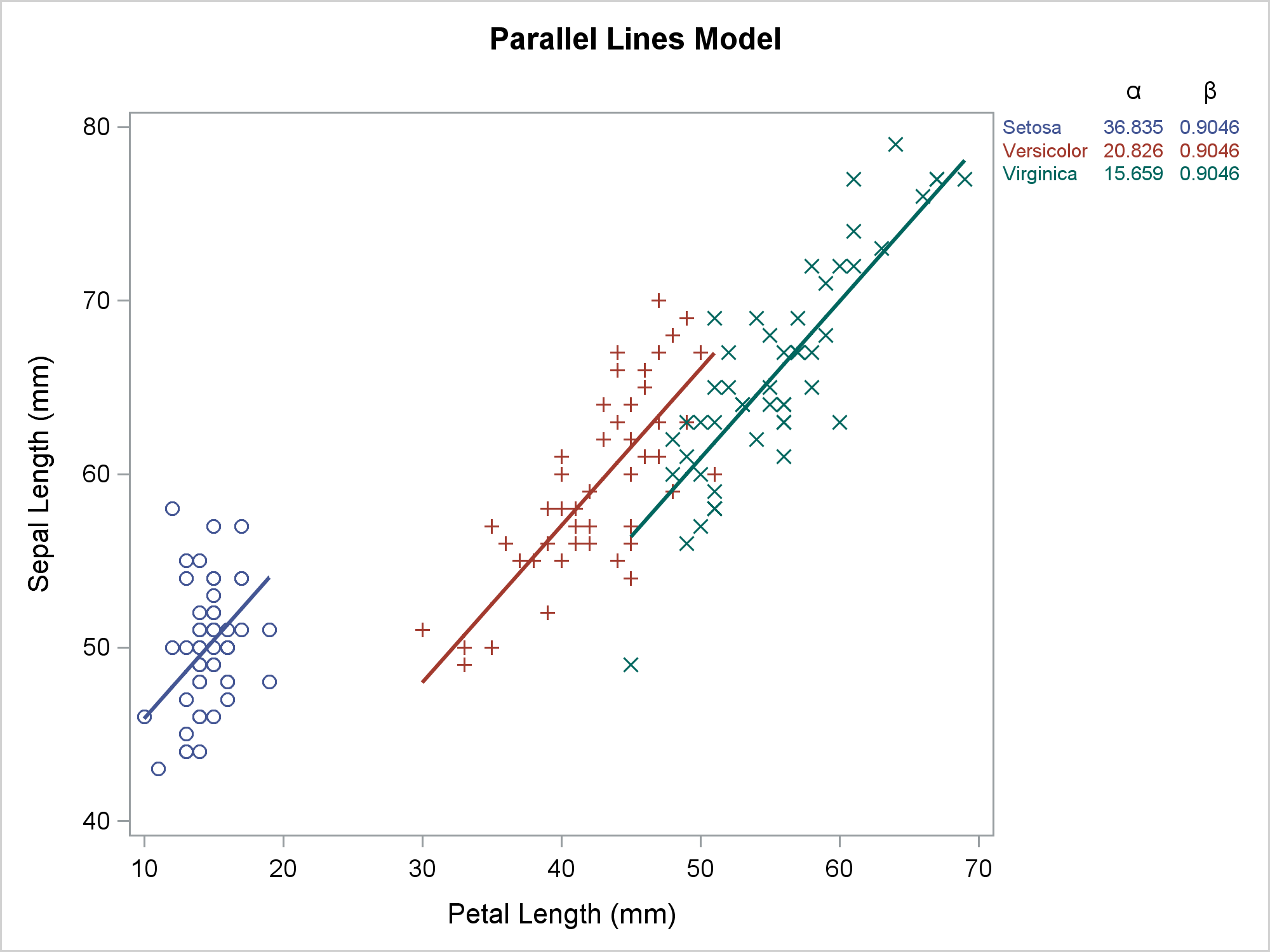
This last step displays the parallel-slopes model along with the regression coefficients. We replaced the REG statement by a SCATTER and SERIES statement. The invisible scatter plot still provides the positions for the rows of the axis table. This time, the Greek letters alpha and beta are displayed as headers.
ods graphics on / attrpriority=none;
proc sgplot data=all2 dattrmap=attrmap noautolegend;
   title 'Parallel Lines Model';
   styleattrs datalinepatterns=(solid);
   scatter y=row x=petallength / y2axis markerattrs=(size=0);
   scatter y=sepallength  x=petallength / group=species attrid=variety;
   series  y=psepallength x=petallength / group=species attrid=variety
                                          lineattrs=(thickness=2);
   %let o = y=row y2axis colorgroup=group attrid=variety label=;
   yaxistable group / &o ' ';
   yaxistable Int   / &o '(*ESC*){Unicode alpha}';
   yaxistable Slope / &o '(*ESC*){Unicode beta}';
   y2axis reverse display=none;
run;
title;
options missing='.'; |
As Rick and I have both shown, SAS analytical procedures combined with data manipulations and ODS Graphics provide great power and flexibility for creating customized graphs. Developing this code was not as easy as it might first appear. My next post continues using the same example and shows the lessons you can learn by looking at the template and ODS OUTPUT data set that PROC SGPLOT creates.


