A Volcano Plot is a type of scatter-plot that is used to quickly identify changes in large data sets composed of replicate data. In the clinical domain, a Volcano Plot is used to view Risk difference (RD) of AE occurrence (%) between drug and control by preferred term.
One example of a volcano plot, P-risk Odds Ratio of Treatment Emergent Adverse Events is contributed by Qi Jiang and is included in the list of Clinical Graphs on the CTSPedia web site. The graph is a used for safety signal screening and AE data display. It allows investigators to evaluate AE risks using both estimates of risk difference and p-values. Optional reference lines are added so that AEs with large RD and small p-values can be identified in the upper right corner of the plot.
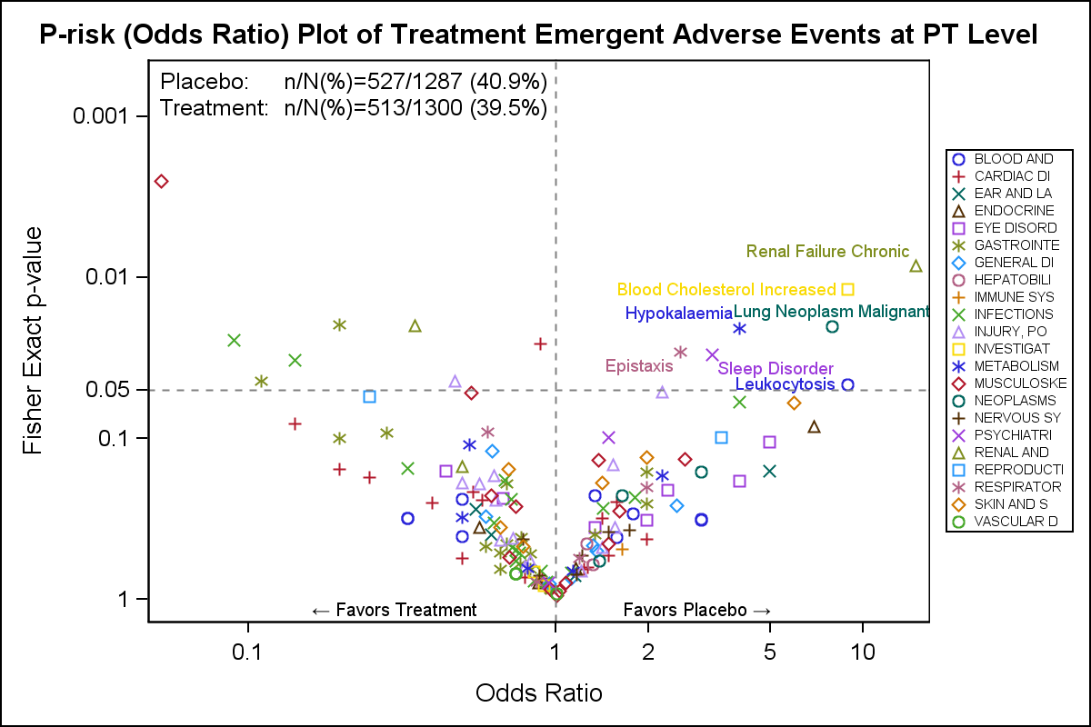 I took the data from the example on the CTSPedia example and used the SGPLOT procedure to create the graph shown on the right. Click on the graph for a higher resolution view.
The graph plots the log of the p-values by the log of the Odds Ratio by AESOC. For this graph, I have displayed the AE terms for p-values > 0.05 are labeled. The scatter plot is by AESOC, and the I have set a format to display 10 characters in the legend which is placed on the right of the plot.
title 'P-risk (Odds Ratio) Plot of Treatment Emergent Adverse Events at PT Level';
proc sgplot data=sample2;
format aesoc $10. text $txt.;
label p_rr='Fisher Exact p-value';
label rr='Odds Ratio';
scatter x=rr y=p_rr / group=aesoc datalabel=label name='a';
refline 1 / axis=x lineattrs=(pattern=shortdash);
refline 0.05 / axis=y lineattrs=(pattern=shortdash);
inset ("Placebo:" = "n/N(%)=&inset1"
"Treatment:" = "n/N(%)=&inset2") / noborder position=topleft;
text x=xlbl y=ylbl text=text / position=bottom contributeoffsets=(ymax);
yaxis reverse type=log values=(1.0 0.1 0.05 0.01 0.001) offsetmin=0.1;
xaxis type=log values=(0.1 1 2 5 10) valueshint;
keylegend 'a' / across=1 position=right valueattrs=(size=6);
run;
It was not obvious to me how the inset values were computed. These would computed in a data step and inserted into macro variables for display in the graph. So I just assigned the values into macro variables and used those in the INSET statement.
Also note the use of the Unicode characters for the left and right arrow in the "Favors" labels. We do this by making these texts as "T" and "P" in the data, but use a user defined format that includes Unicode values in the text.
If you compare with the code on the CTSPedia site, you will see the SGPLOT code is very concise and does not require use of Annotation. This makes the graph code more robust and usable with other data.
Full SAS 9.40M3 SGPLOT code: VolcanoPlot

5 Comments
Dear Sanjay,
Thank you for your code. The graph displays a circle for every AESOC (it changes to "+" when all colors are exhausted). How can we have the same graph as the one in your article, i.e. with "O" for "Blood", "+" for "Cardiac", "X" for "Ears", ... ?
Thank you in avance.
Best,
Reza
You can do this using a Discrete Attributes Map. See my paper at https://support.sas.com/resources/papers/proceedings17/SAS0675-2017.pdf, page 9, to see an example.
Hope this helps!
Dan
Thank you Dan. I created an attrmap dataset (below) and addedd the attrid= option in the scatter line but it fails to take the symbols into account : did I miss something ? Thank you for your assistance.
Reza
data attrmap;
*retain id "soc";
length id $ 4 linecolor markercolor fillcolor $ 8 markersymbol $ 8;
input id $ value $5-57 linecolor $ markercolor $ fillcolor $ markersymbol $;
datalines;
soc BLOOD AND LYMPHATIC SYSTEM DISORDERS blue blue blue Circle
soc CARDIAC DISORDERS red red red Plus
soc CONGENITAL, FAMILIAL AND GENETIC DISORDERS green green green X
soc EAR AND LABYRINTH DISORDERS purple purple purple Triangle
...
;
run;
proc sgplot data=volcano dattrmap=attrmap; /* REZA */
format socname $20. text $txt.;
label pvalue='Fisher Exact p-value (uncorrected)';
label deltap='Risk difference (%)'; /*Odds Ratio';*/
scatter x=deltap y=pvalue / group=socname attrid=soc datalabel=label name='a';
refline 0 /*1*/ / axis=x lineattrs=(pattern=shortdash);
refline 0.05 / axis=y lineattrs=(pattern=shortdash);
inset ("CT+D:" = "n/N(%)=&inset1"
"CT+D+T:" = "n/N(%)=&inset2") / noborder position=topleft;
*text x=xlbl y=ylbl text=text / position=bottom contributeoffsets=(ymax);
yaxis reverse type=log values=(1.0 0.1 /*0.05 0.01 0.001*/) offsetmin=0.2;
xaxis /*type=log values=(0.1 1 2 5 10)*/ valueshint;
keylegend 'a' / across=1 position=right valueattrs=(size=6);
run;
For medarator : my last message included the wrong sgplot. THis is the one with sample2 dataset. It also fails to take the right colour defined in attrmap :
proc sgplot data=sample2 dattrmap=attrmap;
format aesoc $10. text $txt.;
label p_rr='Fisher Exact p-value';
label rr='Odds Ratio';
scatter x=rr y=p_rr / group=aesoc datalabel=label name='a' attrid=soc;
refline 1 / axis=x lineattrs=(pattern=shortdash);
refline 0.05 / axis=y lineattrs=(pattern=shortdash);
inset ("Placebo:" = "n/N(%)=&inset1"
"Treatment:" = "n/N(%)=&inset2") / noborder position=topleft;
*text x=xlbl y=ylbl text=text / position=bottom contributeoffsets=(ymax);
yaxis reverse type=log values=(1.0 0.1 0.05 0.01 0.001) offsetmin=0.1;
xaxis type=log values=(0.1 1 2 5 10) valueshint;
keylegend 'a' / across=1 position=right valueattrs=(size=6);
run;
Do the values in "aesoc" match the case in your attrmap data set?