There are many quotes with words of wisdom to help you live your life. But sometimes one quote seems to contradict another. For example, "Don't sweat the small stuff." ... and "The devil is in the details." When it comes to creating graphs (and perhaps living my life in general), I tend to lean towards the second quote. This will probably be evident when you see my advice on choosing scatter plot markers. :-)
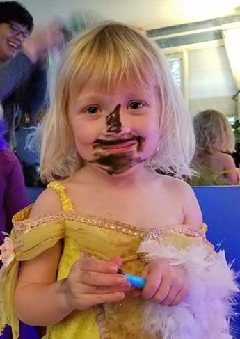
But before we get started on the scatter plot markers, how about some fun advice on a different kind of markers - magic markers. Choosing the right magic markers can also be very important. If you want to create a sign/poster that might get some rain on it, you should use permanent markers. But if you've got kids ... well, you might want to consider markers with water-based ink! Here's a picture of my friend Holly's daughter, that really brings home this point, LOL!
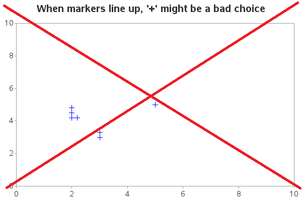
Now that you're smiling, let's work on those scatter plot markers. With SAS/Graph Proc GPlot, the default plot marker is a '+'. This usually works OK, but sometimes I find that data values in plots tend to "line up" (with several markers having the same x-values, or the same y-values), and when that happens, the '+' markers can merge together and form what looks like a line with several marks across it. Here's an example:
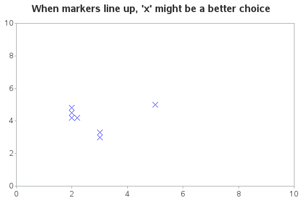
In cases like this, I would recommend using an 'x' marker instead:
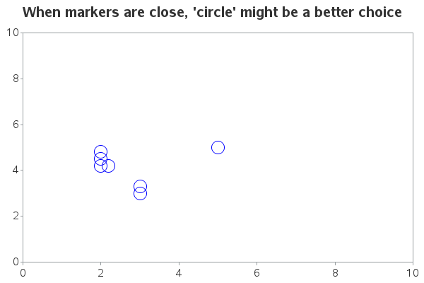
Another marker shape commonly used in scatter plots is a solid-filled dot. This usually works well ... except when the markers are are so close that they merge together or overlap.
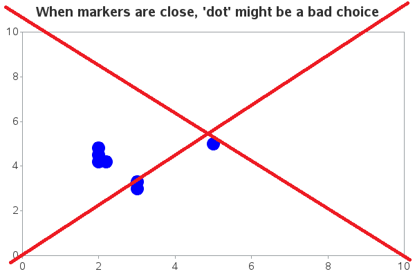
In situations like that, I recommend using circles, rather than a dots.
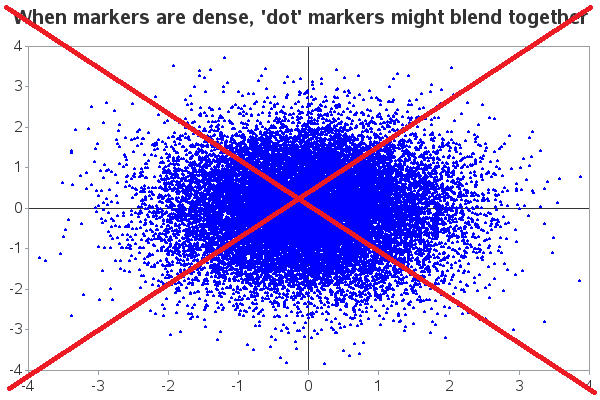
Sometimes when the data points are packed very densely, even small dots are too big, and merge together into a blob.
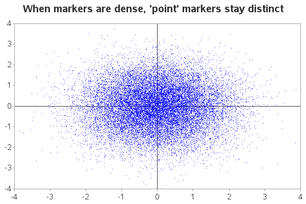
In situations like this, I would recommend using point markers, rather than dot markers. A point is the smallest marker available in SAS/Graph.
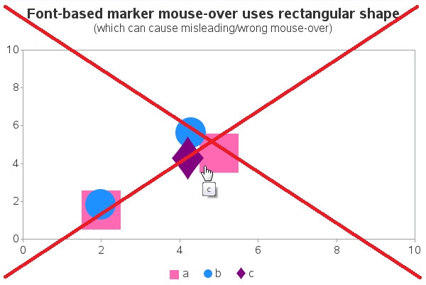
Another issue to consider when choosing plot markers is mouse-over text. Some types of markers work better than others. For example, font-based plot markers can be problematic when used with mouse-over text, because font-based markers always use a rectangular area for their mouse-over text (even though the marker is not rectangular), and the rectangular area usually extends out much farther than the visible marker. If two markers are near each other, the rectangular area for the mouse-over text for one marker might extend over the other marker - then when you mouse over it you can see the wrong value. This can be very misleading and compromise the data integrity of the graph. Here is an example (note that the mouse-over for the pink box should be 'a', but the rectangular mouse-over area for the purple diamond 'c' is showing up). Click here to see the interactive graph, and try out the mouse-overs.
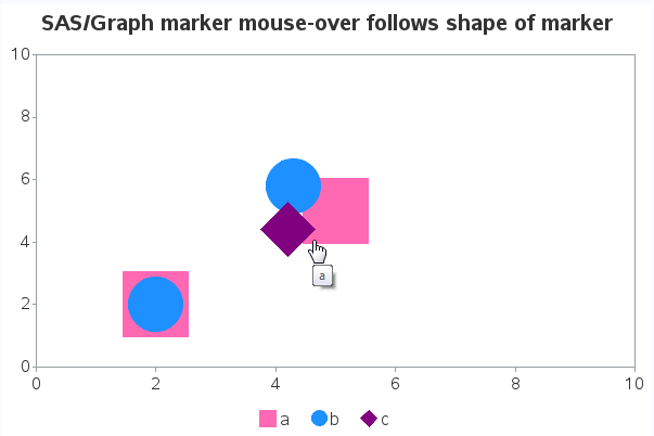
 When you use the SAS/Graph markers shapes (rather than font-based marker shapes), the mouse-over areas follow the shape of the markers, rather than being rectangular. Now when I hover my mouse over the pink triangle, the mouse-over text says 'a' like it should. Click here to see the interactive graph, and try out the mouse-overs.
Here's a link to the SAS code I used to create these examples, if you'd like to experiment with it.
If you have any additional marker-tips you'd like to share, feel free to add them in the comments...


2 Comments
If using markers of multiple colors, it's necessary to make them big enough if you want viewers to be able to reliably distinguish the colors.
Sounds like a good rule of thumb!