My previous post shows how you can add GTL DRAW statements to strategic places in graph templates. Most of the examples illustrate draw spaces--the coordinate systems--but do not say much about the actual DRAW statements. This post provides examples of each of the DRAW statements and links to the documentation. You might argue that I wrote these two posts in the wrong order, since this post is more basic than the previous post, but I wrote them in the order that they occurred to me.
I will use the term "DRAW statements" to refer to the following statements: BEGINPOLYGON, BEGINPOLYLINE, DRAWARROW, DRAWIMAGE, DRAWLINE, DRAWOVAL, DRAWRECTANGLE, and DRAWTEXT. Both the BEGINPOLYGON and BEGINPOLYLINE statements have a subsidiary statement named "DRAW" that is documented with its associated BEGIN statement. You can use the links to learn more details about the syntax of these statements. Just as SG annotation has many variables, DRAW statements have many options.
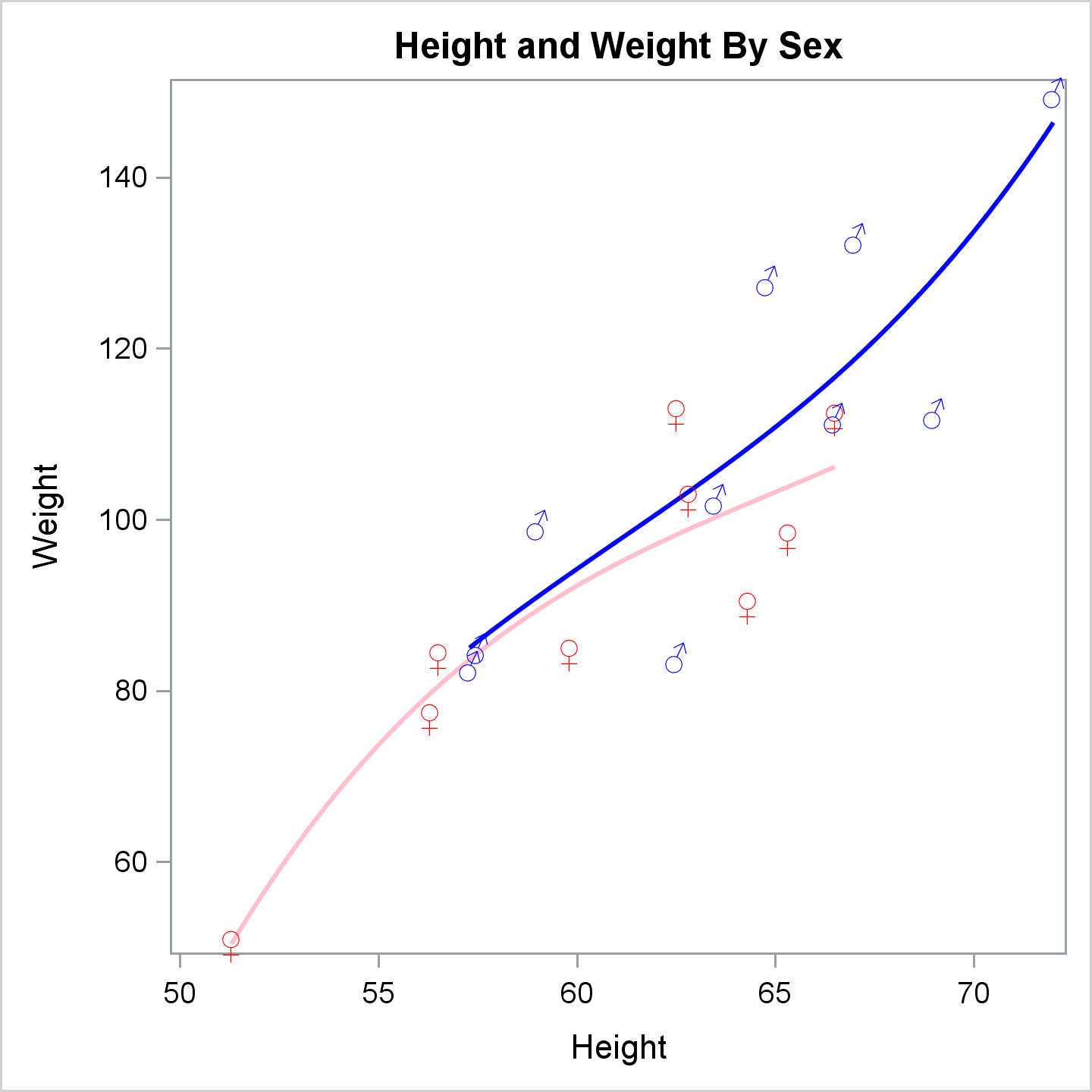
I'll begin in a similar way to the way I started my previous post by showing another example of the relationship between SG annotation in PROC SGPLOT and DRAW statements in the GTL. The following step uses the Sashelp.Class data set both to construct an SG annotation data set and as the input data set for PROC SGPLOT.
ods graphics on / height=4.8in width=4.8in;

data anno(drop=name sex age rename=(weight=y1 height=x1));
   set sashelp.class;
   retain Function 'Text' DrawSpace 'DataValue';
   Label = '(*ESC*){Unicode "' || ifc(sex eq 'F', '2640', '2642') || '"x}';
   TextColor = ifc(sex eq 'F', 'red', 'blue');
   retain x2 y2 0;
run;

proc print noobs;
run;

proc sgplot data=sashelp.class sganno=anno noautolegend tmplout='t1';
   styleattrs datacontrastcolors=(blue pink);
   title 'Height and Weight By Sex';
   reg y=weight x=height / group=sex degree=3 markerattrs=(size=0);
run; |
PROC SGPLOT generates the following graph template.
proc template;
define statgraph sgplot;
begingraph / collation=binary subpixel=on dataContrastColors=( CX0000FF CXFFC0CB );
DiscreteAttrVar attrvar=__ATTRVAR1__ var=Sex attrmap="__ATTRMAP__";
DiscreteAttrVar attrvar=__ATTRVAR1__ var=eval(sort(Sex, RETAIN=ALL)) attrmap="__ATTRMAP__";
DiscreteAttrMap name="__ATTRMAP__" / autocycleattrs=1;
Value "M";
Value "F";
EndDiscreteAttrMap;
EntryTitle "Height and Weight By Sex" /;
layout overlay / yaxisopts=(labelFitPolicy=Split) y2axisopts=(labelFitPolicy=Split);
   ScatterPlot X=Height Y=Weight / primary=true DataID=__TABLE__ group=__ATTRVAR1__ Markerattrs=( Size=0);
   RegressionPlot X=Height Y=Weight / NAME="REG" LegendLabel="Regression" Degree=3 Group=__ATTRVAR1__;
   DrawText TEXTATTRS=( COLOR=blue) {Unicode "2642"x} / X=69   Y=112.5 DRAWSPACE=DataValue;
   DrawText TEXTATTRS=( COLOR=red ) {Unicode "2640"x} / X=56.5 Y=84    DRAWSPACE=DataValue;
   DrawText TEXTATTRS=( COLOR=red ) {Unicode "2640"x} / X=65.3 Y=98    DRAWSPACE=DataValue;
   DrawText TEXTATTRS=( COLOR=red ) {Unicode "2640"x} / X=62.8 Y=102.5 DRAWSPACE=DataValue;
   DrawText TEXTATTRS=( COLOR=blue) {Unicode "2642"x} / X=63.5 Y=102.5 DRAWSPACE=DataValue;
   DrawText TEXTATTRS=( COLOR=blue) {Unicode "2642"x} / X=57.3 Y=83    DRAWSPACE=DataValue;
   DrawText TEXTATTRS=( COLOR=red ) {Unicode "2640"x} / X=59.8 Y=84.5  DRAWSPACE=DataValue;
   DrawText TEXTATTRS=( COLOR=red ) {Unicode "2640"x} / X=62.5 Y=112.5 DRAWSPACE=DataValue;
   DrawText TEXTATTRS=( COLOR=blue) {Unicode "2642"x} / X=62.5 Y=84    DRAWSPACE=DataValue;
   DrawText TEXTATTRS=( COLOR=blue) {Unicode "2642"x} / X=59   Y=99.5  DRAWSPACE=DataValue;
   DrawText TEXTATTRS=( COLOR=red ) {Unicode "2640"x} / X=51.3 Y=50.5  DRAWSPACE=DataValue;
   DrawText TEXTATTRS=( COLOR=red ) {Unicode "2640"x} / X=64.3 Y=90    DRAWSPACE=DataValue;
   DrawText TEXTATTRS=( COLOR=red ) {Unicode "2640"x} / X=56.3 Y=77    DRAWSPACE=DataValue;
   DrawText TEXTATTRS=( COLOR=red ) {Unicode "2640"x} / X=66.5 Y=112   DRAWSPACE=DataValue;
   DrawText TEXTATTRS=( COLOR=blue) {Unicode "2642"x} / X=72   Y=150   DRAWSPACE=DataValue;
   DrawText TEXTATTRS=( COLOR=blue) {Unicode "2642"x} / X=64.8 Y=128   DRAWSPACE=DataValue;
   DrawText TEXTATTRS=( COLOR=blue) {Unicode "2642"x} / X=67   Y=133   DRAWSPACE=DataValue;
   DrawText TEXTATTRS=( COLOR=blue) {Unicode "2642"x} / X=57.5 Y=85    DRAWSPACE=DataValue;
   DrawText TEXTATTRS=( COLOR=blue) {Unicode "2642"x} / X=66.5 Y=112   DRAWSPACE=DataValue;
endlayout;
endgraph;
end;
run; |
There is a clear correspondence between the columns in the SG annotation data set and the options in the DRAWTEXT statement. Furthermore, there is nothing that you can do by using SG annotation that you cannot do by using the GTL and DRAW statements. This SG annotation data set contains only one type of observation. Other data sets might contain multiple functions and have additional variables, some of which might not apply to all observations. The generated DRAW statements are often easier to look at than the SG annotation data set. Superfluous variables do not appear in the DRAW statements. Inspecting the graph template can help you understand the salient parts of your SG annotation data set. When an expected DRAW statement does not appear, check the Function variable value in your data set.
The following steps create a simple graph template and create a regression fit plot with two groups, but without the special markers.
proc template;
   define statgraph MyRegPlot;
      begingraph / dataContrastColors=(CXFFC0CB CX0000FF);
         EntryTitle "Height and Weight By Sex";
         layout overlay;
            ScatterPlot X=Height Y=Weight / primary=true group=sex;
            RegressionPlot X=Height Y=Weight / Degree=3 Group=sex;
         endlayout;
      endgraph;
   end;
run;

proc sort data=sashelp.class out=class;
   by sex;
run;

title;
proc sgrender template=myregplot data=class;
run; |
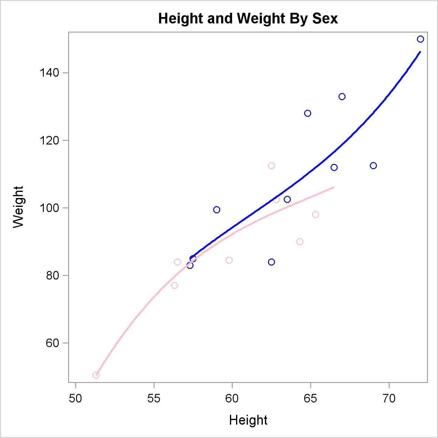
[Incidentally, PROC SGPLOT created an attribute map that explicitly maps the first group (set by Alfred who is male) to blue and the next group (females) to pink. In contrast, the rest of the Sashelp.Class data set examples implicitly map the first group in the sorted data set (females) to pink and the the second group (males) to blue.]
You can add DRAW statements and other options to enhance the plot.
proc template;
   define statgraph MyRegPlot;
      begingraph / dataContrastColors=(CXFFC0CB CX0000FF);
         EntryTitle "Height and Weight By Sex";
         layout overlay / xaxisopts=(offsetmax=0.2);
            ScatterPlot X=Height Y=Weight / primary=true group=sex;
            RegressionPlot X=Height Y=Weight / Degree=3 Group=sex;
            DrawText TextAttrs=(Color=blue) 'Males' / X=72.1 Y=147
                     DrawSpace=DataValue Anchor=Left Width=20;
            DrawText TextAttrs=(Color=pink) 'Females' / X=66.7 Y=106
                     DrawSpace=DataValue Anchor=Left Width=20;
            DrawLine x1=80.5 x2=90.0 y1=93.2 y2=93.1 / LineAttrs=(Color=blue)
                     DrawSpace=WallPercent;
            DrawLine x1=65.9 x2=77.2 y1=55.5 y2=55.5 / LineAttrs=(Color=pink)
                     DrawSpace=GraphPercent;
         endlayout;
      endgraph;
   end;
run;

proc sort data=sashelp.class out=class;
   by sex;
run;

proc sgrender template=myregplot data=class;
run; |
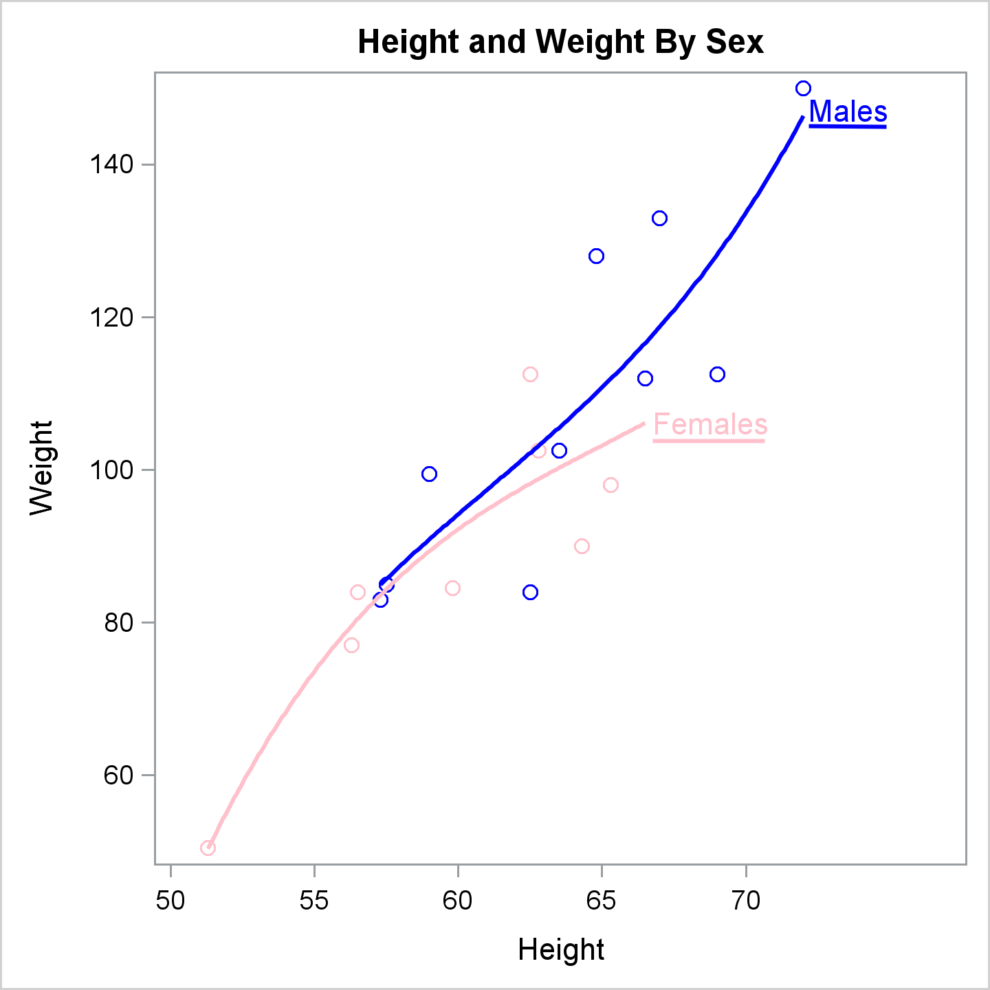
This example adds an offset to the right side of the X axis that provides room for ad hoc curve labels, which are supplied by DRAWTEXT statements and underlined by DRAWLINE statements. Those four statements use two different drawing spaces. In practice, you probably would not do that, but it shows the flexibility that the DRAW statements provide.
The BEGINPOLYLINE and DRAW statements provide an alternative to the DRAWLINE statement. Furthermore, you can have multiple DRAW statements for each BEGINPOLYLINE statement, to draw a series of line segments. (This is more fully illustrated in the polygon example below.) The next step creates the same graph.
proc template;
   define statgraph MyRegPlot;
      begingraph / dataContrastColors=(CXFFC0CB CX0000FF);
         EntryTitle "Height and Weight By Sex";
         layout overlay / xaxisopts=(offsetmax=0.2);
            ScatterPlot X=Height Y=Weight / primary=true group=sex;
            RegressionPlot X=Height Y=Weight / Degree=3 Group=sex;
            DrawText TextAttrs=(Color=blue) 'Males' / X=72.1 Y=147
                     DrawSpace=DataValue Anchor=Left Width=20;
            DrawText TextAttrs=(Color=pink) 'Females' / X=66.7 Y=106
                     DrawSpace=DataValue Anchor=Left Width=20;
            BeginPolyLine x=80.5 y=93.1 / LineAttrs=(Color=blue) DrawSpace=WallPercent;
               Draw x=90.0 y=93.1;
            EndPolyLine;
            BeginPolyLine x=65.9 y=55.5 / LineAttrs=(Color=pink) DrawSpace=GraphPercent;
               Draw x=77.2 y=55.5;
            EndPolyLine;
         endlayout;
      endgraph;
   end;
run;

proc sort data=sashelp.class out=class;
   by sex;
run;

proc sgrender template=myregplot data=class;
run; |
Since the graph matches the previous graph, it is not shown.
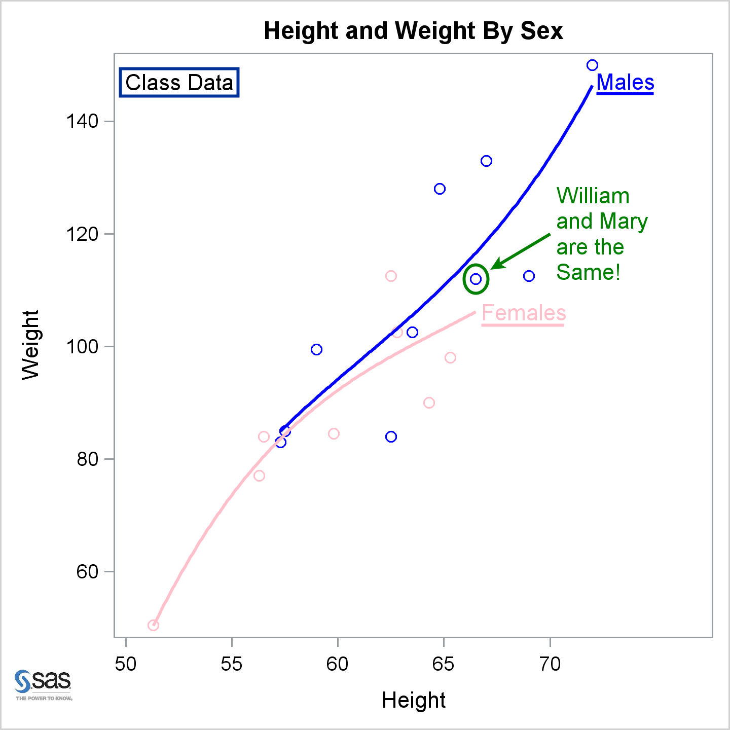
The following step adds additional annotations including more text, a rectangle, an image, an oval, and an arrow.
proc template;
   define statgraph MyRegPlot;
      begingraph / dataContrastColors=(CXFFC0CB CX0000FF);
         EntryTitle "Height and Weight By Sex";
         layout overlay / xaxisopts=(offsetmax=0.2);
            ScatterPlot X=Height Y=Weight / primary=true group=sex;
            RegressionPlot X=Height Y=Weight / Degree=3 Group=sex;
            DrawText TextAttrs=(Color=pink) 'Females' / X=66.7 Y=106
                     DrawSpace=DataValue Anchor=Left Width=20;
            DrawText TextAttrs=(Color=blue) 'Males' / X=72.1 Y=147
                     DrawSpace=DataValue Anchor=Left Width=20;
            BeginPolyLine x=65.9 y=55.5 / LineAttrs=(Color=pink) DrawSpace=GraphPercent;
               Draw x=77.2 y=55.5;
            EndPolyLine;
            BeginPolyLine x=80.5 y=93.1 / LineAttrs=(Color=blue) DrawSpace=WallPercent;
               Draw x=90.0 y=93.1;
            EndPolyLine;
            DrawText 'Class Data' / DrawSpace=WallPercent x=11 y=95 width=100;
            DrawRectangle x=10.9 y=95 height=4.6 width=19.5 / DrawSpace=WallPercent;
            DrawImage 'SAS_org.jpg' / width=8 x=6 y=6 DrawSpace=GraphPercent;
            DrawOval  x=66.5 y=112 height=5 width=5 / DrawSpace=datavalue
                      widthunit=percent heightunit=percent OutLineAttrs=(Color=green);
            DrawArrow x1=70 y1=120 x2=67.2 y2=113.6 / DrawSpace=DataValue
                      LineAttrs=(Color=green) ArrowheadScale=0.6 ArrowheadShape=Barbed;
            DrawText TextAttrs=(Color=Green) 'William and Mary are the Same!' / width=25
                      DrawSpace=DataValue x=70.25 y=120 Anchor=Left;
         endlayout;
      endgraph;
   end;
run;

proc sort data=sashelp.class out=class;
   by sex;
run;

proc sgrender template=myregplot data=class;
run; |
The following steps show how to use a POLYGON statement in PROC SGPLOT to draw a stylized sun.
data Sun(keep=id x y);
   pi = constant('pi');
   id = 1;
   inc = 2 * pi / 32;
   do tau = 0 to 2 * pi - 0.5 * inc by inc;
      x = cos(tau);
      y = sin(tau);
      output;
      x2 = cos(tau + inc);
      y2 = sin(tau + inc);
      m = -(x2 - x) / (y2 - y);
      t1 = mean(x, x2);
      t2 = mean(y, y2);
      x = t1 + ifn(t1 gt 0, -1, 1) * sqrt(0.15 / (1 + m * m));
      y = m * (x - t1) + t2;
      output;
   end;
run;

proc sgplot data=sun noborder;
   polygon x=x y=y id=id / fill fillattrs=(color=yellow) outline lineattrs=(color=red);
   xaxis display=none;
   yaxis display=none;
run; |

It would be tedious to manually write DRAW statements to do the same thing. However, a SAS programmer can always use SAS to make things less tedious. The following steps create the same stylized sun.
data x;
   input x y @@;
   datalines;
1 1 -1 -1
;

data _null_;
   length s $ 32767;
   retain s 'BeginPolygon';
   set sun end=eof;
   if _n_ eq 1 then s = catx(' ', s, 'x=', x, 'y=', y, '/ Display=All',
      'DrawSpace=DataValue OutlineAttrs=(color=red Thickness=1) FillAttrs=(color=yellow);');
   else s = catx(' ', s, 'draw x=', x, 'y=', y, ';');
   if eof then call symputx('s', catx(' ', s, 'EndPolygon;'));
run;

proc template;
   define statgraph HereComesTheSun;
      begingraph;
         layout overlay / border=false walldisplay=none
            yaxisopts=(display=none) xaxisopts=(display=none);
            ScatterPlot X=x Y=y / markerattrs=(size=0);
            &s
         endlayout;
      endgraph;
   end;
run;

proc sgrender template=HereComesTheSun data=x;
run; |
The DATA step writes a BEGINPOLYGON statement and a series of DRAW statements to draw each side of the polygon. It stores them in the macro variable &s, which is incorporated into the template. The DATA step writes the following statements into the macro variable.
BeginPolygon x= 1 y= 0 / Display=All DrawSpace=DataValue OutlineAttrs=(color=red Thickness=1) FillAttrs=(color=yellow); draw x= 0.6049592529 y= 0.0595832858 ; draw x= 0.9807852804 y= 0.195090322 ; draw x= 0.5817110081 y= 0.1764601051 ; draw x= 0.9238795325 y= 0.3826834324 ; draw x= 0.5361079355 y= 0.2865556616 ; draw x= 0.8314696123 y= 0.555570233 ; draw x= 0.4699025355 y= 0.3856390447 ; draw x= 0.7071067812 y= 0.7071067812 ; draw x= 0.3856390447 y= 0.4699025355 ; draw x= 0.555570233 y= 0.8314696123 ; draw x= 0.2865556616 y= 0.5361079355 ; draw x= 0.3826834324 y= 0.9238795325 ; draw x= 0.1764601051 y= 0.5817110081 ; draw x= 0.195090322 y= 0.9807852804 ; draw x= 0.0595832858 y= 0.6049592529 ; draw x= 6.1232339957367E-17 y= 1 ; draw x= -0.059583286 y= 0.6049592529 ; draw x= -0.195090322 y= 0.9807852804 ; draw x= -0.176460105 y= 0.5817110081 ; draw x= -0.382683432 y= 0.9238795325 ; draw x= -0.286555662 y= 0.5361079355 ; draw x= -0.555570233 y= 0.8314696123 ; draw x= -0.385639045 y= 0.4699025355 ; draw x= -0.707106781 y= 0.7071067812 ; draw x= -0.469902536 y= 0.3856390447 ; draw x= -0.831469612 y= 0.555570233 ; draw x= -0.536107935 y= 0.2865556616 ; draw x= -0.923879533 y= 0.3826834324 ; draw x= -0.581711008 y= 0.1764601051 ; draw x= -0.98078528 y= 0.195090322 ; draw x= -0.604959253 y= 0.0595832858 ; draw x= -1 y= -7.6571373978539E-16 ; draw x= -0.604959253 y= -0.059583286 ; draw x= -0.98078528 y= -0.195090322 ; draw x= -0.581711008 y= -0.176460105 ; draw x= -0.923879533 y= -0.382683432 ; draw x= -0.536107935 y= -0.286555662 ; draw x= -0.831469612 y= -0.555570233 ; draw x= -0143469902536 y= -0.385639045 ; draw x= -0.707106781 y= -0.707106781 ; draw x= -0.385639045 y= -0.469902536 ; draw x= -0.555570233 y= -0.831469612 ; draw x= -0.286555662 y= -0.536107935 ; draw x= -0.382683432 y= -0.923879533 ; draw x= -0.176460105 y= -0.581711008 ; draw x= -0.195090322 y= -0.98078528 ; draw x= -0.059583286 y= -0.604959253 ; draw x= 2.4808382392282E-15 y= -1 ; draw x= 0.0595832858 y= -0.604959253 ; draw x= 0.195090322 y= -0.98078528 ; draw x= 0.1764601051 y= -0.581711008 ; draw x= 0.3826834324 y= -0.923879533 ; draw x= 0.2865556616 y= -0.536107935 ; draw x= 0.555570233 y= -0.831469612 ; draw x= 0.3856390447 y= -0.469902536 ; draw x= 0.7071067812 y= -0.707106781 ; draw x= 0.4699025355 y= -0.385639045 ; draw x= 0.8314696123 y= -0.555570233 ; draw x= 0.5361079355 y= -0.286555662 ; draw x= 0.9238795325 y= -0.382683432 ; draw x= 0.5817110081 y= -0.176460105 ; draw x= 0.9807852804 y= -0.195090322 ; draw x= 0.6049592529 y= -0.059583286 ; EndPolygon; |
All of the DRAW statements are illustrated in this post. For ad hoc graphs, you will probably use SG annotation and PROC SGPLOT more often than you will use the GTL and DRAW statements. Still, DRAW statements are an important tool that every ODS Graphics user should know. DRAW statements along with the techniques in my previous post enable you to easily add customizations to some graphs or all graphs. For example, you could add an image to all PROC REG graph templates as follows:
ods path sashelp.tmplmst(read);
proc datasets library=sasuser nolist; delete templat(memtype=itemstor); run;
ods path reset;

proc template;
   source Stat.REG / file='temp.tmp' where=(type='Statgraph');
quit;

options nosource;
data _null_;
   infile 'temp.tmp';
   input;
   if _n_ = 1 then
      call execute('proc template;');
   call execute(_infile_);
   if find(lowcase(_infile_), 'begingraph') then bg + 1;
   if bg and index(_infile_, ';') then do;
      bg = 0;
      call execute("DrawImage 'SAS_org.jpg' / width=4 x=3 y=2 layer=back DrawSpace=GraphPercent;");
   end;
run;
options source;

proc reg data=sashelp.class plots=all;
   model weight=height;
quit; |
The results of these last steps are not displayed.
