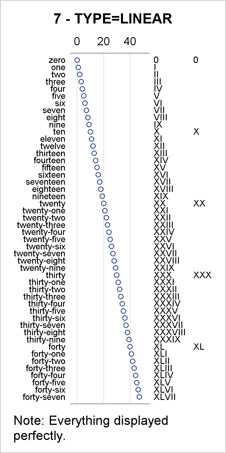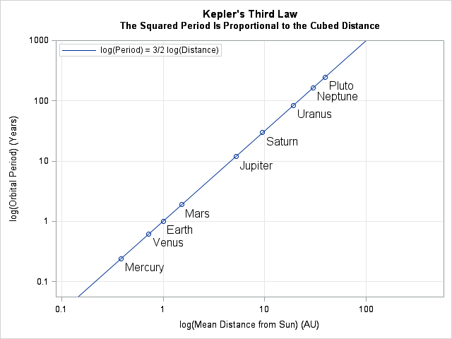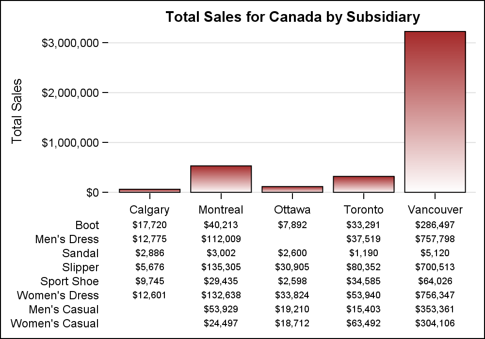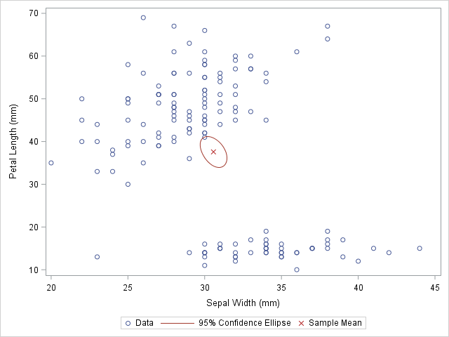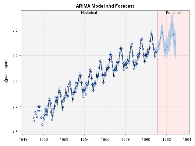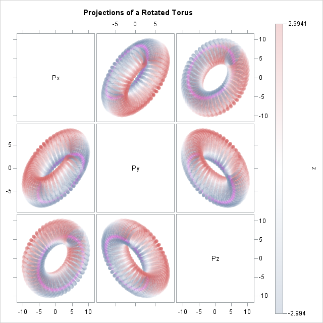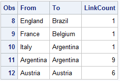
Automate the creation of a discrete attribute map

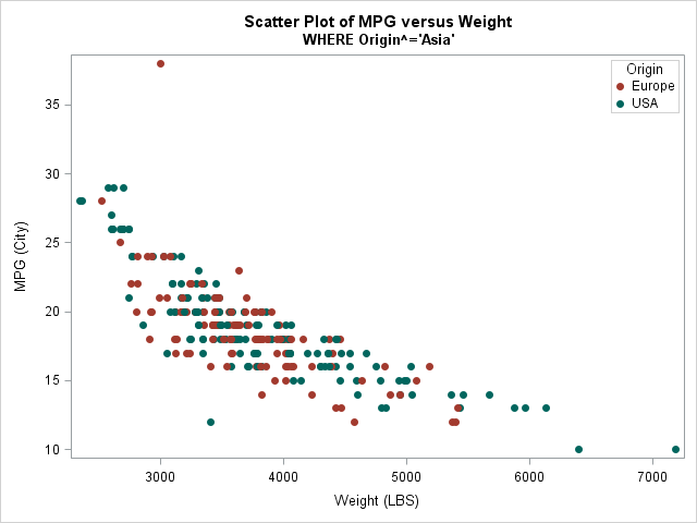
If you are a SAS programmer and use the GROUP= option in PROC SGPLOT, you might have encountered a thorny issue: if you use a WHERE clause to omit certain observations, then the marker colors for groups might change from one plot to another. This happens because the marker colors