In my last post, I showed you how to generate a word cloud of pdf collections. Word clouds show you which terms are mentioned by your documents and the frequency with which they occur in the documents. However, word clouds cannot lay out words from a semantic or linguistic perspective. In this blog I’d like to show you how we can overcome this constraint with new methods.
Word embedding has been widely used in Natural Language Processing, where words or phrases from the vocabulary are mapped to vectors of real numbers. There are several open source tools that can be used to build word embedding models. Two of the most popular tools are word2vec and Glove, and in my experiment I used Glove. GloVe is an unsupervised learning algorithm for obtaining vector representations for words. Training is performed on aggregated global word-word co-occurrence statistics from a corpus, and the resulting representations showcase interesting linear substructures of the word vector space.
Suppose you have obtained the term frequencies from documents with SAS Text Miner and downloaded the word embedding model from GloVe. Next you can extract vectors of terms using PROC SQL.
libname outlib 'D:\temp'; * Rank terms according to frequencies; proc sort data=outlib.abstract_stem_freq; by descending freq; run;quit; data ranking; set outlib.abstract_stem_freq; ranking=_n_; run; data glove; infile "d:\temp\glove_100d_tab.txt" dlm="09"x firstobs=2; input term :$100. vector1-vector100; run; proc sql; create table outlib.abstract_stem_vector as select glove.*, ranking, freq from glove, ranking where glove.term = ranking.word; quit; |
Now you have term vectors, and there are two ways to project 100-dimension vector data in two dimensions. One is SAS PROC MDS (multiple dimensional scaling) and the other is T-SNE (t-Distributed Stochastic Neighbor Embedding). T-SNE is a machine learning algorithm for dimensionality reduction developed by Geoffrey Hinton and Laurens van der Maaten. It is a nonlinear dimensionality reduction technique that is particularly well-suited for embedding high-dimensional data into a space of two or three dimensions, which can then be visualized in a scatter plot.
Let’s try SAS PROC MDS first. Before running PROC MDS, you need to run PROC DISTANCE to calculate distance or similarity of each pair of words. According to Glove website, the Euclidean distance (or cosine similarity) between two word vectors provides an effective method for measuring the linguistic or semantic similarity of the corresponding words. Sometimes, the nearest neighbors according to this metric reveal rare but relevant words that lie outside an average human's vocabulary. I used Euclidean distance in my experiment and showed the top 10 words on the scatter plot as seen in Figure-1.
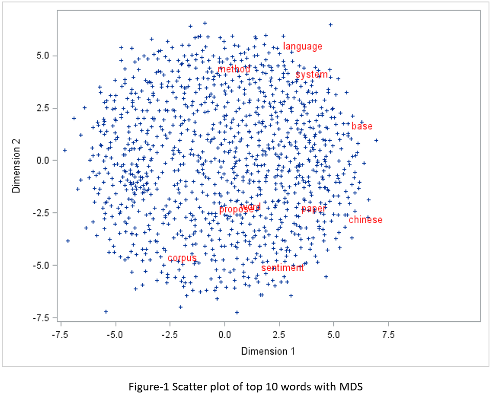
proc distance data=outlib.abstract_stem_vector method=EUCLID out=distances; var interval(vector1-vector100); id term; run;quit; ods graphics off; proc mds data=distances level=absolute out=outdim; id term; run;quit; data top10; set outlib.abstract_stem_vector; if ranking le 10 then label=term; else label=''; drop ranking freq; run; proc sql; create table mds_plot as select outdim.*, label from outdim left join top10 on outdim.term = top10.term; quit; ods graphics on; proc sgplot data = mds_plot; scatter x=dim1 y= dim2 / datalabel = label markerattrs=(symbol=plus size=5) datalabelattrs = (family="Arial" size=10pt color=red); run;quit; |
SAS does not have t-sne implementation, so I used PROC IML to call the RTSNE library. There are two libraries in R that can be used for t-sne plot: TSNE and RTSNE. RTSNE was acclaimed faster than TSNE. Just as I did with the SAS MDS plot, I showed the top 10 words only, but their font sizes are varied according to their frequencies in documents.
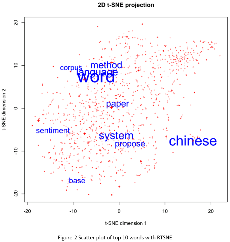
data top10; length label $ 20; length color 3; length font_size 8; set outlib.abstract_stem_vector; if ranking le 10 then label=term; else label='+'; if ranking le 10 then color=1; else color=2; font_size = max(freq/25, 0.5); drop ranking freq; run; proc iml; call ExportDataSetToR("top10", "vectors"); submit /R; library(Rtsne) set.seed(1) # for reproducibility vector_matirx <- as.matrix(vectors[,5:104]) tsne <- Rtsne(vector_matirx) # print tsne plot: svg(filename="d://temp//tsne.svg", width=8, height=8) plot(tsne$Y, t='n', xlab = "t-SNE dimension 1", ylab = "t-SNE dimension 2", main = "2D t-SNE projection", pch=3) plot_colors <- c("blue","red") text(tsne$Y, labels=vectors$label, cex=vectors$font_size, col=plot_colors[vectors$color]) dev.off() endsubmit; run;quit; |
If you compare the two figures, you may feel that MDS plot is more symmetric than T-SNE plot, but the T-SNE plot seems more reasonable from a linguistic/semantic perspective. In Colah’s blog, he did an exploration and comparison of various dimensionality reduction techniques with well-known computer vision dataset MNIST. I totally agree with his opinions below.
It’s easy to slip into a mindset of thinking one of these techniques is better than others, but I think they’re all complementary. There’s no way to map high-dimensional data into low dimensions and preserve all the structure. So, an approach must make trade-offs, sacrificing one property to preserve another. PCA tries to preserve linear structure, MDS tries to preserve global geometry, and t-SNE tries to preserve topology (neighborhood structure).
To learn more I would encourage you to read the following articles.
http://colah.github.io/posts/2014-10-Visualizing-MNIST/
http://colah.github.io/posts/2015-01-Visualizing-Representations
https://www.codeproject.com/Tips/788739/Visualization-of-High-Dimensional-Data-using-t-SNE