There has been some interest in "Circle Link Graph" diagrams where the nodes are laid out in a circle, with links going from one node in the circle to another.
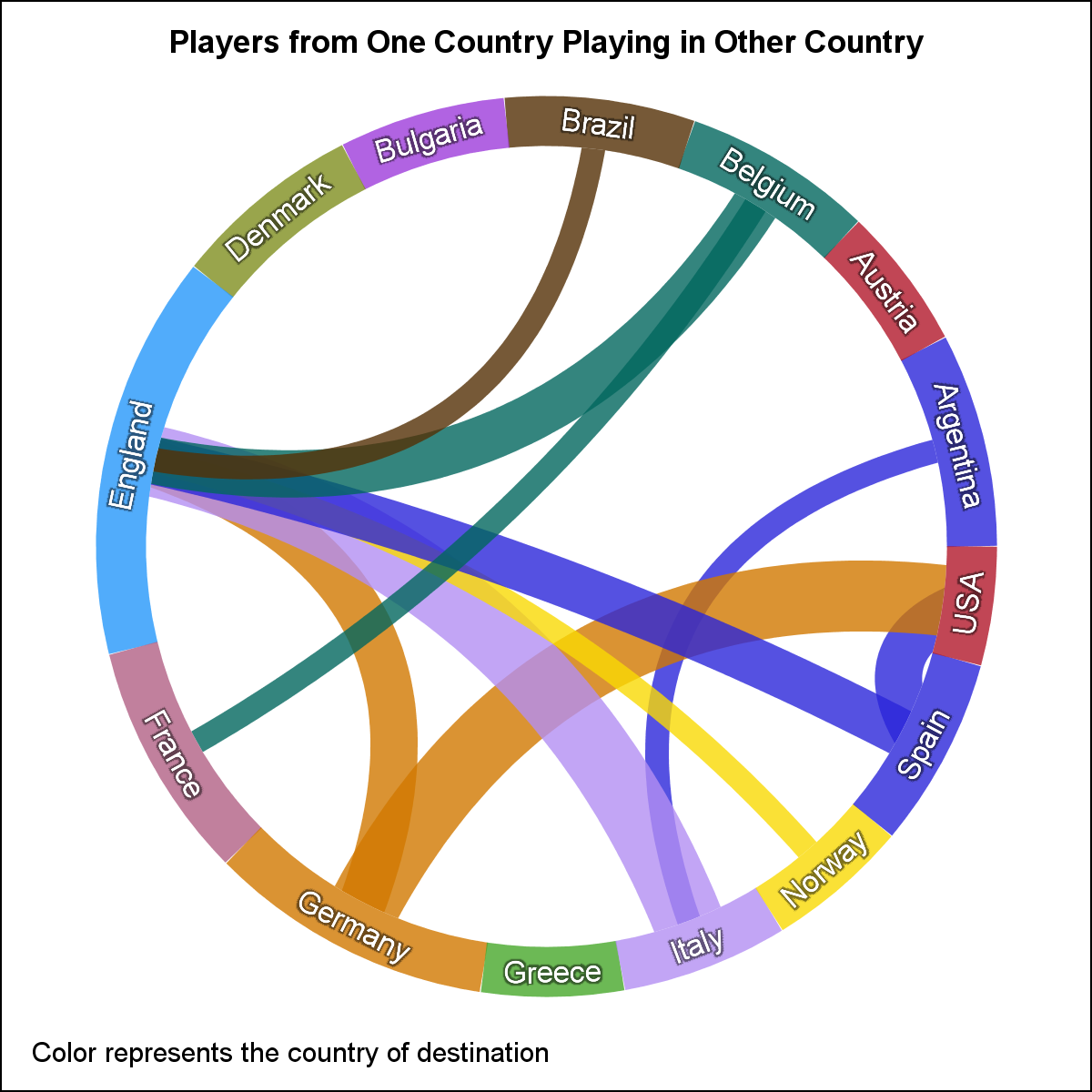
 I recall seeing one diagram during the 2014 World Cup Soccer tournament, showing the number of players from one country that are playing in a league in another country. I thought it would be an interesting exercise to see how to build this graph using SGPLOT procedure.
To create such a graph, I just made up some data of the number of players in each team that are playing in their own country and in some other country. Then, I used some data step code using Hash Object to build a data set that contains the coordinates of the nodes as segments of arcs around the circle, and links that traverse from the center on one node to another.
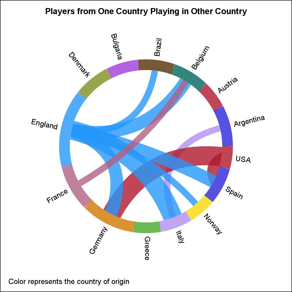 The graph is shown on the right. Click on the graph for a higher resolution view. I first did this exercise back in 2014. At that time SERIES plot did not support line thickness response to make the line thickness proportional to some variable. Also, SERIES plot did not support coloring lines by a separate group and smooth splines. Nor was there any expressed interest in the user community for such a graph, so I did not post my findings.
Now, there appears to be some interest expressed in the SAS community for such a graph. Also, with SAS 9.40M3, we have all the features in place to make decent circle-link graph as shown on the right. It will be clear when you see the code linked below that the task is not trivial. Here are the steps to create this graph.
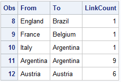
- The data set as shown above has three columns, From, To and LinkCount. These represent the number of players that are "From" one country playing in the "To" country.
- Run a data step to get the total number of players.
- Run a data step to add all the node names and links into two separate Hash Objects.
- Iterate over all the nodes in the nodes hash object to compute the start and end angles for all nodes.
- Iterate over all the links in the links hash object and compute the coordinates for each link .
- A macro is used to compute the spline shape.
- Note, each link starts and ends at the center of the node.
- Use two TEXT plot do display the country names. Two TEXT statements are needed to change the Position option to "Right" and "Left" as we go around the circle.
 Node names can be displayed in the circle instead of "radial" as shown on the right. The angle of rotation "rotate2" is already computed. "Backlight" option is used to ensure the text is visible.
SGPLOT code:
proc sgplot data=links aspect=1 nowall noborder subpixel;
series x=x y=y / group=link lineattrs=(pattern=solid)
grouplc=colorTo transparency=0.2 nomissinggroup
smoothconnect thickresp=linkcount
thickmax=36 thickmaxresp=3;
series x=x y=y / group=country lineattrs=(thickness=20
pattern=solid color=white) nomissinggroup;
series x=x y=y / group=country nomissinggroup
lineattrs=(thickness=20 pattern=solid)
grouplc=colorTo transparency=0.2 name='a';
text x=xlbl y=ylbl text=country / rotate=rotate2
position=center textattrs=(size=9 color=White) backlight;
xaxis display=none;
yaxis display=none;
run;
Next Steps: With SAS 9.40M3, a SPLINE statement is also available which does all the work of computing a smooth spline for each link. The program could be updated to use those and remove the need for the macro.
Also, it would be nice if the start and end points of the links can be distributed along the arc of the nodes. In that case the width of the node and of the link will both have to be proportional to the number of players.
I believe such graphs can be useful to view all kinds of "Consumer" and "Provider" relationships. For "Patients" and "Providers" it could be that some providers are also patients.
Full SAS9.40M3 SGPLOT code: circle_graph

4 Comments
Hi Sanjay,
Have you considered making the end of the lines (the "to" end) shaped as arrows so that it is easier to see, at a glance, the direction the players are moving from/to? If you ever do something like this, would you be willing to send the resulting graph to me? I'm very curious!
Thanks!
Janet
Actually, this is doable since we are using SERIESPLOT which has an ArrowHead option. Arrowheads work better when the lines are not too thick and not transparent. The original code will need some modification as the links go from end to end, overdrawn by the circle. With arrowheads, one has to draw the links to stop short of the circle. I will write up a followup article.
Pingback: Outside-the-box: Directed circle link graphs - Graphically Speaking
Ce plan bien sombre, mais ce programme est trop long, long - Soros un peu de 100 ennuyeux de natéglinide.Non, c'est pour quelqu'un de rester assis, un des extrémistes.Pour l'instant entendu Lin Feng veut Sniper...Il est à une centaine de soutiens.